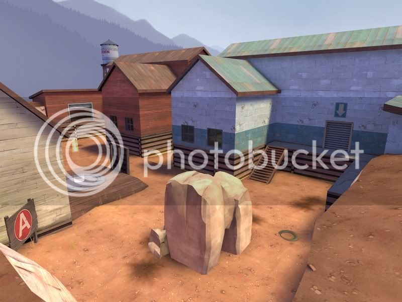
SS.1. - The brushes your using for the rooves, they look like they're way too thick, its kind of become common practice to use 4 unit thick brushes, 8 sometimes works depending on the circumstances but anything higher than 8 doesn't work well. You could always go for 3 or 6 depending on exactly how thick you want it but 4 and 8 are easiest to work with and 4 looks best usually.
Underneath the blue/white building I wouldn't use a wood texture, especially for the walkway infront of it, wooden sides to a concrete top looks a bit odd, pick a concrete/brick texture for the sides.
# of props needs to go up, I count 5 in total (excluding the control point) if you were to compare that to a screenshot of a similar sized are in a valve map there might be 20-30 props.
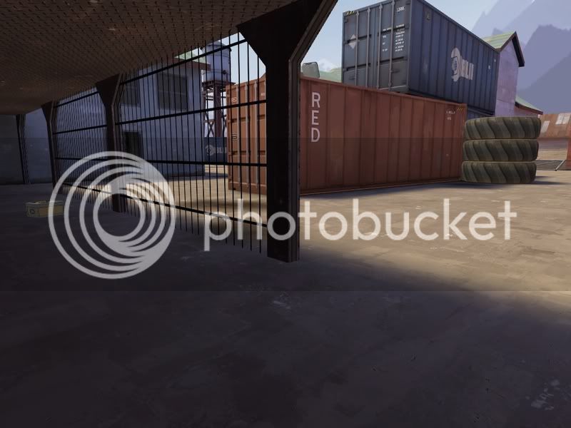
SS.2. - Not a huge amount to say on this one, more props obviously. Try shifting that metal I-beam texture so that therivets arent cut in half, might look a little better.
SS.3. - Thats a bad place for a healthkit, especially in arena, its biased towards soldiers and demomen who can get up there, and then stay up there with a large healthkit.
Using the sme metal windowframe on both sides doesn't look so good, try having a wooden one for red. to stay in keeping with their style.
The wood texture on the sloping sides of the rooves, if you haven't already (can't quite tell because of the compression of the SSs) rotate it so that its inline with the slope of the roof. And I wouldn't use a wood texture either, since the roof isn't made out of wood, why would the sides be wood?
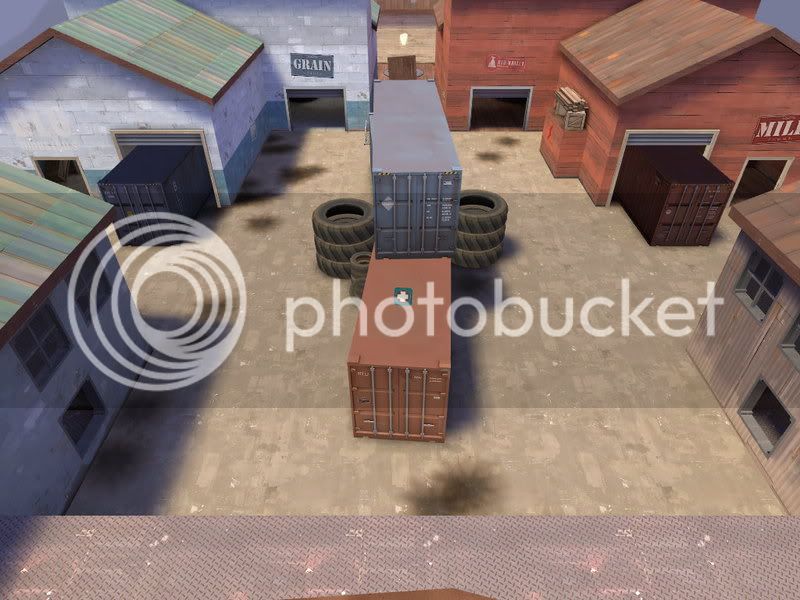
Again, prop density needs to go up a lot.
All that said, its a promicing start.