Arena Lighthouse
- Thread starter Psy
- Start date
You are using an out of date browser. It may not display this or other websites correctly.
You should upgrade or use an alternative browser.
You should upgrade or use an alternative browser.
S3BB0_L1C1OUS
L3: Member
- Nov 2, 2008
- 118
- 13
TheDarkerSideofYourShadow
L10: Glamorous Member
- Apr 12, 2008
- 792
- 286
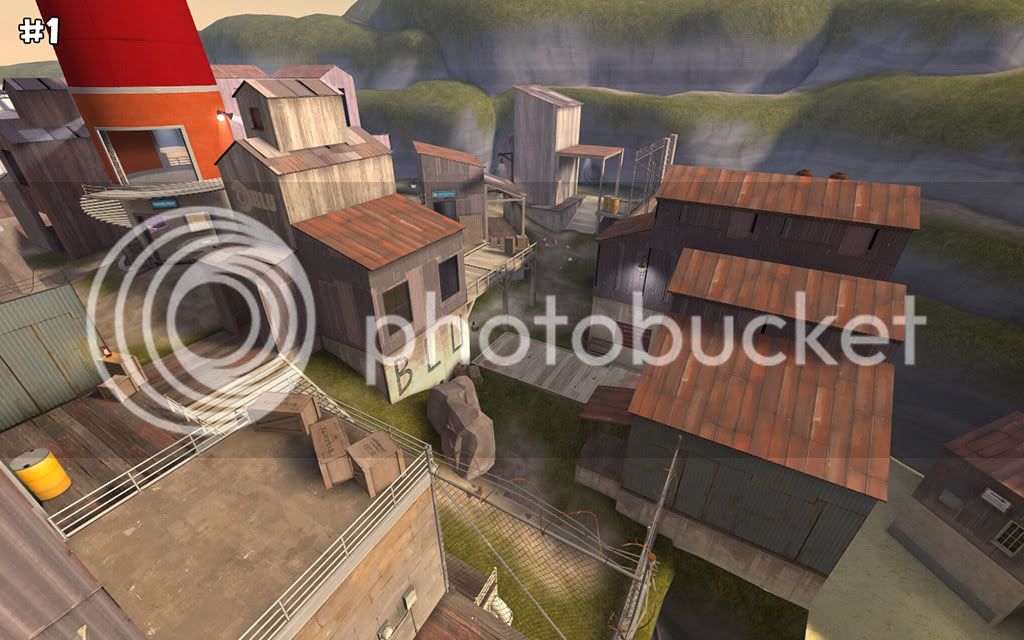
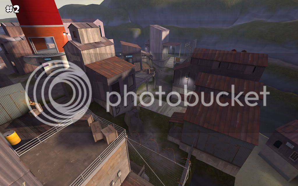
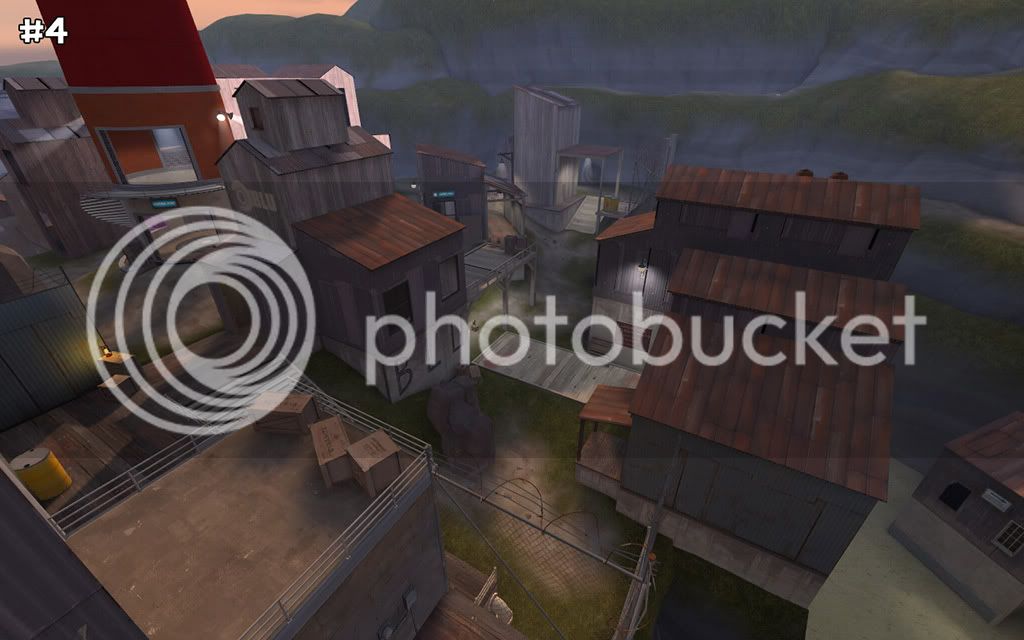
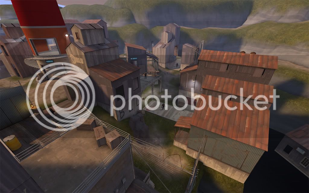
4 or 2. Though I'm leaning towards 4. Just seems a bit smoother than 2 (not as dark in the dark areas, not as light in the light areas).
Scotland Tom
L6: Sharp Member
- Jan 19, 2008
- 332
- 64
1 or 2.
1 is nice and light without being too bright. There is good contrast between the lit and shadowed areas, but not so much that the eyes will have to do a lot of adjusting when moving between the two.
2 is probably a better choice as far as atmosphere goes. It makes the whole place feel much more like it's some sort of seaside shack town. Obviously it's darker than number 1, so I think the major deciding factor here is whether you want a darker or lighter map.
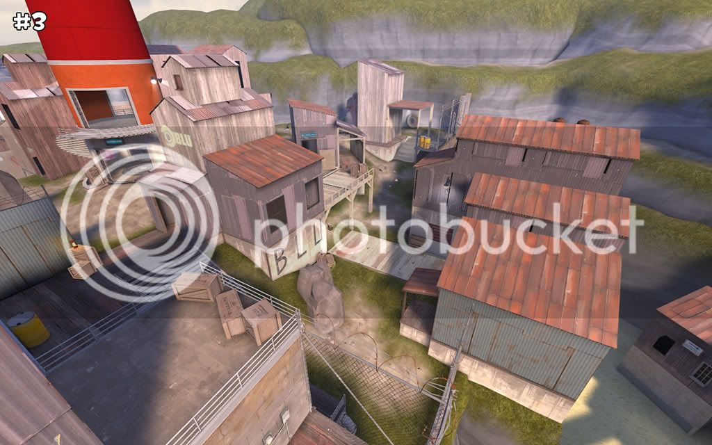
3 is getting the raw deal on this one because, for the angle of the light, it's a poor angle to take a screenshot from. Everything looks too bright because the buildings are blocking their own shadows. I don't like how 3 looks from this angle, but my opinion might change if I were shown another shot from a perpendicular angle.
4, seems just a tad on the dark side to me. I like it, and perhaps it would look different in-game, but I think number 2 is your better bet if you want a slightly darker map.
On another note, did you happen to use a prop wood texture on one of those buildings? It's the one directly behind the big Blu building and the lighthouse in the upper left quadrant of the screenshots. That structure back there seems strangely lit in shots 1 and 2, I can't tell about shot 3, but in shot 4 it's practically glowing.
- Apr 9, 2008
- 1,706
- 1,491
I like 4, but there's a weird lighting with the buildings in the distance, near the right of the lighthouse.
Like I said, I selected the wrong texture and applied the model texture as opposed to the lightmapped texture.
It seems that number 4 is victorious. Thanks for all your opinions.
- Sep 12, 2008
- 1,272
- 1,142
Hmm..
For gameplay 1 would be better I think, but for the view 4 would be the winner..
So 1 is my favourite because 4 is just too dark.
For gameplay 1 would be better I think, but for the view 4 would be the winner..
So 1 is my favourite because 4 is just too dark.
Last edited:
TheDarkerSideofYourShadow
L10: Glamorous Member
- Apr 12, 2008
- 792
- 286
Damn, 5 is nice. I really like the shadows it casts on the hills in the surrounding area.
Hmmm.... I think I'm going to have to go with 5 now.
Hmmm.... I think I'm going to have to go with 5 now.

