- Sep 8, 2008
- 157
- 79
Here i will post all the videos! I will keep the OP updated with the newest images.
Master Snake: http://www.youtube.com/watch?v=mjmgXTONT58
Tree Swaying: http://www.youtube.com/watch?v=5Dfj3UUl3IQ
Box Rail: http://www.youtube.com/watch?v=cJI1fEgZwVA
The Auto Miner: http://www.youtube.com/watch?v=-NSfv-tlanw
The Generator: http://www.youtube.com/watch?v=RkSVsvCnlOI
Engi Easter Egg: http://www.youtube.com/watch?v=Y5NShzhye3Q
The Pistons: http://www.youtube.com/watch?v=6Cn0x88N-r4
The Helicopter: http://www.youtube.com/watch?v=QoKv8DQ5GMg
The Gears http://www.youtube.com/watch?v=zocqk8i6IAI
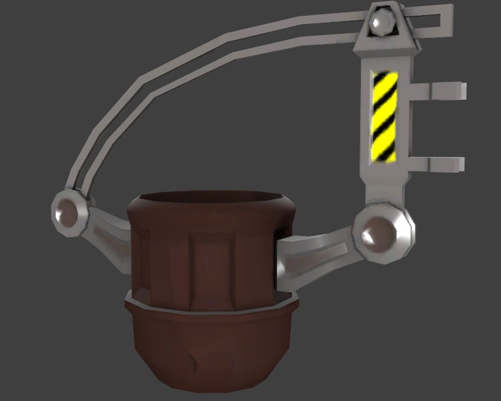
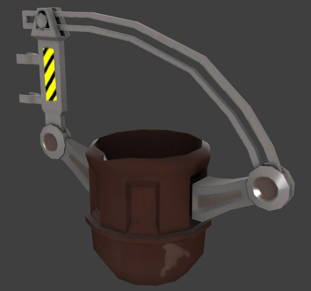
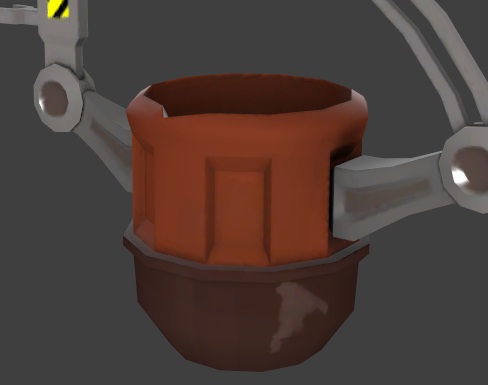
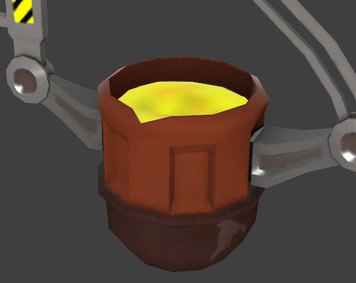
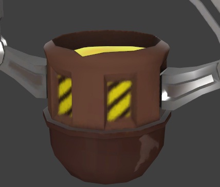
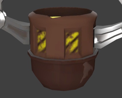
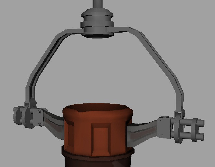
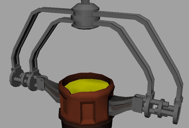
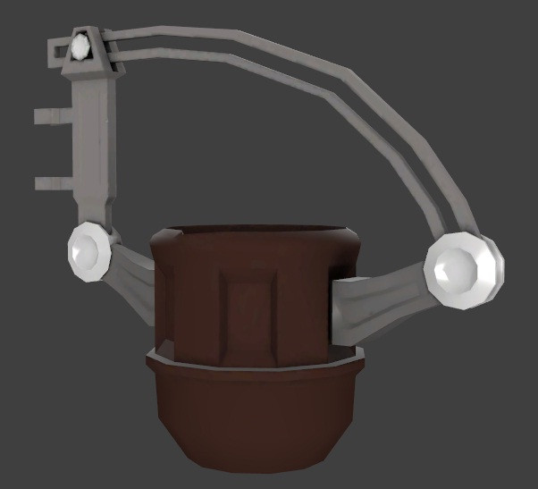
Slag Pot: http://www.youtube.com/watch?v=7KHHPWEDNKs
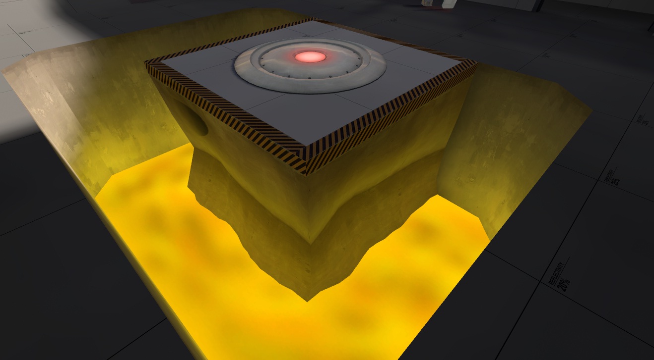
Australium Pit: http://www.youtube.com/watch?v=1uapyrgwPPA
Master Snake: http://www.youtube.com/watch?v=mjmgXTONT58
Tree Swaying: http://www.youtube.com/watch?v=5Dfj3UUl3IQ
Box Rail: http://www.youtube.com/watch?v=cJI1fEgZwVA
The Auto Miner: http://www.youtube.com/watch?v=-NSfv-tlanw
The Generator: http://www.youtube.com/watch?v=RkSVsvCnlOI
Engi Easter Egg: http://www.youtube.com/watch?v=Y5NShzhye3Q
The Pistons: http://www.youtube.com/watch?v=6Cn0x88N-r4
The Helicopter: http://www.youtube.com/watch?v=QoKv8DQ5GMg
The Gears http://www.youtube.com/watch?v=zocqk8i6IAI
Slag Pot: http://www.youtube.com/watch?v=7KHHPWEDNKs
Australium Pit: http://www.youtube.com/watch?v=1uapyrgwPPA
Last edited:
 ).
).