Aly:
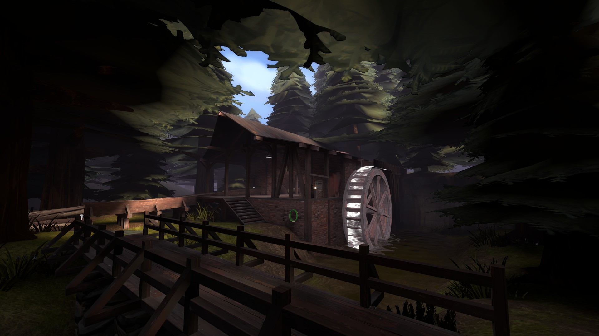
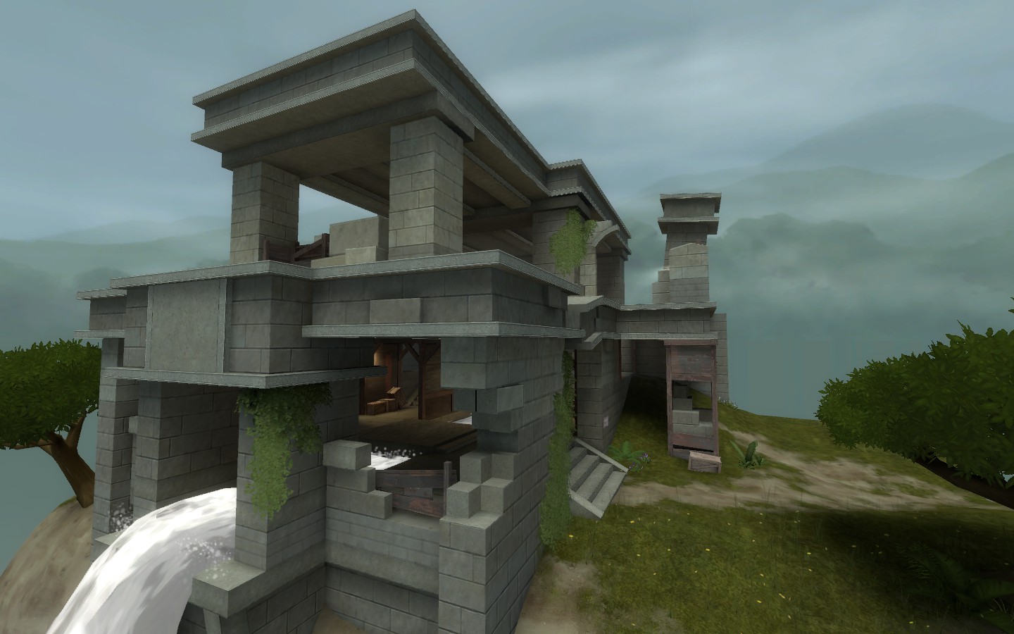
-Nice atmosphere
-Water looked odd - frothy water for a gentle stream
-Bridge might look better going at an angle rather than a right angle from the building
-Indoors looked nice but maybe could've used some shelving/storage. It didn't really seem like a place people worked/stayed in, despite the beer bottles on the porch
Bakscratch:
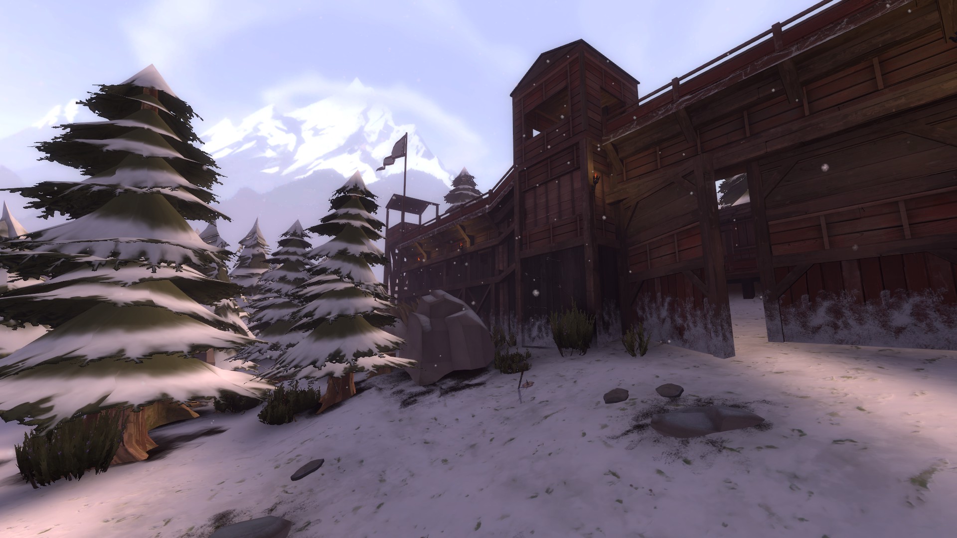
-Original
-No cubemaps
-Very nice choice of wood textures
-Rocks on the entry path looked odd. Maybe consider moving them towards the big boulders, or group them somehow. Right now they look nonsensical
-Snow pattern on the wall repeated pretty obviously
Egan:
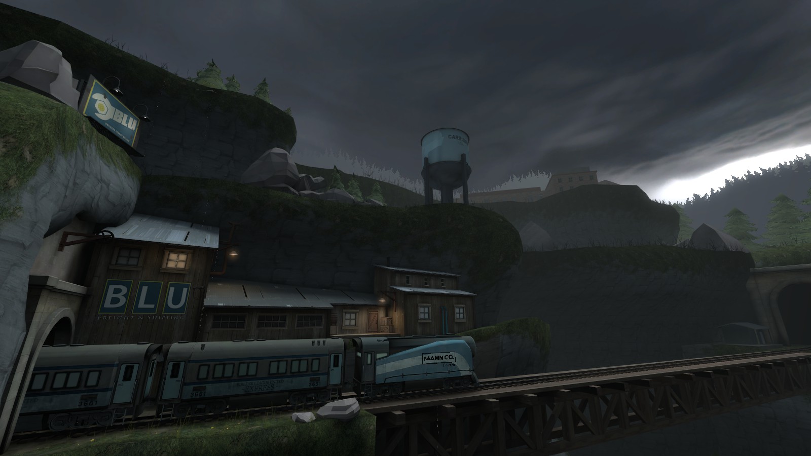
-Really cool atmosphere, imposing and lonely
-The puddles on the ground look hella cool but don't make any splish splashes when you walk through them
-Seems like a lot of wasted detail space
-You can walk inside the train tunnel entrance model
-Great 3D skybox - texture scale is off by quite a bit though, and you should remove the detail sprites
-
I lost it when this happened
Frozen:
-For some reason I was reminded of Tomb Raider, idk exactly why
-Woodwork in first area is too thick in a lot of areas
-Cool exploration aspect
-Collision mesh on the cave waterfall cliff is a bit weird, and I didn't realize I could use the platforms to get up until after I already "solved" that section
-Generally cool but the detailing was just kinda meh
Hexacosichoron:
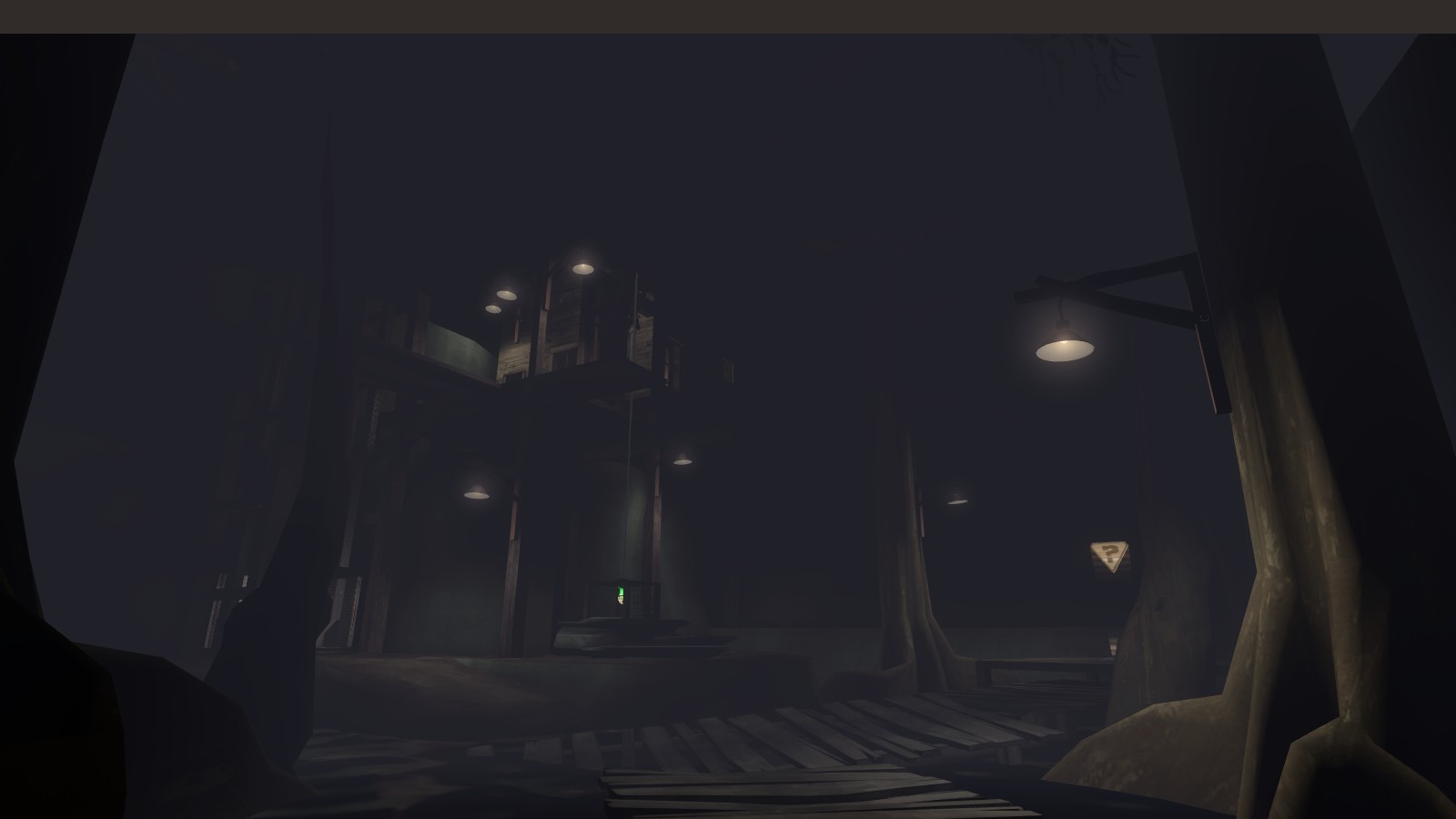
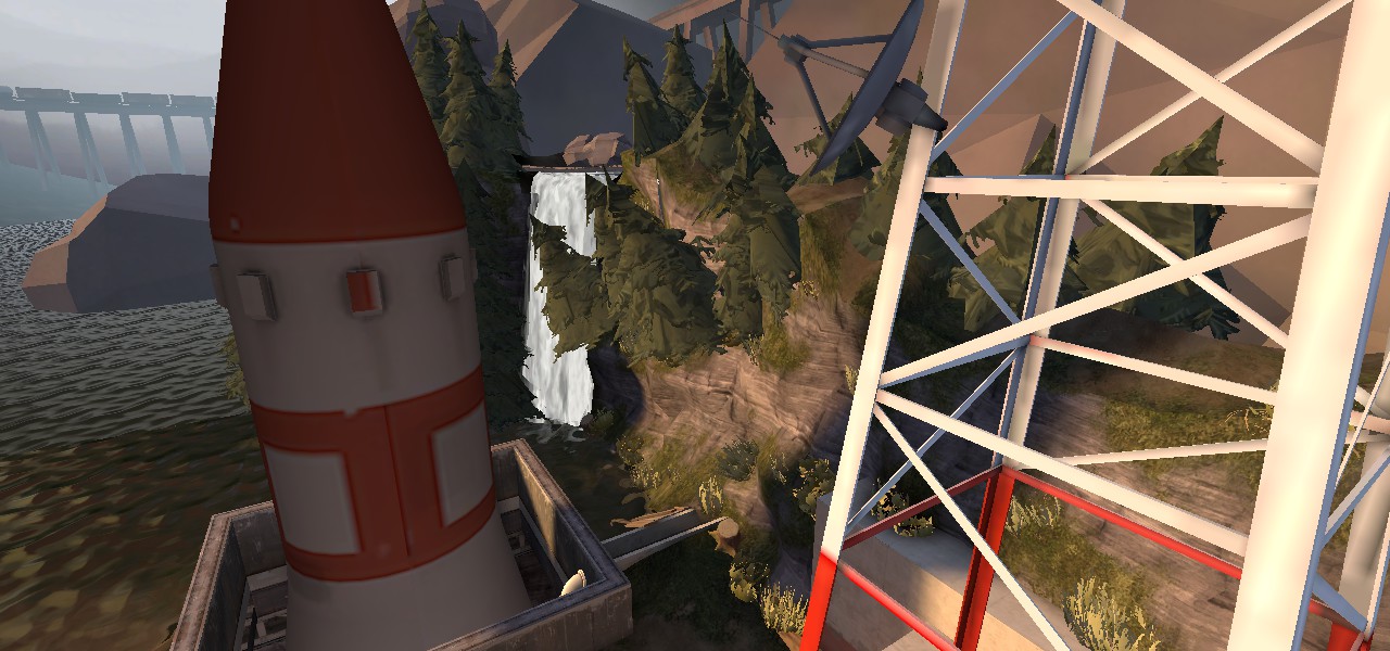
-Huge! This doesn't seem like a real place at all, the silo is just gargantuan and climbing the stairs seems like it would be more tiring than a marathon
-Waterfall is silent and has no particle effects
-Rough displacements
-The spytech computer consoles seemed useless, just stuck there for sticking there's sake
-Cool idea, but not so great execution. Keep working at it
Idolon:
-best map of the contest will win every prize and more, maybe even some grammys
MrLate:
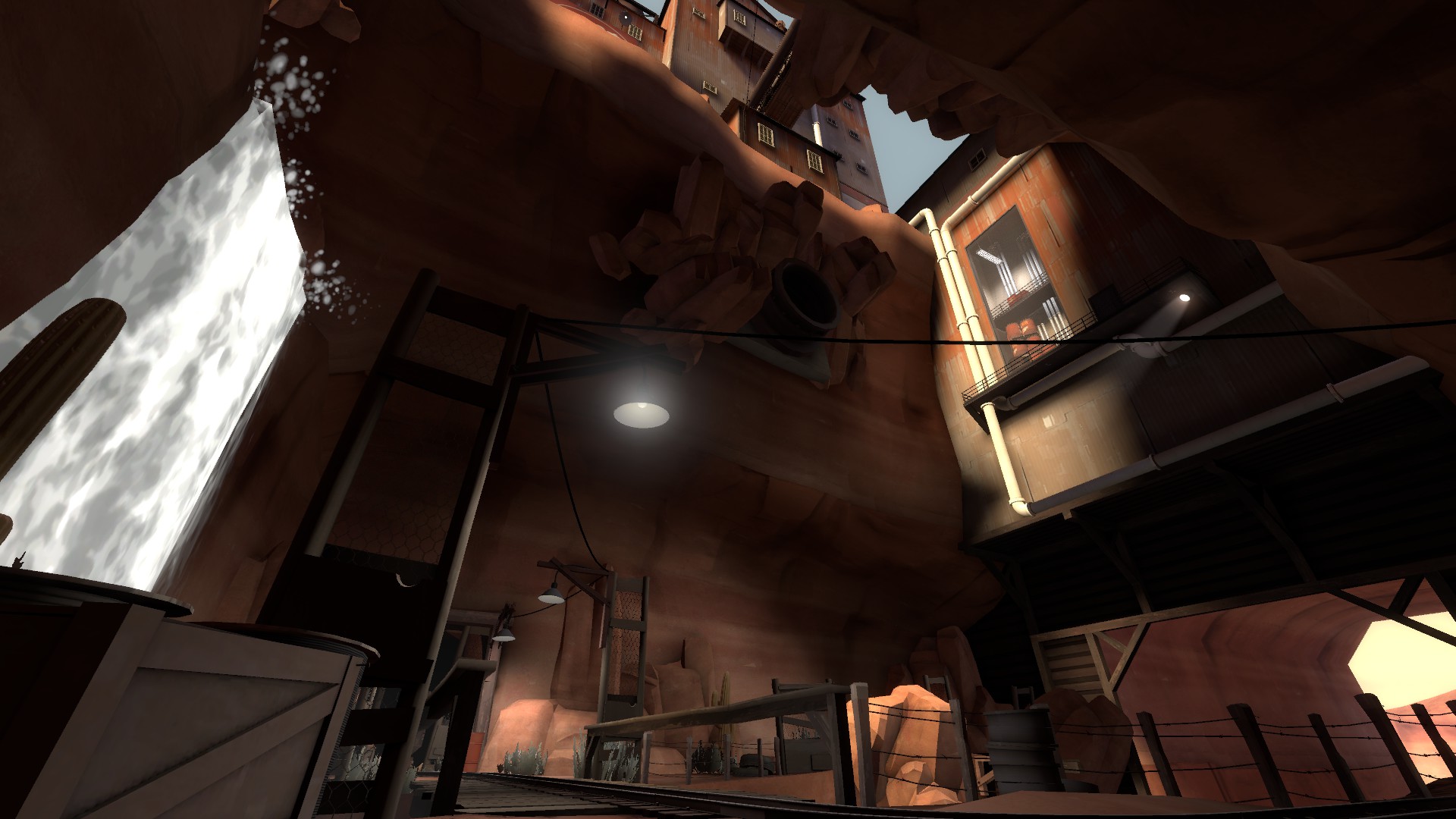
-Cacti are missing textures
-Particle effects were oddly placed. Splashes were going sideways at the top of the waterfall, and there was a patch of splashing water in the middle of the river
-The river, by the way, looks GRADE A. Excellent!
-Lighting did not carry over into the 3D skybox, maybe copy the level geometry and make it blocklight?
-The woodwork has a nice, used feel to it. Feels like a place that was worked in once
-The 3D skybox waterfall looks amazing and is super cool, as is the rest of the 3D skybox
-Did you compile with vertex lighting? The pipes don't look like it
PlipPlop:
-Hydro is one of my all time favorite detailing passes, and you're just short of being that cool
-This building has a LOT of doors in it, wow
-Feels like somewhere that gets used by real people
-Was a bit confused by the road/concrete areas - the road never connected to the concrete pad by the building, and it wasn't really clear what that concrete pad was used for
-Cliff walls are annoyingly high, I didn't realize I wasn't in a cave until I looked straight up
-Detailing was stuck in places that weren't easy to look
-The metal barrier in the water was a missed opportunity for some great wood fence work imo
-Overall cool theme and great detailing, but the placement/scale of things seemed off to me. Still great work though
TheoF114:
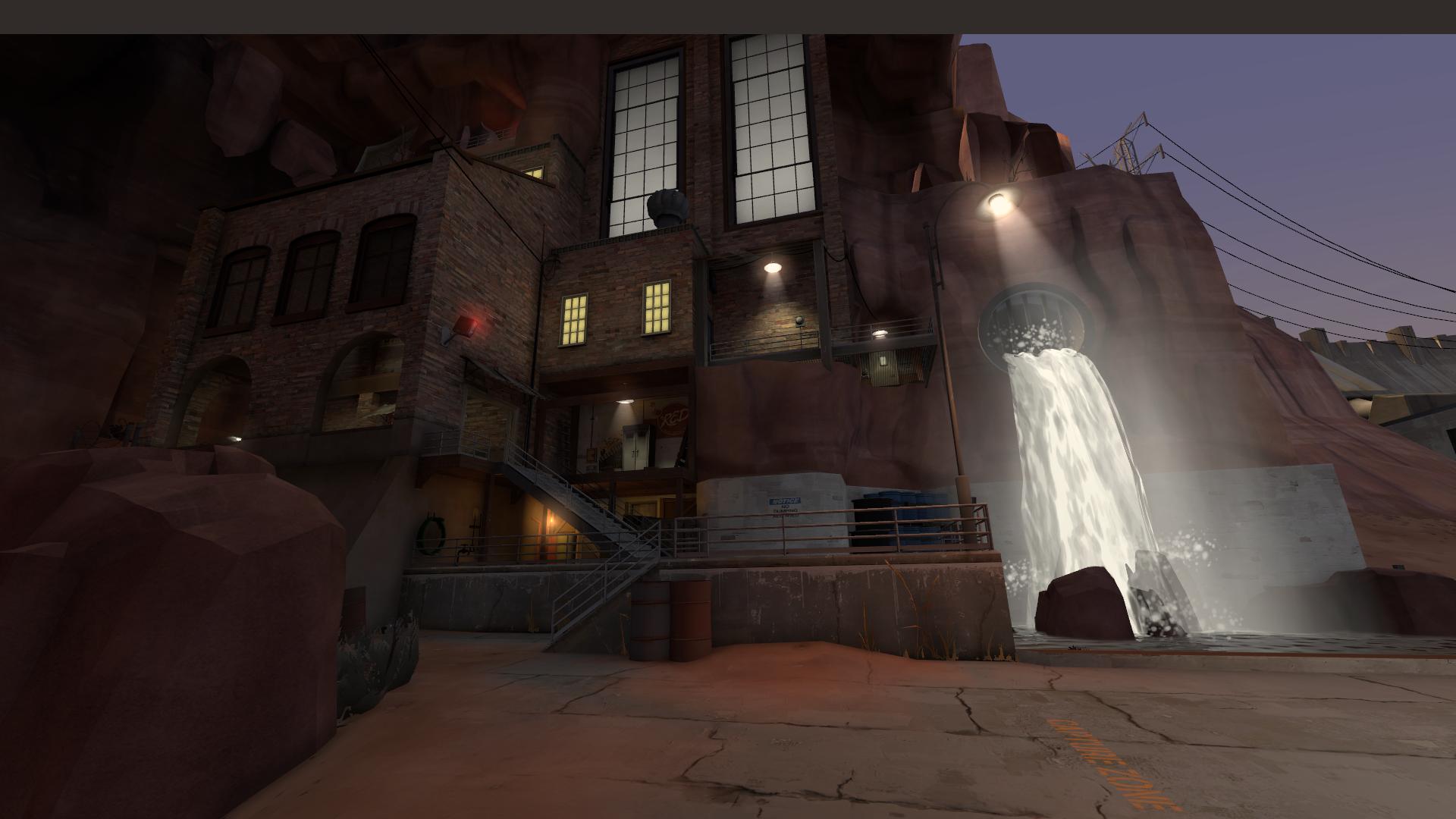
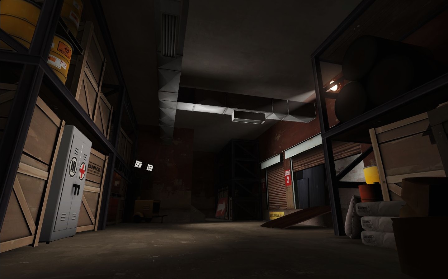
-Cool theme, very industrial/urban. Definitely felt like a place that people used at one point
-Good use of space and flow, no dead-ends was cool
-Lighting was hit and miss - sometimes done really well and created a good sense of drama, other times looked sorta bland or even incorrect (dark props in light areas)
-Good mix of old and new assets, liked the soho props
-Generally, lighter textures should be used for indoor areas. The spawn building looked weird, as that red concrete texture is usually reserved for outdoor walls rather than interior
-Cool 3D sky, would be even cooler with tall urban buildings like in soho or more, smaller ports sticking out into the ocean. Could've used stuff sticking out from the map-side of the waterway as well
-Outdoor areas could've used some more trash
-No cubemaps
Yacan:
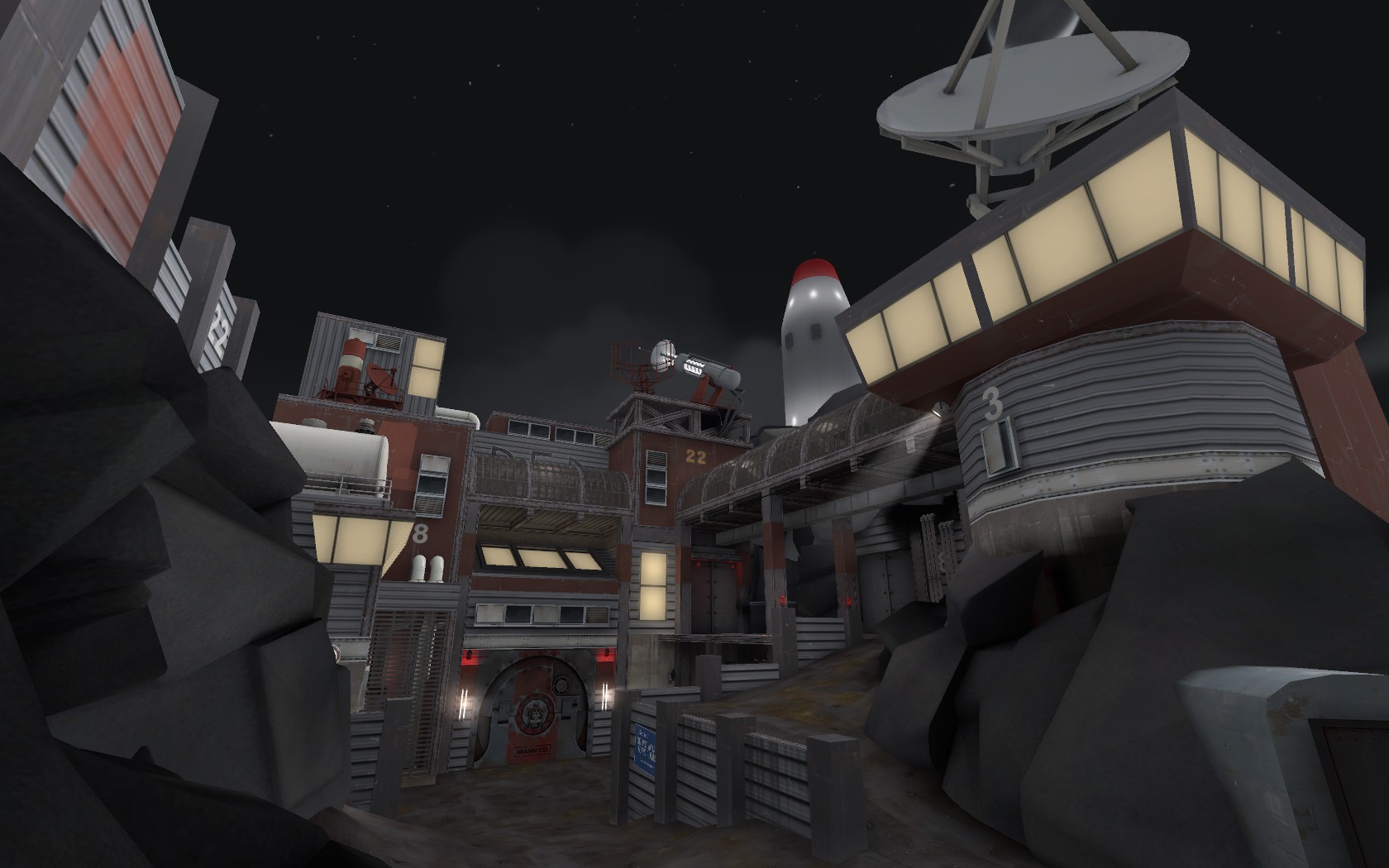
-The most wildly creative entry I think, just poor execution
-White light seemed to be coming up from the bottom of the map?
-An overlay on the metal wall was missing
-Bland lighting. Go for a dark environment light and use the spotlights to highlight the cool/important parts
-Those metal fences are REALLY thick, go for maybe 8/4hu thick instead
-Yellow windows could use some brushwork borders. Cutting off the yellow window texture looked bad on those diagonal walls because it was meant to be a continuous window, but it changes shades on the edge (
pic)
-Red lights would look better if they were brighter and/or had a glow sprite on them
-I would place this in the bottom three in terms of final product/execution, but this is seriously the #1 entry in terms of creativity/base idea. Keep it up!