PLR Yuno
- Thread starter Bakscratch
- Start date
You are using an out of date browser. It may not display this or other websites correctly.
You should upgrade or use an alternative browser.
You should upgrade or use an alternative browser.


B1: Here
Detailing
Stuff
https://dl.dropboxusercontent.com/u/12945353/maps/Yuno/b1/plr_yuno_b1.bsp.bz2
Detailing
Stuff
https://dl.dropboxusercontent.com/u/12945353/maps/Yuno/b1/plr_yuno_b1.bsp.bz2
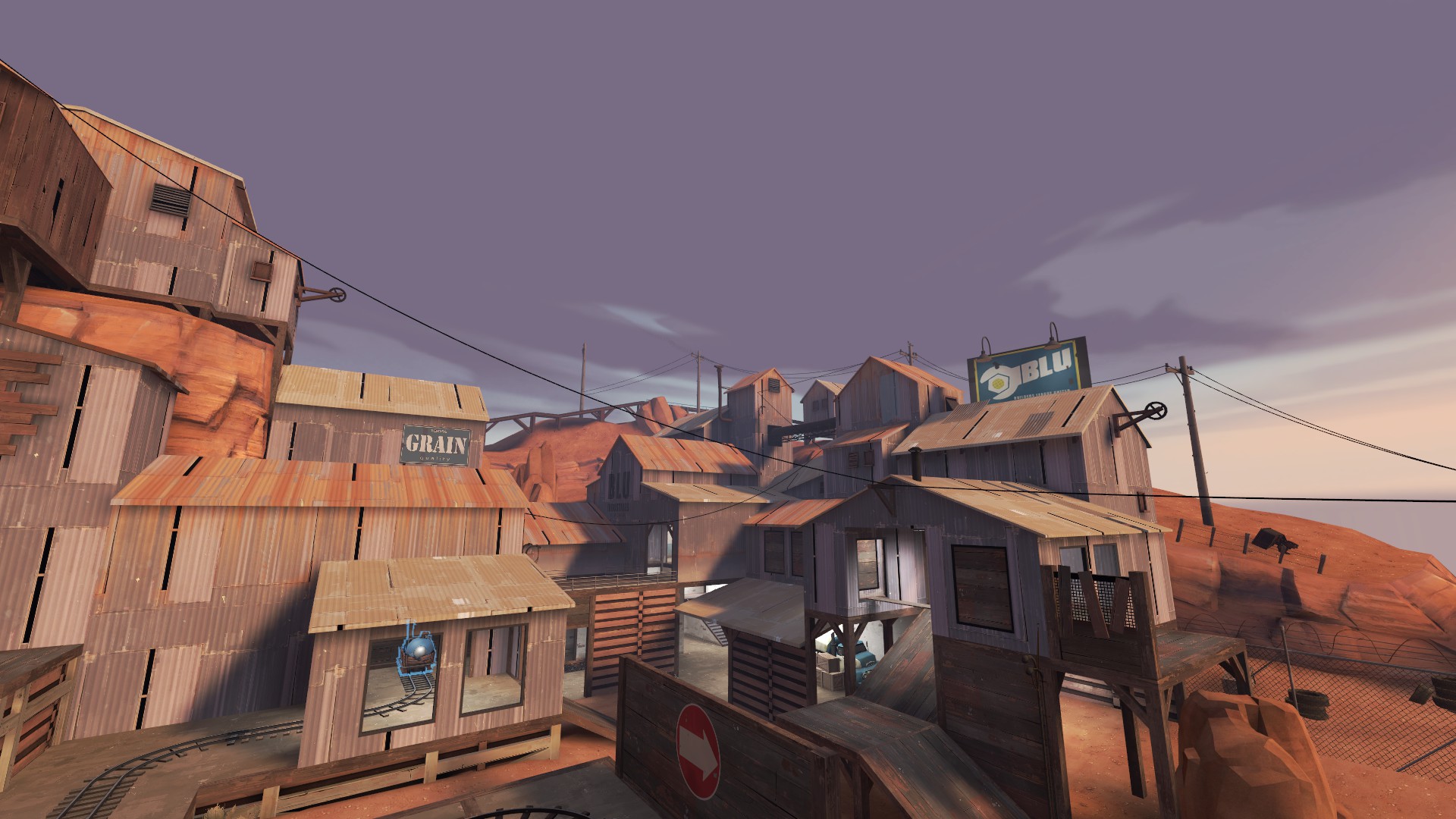
Here are a "few" things I want to say:
Spawnrooms:
Textures could be aligned better. You should also smooth (smoothinggroups) these round corners.
Try to use a bit of the darker metalbeams to give more contrast.
The Visualisers' texture needs to be bigger and centered.
BLU Side:
The Cave Underneath the room is a bit out of place.
Because of the side room, it feels more open than the RED Spawn.
Also, the projected picture is floating in mid air. This doesn't seem right at all...
RED Side:
It's weird that this side doesn't show as much rockwalls. RED is supposed to have more natural things than BLU.
The Rockets in the backroom are strangely placed. They are pointing directly towards the BLU Spawn. The Boardthing behind them is pointless imo.
Paylaud Track:
Carts are starting from nowhere. Did somebody carry these bloody things to the track?
The tracks at the cross section are z fighting. The piece of wood that is going through the concrete is pointless.
At the middle upper part there is a wood beam going only half way through the ground.
At the end the holograms are beeing summoned into existance by black magic.
Other:
The bottom area underneath the tracks is partially badly lit. The displacements also seem to be of low power. Or they are just too big, as they are going through every building.
The bridge in the middle is shaped in a weird way. There needs to be a reason for that. A single lamp on the bottom is devinately not enough. (I would have used a few light bulb models and connected them with cabels. Yes, you can use cabels for other things than telephone poles.)
The more important (walkable) roofs should have something that shows "YOU CAN STAND ON ME". Try making the walkable roofs brighter than the not walkable ones.
I saw you using roof drainage above another roof. Perhaps there are some better places for such detail?
Also, clipping. Lots and lots of clipping.
For the end I just want to point some things out using a few screenshots:
- Feb 15, 2011
- 333
- 344
Pros:
It's purdy.
It has really fast rounds, the perfect foil to Hightower.
Cons:
As a consequence of the fast rounds, trying to defend feels very sisyphean in nature.
You can't block the carts, which is probably a factor in why the rounds go so quick.
The middle area needs to be optimised more, though that might not be possible.
Worst name for worst waifu.
Last edited:
RubbishyUser
L7: Fancy Member
- Feb 17, 2013
- 414
- 488
Worst name for worst waifu.
This. Between Yuno, Keikoku, Suijin, and all the other Japanase named maps, I straight up lost track of what any map is actually about. Now I know it ain't your fault Bakscratch, but this map has gone through it's entire development and yet every time I see the imp announcements for it, I have to look it up on tf2maps to remember what it is.
EDIT: OK, I admit Shiro and Suijin are actually set in Japan so their off the hook. I just remembered Yunshu as well. hhmmphghghgl...
Last edited:

You use the name to figure out what the map is about....? So many names don't match the map. Surely it can't be that difficult to just remember the name.
Maps like Delivery, Delta, even in game we have maps like Process, Snakewater, Well, that don't really have anything to do with the actual map. By your logic Suijin and Shiro have far more to do with the actual map than half the maps we have around here.
Maps like Delivery, Delta, even in game we have maps like Process, Snakewater, Well, that don't really have anything to do with the actual map. By your logic Suijin and Shiro have far more to do with the actual map than half the maps we have around here.
Last edited:
You use the name to figure out what the map is about....? So many names don't match the map. Surely it can't be that difficult to just remember the name.
I either name my maps something that is relevant to the map its self, or something people will remember, Yuno you will remember this map

Greetings.
We tested rc1 today on our testing server at StSv and found that BLU cart couldn't be blocked by RED. It also didn't roll back down hills, and occasionally the func_tracktrain orientation went all screwy, on path angles/path_track points.
We tested rc1 today on our testing server at StSv and found that BLU cart couldn't be blocked by RED. It also didn't roll back down hills, and occasionally the func_tracktrain orientation went all screwy, on path angles/path_track points.