WiP in WiP, post your screenshots!
- Thread starter Arhurt
- Start date
You are using an out of date browser. It may not display this or other websites correctly.
You should upgrade or use an alternative browser.
You should upgrade or use an alternative browser.
Janeator
L2: Junior Member
- Dec 12, 2012
- 66
- 26
Is that grass actually a TF2 texture?Mapping, will you be my valentine?

Deodorant
L6: Sharp Member
- Oct 31, 2011
- 263
- 214
It's the grass part of Mountainlab's blendgroundtograss texture. It'll probably look better after some alpha painting.Is that grass actually a TF2 texture?
info_lighting only works on static props. The dev wiki says to use an info_target for dynamic props, but it doesn't say how. My guess is that if dynamic props still have a line to set an entity that defines the lighting origin, just replacing the info_lighting with an identically-named info_target should be the first thing to try.
XionGaTaosenai
L1: Registered
- Jun 23, 2012
- 27
- 18

WHAT HAVE I DONE
It would be amazing if you did that, but then had each tank have only 100 HP, so that they just go down nigh-instantly. And make it the final wave after a wave that was actually incredibly hard.
"Yeah we finally beat wave 2 that was so hard- wait, what? 80 Tanks! Oh wait, they have less HP than Scouts yes Tank slaughterhouse we are gods!
Thanks Steve! The info_target seemed to do the trick.info_lighting only works on static props. The dev wiki says to use an info_target for dynamic props, but it doesn't say how. My guess is that if dynamic props still have a line to set an entity that defines the lighting origin, just replacing the info_lighting with an identically-named info_target should be the first thing to try.
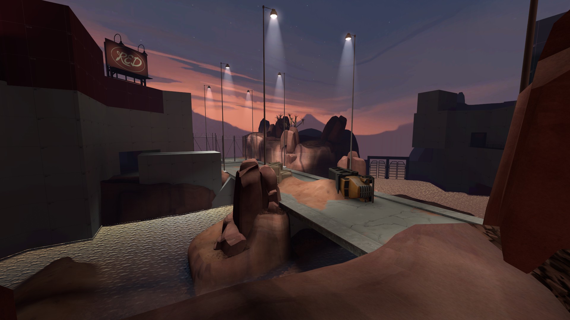
Might as well show what I've been doing.
Before:

After (still re-working the facade):


Arne
L3: Member
- Nov 22, 2012
- 114
- 55
is that the bridge from doublecross?
Yep. This map has a layout from doublecross, turbine and a own layout for the water level and sewers.
- Mar 20, 2012
- 391
- 806
It's looking nice, dicecube.
When you're taking inspiration from another map (which is totally fine and everyone does it), it's best to switch up the qualities to differentiate. For example, you should find an alternative to the truck -> displacement mound -> crate system in the middle of your bridge. By changing that, you'll increase the uniqueness of your map while still retaining your immediate influence.
You might also want to figure out ways to make the bottom bridge area more appealing to play in.
You've got some very nice displacement work, going. And the mood (skybox setting/lighting, ect.) is awesome.
- Mar 20, 2012
- 391
- 806
Arne
L3: Member
- Nov 22, 2012
- 114
- 55
Bingo Bango Bongo I don't want to leave the Congo.
-snip-
Looks a bit simple but... it's damn so beautiful! I say it's a good and beautiful use of the textures and models!
Edit: Lighting too!
Looks a bit simple but... it's damn so beautiful! I say it's a good and beautiful use of the textures and models!
Edit: Lighting too!
Especially the ivy.
- Mar 20, 2012
- 391
- 806
Looks a bit simple but... it's damn so beautiful! I say it's a good and beautiful use of the textures and models!
Edit: Lighting too!
Definitely agree. It requires another good one or two detail passes (especially the respawn room in the second shot - I mainly added that to show that the spawns overhang the cave/canal scene).
Especially the ivy.
I love those models. I've been using them in such weird yet effective ways. They really are awesome, man. Appreciate your work making them.


