Feedback Time
-the black tunnel here could use a better fade. It's very obvious that it's just a black brush without any transition between the black and the rest
-the block texture behind this window texture doesn't look right. It makes it look less like a window and more like something someone painted on
-could up the cubemap scale for these windows
-These shutter doors don't work well for an elevator. Something more like flat metal tends to work better.
-light bleed under this awning
-pop in for the payload bumper is pretty obvious here
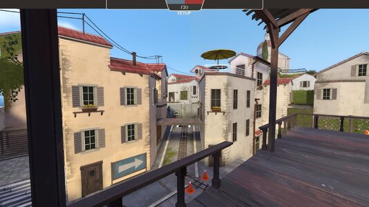
-arrow looks scrunched
-the shutter door texture doors right next to the prop shudder doors is very jarring. The shudder props also tend to only look good outside (in my opinion)
-kinda weird to have toxic waste barrels out in the middle of the townscape and far away from all the other toxic waste barrels at the final point
-Lighting on the doorframe here doesn't match the rest of the inside room
-leaf peaking through wall here
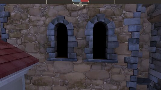
-these windows could use some better transition from normal textures to pure black. With how close they are to play space, it's very noticable that they are just flat black instead of feeling like a window.
-Wouldn't it make more sense for posters to be italian since the map is set in italy?
-bit dark here
-this table looks so lonely
-redering bug seen through these windows
-top texture is very streached and not good
-rope render bug
-far off vines pop in obviously
-set these to vertex lighting to fix the odd shadowing on the barrels
-could probably close these windows to save on rendering power, especially since they don't match the full black windows on the other side.
-z fighting on the ceilng here
-stair prop sticking through the ceiling here
-could use either a blend or a decal under the dirt patch to help the transition between it and the stone
-spawnroom's kinda empty, also grass is growing between the stones inside somehow
-could use a better transition to black. Either push the black brush back or increase the gradiant
-rendering bug here
-grass inside this prop
-doesn't make a ton of sense to have a painting of an american desert in italy. Not a terrible choice but something else could be a better fit
-background tower disapears here
-the shine to dark on the side of these trucks for it's lods are distracting
-lighting bugs. Maybe try smoothgroups?
-Burgomister is a germanic term and doesn't fit Italy
-this random root is weird
-putting all this stuff up here in the skybox could go a long way to fixing rendering bugs
-would be neat if the boats slowly moved, like the clouds from 2fort
-
-I can stand here
That's all for now. Great work as always. Map is very pretty and fun.


