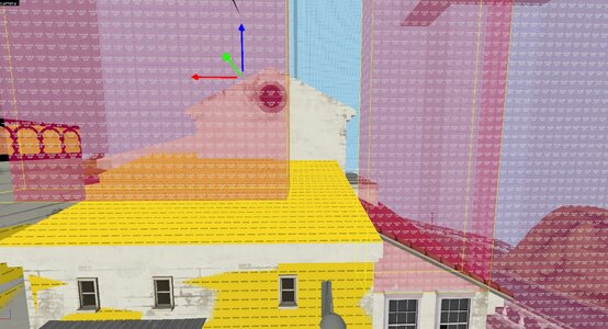
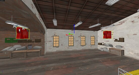
What I like about this map:
- The Theming is really good and well executed. I like how much detail is in the map.
What I did not like about this map:
- "This feels like Gold Rush if it had free reign over visual design."
- Everything felt incredibly cramped
- The routing for the map is horrendous, there are multiple death hallways where a Pyro, Soldier, or Heavy can kill me even if I am expecting someone to show up there simply because I cannot dodge their bullets.
- The forward spawns are incredibly aggressive and make trying to hold an area after you have 'lost' the point super frustrating. Please move these back into the map.
- "It feels like the map is deliberately trying to bastardize sniper, any sightline is either incredibly long or nonexistent."
- Uber is required for every point to be capped reliably.
- Several of the prop cars in the map block people being able to move around and it feel genuinely awful.
- "Why can you jump off the spawn?" in BLU's first point.
- 1st is very easy to hold, which should not be the case in a payload map with
Five Points.
- All the doorways in the map are super tiny in terms of height, especially combined with stairways (See the first point for examples)
- The removal of the unique skyboxes (sky_tuscany_01 and sky_tuscany_02) really do not do the map any favours in terms of visuals, sky_tf2_04 makes the map look a lot worse.
- The character models on default settings blend into the map thanks to how cartoony the map looks without specialized lighting (see the previous point)
- There are multiple hedges on the map that I felt were unnecessary.
- Split spawns at last make it so you cannot hold as a defender.
- Last also has strange clipping for the wooden veranda next to the pit, making it so players could walk on it would be a lot more fun.
- 2nd rolled very hard when we playtested it on Shounic's server.
- "I like how much detail there is in the map." however there is too much detail in the map. You are making a Payload map, not a Detail contest entry.
- There is a LOT of dead space at last. Many areas do not lead to places advantageous for either team.
- The map is incredibly chokey in general. There's chokes in 1st, 2nd, 3rd, 4th, and especially last. It feels awful to play as on Offense. 3rd is probably the point that needs the most revisiting, as there are many options for offenders to get there but RED can still hold very well.
- There's a lot of sharp corners which kinda just suck.
There's probably a lot more I could say here about the map but I think this is enough feedback for now. I'd like to say I want to see this map succeed, as I think it could be AMAZING given the right amount of care. Just please open this map up a bit, the map may be in a city but cities are designed to have drivable streets


