Tidal

CP Tidal rc

heyo

L2: Junior Member
May 14, 2008
71
59
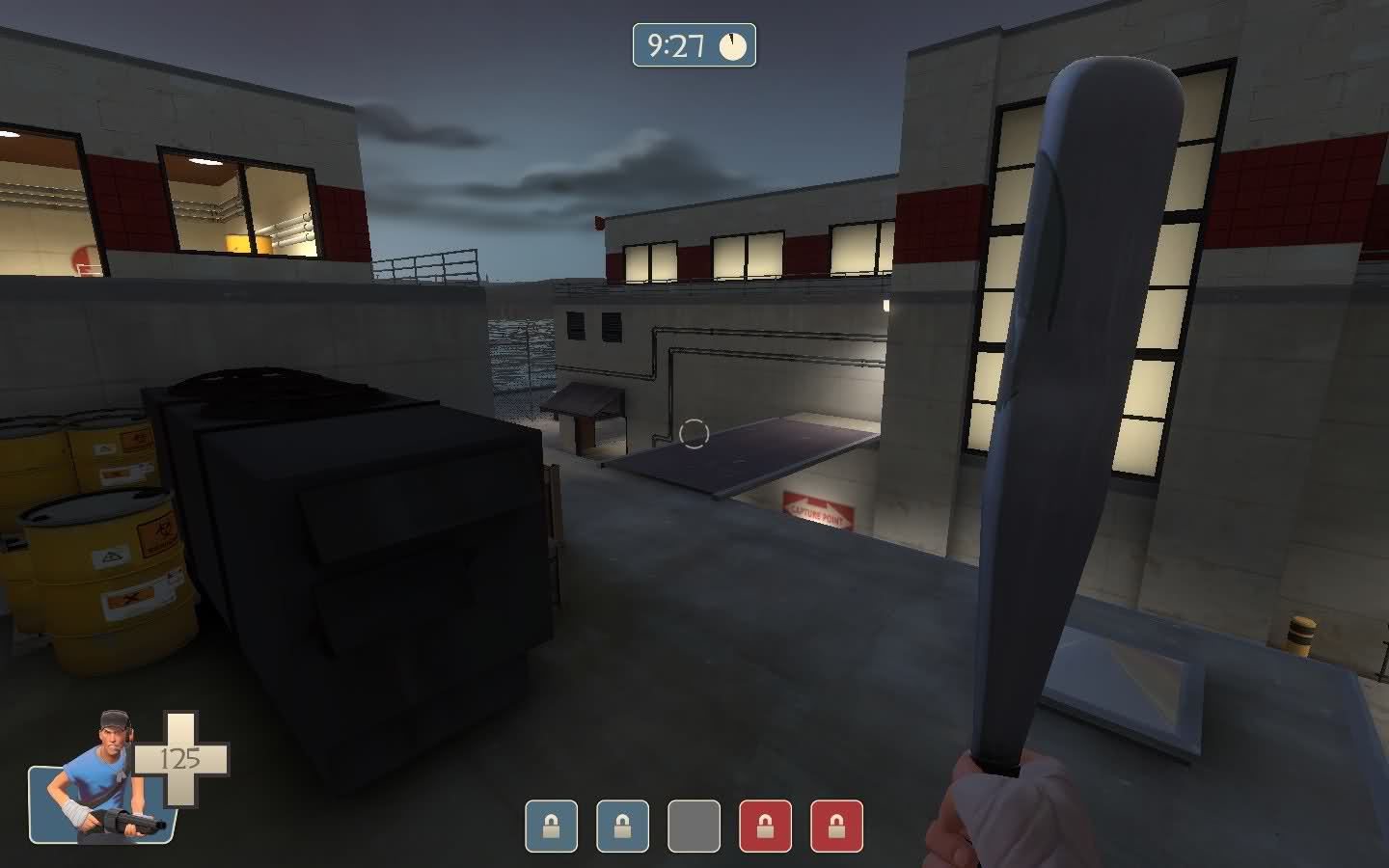
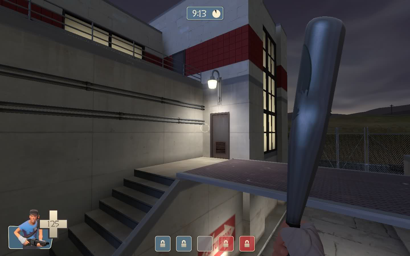
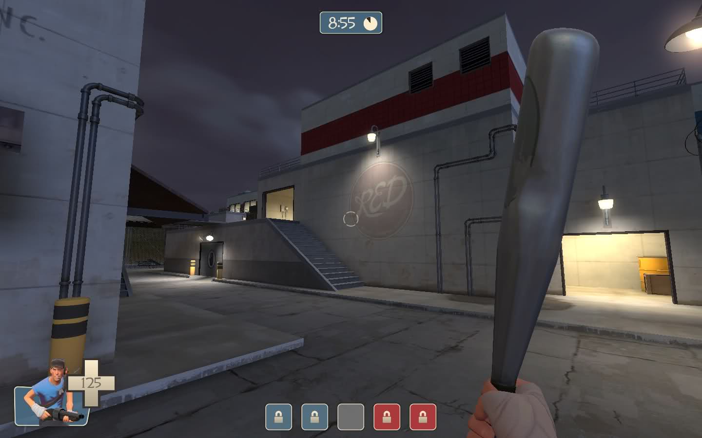
Cp_Tidal is set in a facility on the bayside. It's set at night time and I tried to create a cool view of a suspension bridge across the bay. I chose to keep each side similar in architecture so the whole map would fit together and feel like one cohesive modern facility.

It's a 5 cp linear push map with battles across rooftops and in alleys. There's a lot of ledges to look down and defend/attack from.

I've been working on it off and on since January 2010. For this map I spent a lot longer balancing gameplay and trying to make the areas fun than my I did for previous works. This time I let the maps design evolve more out of the playtests rather than just my head, so I think it plays a lot better than my older maps. It's balanced for 24 players.


--CREDITS--

Map by Sean "heyo" Cutino.

Contact: heyo2490@yahoo.com


--SPECIAL THANKS--

Knifeback Mountain community - playtested the map in early development.

The CouchAthletics community - playtested the map in later development.

TypeZERO - admin of CouchAthletics who helped me a lot with setting up the playtests and gave good feedback.

My friend Justin - ran a server for me to playtest on.

Everyone else who playtested and gave me feedback.
 
Last edited:

Void

Local Man Unable To Map, Sources Say
aa
Sep 14, 2008
1,874
2,985
It looks very bland in a few areas besides the questionably acceptable Golden Gate.
 

PMAvers

L6: Sharp Member
Jan 29, 2008
389
142
Oh, hey, awesome.

Will have to toss it up on my server and see what happens.
 
Aug 10, 2009
1,240
399
Void I think the blandness is part of the whole theme (like pipeline).

I like it a lot, it strikes me as very atmospheric and the windows look to make for cool cover, additional props for the bridge (GG or not)
 

Fireman

L4: Comfortable Member
Mar 21, 2008
150
59
Really like the look of this, I'll be on the lookout for servers running it.
 
Mar 23, 2010
1,874
1,699
layout looks kind of meh, but i'll reserve judgment when i play on it (doesn't really look like a 5CP layout imo).

the detailing is really great (<3 the bridge), but i can't help but think you overused the glass roof sticking up out of the ground or whatever you want to call it.
 
Last edited:

BitOPtimus

L1: Registered
Jul 22, 2010
6
0
>finished map

why aren't the CP's named? i just played it and I capped "cap_blue_cp2"

other then that it looks aight
 

heyo

L2: Junior Member
May 14, 2008
71
59
Just updated to version 2 of the map. Tried to make a bit less samey looking in the details.
 

tyler

aa
Sep 11, 2013
5,100
4,621
Have to say I really enjoy this map. One of favorite push maps. Glad to see it's gotten some visual updates, that's gonna help sell it a lot.
 

Moose

L6: Sharp Member
Nov 4, 2009
312
616
Are all of your lights just plain white? I love the detailing you've done, but to me everything looks boring. I think just making the lighting in some areas feel warmer/colder will go a long way in helping that.

Actually, It's probably just that almost everything is white in general.
 
Last edited:

Citizen Snips

L3: Member
Apr 8, 2010
118
16
The only problem I have with the map is that there are bridges extending from the third point that lead to dead ends, which are incredibly misleading. Either put doorways there for people to pass through, or delete the bridges altogether; otherwise there's no point to them.
 

heyo

L2: Junior Member
May 14, 2008
71
59
Just updated the map to Version 3. I think I pretty much fixed the blandness and lack of variation it had before. Check the first post for new screens.
 

Rexy

The Kwisatz Haderach
aa
Dec 22, 2008
1,798
2,533
The metal variation in textures really brings out the differences. I look forward to playing this.
 

Citizen Snips

L3: Member
Apr 8, 2010
118
16
While you certainly made it look prettier, you still haven't fixed the design flaw I pointed out. Though the way I described it was a little hard to make out, so I'll show you what I mean.

14t6kb9.jpg


After capping the middle point, most people will want to keep the high ground, instead of going down through those passageways and becoming susceptible to fire from above. So, when spotting this bridge beyond the middle point, people will naturally decide to cross it.

25s4fo6.jpg


However, it leads to a dead end, which not only makes this bridge pointless, but also frustrates the player for taking a path that leads to nothing.

11mam2c.jpg


While you could make the argument that the bridge is for people who are coming from the ends towards the center point, that is also flawed. People running in the open area to the right will instinctively decide to go through the yellow gateway, while people running under the building's cover will spot the staircase hugging the wall from a distance, and will want to climb it.

My point is, as it stands, this bridge is entirely meaningless. Either add a passageway that leads into the next building, or delete it, because as of now, it serves only to confuse and frustrate players.
 

Rexy

The Kwisatz Haderach
aa
Dec 22, 2008
1,798
2,533
I have no problem honestly with that bridge/stairway thing. Might be just me though.