

I probably consider Anthem my best map, both in terms of gameplay and development. The fighting is solid, the layout is very intuitive, and people see to have fun. Not only that, but I made it in about two months! Because some people have said they would be interested, what follows is the arc of Anthem's development as best as I can present it. Hopefully others find it useful and can take something away from it.
It's probably useful to also read the development thread along with this.
I. IDEAS AND THINGS
Before the contest started, I was toying with semi-original point designs. The idea of the spire as a point had begun to seriously intrigue me. Though "spire" refers to the 2nd point of Badlands normally, myself and others had taken it to mean any point that spirals upward for any distance. Prestige used the idea regularly in his CSF (Capture Some Flags) maps. ForbiddenDonut used a loose version of a spire in his cp_soot alphas. The points tended to play well, even if the maps didn't. When the contest was announced, I had already begun playing with the concept in what I considered to be Gravel Pit type map. I had planned to make every point a spire (for some reason).
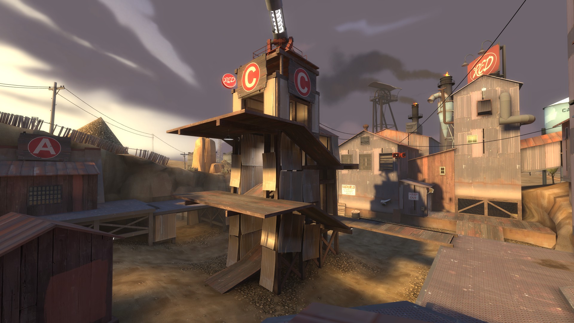
Gravel Pit's C, the basic inspiration for Anthem
But when the contest hit, I knew I didn't want to make this map. For one thing, Valve won't buy any new GPit style maps, and while I don't set out to get my stuff bought by Valve, I also don't want to spend time doing something they've decided most people dislike. They've got the complete stats, after all. So I spent a few hours thinking about existing KOTH maps and TF2 gameplay in general. What I realized was many maps were just literally hills; other than Nucleus and Badlands, every KOTH map in the game is just a hill or some flat ground with a house around it.
Lakeside is a great map... but it's a hill
The other thing I knew at the time was that the map couldn't bottleneck. As the reluctant author of Pro Viaduct, I'd dealt enough with the competitive mindset to understand to a degree what works and what doesn't in that setting. Unfortunately, Pro Viaduct was built for 6s, not Highlander. But I still took careful note of the singular request made of me when I volunteered: a side route. In 6s, a single Heavy could dominate the point, and that's the kind of thing I wanted to avoid with Anthem.
Pro Viaduct is still a hill, but a route is added beside the point, as seen in this image
It's around this time I really got to thinking about what kind of point I wanted to make. I knew it was going to be a spire, because spires were completely absent from KOTH and they had a proved track record of being lots of fun. Not only was no official map on a spire, no community created one was, either. I started thinking about the main spires I had played on and what I liked and disliked about them all:
II. THE FIRST ALPHA
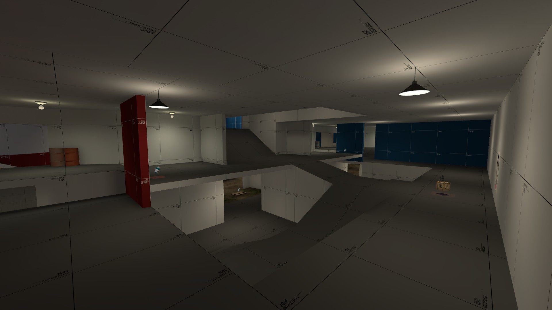
The first version of the spire, as seen in anthem.vmf
I got to work and soon had created the spire. It's changed very little since I made this, but it has changed. The basic idea was to keep with the GPit C design, but leave it open, sort of like the Badlands spire. At the same time, keep the line of symmetry parallel between the teams so the spire feels more interesting. I felt a double helix shape would be too visually confusing or plain boring, and would be hard to scale vertically in a way that retained space for movement without being too massive.
The main problem with spires, I quickly realized, was height. Should be obvious, right? It was and it wasn't. I plopped this into a fresh VMF, put some lightly displaced ground under it, and knew it was wrong. It was the height! I couldn't expect players to climb it from ground level all the time, and if I did expect them to do that, jump classes would still be taking a lot of damage climbing it. Beyond that, sticking this structure in an open, flat area would be totally and completely boring. Therefore, the second thing I added was a U shaped walkway that curved halfway around the spire and ended in a tower. This made the playing field a bit more even.
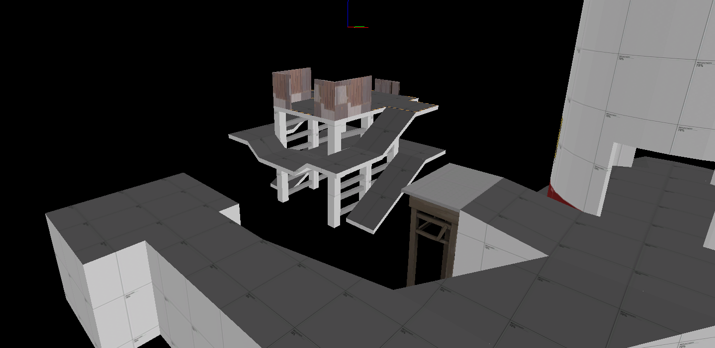
At this point I had a very basic layout
I should probably mention that when I make a new map, I have a major idea or handful of props I want to use. In this case, I had wanted to use the loading tower from Lumberyard. I find that when I give myself these mini-goals, I tend to work a bit faster. I also wanted the theme to be something like MangyCarface's CTF Estate, which was some kind of faux-medieval feudal farmland mansion thing. To these ends, I based the mid level height on that prop and also made chose to make the rounded tower, rather than something square like you might see in other maps. In this way the middle of the map began to take shape.
I began to imagine the future them as a castle-turned-distillery, as some modern scotch distilleries are
The map then crept back toward the spawn rooms. I wanted to create many routes to the point, but less to the spawn area, in an attempt to discourage spawn camping. I did not, however, want to simply use dropdowns. It's my feeling that dropdowns don't play well and generally just annoy players. The difficulty in making them seem useful but fair feels too high. My solution to this was to make a short lower area before the tower and adjoining building with a couple bridges and a ramp upward.
The idea was to force spies or spawn campers trying to creep by the home team to use the same route upward
I also constructed some basic sightline blockers and obstacles at the same time. I added some basic details and depth to the level bounds, and the first alpha was done.
The first overview of the first version
III. TESTING AND FUTURE BUILDS
From the very first test, I knew I was onto something. But that isn't to say there were no problems! For one thing, the area behind the point that I had built kinda sucked and was boring. That's not to mention I had basically copied it from a previous map I abandoned, Diner. Beyond that, even though I had taken steps to make getting onto the point very easy for all classes, I still felt (as did others) that it could, at times, be a challenge. To remedy both of these issues I rebuilt the side area and tacked on a bridge. I had thought of doing it for the first alpha, but I think sometimes it's better to make mistakes on purpose to know that you're right in doing something, especially if it's an early build and somewhat minor, as I feel this was.
Expanded and improved side building
The new bridge, right onto the point
I tested this version a couple times more than I usually do. As with all KOTH maps, mini sentries proved to be a huge annoyance. I also found that while the new side building was a huge improvement, I had also made it a bit confusing to play in and kind of irritating to fight in. Players were coming here because it was easy and safe to access the point, but it wasn't fun to have to fight people in here. I resolved to change these things for the next version.
I released an A3, but little was different. The side building was smoothed out to remove the slight height disparities and needless twists. It got a couple initial complaints, but played much better. Most importantly, I was happy with it. I also added some slight cover to the sides of the top level of the spire to combat mini sentry range, and to compensate, removed a tiny bit of the existing cover. Satisfied, I started to detail.
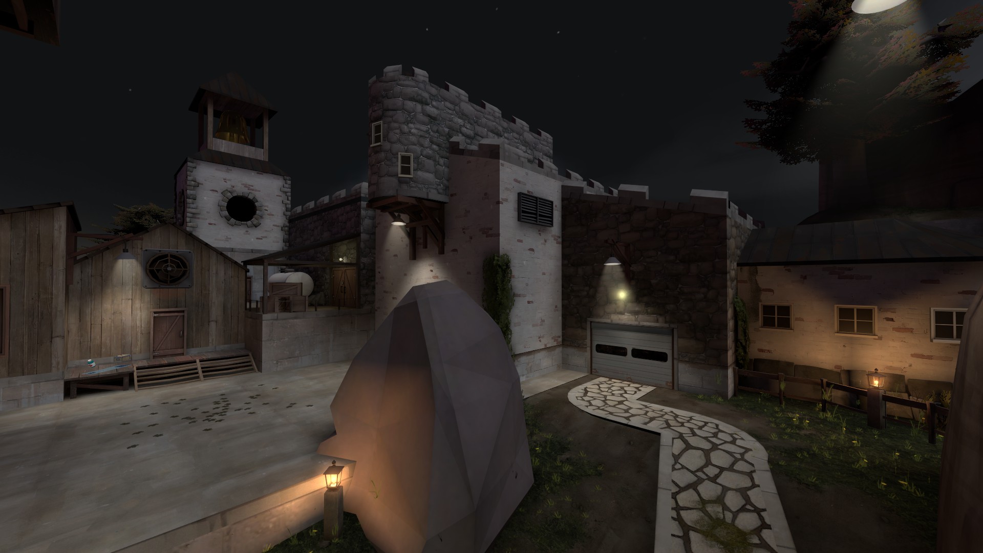
Source Filmmaker had just been released, and I started detailing Anthem as though it was a movie set
IV. DETAILING AND FINISHING TOUCHES
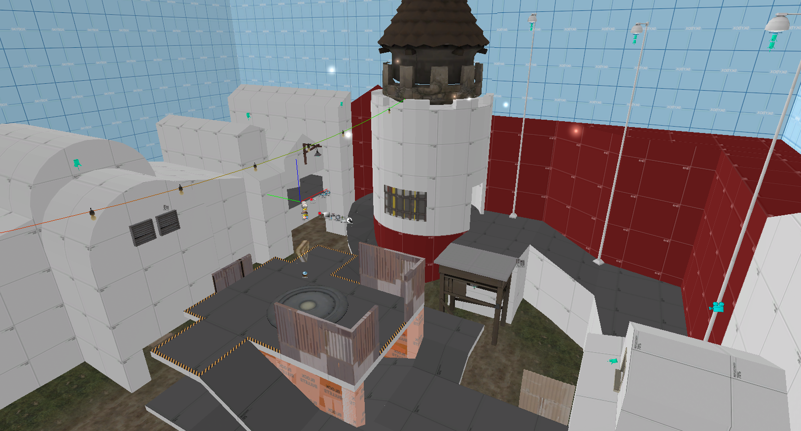
At this point I felt very satisfied with the map in general. Many of the hypotheses I started with had proved true, which meant my projected development cycle was rapidly shrinking. There were minor tweaks to make, but I wasn't too worried. I had successfully made a KOTH map that brought a familiar gameplay element (the spire) to a new mode (KOTH). Players really enjoyed it, and even though people occasionally worried about soldiers dominating or spies having a hard time, in reality what I found was good players had no issues and mediocre players still had fun. In that sense, I succeeded, and therefore I was very proud of myself. I started detailing the map and with advice from MangyCarface nailed the theme down to something similar to Estate but a little more rural. I also dropped the distillery idea altogether, due to it being hard to implement in a way I was satisfied with and felt made sense with the shape of the map.
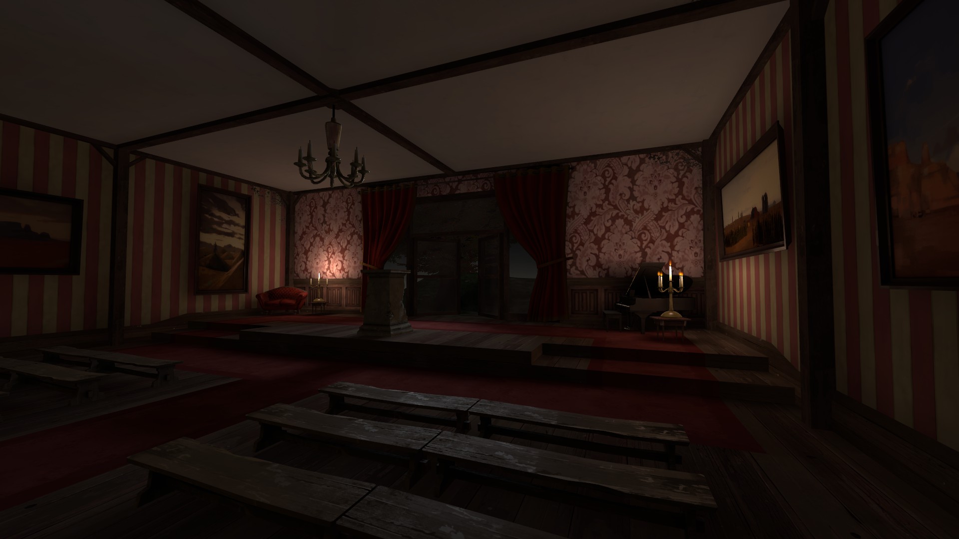
The BLU spawn room from A5
I released the detailed version, A5, and played it a few more times, this time in pubs as well as Highlander matches. I decided, at last, to incorporate some feedback from ScorpioUprising and move some pickups around to better support the teams that needed them. I began the tedious process of lightmap optimization, a bit of additional detail, and the creation of a 3D skybox. The main idea I kept coming back to when detailing was that players should feel like they know the environment they are in without being able to explicitly place it as being from any other map.
I also adjusted the custom soundscapes I had built for A5. I did my best to mix medieval and farm props with woodland and manor settings, creating an interesting and eclectic theme which I hope feels familiar but new. I then took a whack at optimization, but eventually submitted a build with less than ideal frame rates. Then I submitted it to the contest upload thread. Anthem was, for my purposes, done.
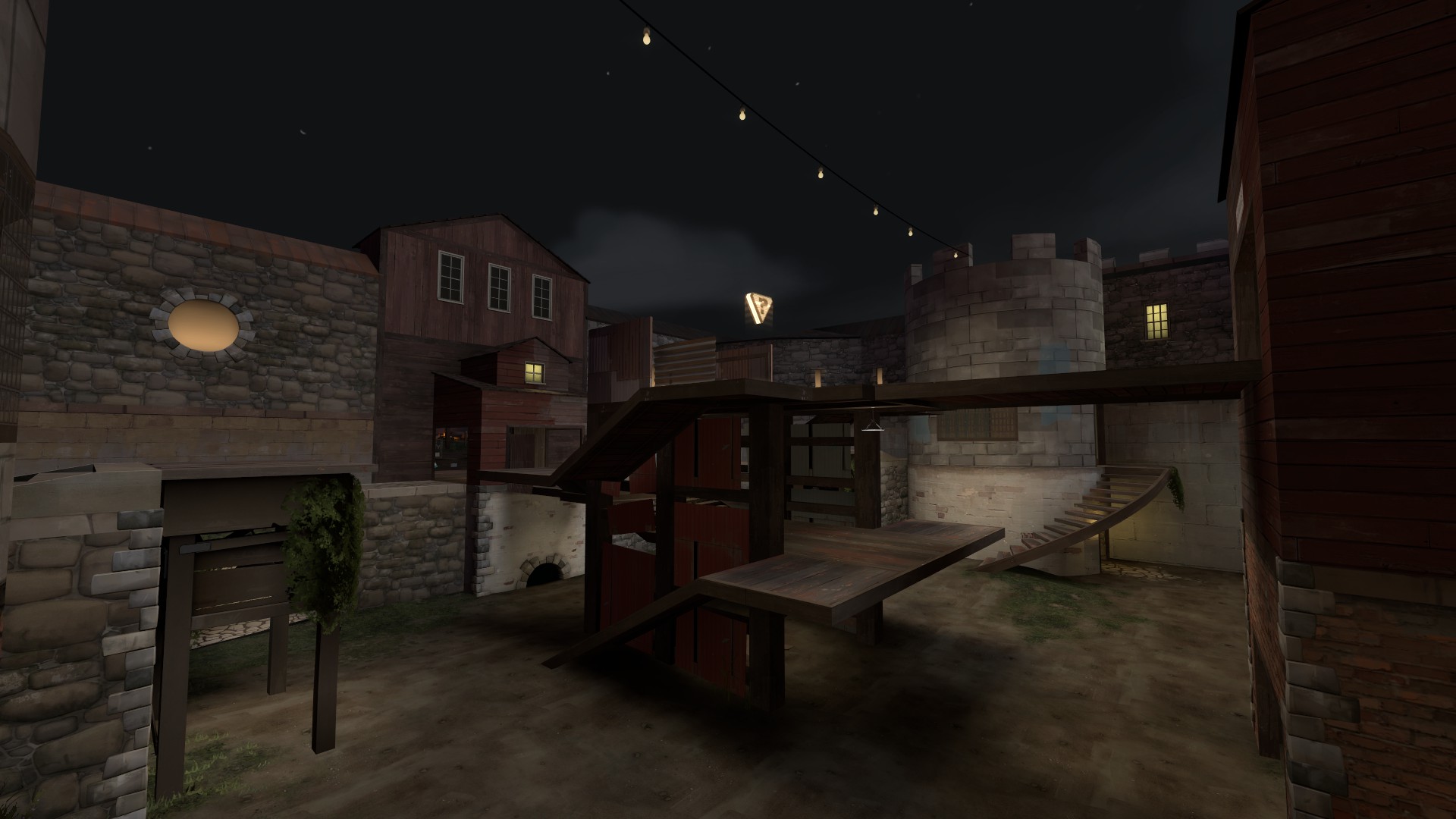
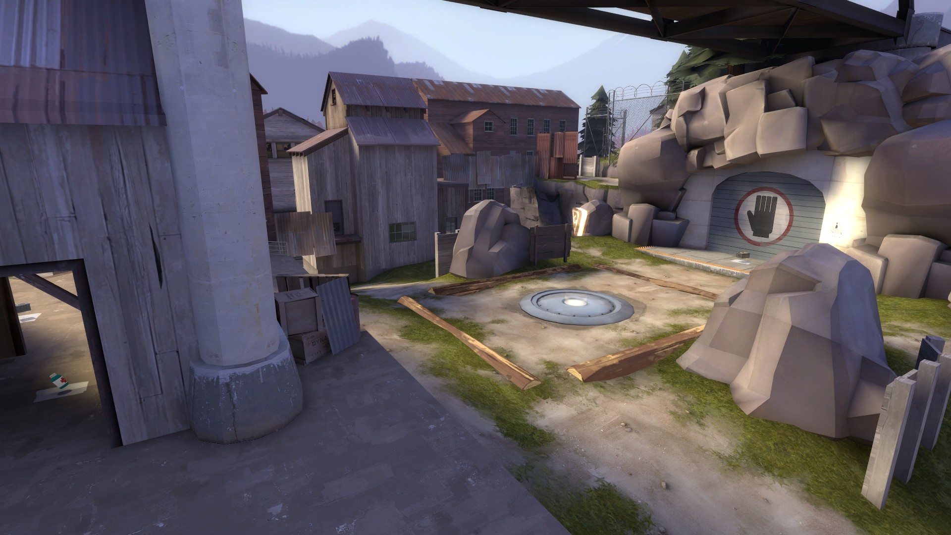
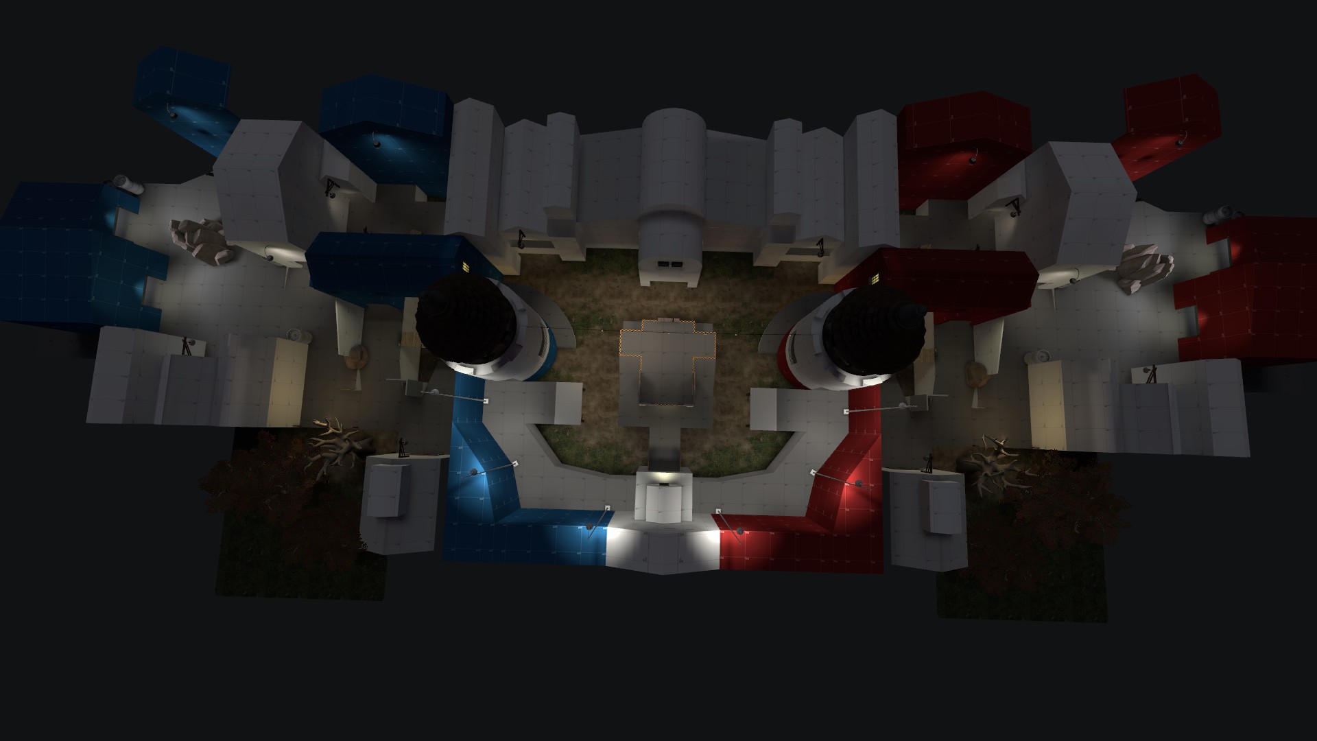
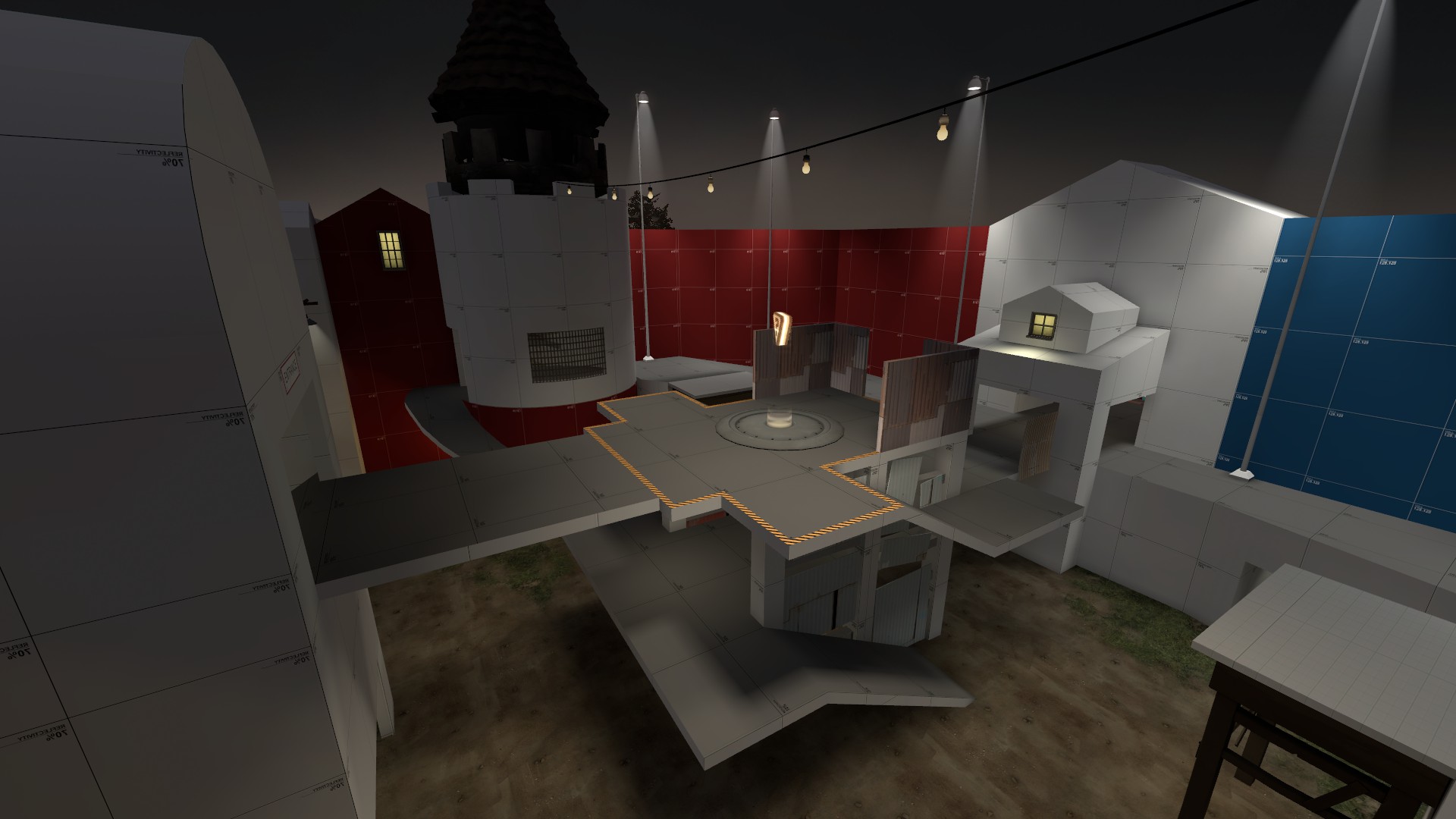
The current version of the middle area and point
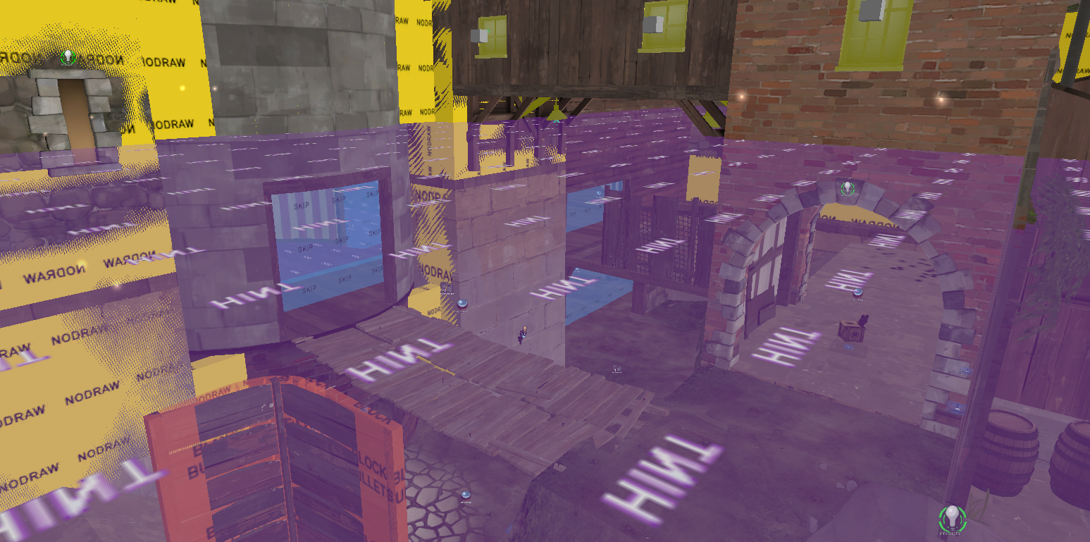
I have since been working on optimization. For this, the hardest thing personally is deciding what level geometry to subtly alter to better visleaf structure, whether with or without hints. In many cases I know that a player won't notice and it won't affect gameplay, but I still find it hard to change something, even slightly, at this point. I've got something that works, and even changing something inconsequential can be hard.
The fence to the right is raised just a hair to make a basic T-shape with the nodraw inside the tower
No map is every truly complete, and I expect that even after I lay it down and call it finished, issues will arise, whether that be with optimization or gameplay or anything else.
Hopefully this short article has provided some insight into how a map is conceived and built, and then evolves through testing and detailing. I will answer any questions posted in this thread about my process, whether about this map or any other I have made. I know some of this is very brief, but I wanted to err on the short side of a lengthy write up.
It's probably useful to also read the development thread along with this.
I. IDEAS AND THINGS
Before the contest started, I was toying with semi-original point designs. The idea of the spire as a point had begun to seriously intrigue me. Though "spire" refers to the 2nd point of Badlands normally, myself and others had taken it to mean any point that spirals upward for any distance. Prestige used the idea regularly in his CSF (Capture Some Flags) maps. ForbiddenDonut used a loose version of a spire in his cp_soot alphas. The points tended to play well, even if the maps didn't. When the contest was announced, I had already begun playing with the concept in what I considered to be Gravel Pit type map. I had planned to make every point a spire (for some reason).
Gravel Pit's C, the basic inspiration for Anthem
But when the contest hit, I knew I didn't want to make this map. For one thing, Valve won't buy any new GPit style maps, and while I don't set out to get my stuff bought by Valve, I also don't want to spend time doing something they've decided most people dislike. They've got the complete stats, after all. So I spent a few hours thinking about existing KOTH maps and TF2 gameplay in general. What I realized was many maps were just literally hills; other than Nucleus and Badlands, every KOTH map in the game is just a hill or some flat ground with a house around it.
Lakeside is a great map... but it's a hill
The other thing I knew at the time was that the map couldn't bottleneck. As the reluctant author of Pro Viaduct, I'd dealt enough with the competitive mindset to understand to a degree what works and what doesn't in that setting. Unfortunately, Pro Viaduct was built for 6s, not Highlander. But I still took careful note of the singular request made of me when I volunteered: a side route. In 6s, a single Heavy could dominate the point, and that's the kind of thing I wanted to avoid with Anthem.
Pro Viaduct is still a hill, but a route is added beside the point, as seen in this image
It's around this time I really got to thinking about what kind of point I wanted to make. I knew it was going to be a spire, because spires were completely absent from KOTH and they had a proved track record of being lots of fun. Not only was no official map on a spire, no community created one was, either. I started thinking about the main spires I had played on and what I liked and disliked about them all:
- The Badlands spire is fantastic. You can jump to it if you're good and it provides a great vantage. Unfortunately it's also very vulnerable to ranged classes and spam from Demomen. It's also easier for the home team to jump to it.
- The GPit spire is hard to climb except for jump classes, but they take a lot of damage doing so. It's relatively shielded from fire, so if you are up there and clear it, you've probably won. On the other hand, it probably hurt a lot getting there, so it won't take much to get you down, either.
- Thunder Mountain's third stage basically revolves around a spire. It's symmetrical, which is strange because the map itself isn't (GPit is also symmetrical, but the line of symmetry isn't parallel to the teams). The top is open but hard to attack.
- Hightower sort of has a spire in the middle of the map, which felt too large to work into any other map though I think it works well there.
II. THE FIRST ALPHA
The first version of the spire, as seen in anthem.vmf
I got to work and soon had created the spire. It's changed very little since I made this, but it has changed. The basic idea was to keep with the GPit C design, but leave it open, sort of like the Badlands spire. At the same time, keep the line of symmetry parallel between the teams so the spire feels more interesting. I felt a double helix shape would be too visually confusing or plain boring, and would be hard to scale vertically in a way that retained space for movement without being too massive.
The main problem with spires, I quickly realized, was height. Should be obvious, right? It was and it wasn't. I plopped this into a fresh VMF, put some lightly displaced ground under it, and knew it was wrong. It was the height! I couldn't expect players to climb it from ground level all the time, and if I did expect them to do that, jump classes would still be taking a lot of damage climbing it. Beyond that, sticking this structure in an open, flat area would be totally and completely boring. Therefore, the second thing I added was a U shaped walkway that curved halfway around the spire and ended in a tower. This made the playing field a bit more even.
At this point I had a very basic layout
I should probably mention that when I make a new map, I have a major idea or handful of props I want to use. In this case, I had wanted to use the loading tower from Lumberyard. I find that when I give myself these mini-goals, I tend to work a bit faster. I also wanted the theme to be something like MangyCarface's CTF Estate, which was some kind of faux-medieval feudal farmland mansion thing. To these ends, I based the mid level height on that prop and also made chose to make the rounded tower, rather than something square like you might see in other maps. In this way the middle of the map began to take shape.
I began to imagine the future them as a castle-turned-distillery, as some modern scotch distilleries are
The map then crept back toward the spawn rooms. I wanted to create many routes to the point, but less to the spawn area, in an attempt to discourage spawn camping. I did not, however, want to simply use dropdowns. It's my feeling that dropdowns don't play well and generally just annoy players. The difficulty in making them seem useful but fair feels too high. My solution to this was to make a short lower area before the tower and adjoining building with a couple bridges and a ramp upward.
The idea was to force spies or spawn campers trying to creep by the home team to use the same route upward
I also constructed some basic sightline blockers and obstacles at the same time. I added some basic details and depth to the level bounds, and the first alpha was done.
The first overview of the first version
III. TESTING AND FUTURE BUILDS
From the very first test, I knew I was onto something. But that isn't to say there were no problems! For one thing, the area behind the point that I had built kinda sucked and was boring. That's not to mention I had basically copied it from a previous map I abandoned, Diner. Beyond that, even though I had taken steps to make getting onto the point very easy for all classes, I still felt (as did others) that it could, at times, be a challenge. To remedy both of these issues I rebuilt the side area and tacked on a bridge. I had thought of doing it for the first alpha, but I think sometimes it's better to make mistakes on purpose to know that you're right in doing something, especially if it's an early build and somewhat minor, as I feel this was.
Expanded and improved side building
The new bridge, right onto the point
I tested this version a couple times more than I usually do. As with all KOTH maps, mini sentries proved to be a huge annoyance. I also found that while the new side building was a huge improvement, I had also made it a bit confusing to play in and kind of irritating to fight in. Players were coming here because it was easy and safe to access the point, but it wasn't fun to have to fight people in here. I resolved to change these things for the next version.
I released an A3, but little was different. The side building was smoothed out to remove the slight height disparities and needless twists. It got a couple initial complaints, but played much better. Most importantly, I was happy with it. I also added some slight cover to the sides of the top level of the spire to combat mini sentry range, and to compensate, removed a tiny bit of the existing cover. Satisfied, I started to detail.
Source Filmmaker had just been released, and I started detailing Anthem as though it was a movie set
IV. DETAILING AND FINISHING TOUCHES
At this point I felt very satisfied with the map in general. Many of the hypotheses I started with had proved true, which meant my projected development cycle was rapidly shrinking. There were minor tweaks to make, but I wasn't too worried. I had successfully made a KOTH map that brought a familiar gameplay element (the spire) to a new mode (KOTH). Players really enjoyed it, and even though people occasionally worried about soldiers dominating or spies having a hard time, in reality what I found was good players had no issues and mediocre players still had fun. In that sense, I succeeded, and therefore I was very proud of myself. I started detailing the map and with advice from MangyCarface nailed the theme down to something similar to Estate but a little more rural. I also dropped the distillery idea altogether, due to it being hard to implement in a way I was satisfied with and felt made sense with the shape of the map.
The BLU spawn room from A5
I released the detailed version, A5, and played it a few more times, this time in pubs as well as Highlander matches. I decided, at last, to incorporate some feedback from ScorpioUprising and move some pickups around to better support the teams that needed them. I began the tedious process of lightmap optimization, a bit of additional detail, and the creation of a 3D skybox. The main idea I kept coming back to when detailing was that players should feel like they know the environment they are in without being able to explicitly place it as being from any other map.
I also adjusted the custom soundscapes I had built for A5. I did my best to mix medieval and farm props with woodland and manor settings, creating an interesting and eclectic theme which I hope feels familiar but new. I then took a whack at optimization, but eventually submitted a build with less than ideal frame rates. Then I submitted it to the contest upload thread. Anthem was, for my purposes, done.
The current version of the middle area and point
I have since been working on optimization. For this, the hardest thing personally is deciding what level geometry to subtly alter to better visleaf structure, whether with or without hints. In many cases I know that a player won't notice and it won't affect gameplay, but I still find it hard to change something, even slightly, at this point. I've got something that works, and even changing something inconsequential can be hard.
The fence to the right is raised just a hair to make a basic T-shape with the nodraw inside the tower
No map is every truly complete, and I expect that even after I lay it down and call it finished, issues will arise, whether that be with optimization or gameplay or anything else.
Hopefully this short article has provided some insight into how a map is conceived and built, and then evolves through testing and detailing. I will answer any questions posted in this thread about my process, whether about this map or any other I have made. I know some of this is very brief, but I wanted to err on the short side of a lengthy write up.
Last edited by a moderator:
") Learned a bunch of stuff.
Learned a bunch of stuff.

