Sorry for the delayed reply
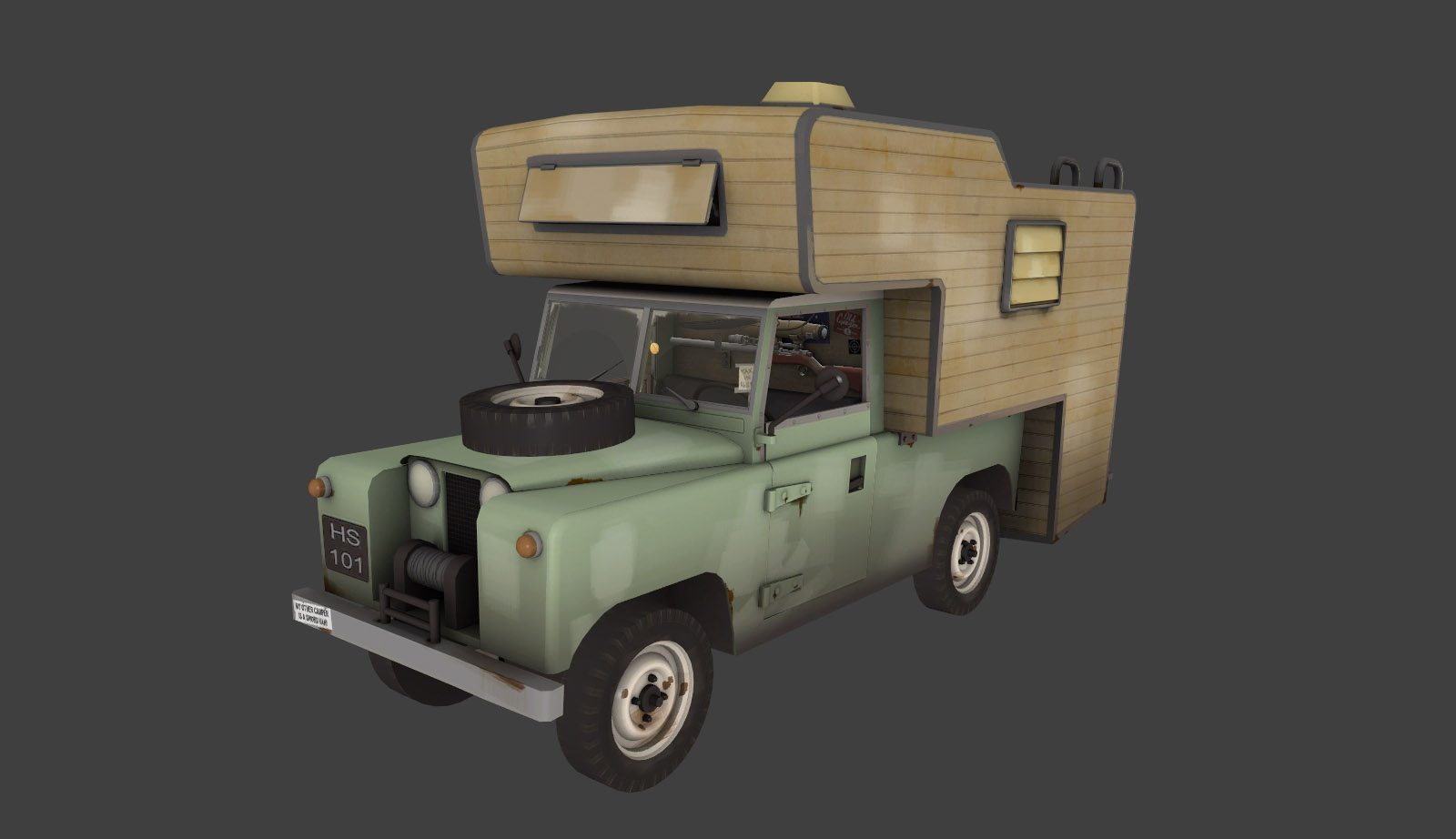
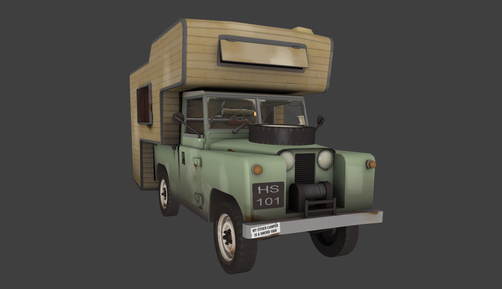
I think the reason it doesn't look so good is mainly the way you've done your brushstrokes, have a look at the campervan model and note that the paint is mostly a solid colour with a grey gradient towards the bottom. The brush strokes are more uniform and with less of the visible overlapping that you have in your texture, they're also much less uniformly distributed and more concentrated into patches. You've also got some very sharp lighter lines highlighting your sharp edges which doesn't look right.
I'd try turning up your brush's opacity and using fewer stokes; vary the colour by using slightly different colours as opposed to more layers. If i take a closer look at a single patch its clear that only one or two strokes were used, probably opacity of around 90 at a guess.
Your method is more suited to indicating subtle wear such as scuffing than to giveing TF2's characteristic brush-stroke style.
i'd also add some grey dirt at the bottom like this in addition to the subtle grey gradient i spoke about earlier
at the moment your edge wear is a mix of very diffuse and very sharp, and as such doesn't really look like wear, go from the gradual buildup with sharp edges you have to something more like dings and scrapes. Don't go overboard, a little goes a long way. Remember also that its paint on metal, and metal rusts, so you want the chips to be a rusty brown colour.
I would perhaps use more diffuse lighter wear on places people would touch; door edges and equipment gets scuffed more than chipped so it would look right in these situations. Think carefully about where the wear would realistically occur - how high up the door edge would people be pulling on it to open and close?
Your metal by and large looks pretty good, though again it could use some chips and dings and a little touch of rust. Little touches like this ooze TF2-style.
Keep referring back to existing models as a style guide,
check out this link if you haven't before, and don't be afraid to delete and redo texturing work that doesn't look quite right - texturing is a very iterative process.
Hope this helps to give some pointers, feel free to ask if you want help with anything specific

p.s., this is a sick model as is, but you could definitely get away with upping the polycount a bit and add some subtle bevels on some of the more harsh edges such as these, might help to soften the overall look a little.
p.p.s, i forgot to mention, keep looking at the model in game with lighting, its only there that you really get a feel of how it's going to look


