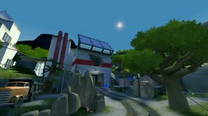
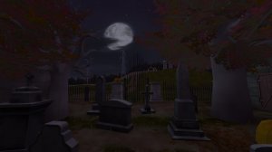
Hey just some additional points of feedback on your map. I was in one of the tests of the normal mode popfile, but I was a spectator - is why I wasn't sure my comments would have added anything extra in the other group of feedback for non-shortlist maps official post.
It really just seemed clear that you didn't playtest the map:
- On wave 4 of the normal mode mission you had a pyro boss that healed faster than it took damage, we had to cheat and force-kill all the mvm bots so we could even progress!
http://i.imgur.com/PGfxVWH.jpg
- On wave 5 of the normal mode mission you had 3 bosses that healed faster than they took damage, and then immediately put in a tank following them which just seemed insane.
http://i.imgur.com/XGBOCF8.jpg
- On wave 6 of the normal mode mission - again, waaaay too hard for normal mode. Another two bosses that healed faster than they took damage, followed by a tank behind them.
- Also on wave 1 of the normal mode mission you start off with 120 huntsman snipers, which can kill you potentially in one shot from a great distance away, which sucks for wave 1 of normal mode... You should, if you're keeping that, set their damage reduction to at least 50-60%.
The map generally flowed very awkwardly. The upper route in the map that sits above around the first closing-door location is probably too complex for players who want to use it as a route during a round. I suggest just closing off this side path here
http://i.imgur.com/PSgWiPL.jpg , since most players didn't appear to use it, and it just added complexity.
The doors also seemed pretty confusing, I think it would have helped a lot more if the gate capturepoint icons were on the HUD, because they weren't, so bots just stood awkwardly around the doors - that WERE opened before they got there (since players used the route during set up) for them to open again.
http://i.imgur.com/DHQZAHC.jpg
I think mixing routes that bots
can't go
sometimes, but players are
required to use
sometimes is pretty confusing generally. I think what might help is to have the gate doors instead be the translucent mesh doors from mannhatten, so at least players could fire at the bots capturing the gates (currently the door is solid and you have to find an alternative route to the bots - awkward).
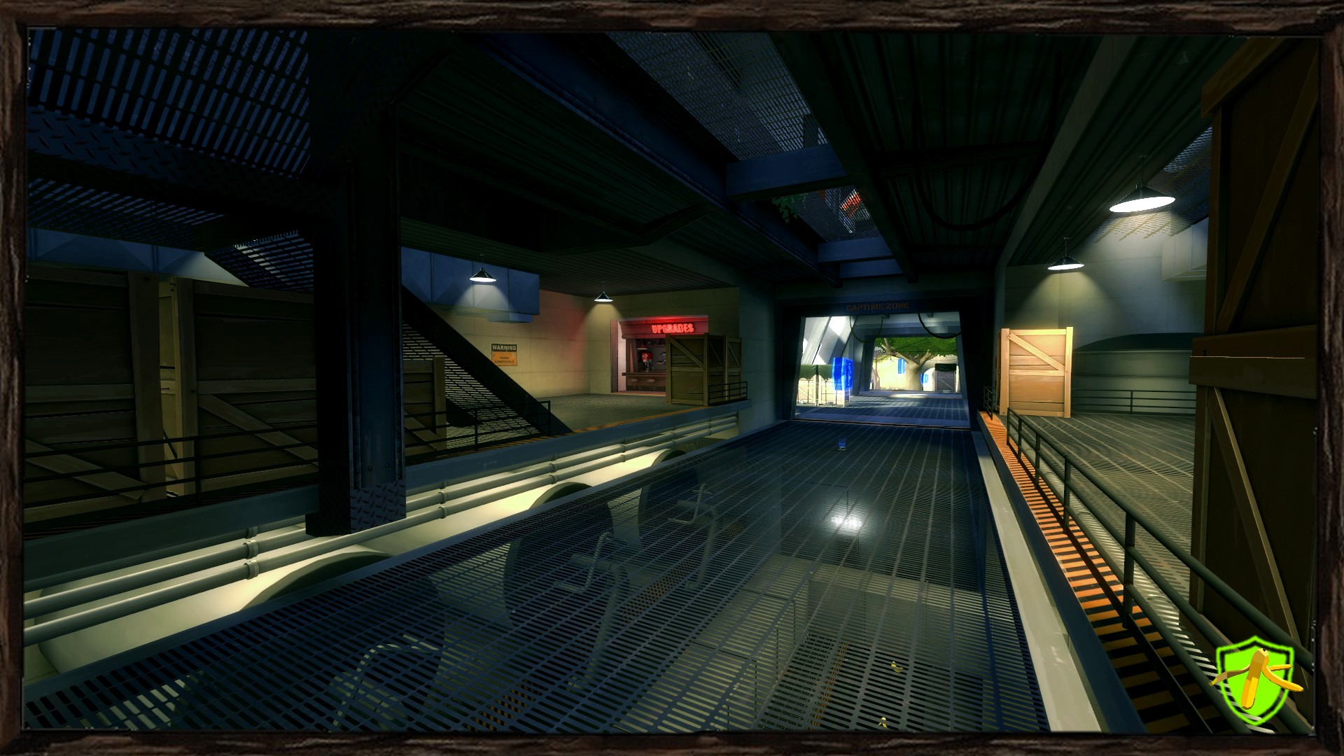
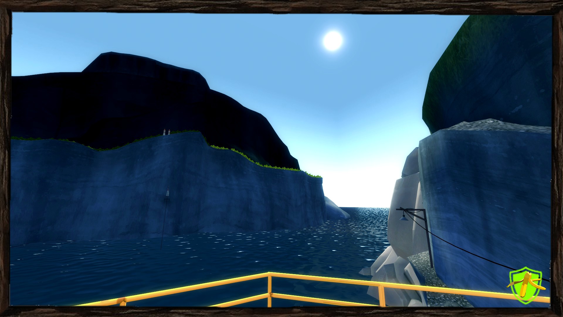
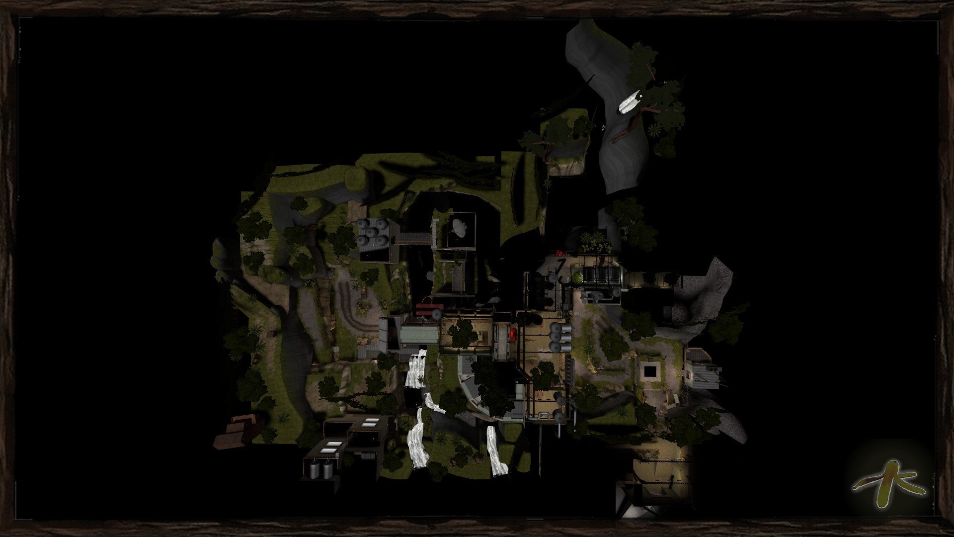
I will say I liked some of the detail on the map. There was this cool background cave area that seemed pretty neat from the player perspective:
http://i.imgur.com/FJaQq8m.jpg
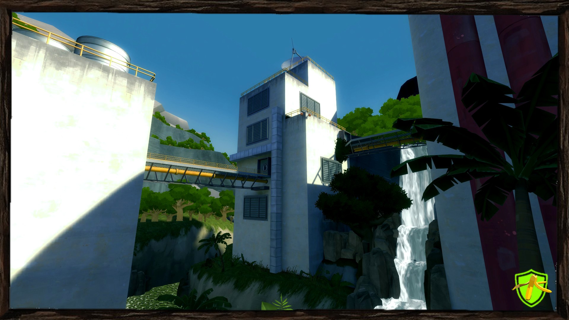
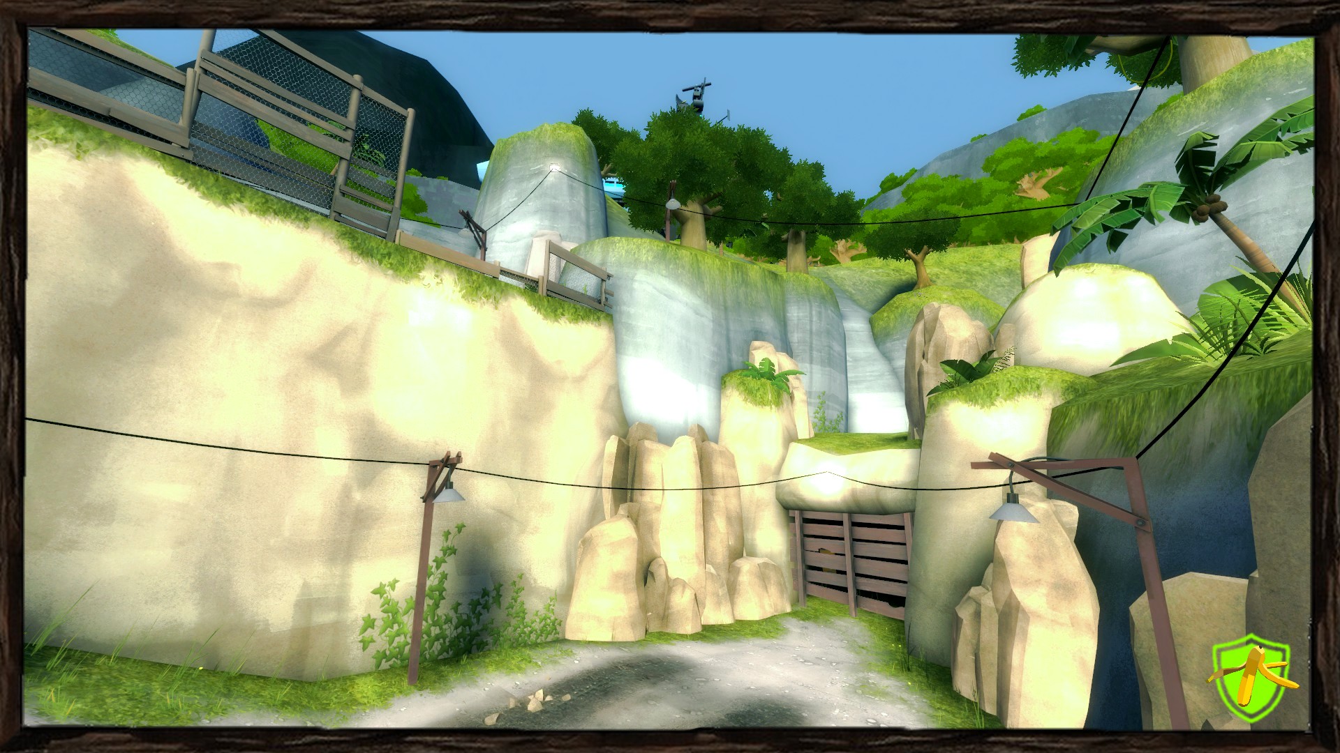
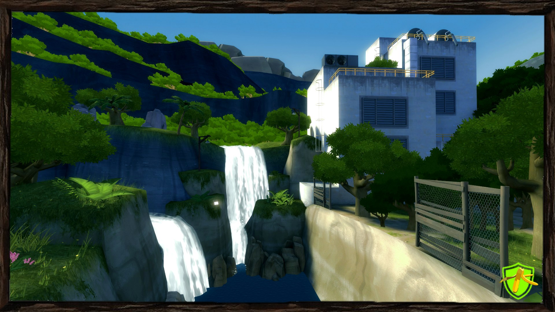
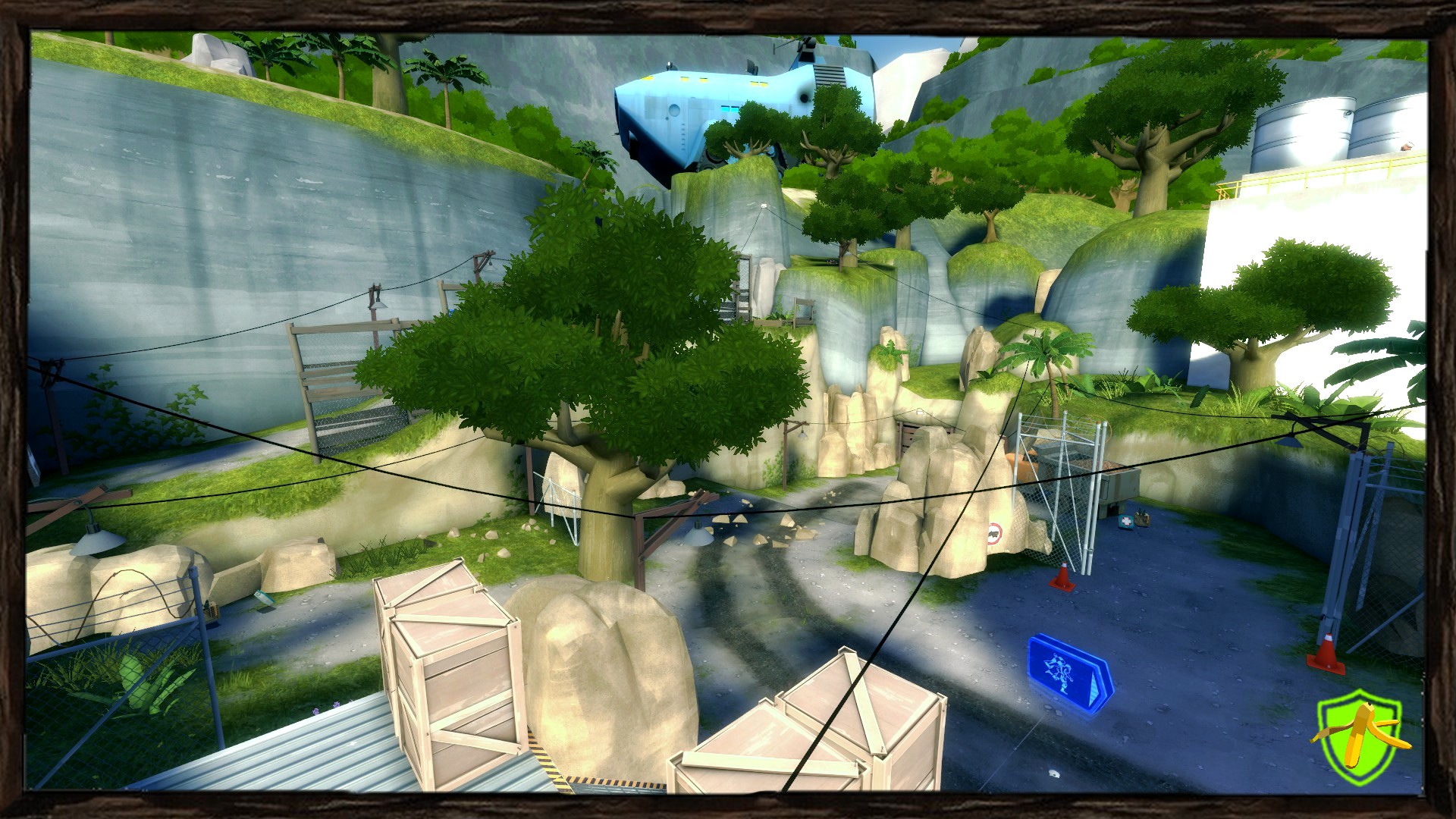
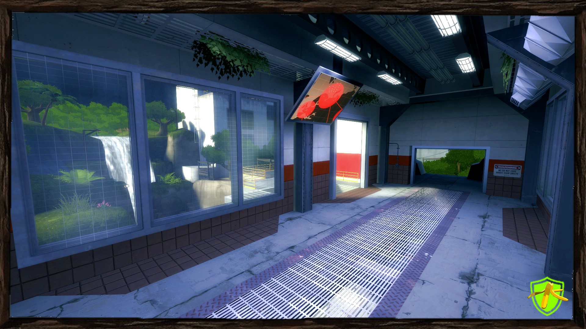
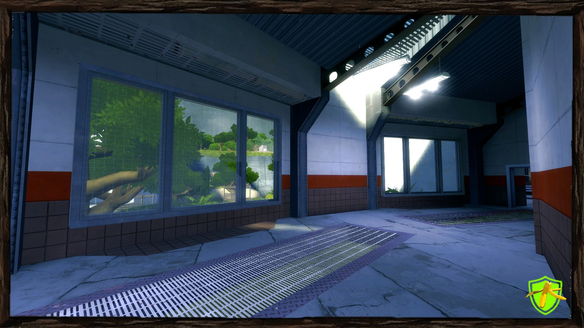
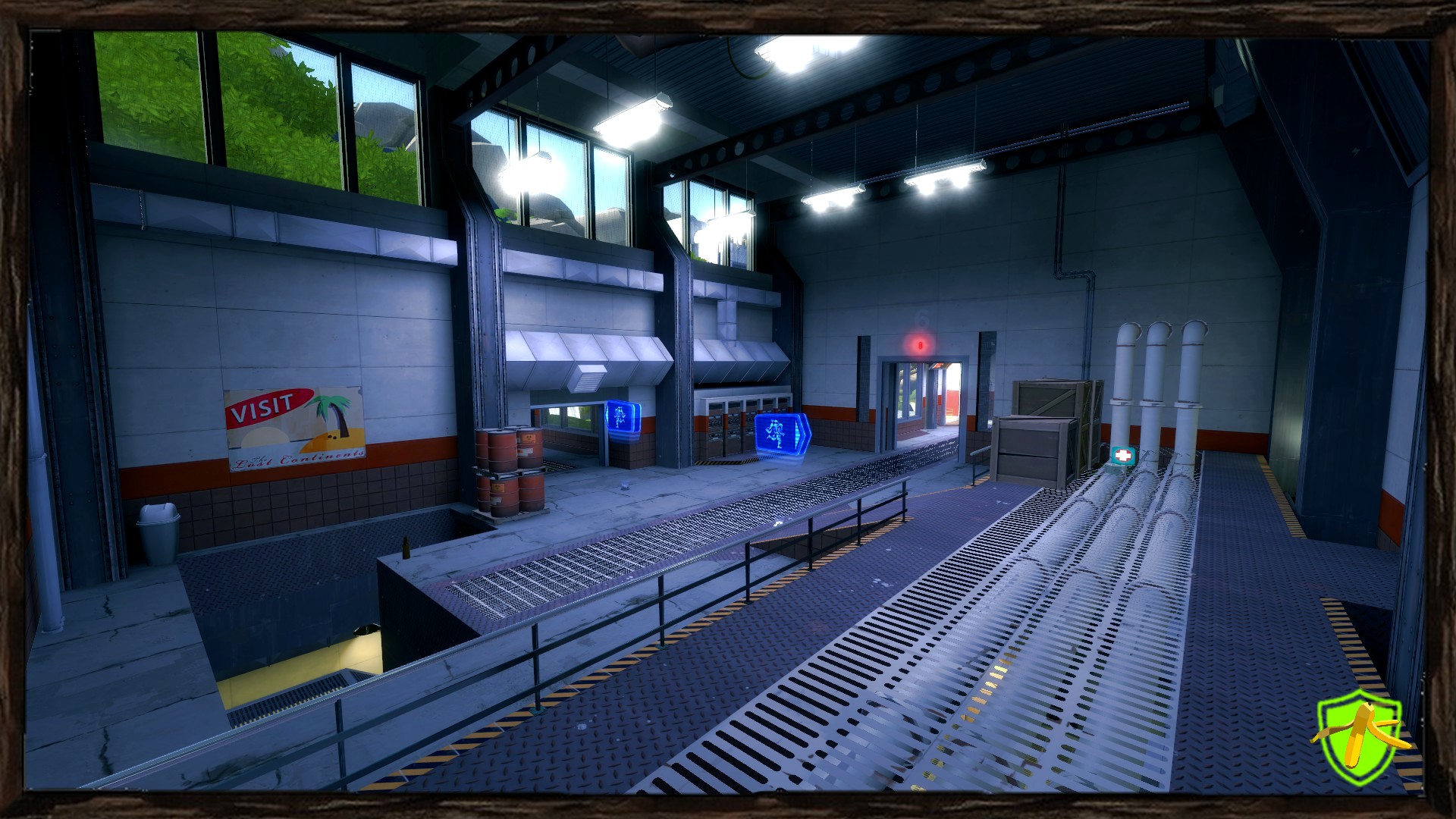
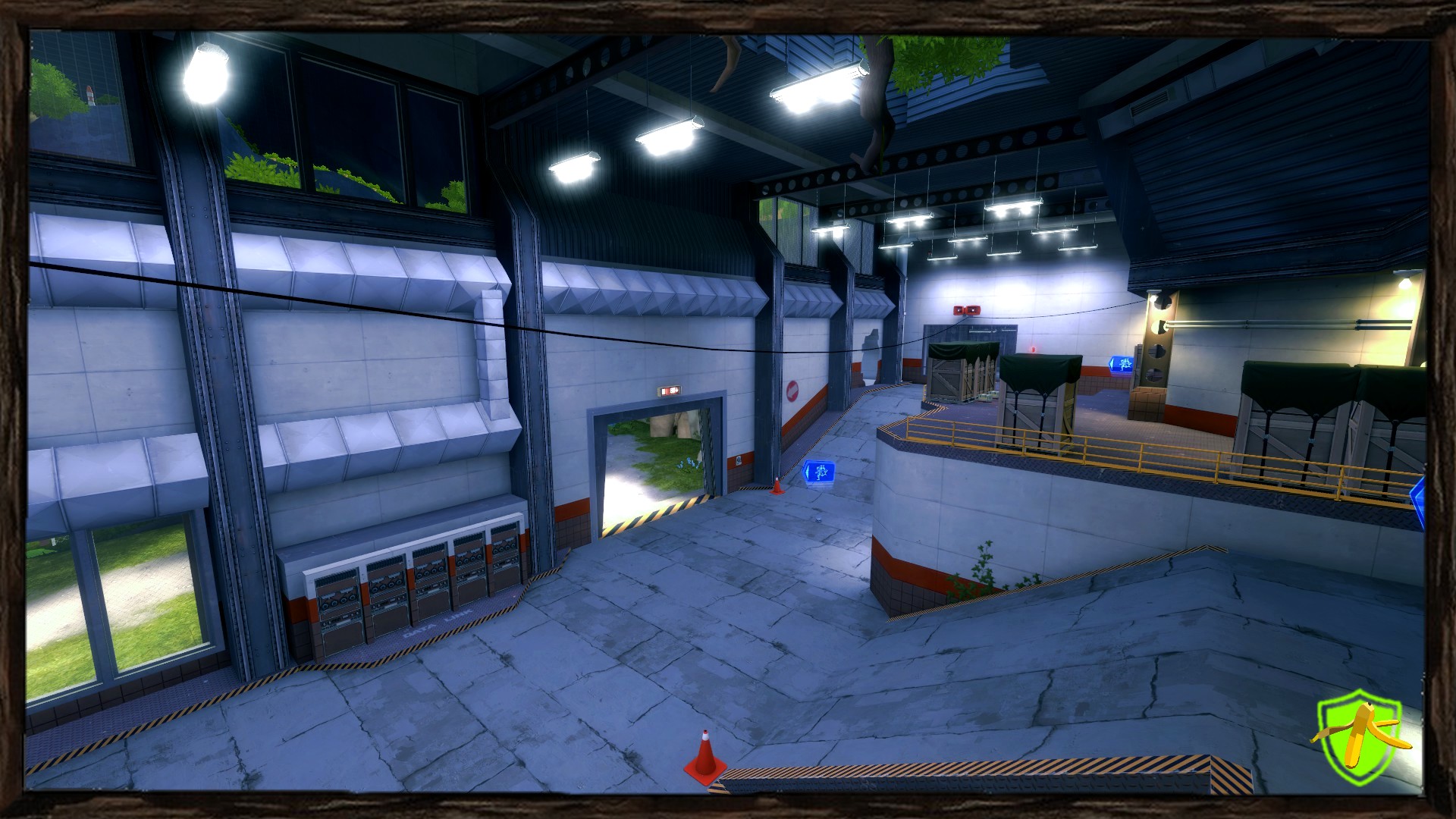
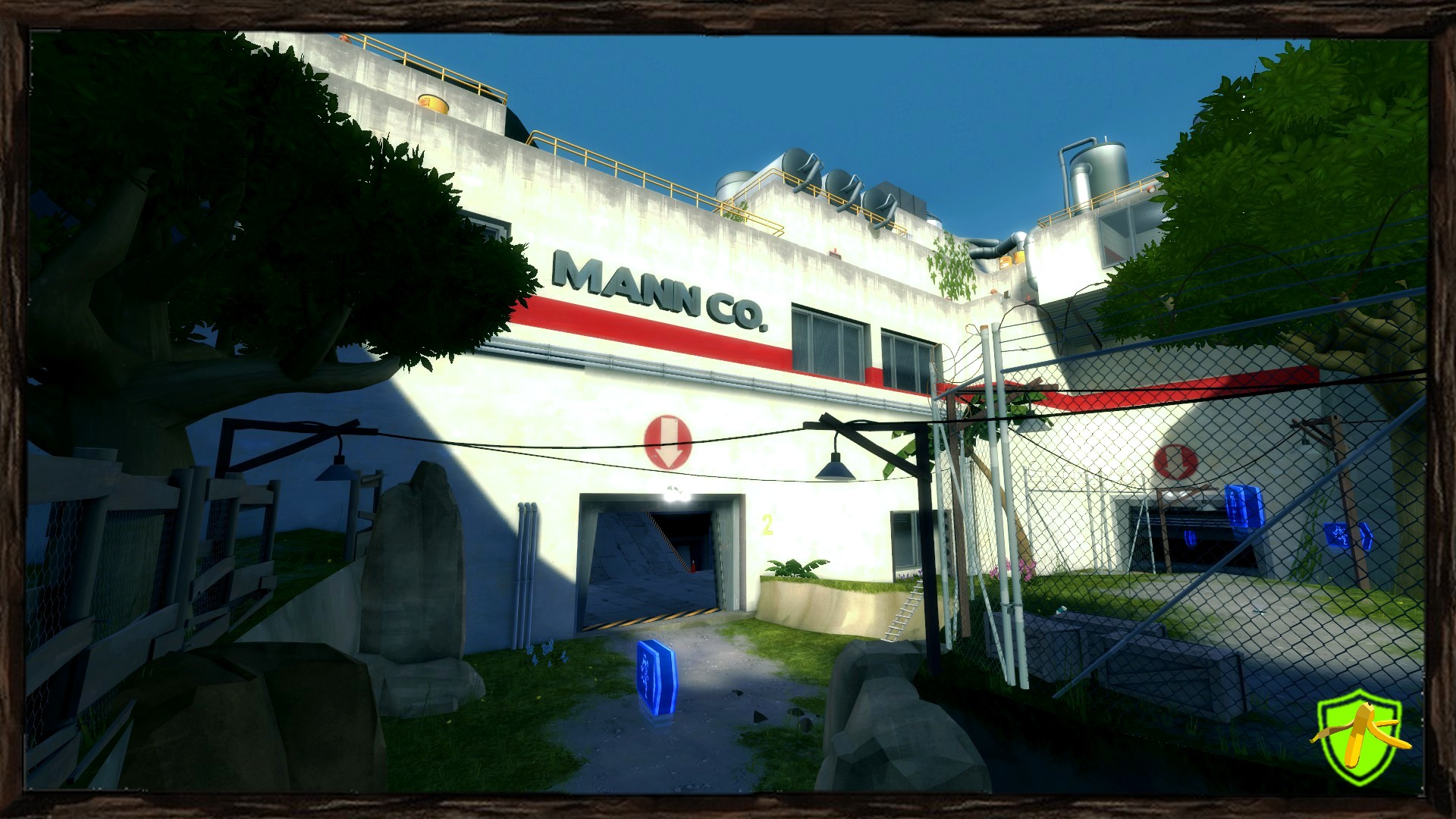
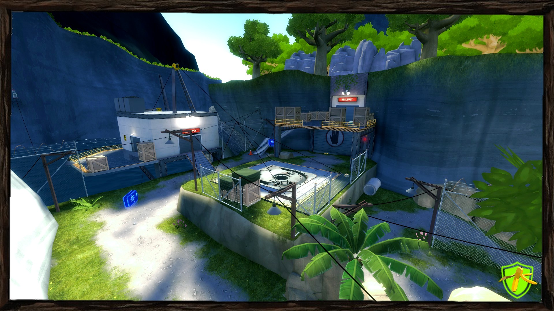
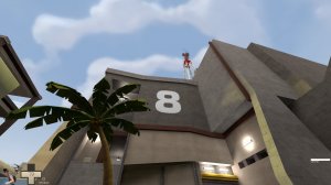
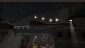
I think the lighting on your map could be improved a lot, not just in using a way more subtle bloom value, but also in the light colors and intensities.
http://i.imgur.com/icRhSQk.jpg -
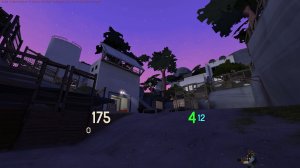
http://i.imgur.com/2lt81jv.jpg . I don't understand why the ambient color of the environment lighting (the shadows) are purple/blue. It makes the whole map seem very unnatural and strange, like you're using a color correction filter. Looks a bit like borderlands 2 actually. Just not TF2-y.
The direct lighting (not-shadow) I think is not intense enough. The 4th value of the lighting will set the intensity, if it's at like 300 now, set it to 600 at least. Check this page
https://developer.valvesoftware.com/wiki/Team_Fortress_2_Sky_List - it shows the 4th value intensity of a variety of maps. The maps that you remember being bright / easy to see outside have the highest 4th value settings. This was something I only just wrapped my head around somewhat recently so I wouldn't blame you too hard if 'intensity affecting color' was a bit confusing at first.
I think if the map's look was cleaned up so it was easier on the eyes in color, intensity, bloom scale, and probably also removing some of the clutter props miscleanously placed around that it could help make players feel better while being in the spaces. I think you'd really need to fix those popfiles by the way, so that players can actually beat the missions... And I would also probably try to see if you can cull, simplify, or merge different routes so that the map layout is less confusing.
