Osiris

CP Osiris b27

  • This map is featured! Our best maps, all together in one place for your viewing pleasure.

JeanPaul

L6: Sharp Member
Aug 5, 2010
295
284
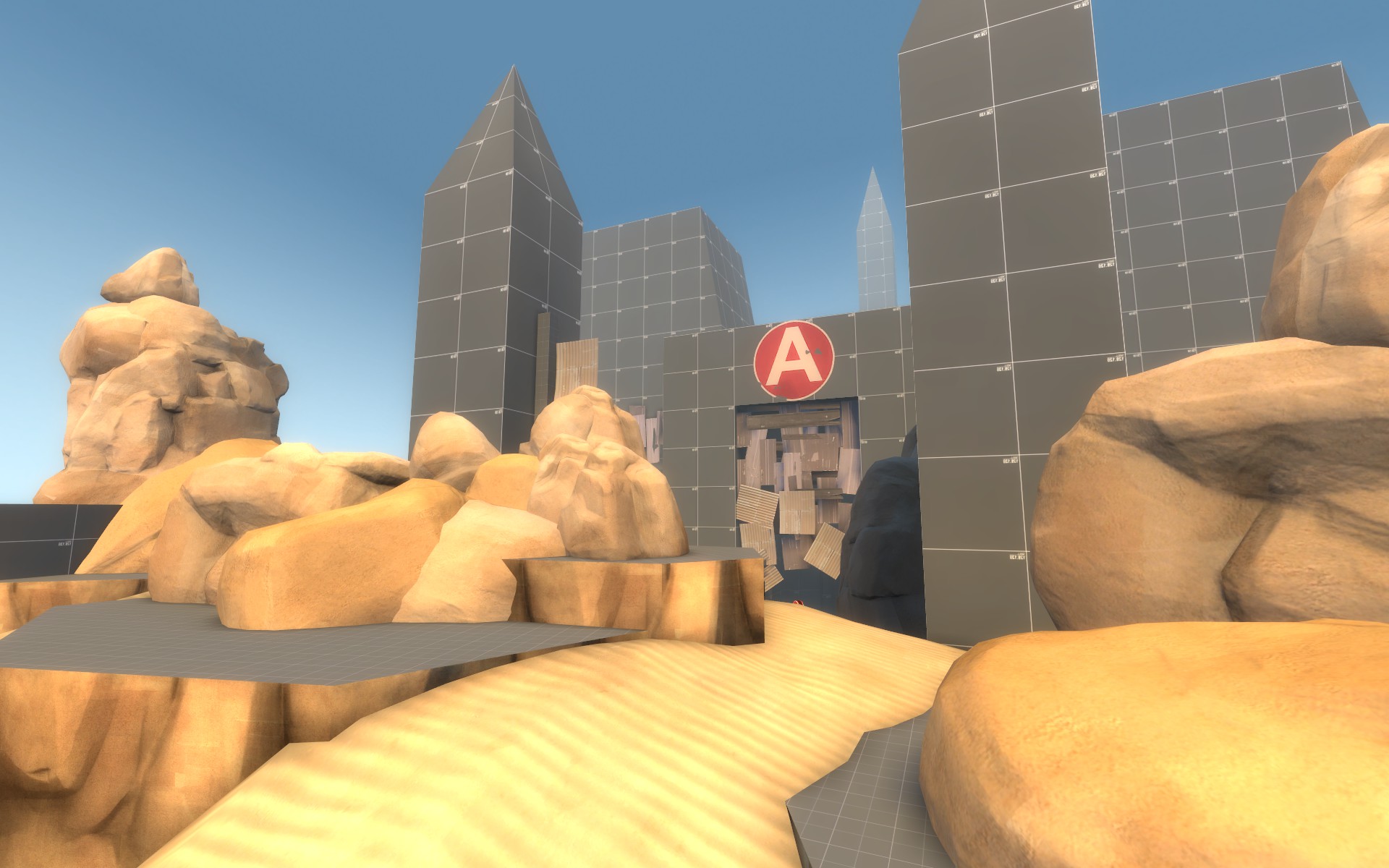
I started this map about 2 and a half weeks or so ago with the intention of creating a very simple layout that uses natural formations, in wide open spaces, for cover instead of your run of the mill barns. I wanted it to be really simple and easy to read - simple to the point of only needing A and B labels in the map and thats it. So far its a single stage 2 cp a/d with the potential to turn into multiple stages down the road depending on a number of irrelevant factors.

Note - there are a few nasty sightlines here and there but I want them resolved via testing rather than just guessing, so Im counting on you guys to help me out here! Some spots will be a bit open but again, post away with concerns and screenshots as I released this super early to get a jump start on testing :)

So far the cap times are ripped from imbricatus as I had no idea where to start with the timing. A - 30 seconds. B - 20 seconds. The spawn times are quick to keep the map very fast paced but then again, only testing will show what works best.

Special thank you to Tarry H. Sruman for putting up with my bullshit and helping me push through to this alpha 1 layout completion.
 
Last edited:

RaVaGe

aa
Jun 23, 2010
733
1,210
Imo it's not that easy to read, there is no differences between each paths you can take, everything looks the same, you know if i'm the attacker, go to the right or left path won't change a lot of things, there's nothing wich gives to one team an advantage to the other, you should consider to put some buildings wich create some rhythm to the game, like the barn on pl_goldrush for the cap1 stage 1, where everyone put his sentry, and camp to get some ammo/health, or the balcony on pl_badwater cp2.

I'm scared that this map in its state is just a playground where player just shoot them each others.

Keep in mind to create your balconies more large too, it's tf2, use at least 128 units for you balconies, I don't like to fall of a thing because it's too tight.

Some ideas :

2013-04-19_00001.jpg


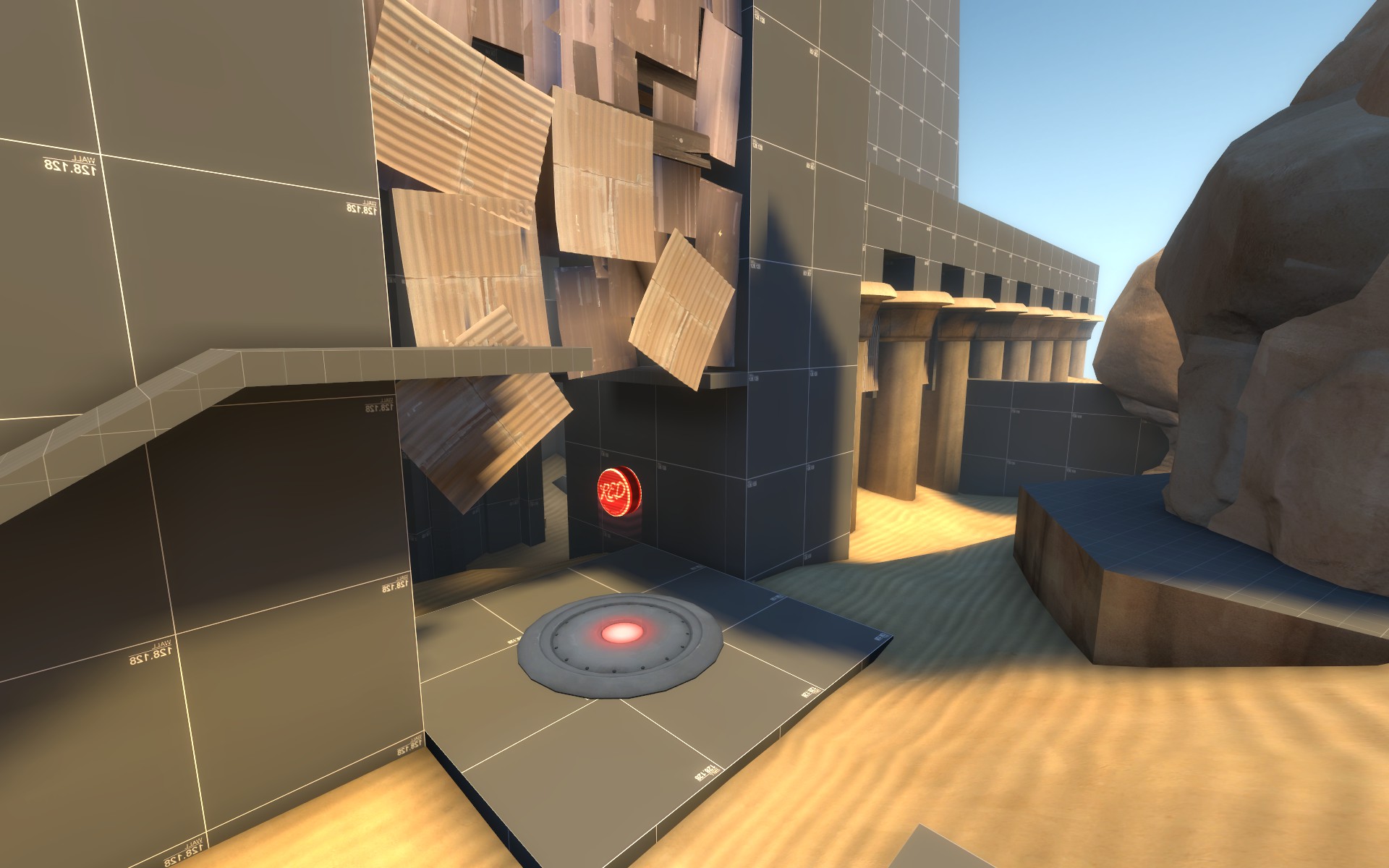
Maybe add a sentry nest in front of the control point, put some ammo/health.

2013-04-19_00002.jpg


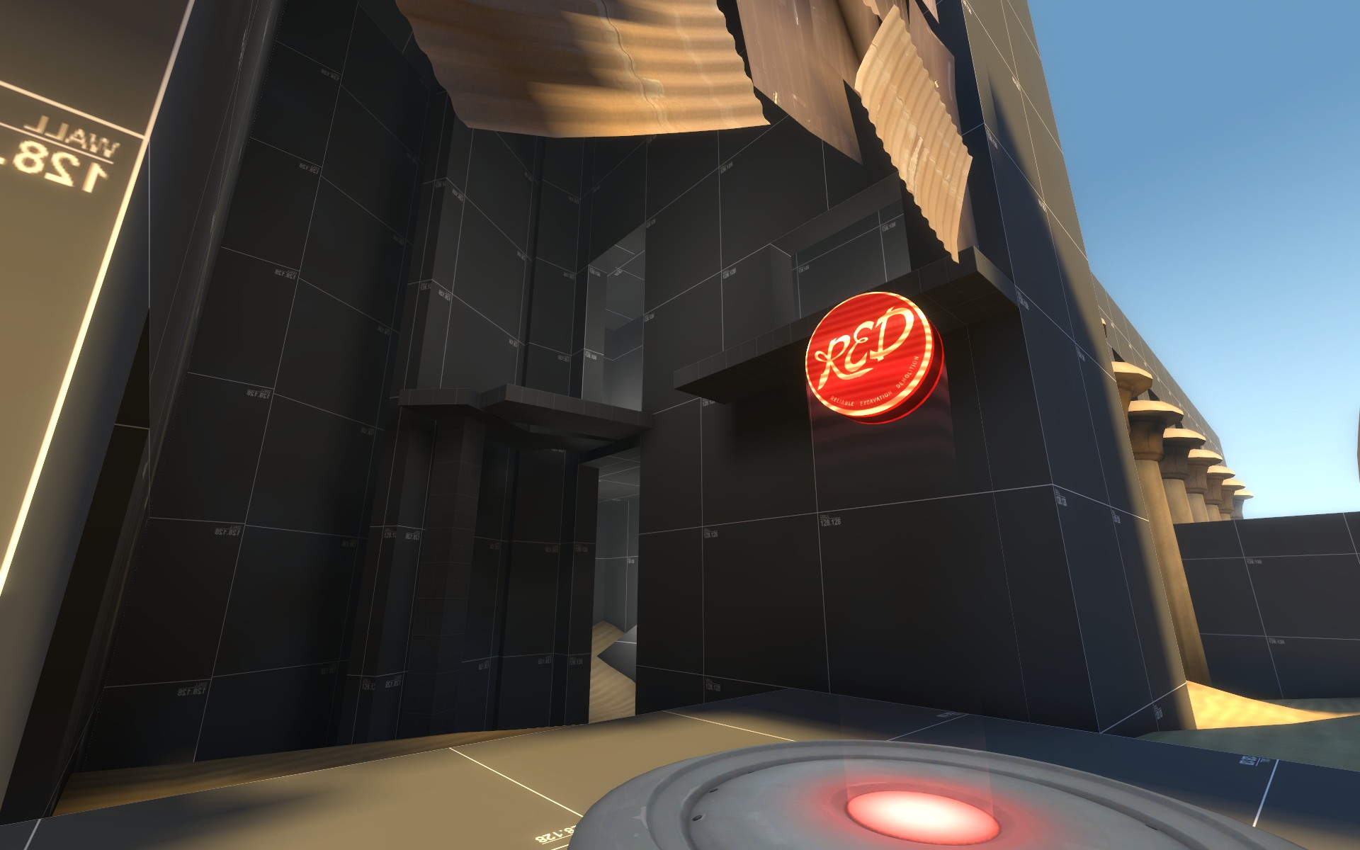
More large plz

2013-04-19_00004.jpg


Use more brushwork here, it will help you optimisation wise, and it's more fun to try to climb a tower than a model.

2013-04-19_00005.jpg


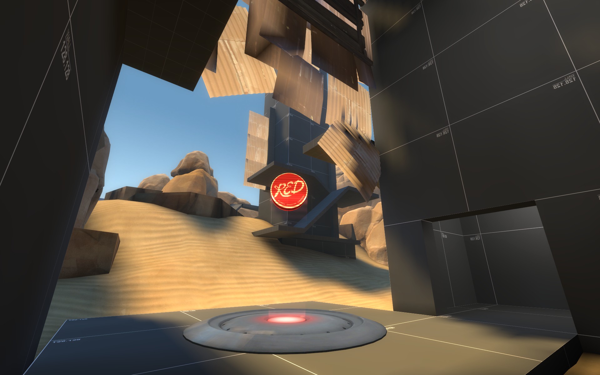
This area is clearly too tight, an heavy will never passes those pillars without getting hurt with the spam.
 

JeanPaul

L6: Sharp Member
Aug 5, 2010
295
284
Good suggestions, Ill get on these for a3

I just updated the original post to A2. It should play a little better this time around.
 

Sel

Banned
Feb 18, 2009
1,239
2,570
I don't think you can possible improve this further. A2 is the pinnacle of tf2 map design.
 

JeanPaul

L6: Sharp Member
Aug 5, 2010
295
284
Just updated the download to A4

Here are the changes for making A more defensible this time around

QhvJKC6.jpg


ectRQlW.jpg


DbrLLTX.jpg


656Kg3i.jpg
 

colacan

L5: Dapper Member
Apr 14, 2012
235
85
I think you overused those metal plates a bit, especially the lower half looks weird, like it's falling apart. Brushwork would look better in my opinion.
 

JeanPaul

L6: Sharp Member
Aug 5, 2010
295
284
Its a tiny bit overused I agree but I want the temple to look as if it has been taken over by bandits or something.

q8DXbwf.jpg


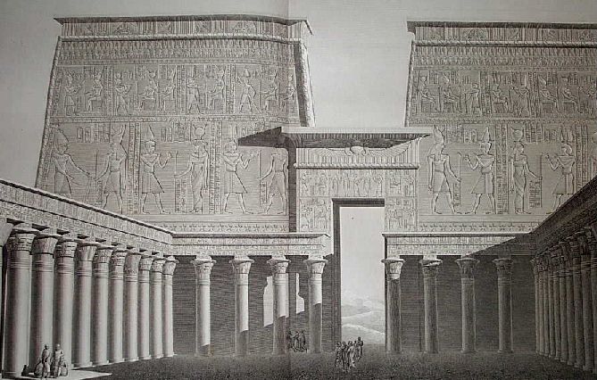
So to get the cover they needed, it was just random salvage from the desert slapped onto an ancient Egyptian temple. Now do you see my reasoning here? It will get better with time.

But with that considered I might simplify it later on if it improves readability at all. Just have to test.
 
Last edited:

Mr. Happy

L6: Sharp Member
Jul 16, 2008
320
158
Fun map

CP A needs less blu-advantage

Cool theme! Did you look at any ancient egypt temple layouts and topdowns when planning this?
 

JeanPaul

L6: Sharp Member
Aug 5, 2010
295
284
Did you get my suggestion as to an overhang at A? Like the one at badwater A, or outside Thundermountain spawn? There's a lot of really early good sentry spots, copying them might make holding a easier.

I could do something like that where ravage suggested earlier in this thread.

Fun map

CP A needs less blu-advantage

Cool theme! Did you look at any ancient egypt temple layouts and topdowns when planning this?

Yeah lots hah. So you still think A needs to be more defensible? Even though our test was only like 8 people?
 
Last edited:

Mr. Happy

L6: Sharp Member
Jul 16, 2008
320
158
Yeah I'm saying that based on the design not the test, more people would just mean more blu coming over the wall. There's no good spot for red to retreat to or hold up at near the point I feel. But there was an impromptu I missed so maybe you've changed it since?
 

Forty-Two

L1: Registered
Mar 7, 2013
12
2
I found that the temple area (middle) was really hard to navigate at first because of all the tight corridors and winding passageways. Consider widening and simplifying that area for better gameplay. The temple is one of the more covered areas, making it better for spies, but with the way it is now it just makes them more likely to bump into players.

The spires/ramps are also an interesting bit, but they're not really useful (again, the narrow ramps). Making the spire ramps about twice as wide as they are now would really help (that way you can actually fight on them without having to worry about falling off). You may also want to consider removing some of the ramps, because it is very repetitive and dull.

In terms of health and ammo, they seem fairly good, but you might want to consider decreasing the full ammos to half, and creating more small health kits. The full health on last is really bad for gameplay, because it allows for the defending team to really tank that point. I suggest demoting it to a small health kit/medium ammo, and moving it off the point. The attackers could also use some medium health kits more towars the point.

Overall, I think that this map could really use some general redesign, especially with the temple and the defender spawn. They both seem very cramped and hard to meneauver in, giving a lot of disadvantage to demos, snipers, and engies. I know that these are supposed to be balanced by the wide open areas, but this just creates a sense of imbalance in the map, like two opposites were smooshed together. It would be much better to have some obstruction over the whole map, and less yard space.
 

Forty-Two

L1: Registered
Mar 7, 2013
12
2
So have you been working on this map at all? Any juicy screenies for us to drool over? :p Real life problems in the way, or just not working on it?
 

JeanPaul

L6: Sharp Member
Aug 5, 2010
295
284
Yeah I havent touched it since a few days before the SDK changed. I might came back once its fixed but I have a lot of other stuff to work on unfortunately.