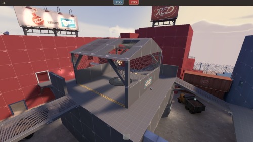
KotH Metal Hill

Montezuma

L2: Junior Member
Oct 16, 2010
57
3
Hey guys, so this is my first good attempt at any sort of half-way decent map. I actually really love the way this is turning out and play it constantly with bots. Please feel free to give feedback or any helpful tips you might have. Though for the moment it might be a ways away, I do need ideas as to the visual direction I should take with the map because, as of right now, buildings and a few signs are about the only things distinguishing the map.

a8 is up!

(I take horrible screenshots I'm terribly sorry :facepalm:)
 
Last edited:

Jeremy

L11: Posh Member
Oct 24, 2010
829
299
The map looks nice so far, and it plays quite well.


The only problem right now is that the capture zone is impossibly small, so entire teams have to huddle together to capture the point. It should cover the area it's in, not just the control point prop.
 

Montezuma

L2: Junior Member
Oct 16, 2010
57
3
The map looks nice so far, and it plays quite well.


The only problem right now is that the capture zone is impossibly small, so entire teams have to huddle together to capture the point. It should cover the area it's in, not just the control point prop.
Alright, good feedback. I think I'll extend it to the edges of the inner box currently separating the capture point from the rest of the roof top. Any other big flaws you see in gameplay that makes one class over-powered or is just impossible to attack/defend from?

Pics or it didn't happen... They're not all that hard to do, and are practically the only way you'll get feedback in a maps early stages.
Yeah I realize, there were just a few little errors (visually) in the map that I wanted to fix and (at 11 pm) I really didn't have the time or will to go in and finish up. I'm getting them up as I type.
 

FiLi

L4: Comfortable Member
Nov 14, 2009
195
102
I say it'd be better to take the roof and have it cover the whole capture box. Other than that, it looks pretty good. Keep it up
 

Montezuma

L2: Junior Member
Oct 16, 2010
57
3
I say it'd be better to take the roof and have it cover the whole capture box. Other than that, it looks pretty good. Keep it up
I'm afraid if I do that I'll 1) make the point much more likely to descend into a mayhem and 2) much easier to defend. Also, I really can't see a good way to make the open sides work with a true roof on it and if I were to enclose the point I feel like it would be almost unaccessible and getting a single sentry in there would make an ubered demo about the only way to re-capture the point.

I don't intend to sound mean, I've just thought about this a bit. If you notice anything completely wrong with my argument or have a counter-point I'm not considering please feel free to respond. :)
 

red_flame586

L420: High Member
Apr 19, 2009
437
122
This isn't a bad go, I can't tell much on the layout though but from what I can see in the pics there doesn't seem to be much of a problem. Maybe take the roof off all together, or put a high roof with room around the sides so a) players don't get caught and b) a demo man can put in a couple of stickies through the hole in the top. Finally, can you please put in a top down view of the map so we can actually see the layout, just makes helping you that much easier.
 

thekurnuttaja

L1: Registered
Dec 4, 2010
27
2
Tip: When you take screenshots put all your video settings maxed out, even if it lags it still looks way better in the screenshots :D
 

Jeremy

L11: Posh Member
Oct 24, 2010
829
299
I'm afraid if I do that I'll 1) make the point much more likely to descend into a mayhem and 2) much easier to defend. Also, I really can't see a good way to make the open sides work with a true roof on it and if I were to enclose the point I feel like it would be almost unaccessible and getting a single sentry in there would make an ubered demo about the only way to re-capture the point.
First of all, TF2 eats mayhem for breakfast. The more, the better.

Secondly, you could add some pillars or something, so the capture point isn't in an enclosed space and you'll be able to have a roof.
 

Montezuma

L2: Junior Member
Oct 16, 2010
57
3
Finally, can you please put in a top down view of the map so we can actually see the layout, just makes helping you that much easier.
I'll get right on that

Tip: When you take screenshots put all your video settings maxed out, even if it lags it still looks way better in the screenshots :D
funny thing is... I did. Would leaving jpeg at 90% quality really make that big of a difference?

First of all, TF2 eats mayhem for breakfast. The more, the better.

Secondly, you could add some pillars or something, so the capture point isn't in an enclosed space and you'll be able to have a roof.
I dunno, I'll see about this, still not sure if I want to go that route. I'll go make some version of it and see how it plays out.
 
Aug 10, 2009
1,240
399
I agree with you montezuma. I don't find universal mayhem particularly enjoyable, because
a) I never do well in it
b) So much spam

I think controlled mayhem would be the way to go. Set up specific areas you want it and allow it there :p

As for the screens, I will say that the double containers blocking off the route to the hill look a bit frustrating. I suggest making it two containers long, with one double stacked and a way around it or removing them, because that side route leads up into a building, so players running that way could be easily picked off.

Finally, the point looks pretty easy to demo spam :p
 

Montezuma

L2: Junior Member
Oct 16, 2010
57
3
I agree with you montezuma. I don't find universal mayhem particularly enjoyable, because
a) I never do well in it
b) So much spam

I think controlled mayhem would be the way to go. Set up specific areas you want it and allow it there :p

As for the screens, I will say that the double containers blocking off the route to the hill look a bit frustrating. I suggest making it two containers long, with one double stacked and a way around it or removing them, because that side route leads up into a building, so players running that way could be easily picked off.

Finally, the point looks pretty easy to demo spam :p
Thanks for the backup mate :p
But on your criticisms I actually want to run some questions by you and see if you can help me. Essentially, I've always had something blocking off that route. The rationalization was that it made that ledge right behind them inviable for setting up on/attacking from. Since you couldn't access those stairs to get back up, if you jumped down to start heading towards the point then you were stuck going that way. Those boxes used to be a fence, but I changed them recently to the boxes just on a whim and although I actually do like them, I find that it completely defeats that no set up/attacking purpose. If you really think it'd be a smart move to allow a way back into those stairs or to remove the blockage at all then I'll work on it but for now I like the way it centralizes combat and brings the action down around the point building.

Yeah I know the point is a demo-trap. I've been trying to figure out a way to fix it but since I don't want to put a roof on the point (yet), I'm still looking for a solution.
 

Montezuma

L2: Junior Member
Oct 16, 2010
57
3
Hey guys here's a quick screenshot of a possible point redesign. Comments? (besides that it's a terrible screenshot)
tumblr_ld52r2WmR01qzl5ofo1_500.jpg

EDIT: Added cover to corner of point. Helps aesthetically as well as gameplay wise I hope.
 
Last edited:
Aug 10, 2009
1,240
399
I think vertical scale is fine, but the more the scale the more necessary it is to have good pathways between each level. Also, I think the new point will make it easier for demos to nade over the walls, but not directly onto the point with stickies. It will certainly make being on the point more dangerous in terms of exposure.

Also, I was mentioning the boxes just because it looked like a route that boxes had appeared to suddenly block off. If I understand what you're saying correctly, the boxes are there to encourage the ledge connected by stairs to be a small base of operations (engie) on the attacking side? It's an interesting idea, maybe provide a means to get around the containers once a player has gotten to the ledge?
 

Montezuma

L2: Junior Member
Oct 16, 2010
57
3
I think vertical scale is fine, but the more the scale the more necessary it is to have good pathways between each level. Also, I think the new point will make it easier for demos to nade over the walls, but not directly onto the point with stickies. It will certainly make being on the point more dangerous in terms of exposure.
Hmmm. Well I realized very quickly that I needed some protection around the point and put some boxes around the exits to help that. Not really sure if that helps with what you're describing though.
If you didn't notice there's chain link on the sides of the point that faces the ramps coming from each spawn side. This really helps against demo spam as before I could pretty much defend the point playing demo by standing on the ramp running parallel to the point and lobbing nades over it.
 

Montezuma

L2: Junior Member
Oct 16, 2010
57
3
Pump for a6. Really changed up a lot. Took whole new set of pictures to show off.
Big changes
-Shipping containers no longer block off that path
-Point is almost completely redone
-Visual stuff
Questions
-Should I not make it possible for players to crouch-jump on the boxes on the point so that they can see through the chain link and, as a consequence, if anyone is coming?
-Is the path I've now opened useful? Or should I go back and block it off again?
-How's the new point? Is the roof useful? Are the boxes helpful or hurtful?
-Anything that was just an idiot move on my part? (I'm going to fix the fences again but they were causing problems with the bots for the while)
 

Montezuma

L2: Junior Member
Oct 16, 2010
57
3
Hey guys, thought I'd let you know that I put this map up for the gameday tonight. Hope to see some of you guys there and get some good feedback.
 

grazr

Old Man Mutant Ninja Turtle
aa
Mar 4, 2008
5,441
3,814
This map was fun to play. Health and ammo was pretty spot on.

Mid was difficult to take if an engi got a dispenser up. Same issue as Koth_harvest really. Perhaps add a spot where you can attack the mid from a greater height, without having to be on the roof.
 
Apr 13, 2009
728
309
Very difficult to attack. Being on the losing team throughout the entire playtime wasn't really fun because I don't think I saw the cp captured by my team even once.

Possible causes :
The access routes are few, and too convoluted. Basically there are 2 routes that are somewht direct, the catwalks on the right. The vent 'pipe' is pretty gimmicky. Accessing the catwalk on the left is a very long walk (despite the surrounding building being your team's color, the other team can reach it much faster). This means the players on the control point have mostly one direction to watch.
-> Try to shorten the paths to the control point where possible. Your ramps aren't steep enough, most of them are on a 1:2 ratio, sometimes less, make them 2:3. Promote attacking from the left side more by shortening that path.

Then, the entrances into the middle area are very narrow, while mid is relatively open in comparison. This means that if you're trying to get into mid, you can receive spam from many directions through your chokepoint doorway, but you can't spam back. The catwalks themselves are pretty narrow. Spawn exits are also narrow.
-> Widen doorways and catwalks where possible

All of this combined means that once the other team has taken root on the point, they are hard to dislodge, you will die when moving in, and when you respawn, you will have to walk a lot, before dying again.
-> Try changing the respawn times after capture to something closer to an A/D map than viaduct (ie 3/9 or even 2/10 instead of 4/8)


EDIT : one more thing : the bottom part of your ground brush still exists in the bsp. Looks like you have some sort of empty space here : remove the skybox brush on the bottom of the map ?
 
Last edited: