- Sep 12, 2008
- 1,272
- 1,142
Okay here's my opinion on the maps. Note that this is MY opinion, and MY votes, so if you don't like it, don't read it. I'm just trying to be helpful. I'm mainly talking at the map autors, as you might notice. I'll keep updating this post when time goes on. I hope I have enough space/time though.
Also, my excuses for my english. I'm trying to do my best.
----
CTF_VECTOR_C3
Gameflow 4
Oh yes! It's Vector... I really like how this map plays. Enough sideroutes, lots of cover, space for counter-attacks, ... I believe you perfectly succeeded in making this map with a new and challanging gamemode. As uninterested as I was (sorry) when you started this map with it's 137 alpha's, as much do I love playing it now. Only a few remarks, not that they're bad, or negative, no... Just... Remarkable. Your ammo placement is fine, but whoa boy, WHAT did you do with the health? It's everywhere!
[SCREENSHOT] Note, these are just nitpicks, I just couldn't give you a 5 eh? You're getting a 4 out of 5 for this.
Balancing 4
Whichever side I choose to play on, RED or BLU, fun is guaranteed. Although the layout seems simple, I can feel it's not.
[SCREENSHOT] You did a great job on this one. When I play some custom maps, I sometimes get the feeling to quit the game because my team just gets raped. Not the case with this map! When BLU captures the first CP, everything nicely flows to the second point. No struggling to 'recapture' the CP when the defending team has pushed the attackers back, no. In this map it's clear. Attackers attack and defenders defend. 4 out of 5.
Optimizing 5
Well... What can I say? No problems on my side! This map is (or at least, feels) optimized! Full stop. 5 out of 5!
Detailing 5
Ah... I've been wanting to write this. This map looks... To say it in my honest opinion, gorgeous. I. Love. It. Seriously, you must've really outdone yourself. To start with BLU's spawn. It's full of those "Never-seen-before-details"; The train room under the window, the walls, that one corridor with all the "private"-doors. In some maps, like my own maybe, you can find nice detailing, but nothing new, just edited details from other maps so that they'd fit within the new map. Your map is different (on most places). I can't stop looking at it. But yeah... You're starting to know me.. The critiques! Some buildings look a tad too known, like the big building in stage two with the CP inside. Isn't that... Hydro?
Nonetheless, you did a fantastic job on detailing this map; 5 out of 5. Now I need to go find a bucket and a mop to clean this mess around my computer. *need to stop drooling*
Style 3
Yeah, I know, it's not much, the map looks pretty, but... We've already met that theme before! It's just hydro, all over again. If this map had that ONE thing, that little thing that makes it stand out, it'd have been perfect. Luckily (for the other contestants, at least), I've yet to meet a perfect map. "DURRR", you'll say now. This one's only in it's second beta yet! 135 To go!
Okay, now seriously, 3 out of 5 for style.
----
Icarus, mate.. You did a wonderful job on this map. Believe me, I can't wait to see a map with that one thing different though! Keep it up, and good luck with the results!
----
CTF_HAARP_B2
Gameflow 4
Aha. H.A.A.R.P.. I like playing this map. No wait.. I love it. From in the beginning of a game of HAARP it's clear what you have to do. Bringing the damn intel to the control points. And yes! That's fun. Your map is straightforward, not too complicated, basically, the layout you can expect from a stock map made by VALVE. 4 out of 5.
Balancing 3
I dunno, sorry for the lower score, but... This map feels like it's built in favour of red. Too much if you ask me. You might want to take a look at some of the routes between the CP's. Sometimes it feels like you have to capture those mini-controlpoints in the corridors between two main CP's. If there's a defending engineer, heavy and/or medic (as an example), you're lost. Because of that, I've only seen the second and last stage once or twice. I think that is sad, because I really like those.. Keep working on it! 3 out of 5.
Optimizing 5
This map's optimized. No problems for me. I like what you did with the 3D-skybox, very inovative! No overload of snow, that's good, good use of optimization techniques. Yup, yup; 5 out of 5.
Detailing 5
I fell in love with this map. Seriously. It's incredible what you've done with the props, brushwork, mechanics, displacements... It feels so real. It fits the whole TF2-idea so well! One of my favourite things you've accomplished are the "Buildings-in-Caves".
[SCREENSHOT] I'm in a cave, so yes, it's dark. But you gave mapping for TF2 an other dimension with this map. It's dusty, gray-ish, realistic, ... Your map is full of things I've never seen before. Huzzah, 5 out of 5. Well done!
Style 5
Yes, it's incredible. The snow, the industrial feeling you gave it all, ... Wonderful. I think you did a fantastic job on giving this map a unique touch. Sometimes, it's even dared, like the last point in stage 3. 5 out of 5, definately! Woop Woop!
----
Doktor Spud, Nice map you made here! The looks are just astonishing, and the gameplay is nice. Keep it up, finish this map, and start to think what kind of community weapon you want! Good luck.
----
PLR_PANIC_B1
Gameflow 4
Rav, ma boi... This is a cool map. I like how this is not just an other "Let's Push the Kart and we'll see where we get"-map. No, this one's different. This is a map whre you really have to think of what you're going to do. Will I defend, or will I run towards the enemy with an axe swinging above my head? I like how you tried (and well, succeeded) to make your gameplay different from the stereotype "PLR". The carts starting on the ramps and the explosives on the walls in stage two are a nice addition ofcourse.
There seems to be a little too few ammo and health, but that's what beta's are for. An other negative thing is the gameplay in the last stage. It's just not cool to see your cart going down while you can't do anything about it. Still a very good flow in the rest of the map. 4 out of 5 on gameflow.
Balancing 4
I don't find it easy judging a symmetrical map on balancing, but i'll try. Your map has something different and special, though. I haven't played a lot of maps where both teams had even chances, and held those throughout the whole map. A team can still win the game, even when the other one has it's cart on a few meters from the end. As I said before though, I dislike the system in the last stage, but yeah... I do believe you did a great job on implementing timers to prevent endless battles. Good job, 4 out of 5.
Optimization 5
Nicely done! Framerates are good for me! Luckily a LOT better than an earlier version of Panic I played... Had about 20 FPS then. Main optimization work must've been done I guess, 5 out of 5! [What else could I say? You're my teacher!!]
Aahh you thought I was done yet eh? Wrong! Have a good look at your props. Fade distances and solid-ness please! (Tip; console).
Detailing 4
Ah yes, Panic. The swampy map with the cloudy sky. Yet an other Let-the-jaw-drop-map. I already loved what you did in the very first alpha (I like pretty alphas). I love what you did with the swamp stuff and the industrial content. You better keep mapping man! I love the originality in your detailing; the broken bridges, the mega subwoofer, ...
[SCREENSHOT] 4 out of 5, because sadly enough, not everything is looking as it should be (Mainly indoors). You did a great job on detailing this map none the less! Keep it up!
Style 5
This map's got style, definately! It's got the looks, the unique environment, the gameplay, ... This map's got all. Only a few tidbits; It feels a little to dark overal, mostly noticable in the second stage. But this map is one of the few that's got that one thing, that one unique touch. I LIKE it! 5 out of 5!
----
Ravidge, you did some epic work on this map. It's plays fantastic, it feels fantastic, and ofcourse, it's sounds BAD-ASS. Good luck with the final results.
----
PLR_ANIMUS_A8
Gameflow 2
Animus... The map of the souls. Maybe there are ghosts haunting this map. I don't know. I guess they know what happened with the good parts then? This map feels so cluttered, so messy, ..!! I don't know where to start.
[SCREENSHOT]I played this map a lot (somehow it was played a lot on the servers, maybe other people liked it), and I must say, I didn't really enjoy it. I can feel however, you tried to change the tides, but it didn't turn out well... Ammo and health placement is okay, layout of the stages is not. Long walks confusing lighting, ... A mess. I'm sorry to say it like this, but I got to be honest. That's just the way I think of the map. 2 out of 5.
Balancing 3
The map is pretty balanced, although it's hard to say because we're talking about a old payl- uh.. a PLR map. The first stage starts decent (talking about gameplay here). Although the trive time is long, combat in the middle is fierce. But that's when it happens; the game locks up completely. Second stage is completely the opposite though. Once one team pushes through the middle, they're victorious. I'm not going to say much about the last stage, since that one just doesn't feel right at all. Way too much cover in the end, no way to stop the winning team when they got "outside" the building thing. 3 out of 5 for the trying.
Optimization 3
Optimation is decent. Although framerates in stage 1 are extremely low for an alpha. Might be due to the s.ize, or not. You also have some really odd lighting bugs and glitches, not sure if you're aware of that since there are so many. It should be your first priority to fix those. Also, I don't know if this falls within "optimization", but... Sew displacements, close holes, fix gaps between brushes and stuff, fix nodraw stuff, ... More info in the "Detailing" part.
Detailing 2
Ah, yes.. Detailing. That's making a map look pretty. There are several ways to do that: neat brushworks, nice displacements, good use of techniques, etc etc. You got the picture. Now most of the detailing in your map, has this. But one time it's an overload of useless particles, the other time it's detailing that doesn't make sense. I really don't understand why you tried to puzzle an entire stage with parts from an, in your own words, "incomplete and unfinished" PAYLOAD map. Another thing I dislike is the skybox texture. It doesn't fit TF2 and looks way too dark, although there's clearly a sun that's brightly shining.
[SCREENSHOT] The overused particle effects in your map add to the messy feeling that's floating around your map. I don't even know what to say about the pumpkins, or the func_lods on places where they don't fit. Cool idea's and all, but this just isn't L4D or some other reallistic game. I guess that's enough, you'll have to do it with a 2 out of 5. Sorry.
Style 4
I'm gonna give you a 4 for style, because... Yeah, you did make something unique and refreshing non the less. It's just not "ghosty" enough to be special, just a heap of random creepy-related stuff. The start is there, now it's up to you to finish and rethink some things! Nicely made particle effects, but there is a time and place for those.
----
Fearlezz... What a map. The dish is okay but the sauce is horrible. It started all very promising, but you really messed it up near the end, didn't you? I'm rather dissapoint. The map's full of forgotten bugs. You really need to do something about it!! Good luck with the results.
----
CTF_PREMUDA_B1A
Gameflow 5
Yeaaahhh!! It's my premuda-baby! The most dared entry in the whole competition, no doubt. Wait, what! I wouldn't even think of doubting! I really like how this map plays. It's no big deal to learn the solid layout once you've played the map a few times, and I know maps that are more difficult to learn (eg. Steel, Dustbowl, ...). I actually like the small dispenser-addition on the intelligence too, it gives the map yet an other unique feature. By seeing thise kind of things, I can feel you've been thinking a lot throughout the whole production of this map. Some negative points though! The rain distracts a bit too much from the combat. Not that it's annoying itself, but when I got used to it, I started to ignore movements of other players as well. I think it's in too high contrast with the rest of the map: bright blue/white against orange/brown. None the less you did it again. 5 out of 5.
Balancing 4
Everytime I play this map, no matter what team I'm in, I'm always having a great time. First point is what the example point should be: easy to capture but challanging with a good defense. The second capture point though, feel a little too hard again! Second stage's a bit too easy again and the last point a tad too hard. Note that I'm just thinking in straight laines now. The map feels balanced, but could use a few tweaks and fixes. Good job, almost perfect. 4 out of 5.
Optimization 5
Optimized! Luckily! I'm not getting any odd framerates, so no problems on that side. You might want to take a look at sound optimizing, like making the annoucner's voice in the beginning of the map a bit quieter, getting rid of the thunder sounds, etc. Also, a protip; take a look at the console. Toppie! 5 out of 5.
Detailing 5
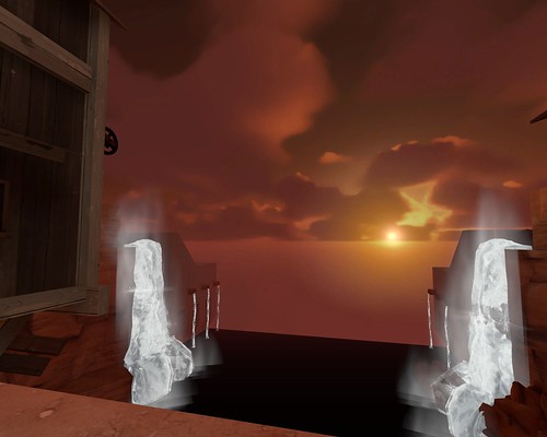
Visually stunning. I love what sick idea's you've implemented in this masterpiece. I have a huuuge respect for your skills and ideas. You told me once, 5 months or more ago, this is what it has to look like (yes, I do still remember those pictures), and now, it DOES look like it! You are one of the only contestants who dared it to try out a completely new theme. And it looks gorgeous. The subtle fishing nets and fences clearly beacon where the playable area ends. Your brushwork is impressive, the use of props is fantastic, and the theme is just sweet. Win - win - win. 5 out of 5.
Style 5
Man... I'm still astonished by what you've accomplished with this map. The creativity that's come allong with this map is immense, and proves of the dedication.
[SCREENSHOT] It's not easy to smash out an entire new theme out of the ground, but you did it as if it was eating cake. Cake or no cake, you deserve a 5 out of 5 for style. Absolutely. Congratulations.
----
Eerie! What have you done! I think I can't hold it any lo-*smash*
The writer of this text has been brought to intensive care. The following sentence is purely based on speculations.
This map ROCKS!
----
CTF_SLATE_B1
Gameflow - 4
Balancing - 4
Optimizing - 5
Detail - 5
style - 3
----
CTF_PANAMINT_A17
Gameflow - 4
Balancing - 4
Optimizing - 5
Detail - 3
style - 2
----
CTF_SNOWDRIFT_B2
Gameflow - 4
Balancing - 3
Optimizing - 4
Detail - 4
style - 3
----
PLR_SCOVILLE_C2
Gameflow - 4
Balancing - 3
Optimizing - 2
Detail - 4
style - 5
----
PLR_SOLITUDE_B1
Gameflow - 4
Balancing - 4
Optimizing - 3
Detail - 4
style - 5
----
PLR_NIGHTFALL_C
Gameflow - 5
Balancing - 4
Optimizing - 4
Detail - 5
style - 4
----
PLR_HIGHWIND_A4
Gameflow - 4
Balancing - 3
Optimizing - 4
Detail - 3
style - 4
----
PLR_ROLLOUT_A1
Gameflow - 3
Balancing - 2
Optimizing - 5
Detail - 1
style - 2
----
PLR_ARCTIC_C
Gameflow - 4
Balancing - 3
Optimizing - 5
Detail - 2
style - 3
----
PLR_CORNFIELD_C1
lolwat?
----
Working on the rest, right now!
Also, my excuses for my english. I'm trying to do my best.
----
CTF_VECTOR_C3
Gameflow 4
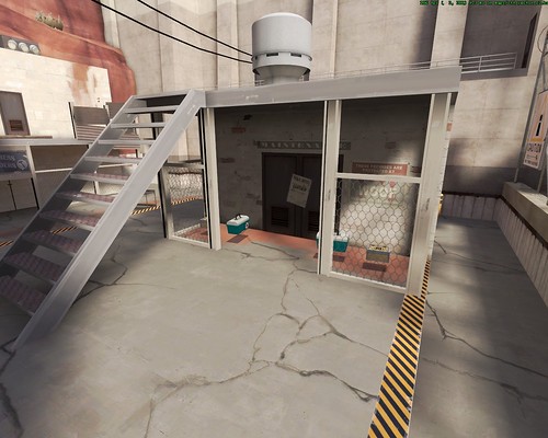
Oh yes! It's Vector... I really like how this map plays. Enough sideroutes, lots of cover, space for counter-attacks, ... I believe you perfectly succeeded in making this map with a new and challanging gamemode. As uninterested as I was (sorry) when you started this map with it's 137 alpha's, as much do I love playing it now. Only a few remarks, not that they're bad, or negative, no... Just... Remarkable. Your ammo placement is fine, but whoa boy, WHAT did you do with the health? It's everywhere!
[SCREENSHOT] Note, these are just nitpicks, I just couldn't give you a 5 eh? You're getting a 4 out of 5 for this.
Balancing 4
Whichever side I choose to play on, RED or BLU, fun is guaranteed. Although the layout seems simple, I can feel it's not.
[SCREENSHOT] You did a great job on this one. When I play some custom maps, I sometimes get the feeling to quit the game because my team just gets raped. Not the case with this map! When BLU captures the first CP, everything nicely flows to the second point. No struggling to 'recapture' the CP when the defending team has pushed the attackers back, no. In this map it's clear. Attackers attack and defenders defend. 4 out of 5.
Optimizing 5
Well... What can I say? No problems on my side! This map is (or at least, feels) optimized! Full stop. 5 out of 5!
Detailing 5
Ah... I've been wanting to write this. This map looks... To say it in my honest opinion, gorgeous. I. Love. It. Seriously, you must've really outdone yourself. To start with BLU's spawn. It's full of those "Never-seen-before-details"; The train room under the window, the walls, that one corridor with all the "private"-doors. In some maps, like my own maybe, you can find nice detailing, but nothing new, just edited details from other maps so that they'd fit within the new map. Your map is different (on most places). I can't stop looking at it. But yeah... You're starting to know me.. The critiques! Some buildings look a tad too known, like the big building in stage two with the CP inside. Isn't that... Hydro?
Nonetheless, you did a fantastic job on detailing this map; 5 out of 5. Now I need to go find a bucket and a mop to clean this mess around my computer. *need to stop drooling*
Style 3
Yeah, I know, it's not much, the map looks pretty, but... We've already met that theme before! It's just hydro, all over again. If this map had that ONE thing, that little thing that makes it stand out, it'd have been perfect. Luckily (for the other contestants, at least), I've yet to meet a perfect map. "DURRR", you'll say now. This one's only in it's second beta yet! 135 To go!
Okay, now seriously, 3 out of 5 for style.
----
Icarus, mate.. You did a wonderful job on this map. Believe me, I can't wait to see a map with that one thing different though! Keep it up, and good luck with the results!
----
CTF_HAARP_B2
Gameflow 4
Aha. H.A.A.R.P.. I like playing this map. No wait.. I love it. From in the beginning of a game of HAARP it's clear what you have to do. Bringing the damn intel to the control points. And yes! That's fun. Your map is straightforward, not too complicated, basically, the layout you can expect from a stock map made by VALVE. 4 out of 5.
Balancing 3
I dunno, sorry for the lower score, but... This map feels like it's built in favour of red. Too much if you ask me. You might want to take a look at some of the routes between the CP's. Sometimes it feels like you have to capture those mini-controlpoints in the corridors between two main CP's. If there's a defending engineer, heavy and/or medic (as an example), you're lost. Because of that, I've only seen the second and last stage once or twice. I think that is sad, because I really like those.. Keep working on it! 3 out of 5.
Optimizing 5
This map's optimized. No problems for me. I like what you did with the 3D-skybox, very inovative! No overload of snow, that's good, good use of optimization techniques. Yup, yup; 5 out of 5.
Detailing 5
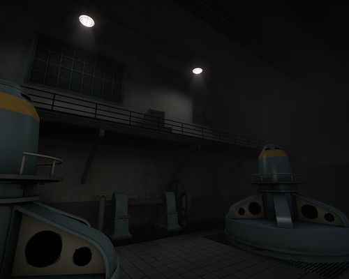
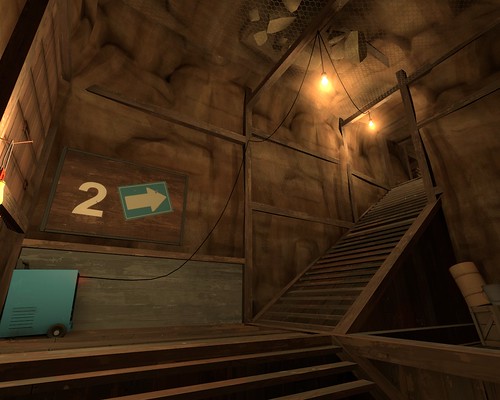
I fell in love with this map. Seriously. It's incredible what you've done with the props, brushwork, mechanics, displacements... It feels so real. It fits the whole TF2-idea so well! One of my favourite things you've accomplished are the "Buildings-in-Caves".
[SCREENSHOT] I'm in a cave, so yes, it's dark. But you gave mapping for TF2 an other dimension with this map. It's dusty, gray-ish, realistic, ... Your map is full of things I've never seen before. Huzzah, 5 out of 5. Well done!
Style 5
Yes, it's incredible. The snow, the industrial feeling you gave it all, ... Wonderful. I think you did a fantastic job on giving this map a unique touch. Sometimes, it's even dared, like the last point in stage 3. 5 out of 5, definately! Woop Woop!
----
Doktor Spud, Nice map you made here! The looks are just astonishing, and the gameplay is nice. Keep it up, finish this map, and start to think what kind of community weapon you want! Good luck.
----
PLR_PANIC_B1
Gameflow 4
Rav, ma boi... This is a cool map. I like how this is not just an other "Let's Push the Kart and we'll see where we get"-map. No, this one's different. This is a map whre you really have to think of what you're going to do. Will I defend, or will I run towards the enemy with an axe swinging above my head? I like how you tried (and well, succeeded) to make your gameplay different from the stereotype "PLR". The carts starting on the ramps and the explosives on the walls in stage two are a nice addition ofcourse.
There seems to be a little too few ammo and health, but that's what beta's are for. An other negative thing is the gameplay in the last stage. It's just not cool to see your cart going down while you can't do anything about it. Still a very good flow in the rest of the map. 4 out of 5 on gameflow.
Balancing 4
I don't find it easy judging a symmetrical map on balancing, but i'll try. Your map has something different and special, though. I haven't played a lot of maps where both teams had even chances, and held those throughout the whole map. A team can still win the game, even when the other one has it's cart on a few meters from the end. As I said before though, I dislike the system in the last stage, but yeah... I do believe you did a great job on implementing timers to prevent endless battles. Good job, 4 out of 5.
Optimization 5
Nicely done! Framerates are good for me! Luckily a LOT better than an earlier version of Panic I played... Had about 20 FPS then. Main optimization work must've been done I guess, 5 out of 5! [What else could I say? You're my teacher!!]
Aahh you thought I was done yet eh? Wrong! Have a good look at your props. Fade distances and solid-ness please! (Tip; console).
Detailing 4
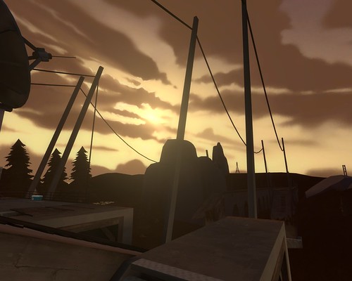
Ah yes, Panic. The swampy map with the cloudy sky. Yet an other Let-the-jaw-drop-map. I already loved what you did in the very first alpha (I like pretty alphas). I love what you did with the swamp stuff and the industrial content. You better keep mapping man! I love the originality in your detailing; the broken bridges, the mega subwoofer, ...
[SCREENSHOT] 4 out of 5, because sadly enough, not everything is looking as it should be (Mainly indoors). You did a great job on detailing this map none the less! Keep it up!
Style 5
This map's got style, definately! It's got the looks, the unique environment, the gameplay, ... This map's got all. Only a few tidbits; It feels a little to dark overal, mostly noticable in the second stage. But this map is one of the few that's got that one thing, that one unique touch. I LIKE it! 5 out of 5!
----
Ravidge, you did some epic work on this map. It's plays fantastic, it feels fantastic, and ofcourse, it's sounds BAD-ASS. Good luck with the final results.
----
PLR_ANIMUS_A8
Gameflow 2
Animus... The map of the souls. Maybe there are ghosts haunting this map. I don't know. I guess they know what happened with the good parts then? This map feels so cluttered, so messy, ..!! I don't know where to start.
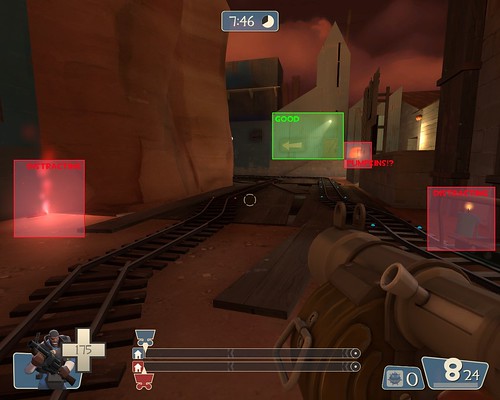
[SCREENSHOT]I played this map a lot (somehow it was played a lot on the servers, maybe other people liked it), and I must say, I didn't really enjoy it. I can feel however, you tried to change the tides, but it didn't turn out well... Ammo and health placement is okay, layout of the stages is not. Long walks confusing lighting, ... A mess. I'm sorry to say it like this, but I got to be honest. That's just the way I think of the map. 2 out of 5.
Balancing 3
The map is pretty balanced, although it's hard to say because we're talking about a old payl- uh.. a PLR map. The first stage starts decent (talking about gameplay here). Although the trive time is long, combat in the middle is fierce. But that's when it happens; the game locks up completely. Second stage is completely the opposite though. Once one team pushes through the middle, they're victorious. I'm not going to say much about the last stage, since that one just doesn't feel right at all. Way too much cover in the end, no way to stop the winning team when they got "outside" the building thing. 3 out of 5 for the trying.
Optimization 3
Optimation is decent. Although framerates in stage 1 are extremely low for an alpha. Might be due to the s.ize, or not. You also have some really odd lighting bugs and glitches, not sure if you're aware of that since there are so many. It should be your first priority to fix those. Also, I don't know if this falls within "optimization", but... Sew displacements, close holes, fix gaps between brushes and stuff, fix nodraw stuff, ... More info in the "Detailing" part.
Detailing 2
Ah, yes.. Detailing. That's making a map look pretty. There are several ways to do that: neat brushworks, nice displacements, good use of techniques, etc etc. You got the picture. Now most of the detailing in your map, has this. But one time it's an overload of useless particles, the other time it's detailing that doesn't make sense. I really don't understand why you tried to puzzle an entire stage with parts from an, in your own words, "incomplete and unfinished" PAYLOAD map. Another thing I dislike is the skybox texture. It doesn't fit TF2 and looks way too dark, although there's clearly a sun that's brightly shining.
[SCREENSHOT] The overused particle effects in your map add to the messy feeling that's floating around your map. I don't even know what to say about the pumpkins, or the func_lods on places where they don't fit. Cool idea's and all, but this just isn't L4D or some other reallistic game. I guess that's enough, you'll have to do it with a 2 out of 5. Sorry.
Style 4
I'm gonna give you a 4 for style, because... Yeah, you did make something unique and refreshing non the less. It's just not "ghosty" enough to be special, just a heap of random creepy-related stuff. The start is there, now it's up to you to finish and rethink some things! Nicely made particle effects, but there is a time and place for those.
----
Fearlezz... What a map. The dish is okay but the sauce is horrible. It started all very promising, but you really messed it up near the end, didn't you? I'm rather dissapoint. The map's full of forgotten bugs. You really need to do something about it!! Good luck with the results.
----
CTF_PREMUDA_B1A
Gameflow 5
Yeaaahhh!! It's my premuda-baby! The most dared entry in the whole competition, no doubt. Wait, what! I wouldn't even think of doubting! I really like how this map plays. It's no big deal to learn the solid layout once you've played the map a few times, and I know maps that are more difficult to learn (eg. Steel, Dustbowl, ...). I actually like the small dispenser-addition on the intelligence too, it gives the map yet an other unique feature. By seeing thise kind of things, I can feel you've been thinking a lot throughout the whole production of this map. Some negative points though! The rain distracts a bit too much from the combat. Not that it's annoying itself, but when I got used to it, I started to ignore movements of other players as well. I think it's in too high contrast with the rest of the map: bright blue/white against orange/brown. None the less you did it again. 5 out of 5.
Balancing 4
Everytime I play this map, no matter what team I'm in, I'm always having a great time. First point is what the example point should be: easy to capture but challanging with a good defense. The second capture point though, feel a little too hard again! Second stage's a bit too easy again and the last point a tad too hard. Note that I'm just thinking in straight laines now. The map feels balanced, but could use a few tweaks and fixes. Good job, almost perfect. 4 out of 5.
Optimization 5
Optimized! Luckily! I'm not getting any odd framerates, so no problems on that side. You might want to take a look at sound optimizing, like making the annoucner's voice in the beginning of the map a bit quieter, getting rid of the thunder sounds, etc. Also, a protip; take a look at the console. Toppie! 5 out of 5.
Detailing 5
Visually stunning. I love what sick idea's you've implemented in this masterpiece. I have a huuuge respect for your skills and ideas. You told me once, 5 months or more ago, this is what it has to look like (yes, I do still remember those pictures), and now, it DOES look like it! You are one of the only contestants who dared it to try out a completely new theme. And it looks gorgeous. The subtle fishing nets and fences clearly beacon where the playable area ends. Your brushwork is impressive, the use of props is fantastic, and the theme is just sweet. Win - win - win. 5 out of 5.
Style 5
Man... I'm still astonished by what you've accomplished with this map. The creativity that's come allong with this map is immense, and proves of the dedication.
[SCREENSHOT] It's not easy to smash out an entire new theme out of the ground, but you did it as if it was eating cake. Cake or no cake, you deserve a 5 out of 5 for style. Absolutely. Congratulations.
----
Eerie! What have you done! I think I can't hold it any lo-*smash*
The writer of this text has been brought to intensive care. The following sentence is purely based on speculations.
This map ROCKS!
----
CTF_SLATE_B1
Gameflow - 4
Balancing - 4
Optimizing - 5
Detail - 5
style - 3
----
CTF_PANAMINT_A17
Gameflow - 4
Balancing - 4
Optimizing - 5
Detail - 3
style - 2
----
CTF_SNOWDRIFT_B2
Gameflow - 4
Balancing - 3
Optimizing - 4
Detail - 4
style - 3
----
PLR_SCOVILLE_C2
Gameflow - 4
Balancing - 3
Optimizing - 2
Detail - 4
style - 5
----
PLR_SOLITUDE_B1
Gameflow - 4
Balancing - 4
Optimizing - 3
Detail - 4
style - 5
----
PLR_NIGHTFALL_C
Gameflow - 5
Balancing - 4
Optimizing - 4
Detail - 5
style - 4
----
PLR_HIGHWIND_A4
Gameflow - 4
Balancing - 3
Optimizing - 4
Detail - 3
style - 4
----
PLR_ROLLOUT_A1
Gameflow - 3
Balancing - 2
Optimizing - 5
Detail - 1
style - 2
----
PLR_ARCTIC_C
Gameflow - 4
Balancing - 3
Optimizing - 5
Detail - 2
style - 3
----
PLR_CORNFIELD_C1
lolwat?
----
Working on the rest, right now!
Last edited:
")