Snipping out the pictures for length...
Hey Paranoid! I just did a run thru of your map and here are some of the things I saw...
Starting with the first map:
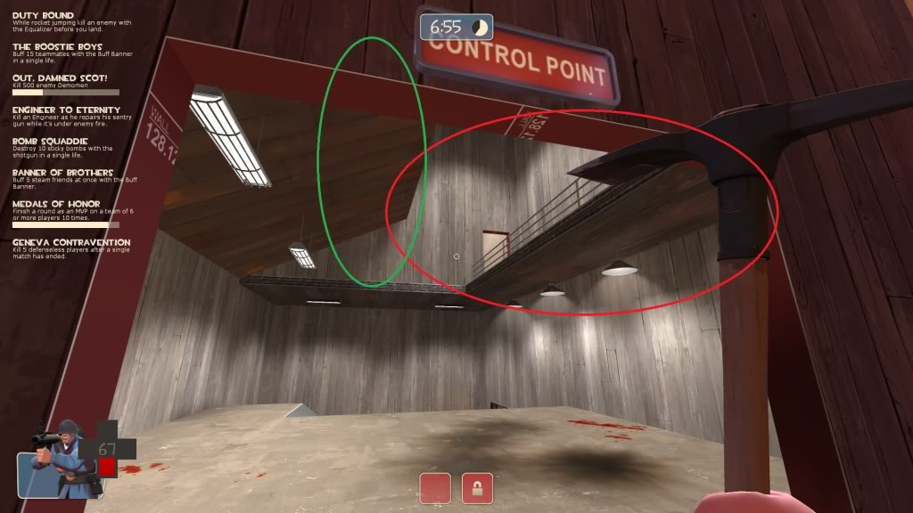
At the first point near the spawn, players can still jump on the lamps by the spawn gate (At least the one circled in red). Intentional or not? Personally I like it.
Not intentional, I'll need to make them nonsolid...again. (I had a little fiasco where I accidentally backed up the .bsp instead of the .vmf, so I had to decompile it to work on it again, and some stuff got lost in the transition. Like nonsolidity.)
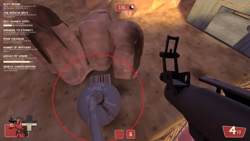
Secondly, I chatted with you before about removing on of these ramps. Preferable the red circled one. The idea of "ramps on the defender's side and no on the attacker's" is common in several of the official maps. I think you said you were planning to.
Being a little nit-picky, the background in the map could use some cleaning up (and I'm sure you will sooner or later).
I remember talking with you about it, but it slipped my mind. You're also the only person to mention anything like that, so while I like the idea, I want to wait to see if anyone else has an opinion on it.
I agree the background areas are very...bare bones, to put it lightly. It's still alpha, so I'm intentionally not putting in a lot of detail yet.
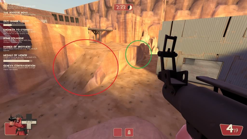
On to map two! One glaring problem is this black hole/gap in the map off the right hand side of the attacker's spawn. It is by the stairs there. As Master Yoda would say, "How embarrassing!"
It looks like a stray nodraw brush. Easy fix.
This drop down area near there could maybe use a spiffy gate or something to spice it up?
It does need some sprucing up and maybe a size increase. I haven't actually tried jumping up, but I can't imagine a 128 square hole can be easy to fit into. I'll make it bigger and see how that goes.
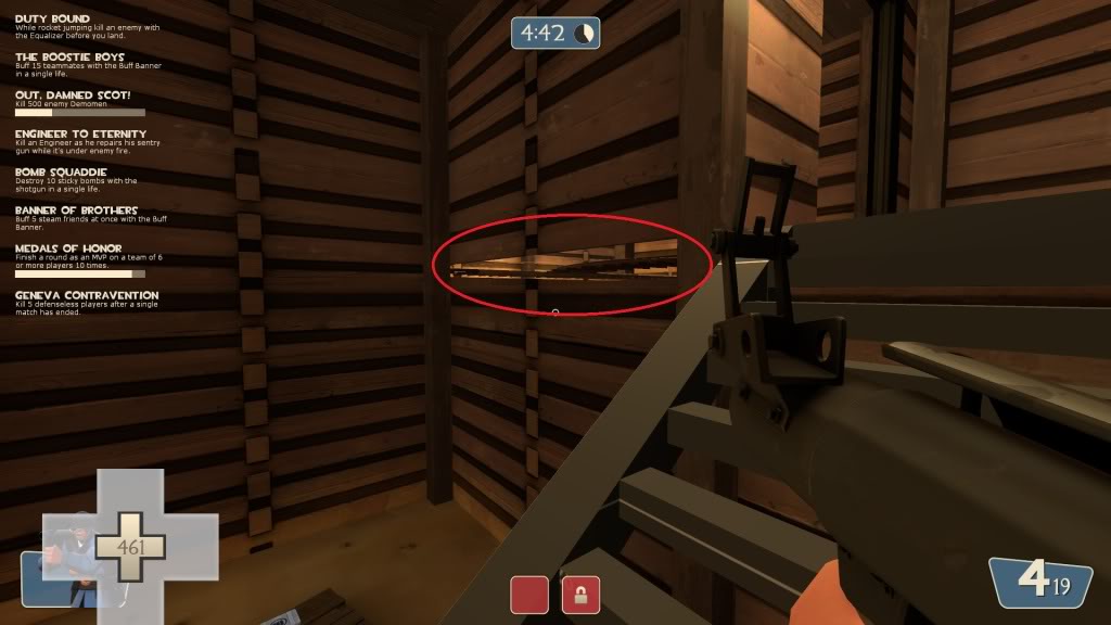
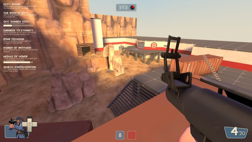
Can player's rocket jump up to this point (circled in red)? I tried and couldn't because the roof or something was blocking me (in blue). When I noclip'd up there all I found was a little room. It looks very enticing and will end up making player's aggravated that it's there but unaccessible.
The playerclipping is on purpose. I should make it more obvious that the ledge is out of bounds, I guess.
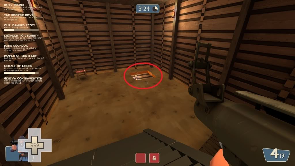
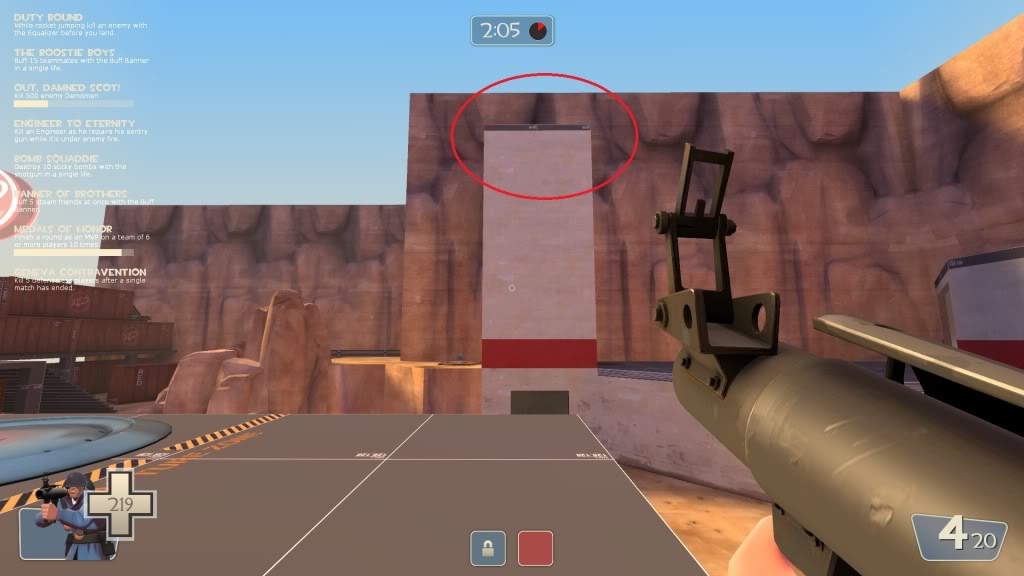
The large building here is also not accessible. Intentional? A two-sticky jump or a double rocket jump should get players up there.
Intentional. I'll probably stick a vent or something up there to more clearly mark it as out of bounds.
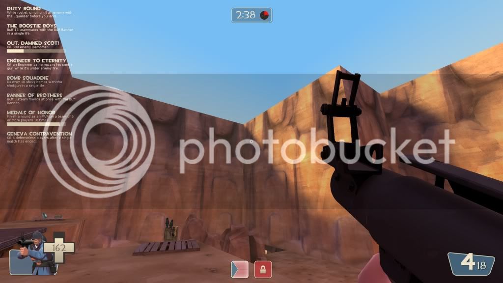
Things also still look a bit, eh?, sharp. Some corners would be nice.
I have almost no displacements in place yet, which are responsible for creating uneven ground, cliffs, etc. Again, those will go up as the layout becomes more finalized.
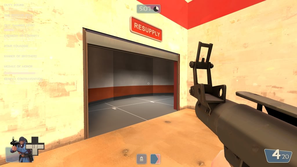
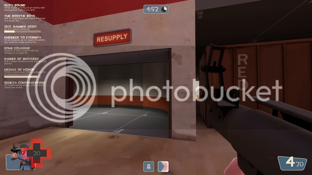
Also, both enemy spawn doors open to the opposing team. Oops!
Only those aren't the spawn doors. Head inside a bit more and you'll find the actual resupply room.
The ground is also very flat apart from the occasional dirt ramps. In the outside areas, some variable-level bumpmap grounds would be nice. This area also feels a bit to open and big. Just IMHO.
Again with no displacements. I guess I should start on those.

I agree that it's big, but it looked weird when I tried scaling it down considering the size of the props involved. I'm still trying to figure out a happy medium.
By the way, I do like how the second capture point leaves the defending team feeling a bit taunted that it's right there but they need to go around to get to it!
I like the idea of letting a player see something that they can't necessarily get to quickly. Not sure why.