KotH Rooftop Plaza

KotH KotH Rooftop Plaza b20

TheAppleJhon

L2: Junior Member
Oct 11, 2015
72
29
Gangwars - Grab your guns and most expensive hats and go paint the town red... literally!

This is my first map! Literally! The first map file i ever created...

Please give me some feedback, since i have much to learn!

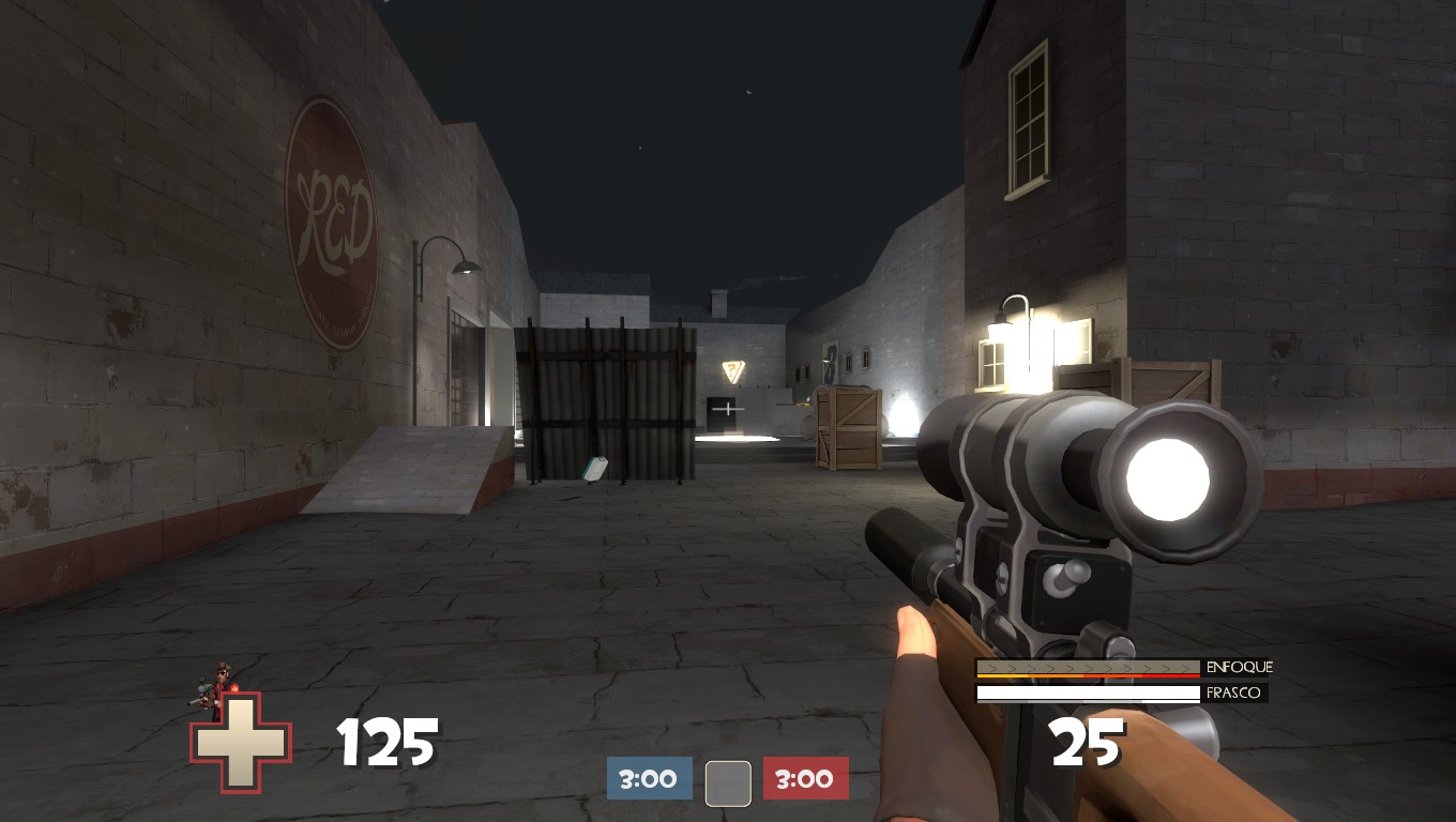
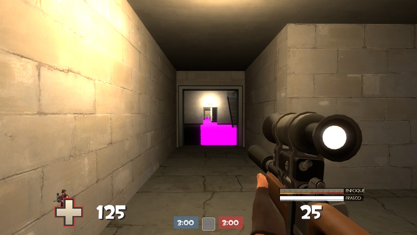
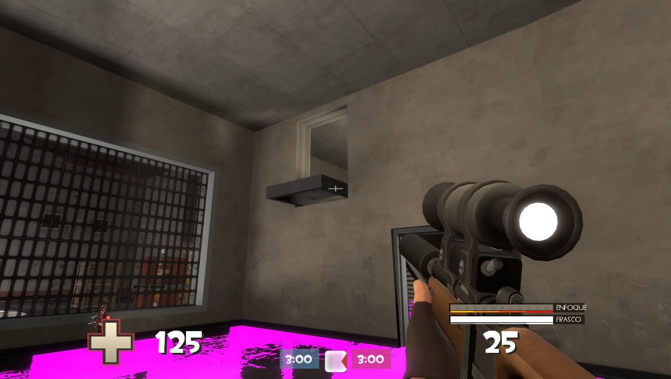
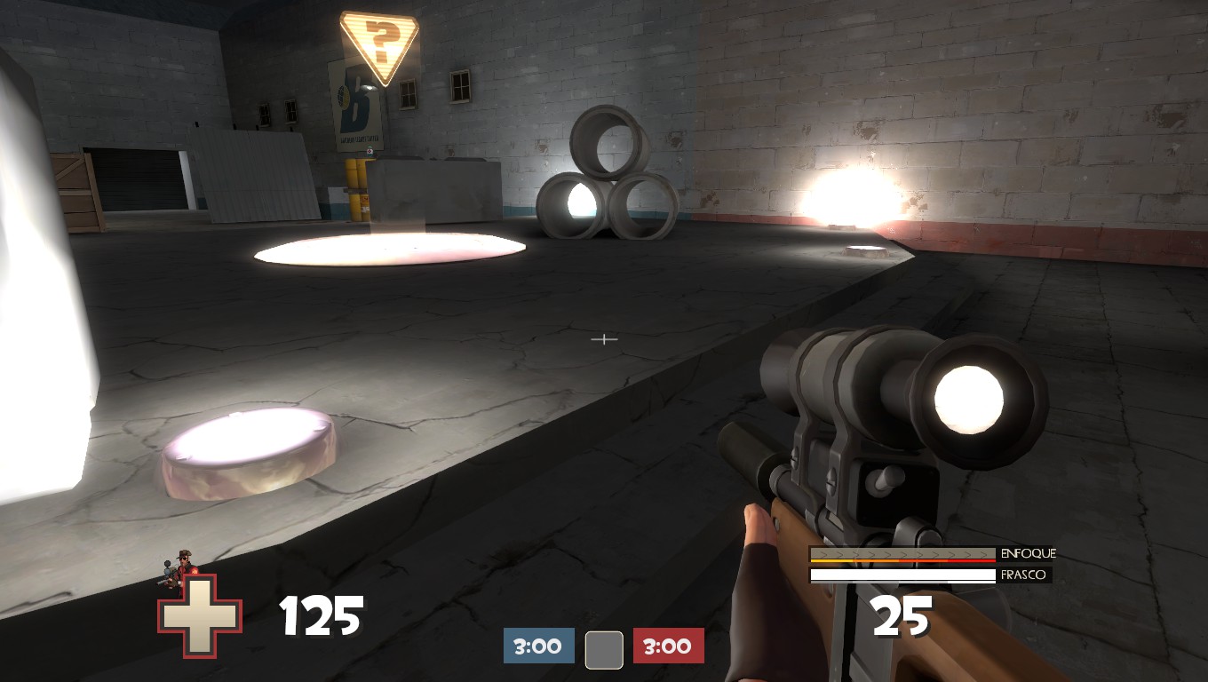
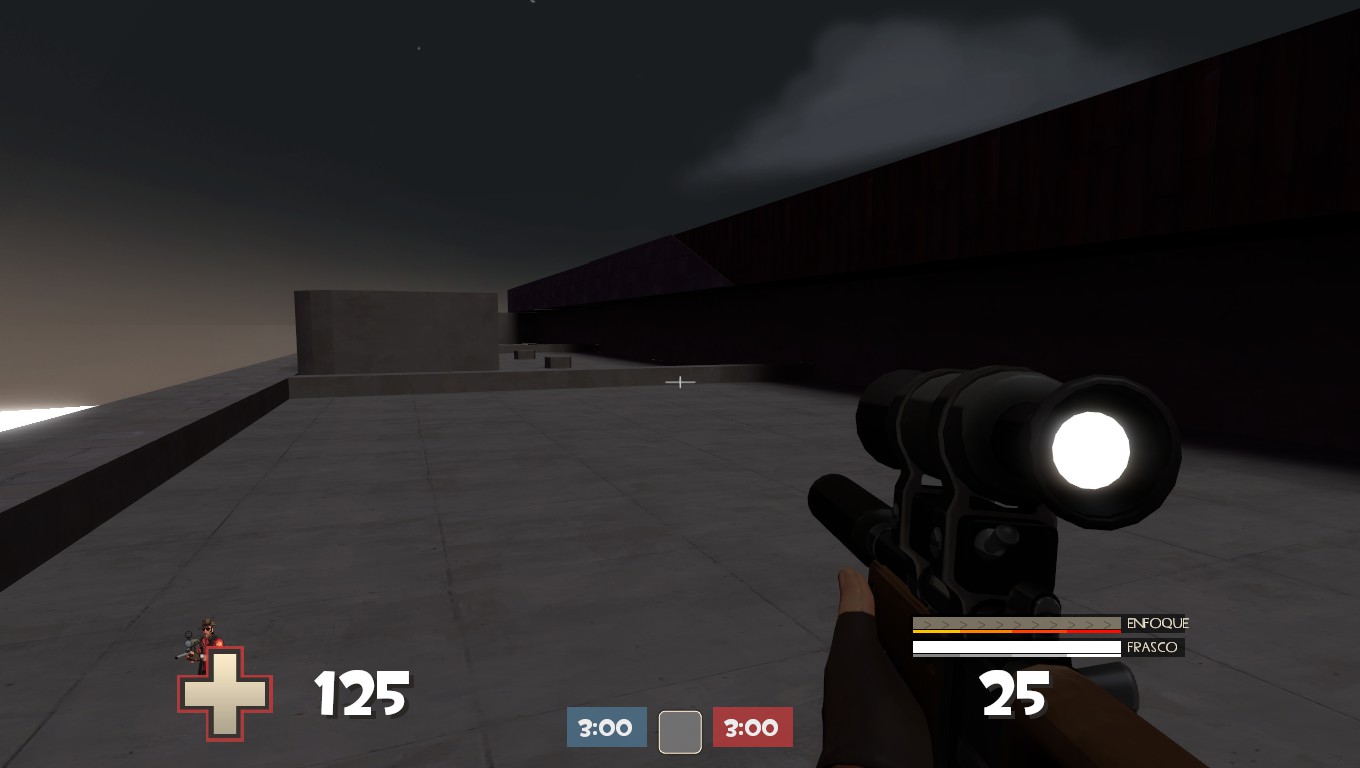
Here is some screenshots:

The next update will make it possible to fight on the roof too!
 

SnickerPuffs

(*single chuckle*)
aa
Apr 10, 2014
1,325
1,866
It's rather far in development.

Has this been tested on any servers?
 

The Siphon

L6: Sharp Member
Mar 2, 2015
278
190
This is really solid for a first map. I like the architecture of the buildings. But there are couple small problems that should be easy to fix.

First: When adding lights don't use the light entity named "func_light", because it shows light in all directions. That makes the light look unrealistic and also it will make the walls and anything next to it way too bright.
You should almost always use func_lightspot, because as the name says it makes a spotlight. This can also create really nice visual lighting.

Second: You should add a clip brush to stairs, because it will movement on the stairs much smoother and also it doesn't stop the player if he/she jumps on the stairs.

Also a little tip, you can remove the bright shining in models by creating cubemaps. Place couple cubemaps (couple outside and one in every room depending on the room size) and then compile the map and type these commands in console:

mat_specular 0
buildcubemaps
mat_specular 1
disconnect
sv_cheats 1
mat_reloadallmaterials
sv_cheats 0


CriminalBunny

Lasers are just deadly rainbows
aa
Oct 11, 2013
273
413
Hi AppleJhon! I've ran around your map and got this:

First is the lighting 'bugs' you mentioned. Gibus scout already told you how to fix them

The map feels rather flat. I hope when you add the roofs adds some height variation :)
Here's a guide on height variaton you should read over and over. Once isn't enough!

DzMaJnv.jpg

There's a big sightline between these 2 spawn exits. This is bad. Avoid this whenever you can

Ia98OOg.jpg

Here's the same issue. This one can be solved just by moving this exit more to the right or left.
Also, build cubemaps. I almost got blind inside that room :confused:

lW5Hi1M.jpg

I guess this platform is going to lead to the rooftops, as you said earlier, but at the moment feels out of place.

Tqi2s8o.jpg

The capture_area limits should be marked, so it's easier to tell where you start capping the point. Also sunken prop :O !

8V08CYU.jpg

I went noclip and got to the rooftop. You should connect it with the map ASAP.
But screwing around even further I found out something...

gWFNpRl.jpg

p6ZuG79.jpg

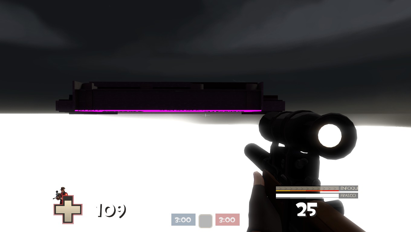
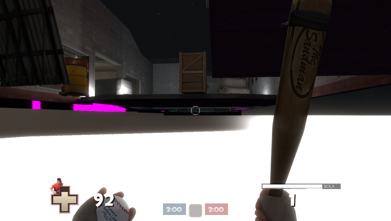
You made the skybox a big box surrounding the map, didn't you?
You shouldn't have done that

I can't explain it quite well, but here's a link on how to make skyboxes properly
Maybe another mapper with more knowledge on Optimization than me can explain better than I would :confused:

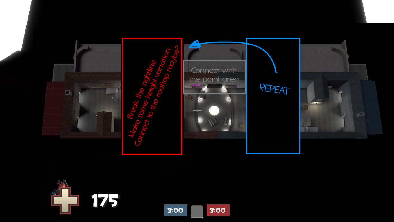
The map is really small. I know this is YOUR map but I think this layout tips will be useful for ye:
iEzuUpf.png


You should let detailing for last, focus on gameplay first and then get to detail. It should be simple enough to make ani big or small changes quicker and easier, and it prevents having to delete a fully detailed area because it doesn't play well. (I personally think this map fits better as an Alpha than a Beta, since it's for first map after all)

Overall, It's good for a first map! When you add the rooftop area, make sure it isn't apart from the cp area to ensure more action in it :)

EDIT: I put everything inside a spoiler so nobody murders their mouse wheel
 
Last edited:

radarhead

Basically? Kind of a Huge Mess
aa
Mar 6, 2013
1,044
627
To iterate on Gibus' tips on lighting:
The light entity is fine to use, provided it's not close to a wall. Use light_spot for light that are supposed to come from a specific source, or are close to any brush that you don't need lit with a huge bright spot, like a ceiling.

Also, I wanted to say that you've really got scaling down. First maps are tricky.
 

TheAppleJhon

L2: Junior Member
Oct 11, 2015
72
29
Hi AppleJhon! I've ran around your map and got this:

First is the lighting 'bugs' you mentioned. Gibus scout already told you how to fix them

The map feels rather flat. I hope when you add the roofs adds some height variation :)
Here's a guide on height variaton you should read over and over. Once isn't enough!

DzMaJnv.jpg

There's a big sightline between these 2 spawn exits. This is bad. Avoid this whenever you can

Ia98OOg.jpg

Here's the same issue. This one can be solved just by moving this exit more to the right or left.
Also, build cubemaps. I almost got blind inside that room :confused:

lW5Hi1M.jpg

I guess this platform is going to lead to the rooftops, as you said earlier, but at the moment feels out of place.

Tqi2s8o.jpg

The capture_area limits should be marked, so it's easier to tell where you start capping the point. Also sunken prop :O !

8V08CYU.jpg

I went noclip and got to the rooftop. You should connect it with the map ASAP.
But screwing around even further I found out something...

gWFNpRl.jpg

p6ZuG79.jpg

You made the skybox a big box surrounding the map, didn't you?
You shouldn't have done that

I can't explain it quite well, but here's a link on how to make skyboxes properly
Maybe another mapper with more knowledge on Optimization than me can explain better than I would :confused:

The map is really small. I know this is YOUR map but I think this layout tips will be useful for ye:
iEzuUpf.png


You should let detailing for last, focus on gameplay first and then get to detail. It should be simple enough to make ani big or small changes quicker and easier, and it prevents having to delete a fully detailed area because it doesn't play well. (I personally think this map fits better as an Alpha than a Beta, since it's for first map after all)

Overall, It's good for a first map! When you add the rooftop area, make sure it isn't apart from the cp area to ensure more action in it :)
Thanks for the detailed response! I think i have fixed the cubemap! Btw, the platforms there are not for the rooftop, but more for some height difference. i will fix the skybox when i have found out how i want the rooftops.
 

TheAppleJhon

L2: Junior Member
Oct 11, 2015
72
29
2015 13/10 Changelog:
  • Most lighting issues should be fixed now!
  • I have optimized the SHIT out of the map! (My current fps on the map on high settings is 300) I have basicly used the nodraw texture to increase performance by tons!
  • you can now walk on the roof! next update will include a spawn on the roof!
  • I have improved the lighting and improved the texture placements!
  • Better doors
  • fixed some spawncamping, so snipers want have such an easy time camping the spawn doors :)
  • Fixed the skybox!
  • improved prob placements and health and ammo kits!
  • The reflections are beautiful now
  • HDR shouldn't fuck up the lighting anymore!
That was a lot! Time for some sleep... It's 5am!

Here are some screenshots!

this the only way to get up on the roof on foot (for now!)

This is to prevent spawncamping...

just a nice view from the roof!


Read the rest of this update entry...
 

Zed

Certified Most Crunk™
aa
Aug 7, 2014
1,241
1,025
The name "Rooftop" is already used.
 

TheAppleJhon

L2: Junior Member
Oct 11, 2015
72
29
Changelog:
  • improved spawn rooms.
  • Added barriers on the roof (Gonna add some building or something, so the roof is more interesting).
  • Added more props
  • Added clipping on stairs, for a more smooth experience!
  • Added more lighting
  • Added dynamic lighting that changes color based who has capped the control point
  • Cooler textures that fit the theme better!
  • Fixed some issues, with brushes not aligning correctly wich gave some ugly holes in the walls.
  • added spectator cameras!
  • Improved lighting to look more natural
  • added bricks, and added a lot of details in the new spawn area
  • added cover around the capture point, so engies aren't so op!
  • Changed the name for the last time!
The map gets close and closer to being finished, so if you have some issues with the map, please tell me! Some feedback would be great!

Gonna make a trailer soon...!

Images:


Read the rest of this update entry...
 

TheAppleJhon

L2: Junior Member
Oct 11, 2015
72
29
Changelog:
  • Changed the capture area, to be 4 barriers with an outline clearly showing where you can cap!
  • Changed some things around and added a bit more clutter
  • improved some lighting and removed the dynamic lights that changed based on who capped (didnt fit the asthetics of the map)
  • a nav file is included with the download, for the people who have no friends to play with! Enjoy the bots...
  • fixed the issue with props not showing, by making props prop_dynamic, instead of prop_static.
  • added some more clipping for the players enjoyment...
I hope you enjoy the map! Don't be shy to give it a rating ;)

Read the rest of this update entry...
 

TheAppleJhon

L2: Junior Member
Oct 11, 2015
72
29
This update is huge!

I don't even know where to start! So just check it out, im pretty proud of it!

I have added an elevator, a lot of small paths and corridors, finalized layouts of all rooms and highly improved the roof. Fixed many issues. Made the roof actually look like a roof! Added a room, a new path from spawn and MUCH more!

There is also a secret hidden in the map! Can you find it?

Read the rest of this update entry...
 

Bunbun

aa
May 18, 2014
401
782
Your screenshots are hilarious! Those angles constantly make everything look big and dramatic!