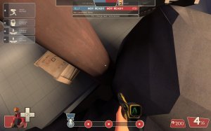
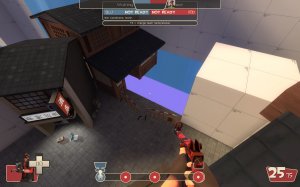
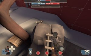
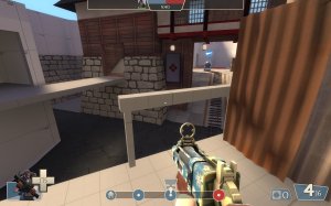
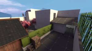
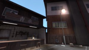
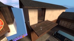
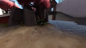
Here's some nitpicky feedback for ya after getting a chance to play in one of your map tests!

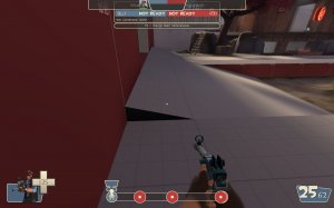
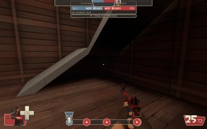
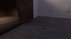
-clip it smooth

-clip it smooth

-clip it smooth

-clip it smooth

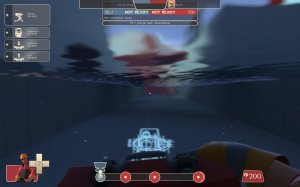
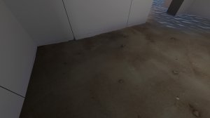
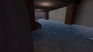
-this spot here at the drop down makes the sound of water even though it's so shallow I can't tell it's water. may want to raise or lower the ground depending upon what you're going for here

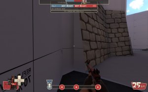
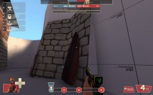
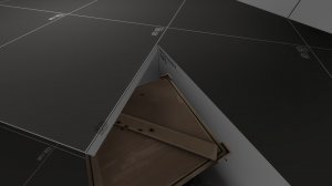
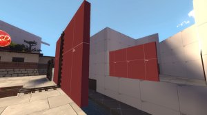
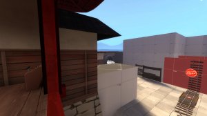
-wall could be thicker to hide this stick out bit of the model

-clip it smooth

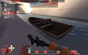
-you can still hide buildings in this water that can't be seen while outside of it. There's one in there now even though you can't tell. Might want to go for a clearer water texture

-clip it smooth

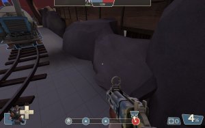
-while these rocks n such look nice, they can be very awkward to navigate around and on. Since this is used as a route into that building on the back right, something more substantial and easier to walk across would be ideal.

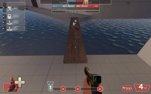
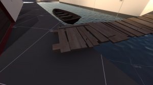
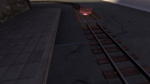
-clip the sides of this bridge smooth

-these lil props all have collision across the map. They are mostly in places where I wouldn't see it being a problem but this one by blu's first spawn I could see people getting caught up on

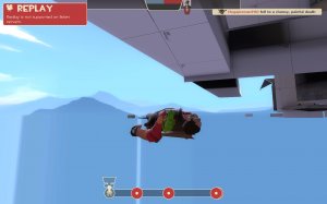
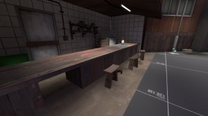
-Ok, so this is a bit weird. While playtesting this I was airblasting a uber med and soldier only for the soldier to fall off the cliff and the med get caught on some collision on that far corner of the bar. Whatever's there is completely invisible and I wasn't sure what was happening at first since it all looks open to the death pit

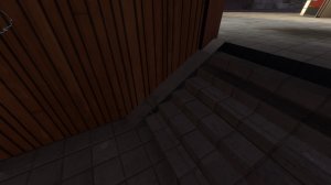
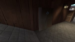
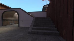
-what in the world is going on with the sides of these stairs? It's like a brush inside a brush or something

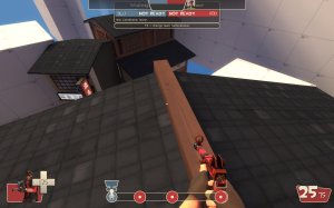
-the clipping here is kinda awkward since the roof is playspace while the rest isn't. Also you can fix that black prop with a light_info entity

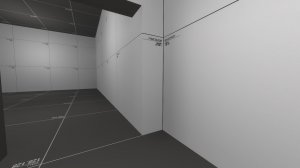
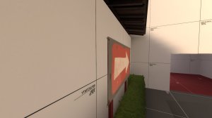
-obligatory seam feedback

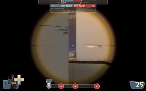
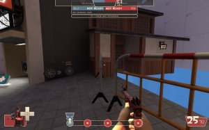
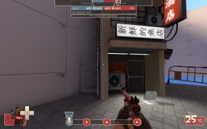
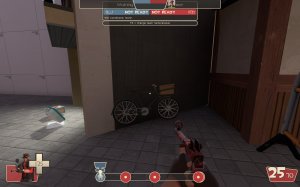
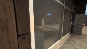
-something weird is going on with these windows and that bike prop. They don't seem to render in the correct order causing the prop to look normal even though it's behind glass. I think this may just be an issue with the prop itself with the only real option being to move it elsewhere. Also the back of the storefront prop doesn't have any kind of texture or anything so it can be seen through from this spot, but not from the other side

-shadow of gate going through wall

-clip it smooth

-the fact that this isn't a physics prop saddens me

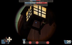
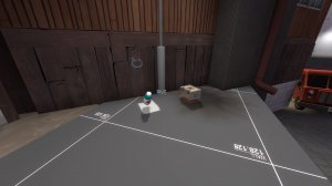
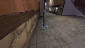
-with this lamp post having no collision, you can somewhat hide stickies in it and catch anyone going for the pickups off guard

-while dynamic brushes don't let stickies stick to them, dynamic props do. I imagine this would be done farther in development, but if have both sides of the bridge disable then a prop enable in the same spot once they are lowered, that should let players stick stuff to them when they are down

-its odd how chunky these stairs are as they seem to be the only ones in the map at this size

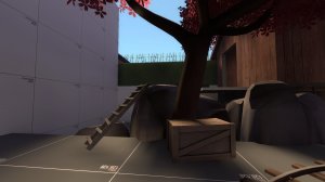
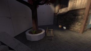
-while I like this bench, you can sorta get stuck and caught up between it and the tree. Might want to move it over to a wall so that can't happen


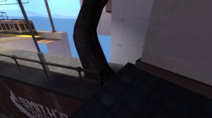
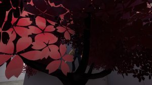
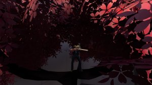
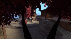
-Alright, so this is a bit what if scenerio here. IF a engie sentry jumps onto the roof near this tree by A they could set up a teleporter that would allow snipers to cheekily hide in this tree. While there are other trees in the map that players can get on, they are in more central areas where it should be easy enough to see them. This tree, however, is off in a corner and may let someone get some cheap headshots

-I don't like how the low blue roof here stops me from being able to jump to that platform

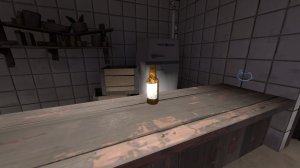
-it's easy to get caught up on these stools. Probably should push em up against the bar and clip em smooth

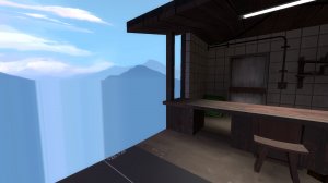
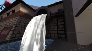
-I'm sort of split on this pipe. On one hand it gives a good explanation for why the water's there. On the other hand it jutting out like that is jarring compared to the surrounding themes and waterfalls in playspace can be kind of funky since players can hide in them. I think maybe push this pipe back into an oob area that's more industrialized so you still get the detailing without the awkwardness. Also the mercpark ladder you used here is MASSIVE. That prop is stupidly overscaled


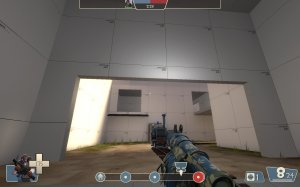
-why do all of these lamps lack collision? being able to just walk through a sizable prop like this is odd. I'd recommend reenabling collision and adding clipping so players don't get caught on it.

-From what I played of the map, blu team seemed to steam roll through D without much push back. While this could have been teams, I think it doesn't help that blu has so many entrances into the final area. red has to defend from the front, right, and upper left without much cover making it easy to outrange sentries as well as counter snipe.

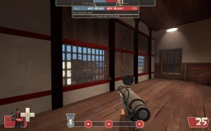
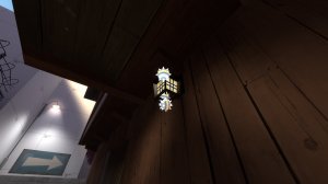
-you can have these windows uniformly lit with a info_lighting


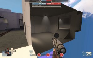
-while this sticking out bit at the top looks fine from the outside, it looks kind of strange from the inside. Construction like that was done to give upper floors more space than a bottom floor but since this is only 1 room without any upper floor, it just makes for an uneven wall

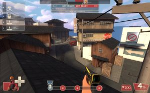
-from what I played of this map, I can't say I ever really saw anyone use this upper route. I think that may be due to how much you have to go out of the way to get onto the roof by the window. A more direct route such as a board leaning up to the overhang could help that

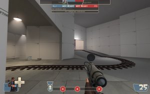
as a demo I can launch stickies and nades from here

-to here. Could lead to some frustrating spawn camping

-can hide lil buildings in this plant

-I wish blu had a more direct way onto the balcony at this building by A. The small prop jump path is awkward to navigate in a fight which easily lets red team hold it

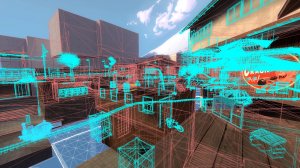
-I would really recommend doing some optimization soon since you've decided to start the art pass for this map already. Part of saving art passing for later in development is to save time on optimization but there's a good amount of stuff in the map already that renders when it can't be seen
That's all for now.


