- Sep 10, 2016
- 602
- 465
As you may have noticed, tf2maps.net proudly advertises five content packs at the bottom of the homepage.
These content packs each promise a distinct map theme, and the textures and models you need to create it.
In fact, one of these - the Swamp pack - was even bought by Valve and officially added to TF2 in 2010!
But it seems that people are really reluctant to make maps for these themes. For instance, you see a lot of people using the Frontline metal wall and trench wall textures, but not a lot of people making specifically Frontline-themed maps. Why is that? Is it because these content packs are past their prime and all the buzz has died down? I'm not so sure about that.
So let's dive into:
You'll find that the other popular Frontline assets (generator, trees, hedges, awnings, storefront, concrete barriers) all also meet these three criteria.
But there's actually more to making a good content pack than just making good assets.
I find that one of the major reasons that custom props go unused is because they aren't providing a gameplay purpose that wasn't possible with the base-game assets.
As such, you get this problem where even if your pack is capable of creating a unique and amazing rendition of your theme, you really can't account for the skill level of the people who are using it, because we are in fact a community of hobbyists.
So, your theme ends up being known for all the people who build a map with boring gameplay and then slap a few of your assets into it, because your assets don't actually encourage unique and interesting gameplay - they're only a useful tool that, if used right, can create interesting gameplay.
To avoid this, what you could try doing is:
The second approach might work well for the mapping style of the particular mapper who the assets have been built for, but it might cause frustration for other mappers who don't use the same distances. It's also a slippery slope to making props that require very specific brushwork built around them, which is a fast way to create a prop that no one will use. It also constrains the amount of creative spins on the theme people can create, since you're building all your assets for one person's vision of the theme, and probably to fit one skybox and set of lighting conditions.
What I'm proposing is a new, third approach:
Firstly, scan a number of promising alpha maps, keeping your theme in mind.
What you're looking for is a map where the only way to explain the gameplay the mapper built is by artpassing the map with your theme.
That way, you know that if a future mapper builds gameplay similar to this, they'll want to use your theme pack instead of base-game assets or a different theme pack.
Putting the cart before the horse like this is also kind of a loophole - your assets will inherently be useful outside of maps with your specific theme, since anyone who builds this specific kind of gameplay will want to use your assets, regardless of whether or not they set out to make a map with your theme.
Now, pick one of the maps you found and ask yourself "What would I do if I had to artpass this map with my theme?"
Since your assets don't exist yet, you should get as far as possible with the base-game assets. (Don't decompile the map, this is just a thought experiment!)
This will prevent you from creating assets which are made redundant by base-game assets.
Once you've done that, make a list of everything that wouldn't be possible to artpass to the standard you want with base-game assets, and put it in a "potential assets" document. Then, go to the next map and repeat.
This is all a bit vague, so let's try it with a couple of recent alphas and the Space/Moonbase theme.
And there you go! By doing this, we end up with a much smaller, but more effective list of props - it's almost difficult to use any of these props without forming a unique and interesting gameplay space around them.
The texture suggestions and 3d sky planet props also feed into gameplay somewhat, since the space skybox and 3dsky planets can be used to create a space map that still has normal gravity and death pits as a falling hazard, and the light strip... well, that's kind of just a light strip.
It is totally fine to make assets that are just there to look cool - just as long as they're not too similar to base-game assets.
Firstly, you have to have a strong visual idea. This comes even before you select maps to draw gameplay ideas from. Ideally, we would have concept art, but Valve's concept artists are busy with their real jobs, so we can't ask them.
So, what people choose to do instead is build a moodboard of reference images from other media or real life. This is great and all, but the problem is that other media, real life and TF2 tend to not inherently be compatible. For instance, I see a lot of people these days making office spaces, and lovingly furnishing them with authentic shiny wood walls, and objects that would be plausible to see in a 1960s office.
But the thing is that not everything that's 1960s is inherently TF2. TF2 as of 2007, and most importantly as of Valve's concept art, focuses around a bunch of dusty, dirty industrial buildings. This is true of the deserts of 2007, the alpine lumberyard of 2008 and the snowy viaduct of 2009. Conversely, even the fully industrial foundry of 2012 still has its dust and dirt, its paint, stains and grime on its textures.
Now, you don't have to specifically imitate industrial areas - that would be boring. But you have to remember that TF2 focuses around almost cartoonish ridiculousness. You don't have to put your buildings on stilts, but rejecting an idea because it makes it hard to build the space in a realistic way is just not using TF2's design toolkit to its fullest potential. For instance, electrical boxes and crates would look pretty out of place in a real office, but in TF2's universe, would anyone bat an eyelid to see them there?
It's also important to keep a strong colour palette and the right amount of colour contrast in mind. I see too many themes fail to get off the ground visually because their scenes are all effectively a single colour. Conversely, a theme can have too much colour contrast, and just give every building a different colour of plaster wall to produce a result that really isn't visually appealing.
Typical TF2 maps will strike a good middle ground by having really intense colours, but a low raw number of colours.
Here's Dustbowl as an example:
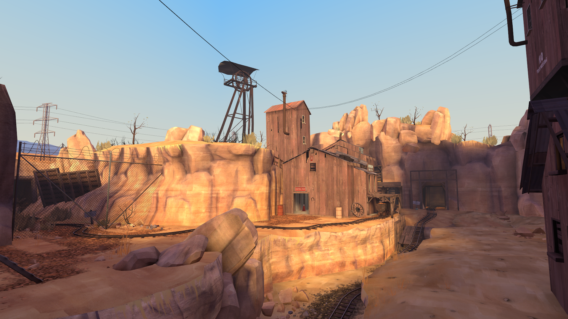
The sunlight is quite intensely orange, and the surfaces do nothing to reduce that, being all yellow or brown. However, all this is contrasted with the strong blue of the sky, creating one of the most simple yet effective two-tone aesthetics possible: blue and orange.
Many custom themes fail to preserve this, either by failing to create enough contrast with the blue sky, or by using a sky which isn't blue and ends up having a colour too similar to the sunlight, again ending up with not enough contrast.
It's important to note that blue and orange isn't the only "strong colours but few colours" aesthetic that TF2's capable of. For instance, my favourite map, Gravel Pit, has a grey sky. So how can it have contrast?
Simple. The sunlight is REALLY brightly orange-yellow, and the shadows are REALLY blue:
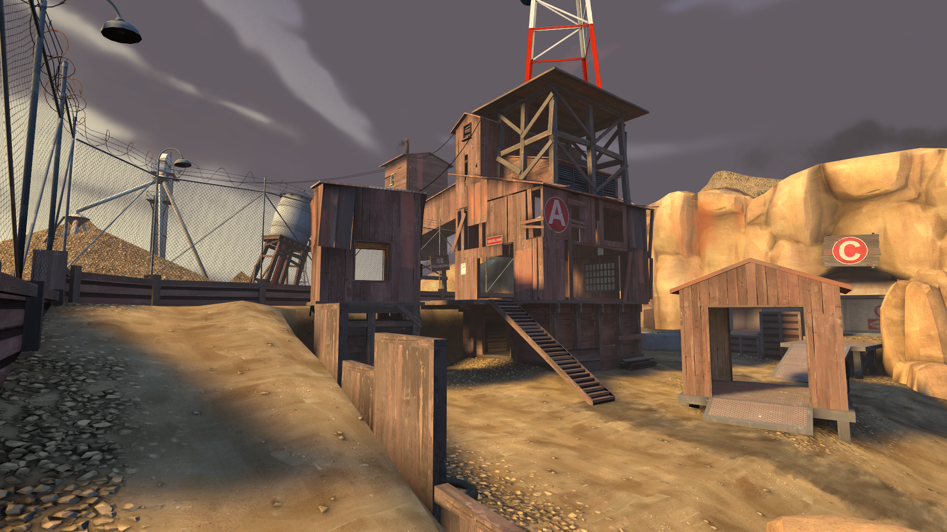
The sunlight and shadows contrast strongly both against each other and the sky. The slight purplish tint of the sky helps it contrast against the sunlight, which is tinted more towards yellow than orange.
So, no matter what skybox and lighting conditions you're going for, you have to remember to have a strong colour palette.
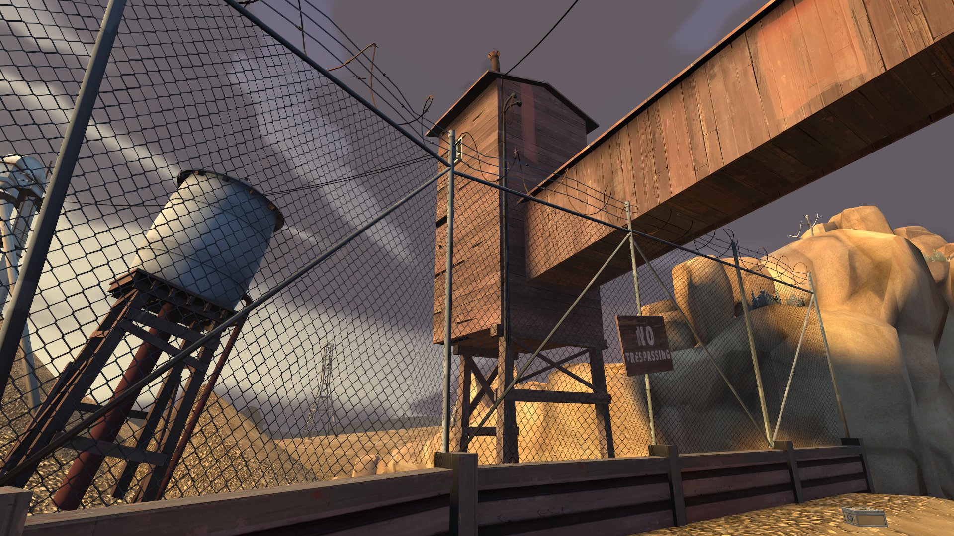
I'll leave off with one final shot of Gravel Pit that I think demonstrates the most fundamentally important aspect of crafting a TF2 theme - the need for every scene to feel like a painting.
These content packs each promise a distinct map theme, and the textures and models you need to create it.
In fact, one of these - the Swamp pack - was even bought by Valve and officially added to TF2 in 2010!
But it seems that people are really reluctant to make maps for these themes. For instance, you see a lot of people using the Frontline metal wall and trench wall textures, but not a lot of people making specifically Frontline-themed maps. Why is that? Is it because these content packs are past their prime and all the buzz has died down? I'm not so sure about that.
So let's dive into:
Section 1: What makes a good custom asset?
I won't spend much time on this section since it's mostly known info to asset creators, but there are a few common trends between assets you see commonly used:- Assets that are still useful outside the theme they were built for (Frontline metal wall, Frontline trench wall, Swamp rocks and shrubs
- Props that substitute commonly-used brush lengths (walls with 128/256 width and height) or have well-placed origins (look at the base-game mining rock props and coalmines window props)
- Assets that do something that's not possible to do with brushes or base-game models (Japan pack roofs)
You'll find that the other popular Frontline assets (generator, trees, hedges, awnings, storefront, concrete barriers) all also meet these three criteria.
But there's actually more to making a good content pack than just making good assets.
I find that one of the major reasons that custom props go unused is because they aren't providing a gameplay purpose that wasn't possible with the base-game assets.
As such, you get this problem where even if your pack is capable of creating a unique and amazing rendition of your theme, you really can't account for the skill level of the people who are using it, because we are in fact a community of hobbyists.
So, your theme ends up being known for all the people who build a map with boring gameplay and then slap a few of your assets into it, because your assets don't actually encourage unique and interesting gameplay - they're only a useful tool that, if used right, can create interesting gameplay.
To avoid this, what you could try doing is:
Section 2: Plan the pack differently
Conventional content packs will do one of two things:- Make the pack first, then try to get people to make maps for the theme it encourages
- Make the pack as a set of assets tailor-made to fit a single map that's going for a particular theme
The second approach might work well for the mapping style of the particular mapper who the assets have been built for, but it might cause frustration for other mappers who don't use the same distances. It's also a slippery slope to making props that require very specific brushwork built around them, which is a fast way to create a prop that no one will use. It also constrains the amount of creative spins on the theme people can create, since you're building all your assets for one person's vision of the theme, and probably to fit one skybox and set of lighting conditions.
What I'm proposing is a new, third approach:
Firstly, scan a number of promising alpha maps, keeping your theme in mind.
What you're looking for is a map where the only way to explain the gameplay the mapper built is by artpassing the map with your theme.
That way, you know that if a future mapper builds gameplay similar to this, they'll want to use your theme pack instead of base-game assets or a different theme pack.
Putting the cart before the horse like this is also kind of a loophole - your assets will inherently be useful outside of maps with your specific theme, since anyone who builds this specific kind of gameplay will want to use your assets, regardless of whether or not they set out to make a map with your theme.
Now, pick one of the maps you found and ask yourself "What would I do if I had to artpass this map with my theme?"
Since your assets don't exist yet, you should get as far as possible with the base-game assets. (Don't decompile the map, this is just a thought experiment!)
This will prevent you from creating assets which are made redundant by base-game assets.
Once you've done that, make a list of everything that wouldn't be possible to artpass to the standard you want with base-game assets, and put it in a "potential assets" document. Then, go to the next map and repeat.
This is all a bit vague, so let's try it with a couple of recent alphas and the Space/Moonbase theme.
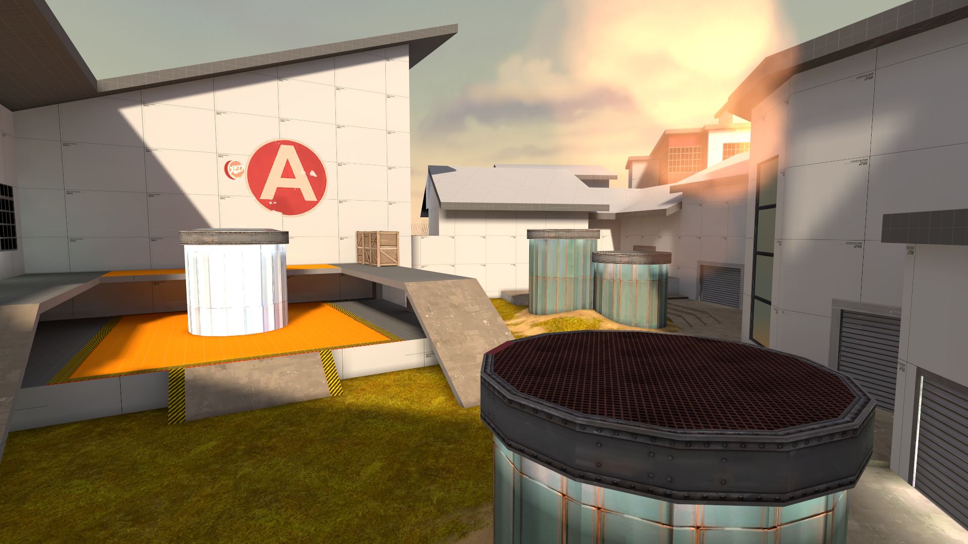
Immediately we can see a very symmetrical and angular design which would be very easy to translate into a space-base theme.
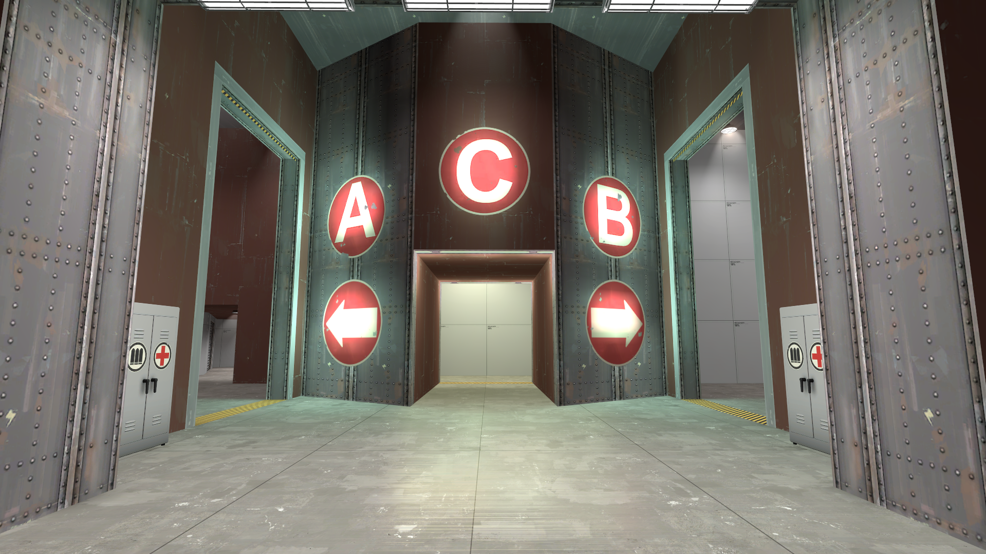
All of these circular structures are perfect, since rounded or beveled edges are a common space-base trope.
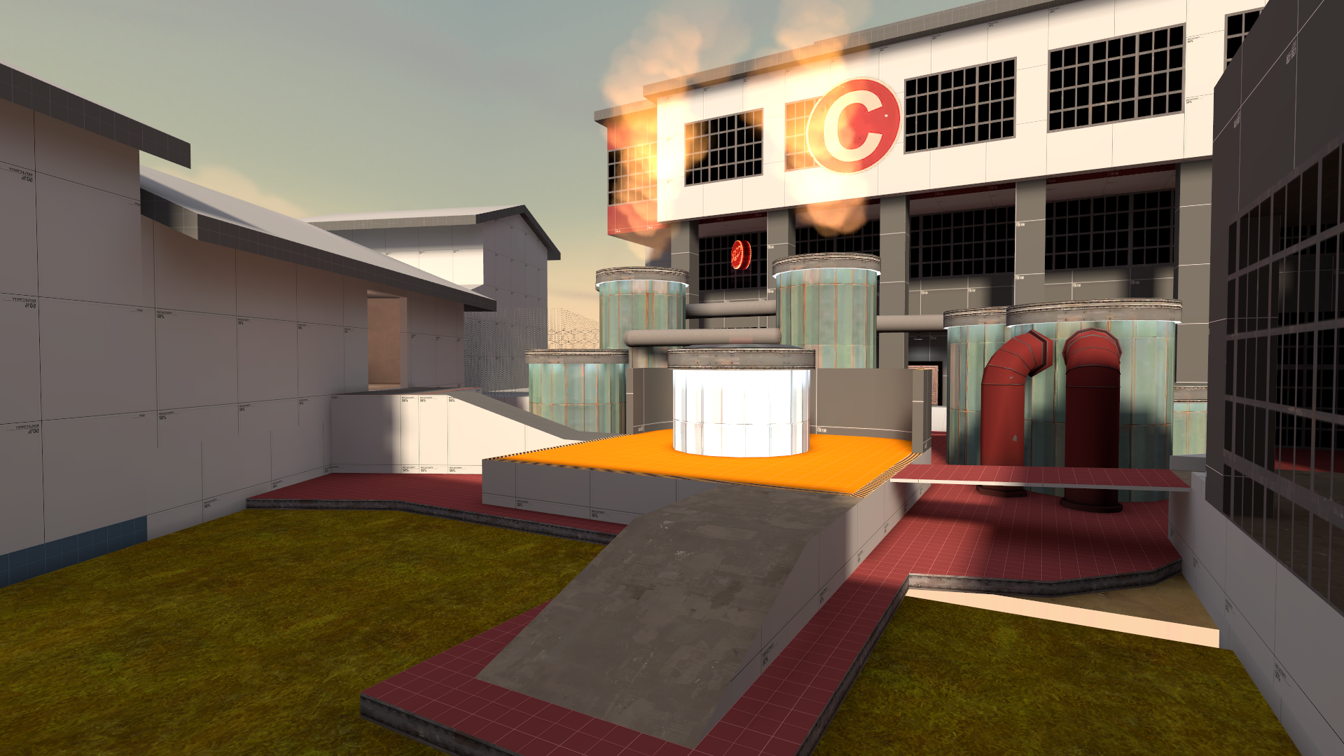
These open courtyards with very low-to-the-ground structures are also perfect, since pipes running along the moon/planet surface are common in space-base concept art and could easily be imitated here.
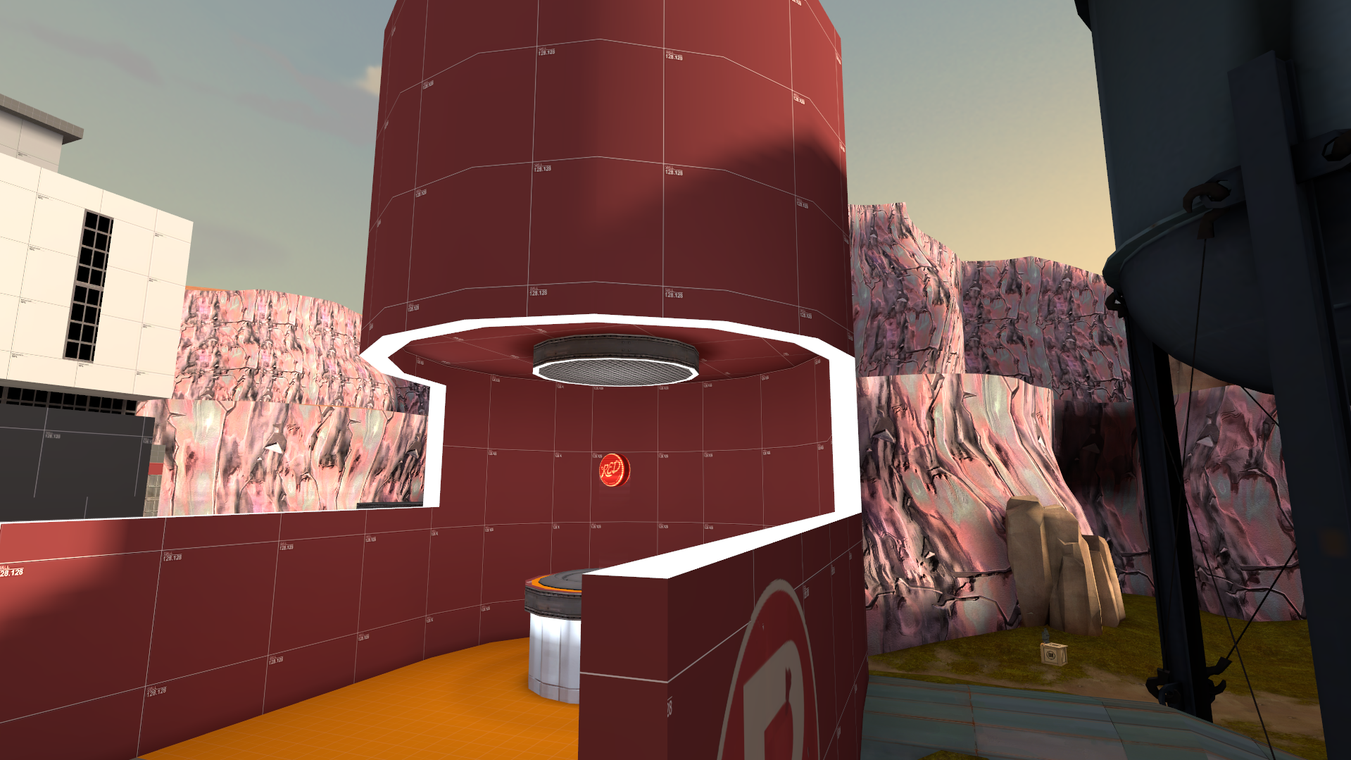
This area combines a number of these ideas - there are pipes running along the ground, a small circular structure contained within a much larger one is great, and the white trim highlights how amazingly useful a generic "light strip" texture could be.
Current "potential assets" list:
All of these circular structures are perfect, since rounded or beveled edges are a common space-base trope.
These open courtyards with very low-to-the-ground structures are also perfect, since pipes running along the moon/planet surface are common in space-base concept art and could easily be imitated here.
This area combines a number of these ideas - there are pipes running along the ground, a small circular structure contained within a much larger one is great, and the white trim highlights how amazingly useful a generic "light strip" texture could be.
Current "potential assets" list:
- Circular wall pieces (256 radius, 32 width, lots of grates and internal pipes/wiring)
- 128x128, 256-tall cylinder prop; perhaps more than one (RED and BLU skins?)
- Light strip texture for edges and trims
- Wall details (numbers, vents, windows)
- Pipes
- Various angular shapes (brushwork)
- Spherical storage tanks
This BLU spawn looks very like some kind of starship. Maybe there could be a "starship spawn room prop", except rebuilt to act as more of an effective spawn room (e.g. with two side doors that go to catwalks on the sides of the hull so that the rotate time is shorter for players exiting spawn than prospective spawncampers)
Additionally, a space skybox with a planet in the bottom texture (or a generic space skybox + a few planet props to stick in the 3d skybox) would be really useful for maps like this, where getting sucked out into space would be a hazard.
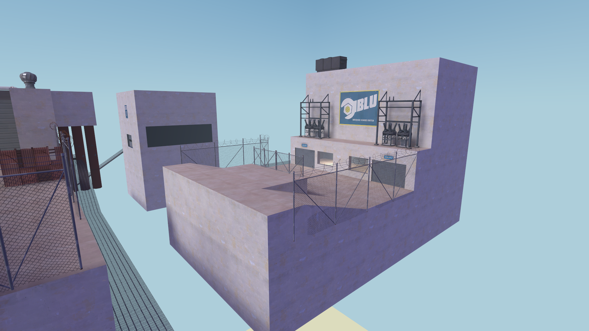
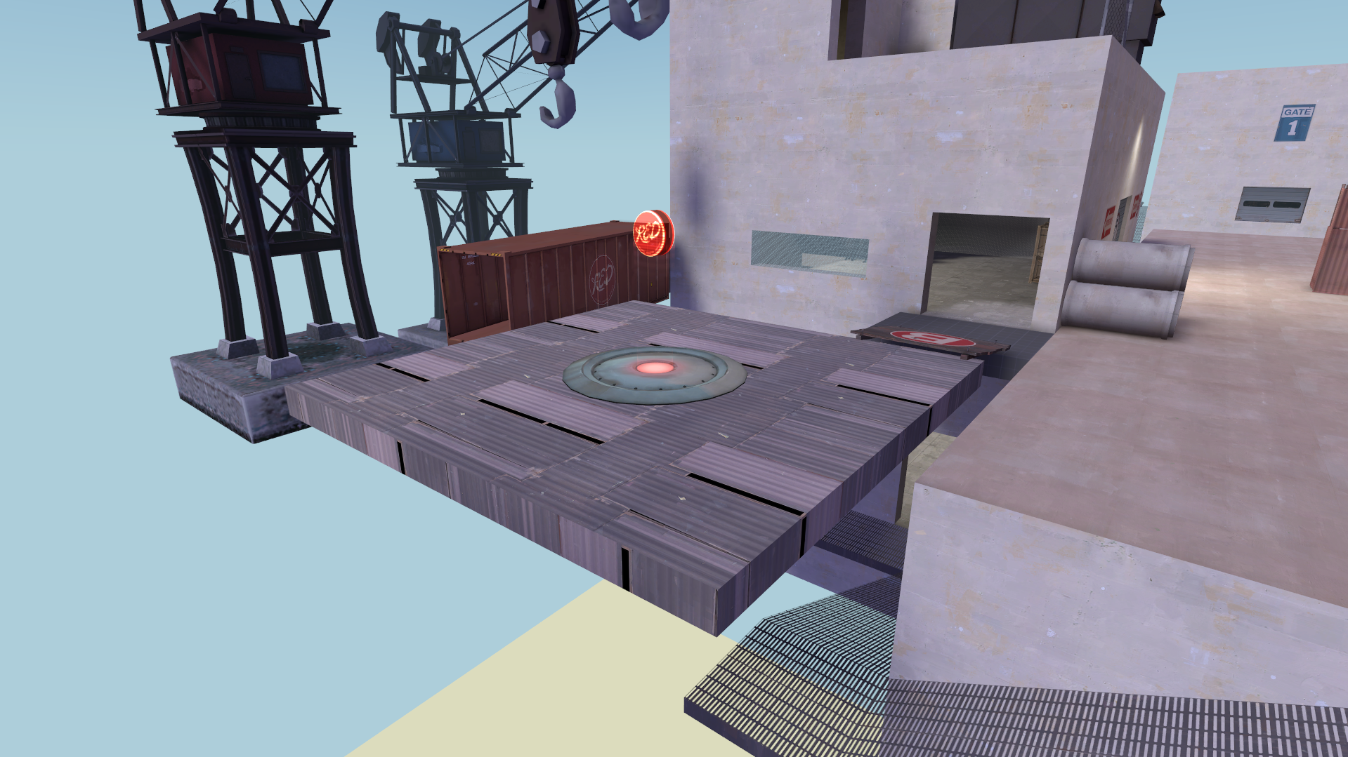
A generic 512x512 or 1024x1024 "floating platform" prop with some kind of stabiliser machine under it could be very helpful to mappers who want to build underneath a platform without having to build supports - the stabiliser on its own could also be useful for mappers to place under floating brushwork platforms
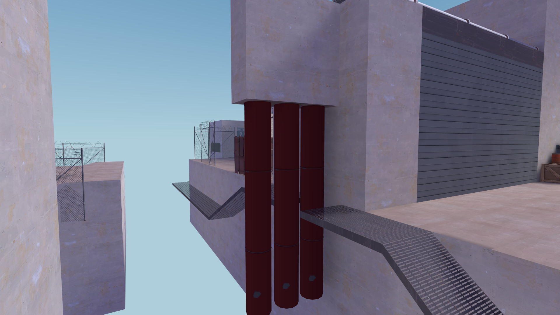
A particularly tall stabiliser machine could be useful as cover in situations like this.
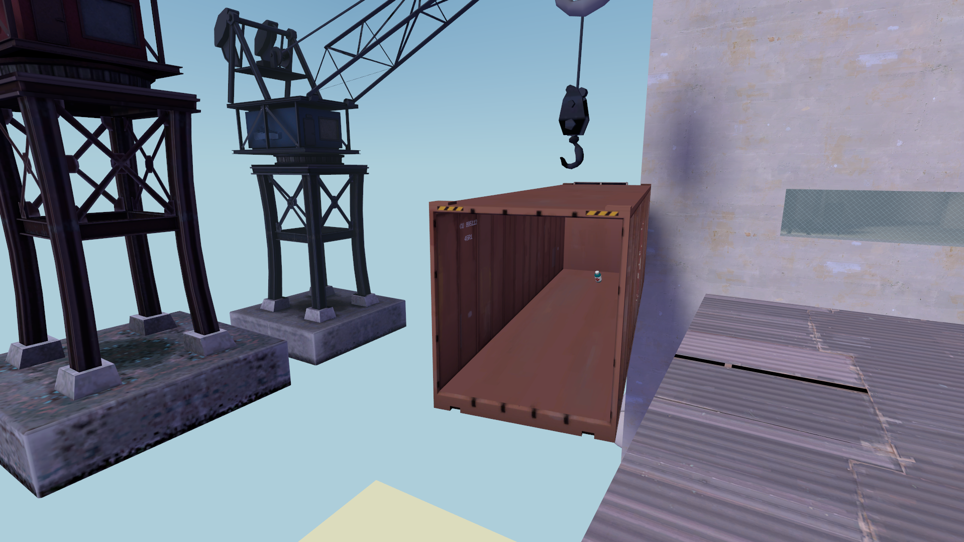
This shipping container with the health pack in it could be replaced with some kind of escape shuttle, which could act as both a cover prop and a nice little health cubby, similar to a gravelpit shack.
Current "potential assets" list:
Additionally, a space skybox with a planet in the bottom texture (or a generic space skybox + a few planet props to stick in the 3d skybox) would be really useful for maps like this, where getting sucked out into space would be a hazard.
A generic 512x512 or 1024x1024 "floating platform" prop with some kind of stabiliser machine under it could be very helpful to mappers who want to build underneath a platform without having to build supports - the stabiliser on its own could also be useful for mappers to place under floating brushwork platforms
A particularly tall stabiliser machine could be useful as cover in situations like this.
This shipping container with the health pack in it could be replaced with some kind of escape shuttle, which could act as both a cover prop and a nice little health cubby, similar to a gravelpit shack.
Current "potential assets" list:
- Circular wall pieces (256 radius, 32 width, lots of grates and internal pipes/wiring)
- 128x128, 256-tall cylinder prop; perhaps more than one (RED and BLU skins?)
- Light strip texture for edges and trims
- Starship spawnroom prop
- Escape shuttle prop
- Floating platform / stabliser machine prop
- Space sky texture
- Planet props for 3d skybox
- Wall details (numbers, vents, windows)
- Pipes
- Various angular shapes (brushwork)
- Spherical storage tanks
This sort of machine with three cylindrical storage tanks and a catwalk along the top would be great to turn into a prop, especially if the catwalk was also mirrored onto the other side like so
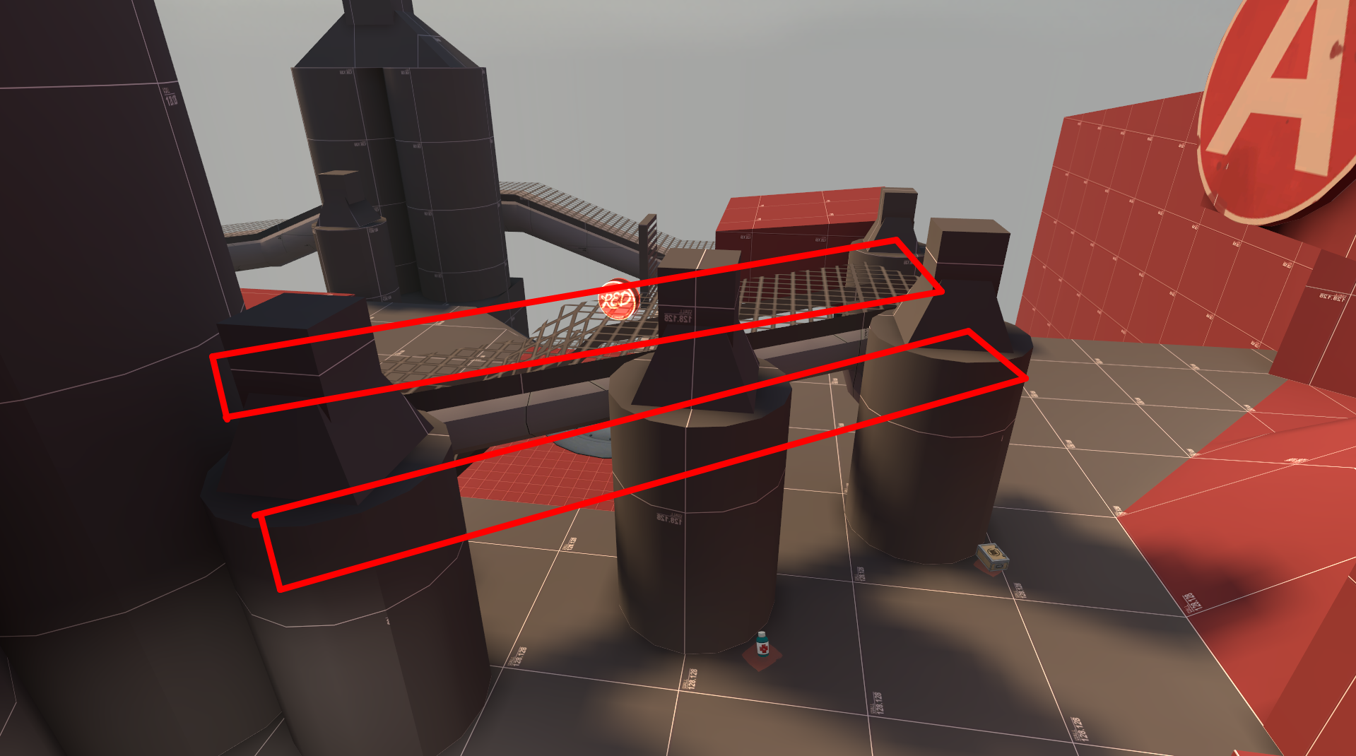
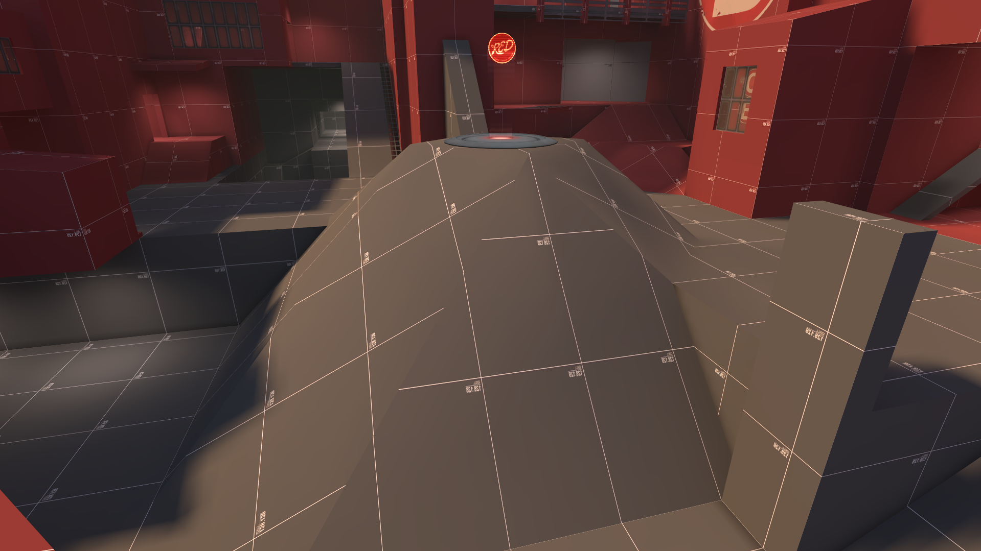
A gigantic mound of space rock or crashed meteorite would be an amazing prop for this area.
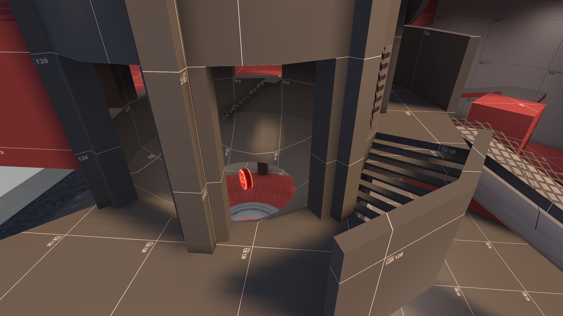
A set of circular catwalks and stairs to go around our circular wall pieces would be amazing - also, this bowl shape with the hole cut out of it would be useful in so many situations.
Current "potential assets" list:
A gigantic mound of space rock or crashed meteorite would be an amazing prop for this area.
A set of circular catwalks and stairs to go around our circular wall pieces would be amazing - also, this bowl shape with the hole cut out of it would be useful in so many situations.
Current "potential assets" list:
- Circular wall pieces (256 radius, 32 width, lots of grates and internal pipes/wiring)
- 128x128, 256-tall cylinder prop; perhaps more than one (RED and BLU skins?)
- Light strip texture for edges and trims
- Starship spawnroom prop
- Escape shuttle prop
- Floating platform / stabliser machine prop
- Space sky texture
- Planet props for 3d skybox
- Triple-tank + catwalk cover prop
- Circular catwalks and stairs to fit with the circular wall pieces
- Version of the circular wall piece with a tall window that can be shot through cut out of it
- Bowl with a hole cut in the bottom (could be made of glass and braced with metal to cast interesting shadows)
- Wall details (numbers, vents, windows)
- Pipes
- Various angular shapes (brushwork)
- Spherical storage tanks
The texture suggestions and 3d sky planet props also feed into gameplay somewhat, since the space skybox and 3dsky planets can be used to create a space map that still has normal gravity and death pits as a falling hazard, and the light strip... well, that's kind of just a light strip.
It is totally fine to make assets that are just there to look cool - just as long as they're not too similar to base-game assets.
Section 3: Remember your Roots
The final step to creating a good content pack is ensuring the quality of the theme itself.Firstly, you have to have a strong visual idea. This comes even before you select maps to draw gameplay ideas from. Ideally, we would have concept art, but Valve's concept artists are busy with their real jobs, so we can't ask them.
So, what people choose to do instead is build a moodboard of reference images from other media or real life. This is great and all, but the problem is that other media, real life and TF2 tend to not inherently be compatible. For instance, I see a lot of people these days making office spaces, and lovingly furnishing them with authentic shiny wood walls, and objects that would be plausible to see in a 1960s office.
But the thing is that not everything that's 1960s is inherently TF2. TF2 as of 2007, and most importantly as of Valve's concept art, focuses around a bunch of dusty, dirty industrial buildings. This is true of the deserts of 2007, the alpine lumberyard of 2008 and the snowy viaduct of 2009. Conversely, even the fully industrial foundry of 2012 still has its dust and dirt, its paint, stains and grime on its textures.
Now, you don't have to specifically imitate industrial areas - that would be boring. But you have to remember that TF2 focuses around almost cartoonish ridiculousness. You don't have to put your buildings on stilts, but rejecting an idea because it makes it hard to build the space in a realistic way is just not using TF2's design toolkit to its fullest potential. For instance, electrical boxes and crates would look pretty out of place in a real office, but in TF2's universe, would anyone bat an eyelid to see them there?
It's also important to keep a strong colour palette and the right amount of colour contrast in mind. I see too many themes fail to get off the ground visually because their scenes are all effectively a single colour. Conversely, a theme can have too much colour contrast, and just give every building a different colour of plaster wall to produce a result that really isn't visually appealing.
Typical TF2 maps will strike a good middle ground by having really intense colours, but a low raw number of colours.
Here's Dustbowl as an example:
The sunlight is quite intensely orange, and the surfaces do nothing to reduce that, being all yellow or brown. However, all this is contrasted with the strong blue of the sky, creating one of the most simple yet effective two-tone aesthetics possible: blue and orange.
Many custom themes fail to preserve this, either by failing to create enough contrast with the blue sky, or by using a sky which isn't blue and ends up having a colour too similar to the sunlight, again ending up with not enough contrast.
It's important to note that blue and orange isn't the only "strong colours but few colours" aesthetic that TF2's capable of. For instance, my favourite map, Gravel Pit, has a grey sky. So how can it have contrast?
Simple. The sunlight is REALLY brightly orange-yellow, and the shadows are REALLY blue:
The sunlight and shadows contrast strongly both against each other and the sky. The slight purplish tint of the sky helps it contrast against the sunlight, which is tinted more towards yellow than orange.
So, no matter what skybox and lighting conditions you're going for, you have to remember to have a strong colour palette.
I'll leave off with one final shot of Gravel Pit that I think demonstrates the most fundamentally important aspect of crafting a TF2 theme - the need for every scene to feel like a painting.
Last edited:


