[Guide] Details: how VALVe do it

YM

LVL100 YM
aa
Dec 5, 2007
7,158
6,079
Details: How valve do it
Part 3: Dustbowl

(Tips and tricks used by the pros)

cpdustbowl0058rj8.jpg

Windows - Valve's buildings are full of them, they're a really easy way to add extra detail into your map. You don't even have to make them open, half the windows in this screenshot are boarded up and a further two are almost boarded up, leaving only one that can actually be fired though, and even then it's a very good shot to go though and hit anyone since you pretty much have to use a nade...

cpdustbowl0056ho3.jpg

Pits - this tunnel is quite claustrophobic, especially with those crates at the end, but you can make your tight corridors and tunnels feel less so by adding inacessable but visible areas beyond the limits of the corridor. In this pit it was too dark to have any real effect so valve put a very dim light (one of only four 'light' entities in the entire of dustbowl) halfway down to fake a bit of ambient light.

cpdustbowl0053hc2.jpg

Another similar use for the inacessable areas, this one doesn't make the area feel larger, or add significant detail (be honest, how often do you look up in this bit??) but what it does add is lighting, you can see how bright the light is in the smaller image, that light shines though the gaps in the wood to below.

cpdustbowl0055xj6.jpg

Grass decals and grass props - These are a great way to add details to the lower half of walls, the grass models are only a few polies each so don't add much to the workload - great!

cpdustbowl0052wu2.jpg

Roof details - so many people's rooftops are bland and undetailed. Its very easy to make your roof areas more interesting, beams, a couple pipes, vents, chimneys, etc..

cpdustbowl0059yd7.jpg

Guttering! no one uses the gutter props in their maps, its such a mind-blowingly easy way to add simple detail to an otherwise bland patch.

cpdustbowl0051ho2.jpg

Buildings like this tall one are great, you can see both sides of it from different parts of the map cutting down the ammount you have to make. Also, the tall buildings like this just look really cool too..
 
Last edited:

UKCS-Alias

Mann vs Machine... or... Mapper vs Meta?
aa
Sep 8, 2008
1,264
817
Another detail that valve uses alot is a bright light source inside behind a door. that way the border of the door is easily seperated. just look at the 2nd, 4th and last (left part) screen of youmes post above. And of course, when you make the border detailed with it the effect can be very good looking.

Another detail is that below any health or ammo pack in the map they have placed a patch overlay. Its just another tiny detail. Further it has the function of telling people where you can find health or ammo even if its taken away.
 

YM

LVL100 YM
aa
Dec 5, 2007
7,158
6,079
Another detail is that below any health or ammo pack in the map they have placed a patch overlay. Its just another tiny detail. Further it has the function of telling people where you can find health or ammo even if its taken away.

yeah I was going to write that, guess I forgot... In well, some of the ammo/health packs also have a little light just above them...
 

YM

LVL100 YM
aa
Dec 5, 2007
7,158
6,079
Details: How valve do it
Part 4: 2Fort

(Tips and tricks used by the pros)
Most infamous Team Fortress map's turn now.


3128301654_4bdfb1c721_o.jpg

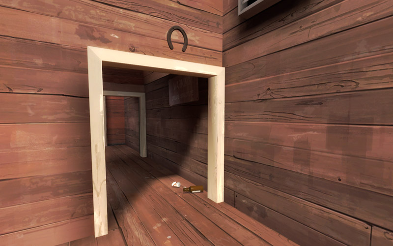
Touching on a previous topic here, clustering details around doors, valve do it a lot you'll find. Since doorways are a place players run through a lot they see the details that are there a lot as well so you can get a free ride with your detailing by putting it closer to areas players see a lot of. Since they see it so often they'll end up with the impression the map is more detailed than it really is - great! This one also shows some cans and a bottle, those are prop_physics_multiplayer, they've got some keyvalues set so that they don't lag up the server by checking for collisions too often but a good rocket blast will send them flying. I've yet to see a single custom map have any of these types of props in.


3127472981_7c148a284f_o.jpg

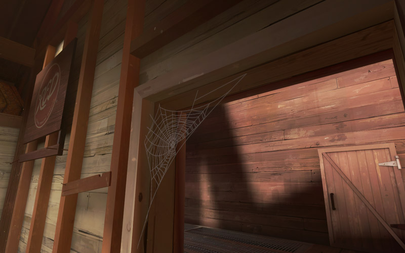
Another thing to consider in your doorways, cobwebs. In the group chat I've had a lot of people ask which model they are, most are suprised to hear its just a standard brush with a texture on it. Ok so you have to make it a func_ilusionary so you don't get caught on it but its still just a brush with a texture, ultra simple. They work well if you put a strong light near them, then they'll stand out a lot.


3127473109_1914735235_o.jpg

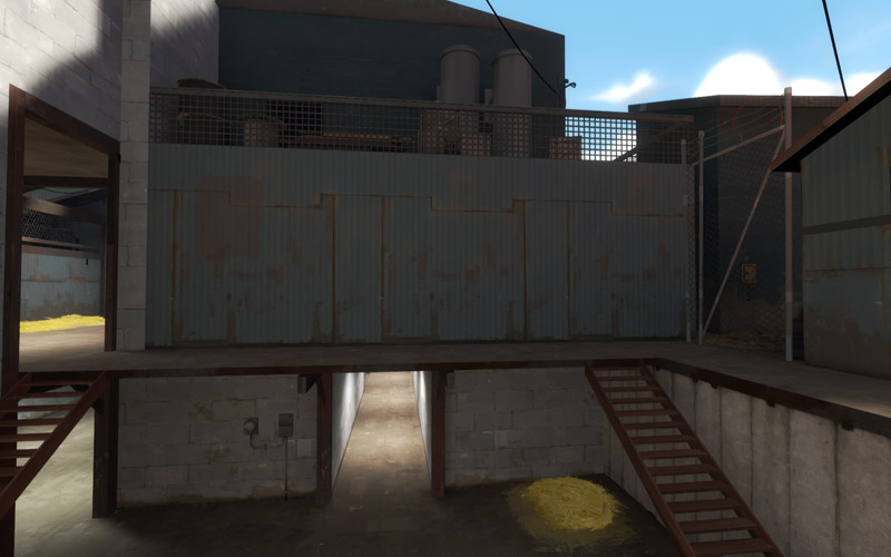
Bland is bad? Nope, not at all. I was quite suprised when I was spectating around 2fort to find such an empty wall but actually I've never noticed it being bland whilst playing since I'm usually way too busy dealing with sentries or running with the intel. Whenyou come to detailing your map it can be best to leave areas quite blank, these areas will usually be ones that have sentries in them constantly, since you're always so focused on getting past/sapping/blowing up/etc the SG you're far less likely to notice the huge blank wall behind it.


3127473051_f9d4b13725_o.jpg

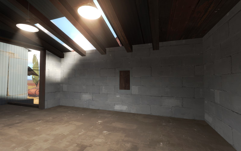
Another seemingly blank wall, but actually this area sees little traffic so it doesn't make sense to put a lot of detail here. However the holes in the roof and the wooden back to the window in the middle are just to stop you from realising how empty it is.


3127473451_0dd0d1091e_o.jpg

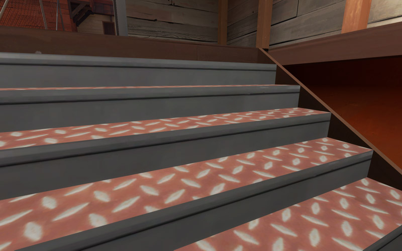
This texture just here... TF2 texture?.... Nope. Its one of the stair textures from HL2, but it works well on TF2 stairs. Just a reminder that its not always a cardinal sin to use HL2 textures, you just have to be careful about which ones you use and where you use them.


3127473751_0bfe45e4fe_o.jpg

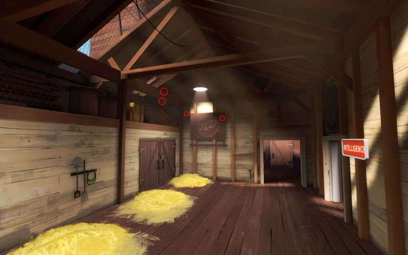
See the little yellow spots I've circled? func_dustmotes. If you've got an area with lots of light flooding in from the sun or bright spotlights you might want to consider adding some of these guys. Be warned though, they make the area look dusty and they really stick out in places that look clean, like the locker room type spawnroom.


3127473639_a59bc441cf_o.jpg

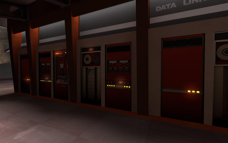
Do you see how the lights seem to give off a little glow? Thats done using an env_sprite. They're an effective and cheap way to make the computer models actually look like they're on. Valve also use these on their security cameras and generators as well.
One thing I noticed here that I can't show with a screenshot is the soundscape, as you fly though a map the sounds you'll hear change depending on where you are, deep inside the spytech base of 2fort the computer wirring sounds are strong and theres a low humming that really adds to the atmosphere. Don't forget to make sure when you go outside you change the soundscape to something more suitable though otherwise it will just feel wrong.


3127473551_b17d2cdf76_o.jpg

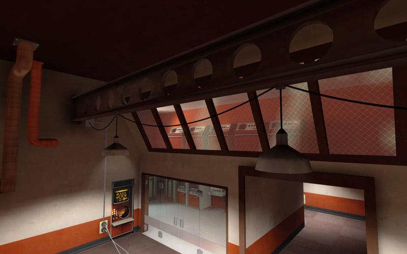
See the wires between the lights here? going to a conduit on the wall? It's a really nice touch, something that might often get overlooked or forgotten.


3128301548_ddda8865f6_o.jpg

And lastly just a really nice image, I don't know what to say about this one just that when I saw it I thought "wow, I've never seen that before.... it looks great!"


I think valve are making maps faster than I'm reviewing them here.....
 
Jan 31, 2008
555
1,482
Valve's maps has such a style. Custom maps are often undetailed or too detailed. Valve manages to create that perfect balance that I have yet to see someone else achieve.
 

Ida

deer
aa
Jan 6, 2008
2,289
1,372
Holy shit, where's that last place? Wow, 2fort has some amazing details. Incredible. Just incredible. Not to mention this is a great guide, it's very useful.
 

Nineaxis

Quack Doctor
aa
May 19, 2008
1,767
2,820
Every time I play 2fort I see that BLU detail area and feel worse about my mapping.
 

Cameron:D

L6: Sharp Member
Sep 28, 2008
363
145
It is very interesting when you stop, and look out of the main game play area, to the sky box and such, some of the things you see, that you never noticed before.
 

Icarus

aa
Sep 10, 2008
2,245
1,210
Details: How valve do it
Part 2: Goldrush

(Tips and tricks used by the pros)

pl_goldrush0011.jpg

Ahh yes, the displacement roof... There was a lot of discussion about this a while back that some people might not remember or have been around for so I'll go over it again. Make some of your roofs into displacements - then warp them slightly like this one, whilst from a static image its not that easy to tell and doesn't looks amazing when you're playing its a small thing that really helps make seeing roof after roof after roof less monotonous. Because displacements are done as a batch process this isn't as intensive as you might think, whilst I can't give any really figures on if its better or not it really isn't the sort of thing you need to worry about when optimising.

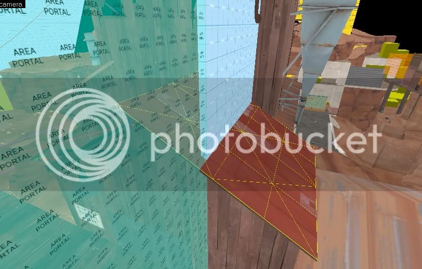
If I may add another note, this is also especially important in badlands, which effectively seals areas of maps using skybox brushes+areaportals. By using displacement roofs, the skybox brush is prevented from cutting your texture and leaving a gaping hole.
badlands.jpg


And something I have noticed on Gold Rush:
pl_goldrush0003.jpg

Where it may otherwise be difficult to notice, cliffs with little contrast to the colors on the other side has grass growing on the edges to accentuate it, and making it more easier to notice (and avoid if necessary!). The contrast brought by the grass also easily adds noticeable detailing!
You can even see it in action here in Youme's screenshot: http://img186.imageshack.us/img186/6283/pl_goldrush0003.jpg
 
Last edited:

Void

Local Man Unable To Map, Sources Say
aa
Sep 14, 2008
1,873
2,984
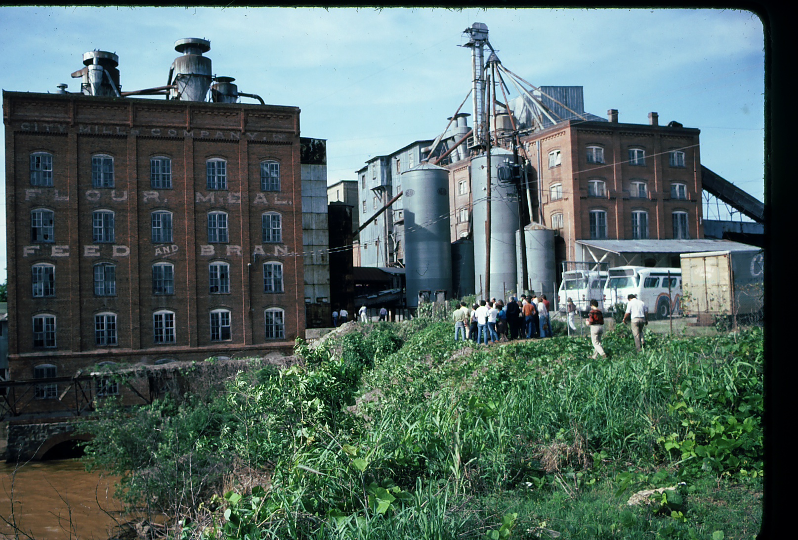
Maybe on Monday I'll go take a few pics of an old Trainyard that has a lot of TF2-like structures in it.

My dad says it would be a great detail area for a 3D skybox or something.
 

YM

LVL100 YM
aa
Dec 5, 2007
7,158
6,079
Maybe I'll do another of these.. I'm not entirely sure theres really much left to cover..
 

HojoTheGreat

L5: Dapper Member
Nov 11, 2008
206
34
I'd recommend doing one related to their use of Nature. Cliffs, props, buildings in relation to the environment (walls, cliffs, ledges, rock formations, etc.).