You are using an out of date browser. It may not display this or other websites correctly.
You should upgrade or use an alternative browser.
You should upgrade or use an alternative browser.


FreeLance_FoX
L6: Sharp Member
- Sep 6, 2008
- 353
- 173
I figure I'd better say what's on my mind before you get too deep into creating the next version:
Furnace suffers from Rock Syndrome, an acute disease caused by the overuse of rocks as cover when it's just oh so convenient. Case & Point: A. It's very bad... there. You've definitely created what I can say is a nearly flawless battle area in terms of no overpowered angles, but that doesn't make it fun to play...
Gravelpit, to hark on what I consider the quintessential TF2 map, does the same thing with around half the number of rocks and probably a quarter as much cover overall. It's remarkable, yes, but on Furnace you've basically done the same thing. It's like being wordy or loquacious... to solve, at least make some of the rocks... not rocks? It may just be my OCD, but it's always bothered me. But as it is, I think one of the main things holding this map back from Gravelpit level awesomeness is its overuse of cover to make up for what would otherwise be called... poor planning.
A, just in general, should be bigger. Adding conflict-creating areas towards the front of A, by that I mean clearings or something to bring the fight away from the point, will make the experience of A much more crisp.
As far as detailing, just don't go overboard! I LOVE your aesthetics, don't just widen and prettify because you can. It's very understatedly... majestic, right now, with this entire run-down area bathed in the glorious sunlight.
Much <3,
FoXy
Last edited:
- Feb 26, 2008
- 1,626
- 1,325
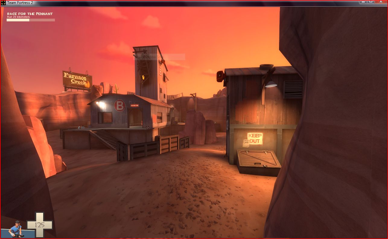
Moved the furnace creek sign, made detail area that had the strange hoodoo into a neat building w/ basement entrance, invisible clipping fixes, new crates towards the back right of the B shack, hidden CP borders on the ground, uhhh that's all I can notice without booting up the game
purequaternion
L3: Member
- May 19, 2009
- 101
- 64
Looks great
Looks great really. A random question though: what is the music in the video? It was pretty catchy.
-C
Looks great really. A random question though: what is the music in the video? It was pretty catchy.
-C
Just had a late night play through with a near-full server.
Generally, response was good.
Comments from the play through:
- Plays well, very balanced
- "There's a Laser? I never saw one..."
- "Less orange."
- "Less Snipers."
- "Your Mother."
- Players could handle a full rotation of it, but were begging for a new map later on because of the lighting
- "Makes my eyes bleed"
- "Looks good, just tone down the color a bit"
- "OMG youme made this map?!! zomg!!"
An Icy Mouse
aa
- May 23, 2009
- 205
- 34
- "Your Mother."
Signed, I want to see more mothers in this map!

Looks great really. A random question though: what is the music in the video? It was pretty catchy.
-C
Isn't it on the youtube description?
Moved the furnace creek sign, made detail area that had the strange hoodoo into a neat building w/ basement entrance, invisible clipping fixes, new crates towards the back right of the B shack, hidden CP borders on the ground, uhhh that's all I can notice without booting up the game
Oh so close! I added the sign there rather than moving it, I did move it though, its now the other side of C. The tower is also taller which moves the crane further out of the way of players on the roof.
And the music is on the yourube page with a link to where you can get it, I cba to get the link for you but its called "larmes" by Silence
new crates towards the back right of the B shack
Those crates have always been there... put them there myself.
laghlagh
L6: Sharp Member
- Jul 15, 2008
- 389
- 53
Mar
Banned
- Feb 12, 2009
- 607
- 63
This map is so fun, just want to throw this out there:
Like in Hoodoo, this map's use of tall "cliffs" to seal off the level makes it feel cramped. You don't get the feeling that the fat that you're right there fighting is a coincidence, it feels more like a "level" if you know what I mean.
So you're saying it feels less like an actual real world skirmish and more like a premade videogame level.
- Feb 3, 2009
- 502
- 270
This map is so fun, just want to throw this out there:
Like in Hoodoo, this map's use of tall "cliffs" to seal off the level makes it feel cramped. You don't get the feeling that the fat that you're right there fighting is a coincidence, it feels more like a "level" if you know what I mean.
Yeah, I agree there. Having some bits of cliffs replaced with fences showing off into the distance would be better.
Sgt.Sausage
L420: High Member
- Dec 5, 2008
- 420
- 103
Hey nine i played this today in the server with you and someone said it reminds them to much of gravel pit and i said its the same layout. I didn't mean the rounds and stuff, i meant the control point layout A+b=C
Actually it doesn't remind me of gravel pit at all and i like it a lot more at that. I also like the color of it its more soothing. I don't like the theme of gravel pit either it looks to junky i think.
I hope you didn't get to offended and i am surprised people are saying that it reminds them of gravel pit but i think they just see the layout A-b-c of the control points and even though the routes are different it reminds them of gravel pit. Hopefully you keep working on this map more and don't just rush it out because it is such a good map and i love it a lot. This should be the triangle cp map not junction, thought junction is cool because it is inside.
Anyway thanks for making a great map here is one bug i found.

That step i get caught on sometimes but not every time. I would keep the step i like it but flatten out the player clip or whatever you call it so you can just walk up it normally.
And one suggestion sorry for long post.
After capping B or A in the beginning before going to C as blu we must cap the other point. I get lost a lot because i see the sign or C but not one to A from B or B from A. If you could add a sign or something to show the connector(s) from A and B that would be great.
Other than that thanks for a great map love the textures and theme its coming along nicely, hope you didn't get discouraged.
Actually it doesn't remind me of gravel pit at all and i like it a lot more at that. I also like the color of it its more soothing. I don't like the theme of gravel pit either it looks to junky i think.
I hope you didn't get to offended and i am surprised people are saying that it reminds them of gravel pit but i think they just see the layout A-b-c of the control points and even though the routes are different it reminds them of gravel pit. Hopefully you keep working on this map more and don't just rush it out because it is such a good map and i love it a lot. This should be the triangle cp map not junction, thought junction is cool because it is inside.
Anyway thanks for making a great map here is one bug i found.
That step i get caught on sometimes but not every time. I would keep the step i like it but flatten out the player clip or whatever you call it so you can just walk up it normally.
And one suggestion sorry for long post.
After capping B or A in the beginning before going to C as blu we must cap the other point. I get lost a lot because i see the sign or C but not one to A from B or B from A. If you could add a sign or something to show the connector(s) from A and B that would be great.
Other than that thanks for a great map love the textures and theme its coming along nicely, hope you didn't get discouraged.
An Icy Mouse
aa
- May 23, 2009
- 205
- 34
Look at his readme file, it's got dates of all the dates of release:
EDIT: Incase you can't read English dates, that's 4 months.
And I'd assume him and nineaxis were working on it for maybe a week or two before that.Youme's readme said:Beta 1 released 10/05/09:-
...
blah blah blah
...
Alpha 1 released 04/01/09:-
EDIT: Incase you can't read English dates, that's 4 months.
- Apr 19, 2009
- 4,460
- 1,724
Youme I think this is one of your best maps to date. It is very well balanced and it looks so good. Your displacements are perfect. My only gripes with the map are the lack of cover for BLU spawn addressed by Snipergen, the lip already mentioned by Sgt.Sausage, and that were a few times I was blinded by the sun. Other than that this is a very good map.
One thing I'm interested to find out is if turning the setup doors, that keep blu locked in at the start, into normal doors would help, that way red could only shoot in at teleports/players when a blu player opened the door themself.
GP doesn't really need this but I think without significantly reworking the whole of that setup area I can't see a way around the problem, what snipergen suggests seem's impractical.
The sun has also been very mildly reduced in intensity.
GP doesn't really need this but I think without significantly reworking the whole of that setup area I can't see a way around the problem, what snipergen suggests seem's impractical.
The sun has also been very mildly reduced in intensity.
Randdalf
aa
- Feb 14, 2008
- 1,051
- 932
One thing I'm interested to find out is if turning the setup doors, that keep blu locked in at the start, into normal doors would help, that way red could only shoot in at teleports/players when a blu player opened the door themself.
GP doesn't really need this but I think without significantly reworking the whole of that setup area I can't see a way around the problem, what snipergen suggests seem's impractical.
The sun has also been very mildly reduced in intensity.
You can do it on gravelpit as well, and nobody seems to complain much.
- Apr 19, 2009
- 4,460
- 1,724
People don't do it on Gravel Pit is beacuse it is hard to get into the tunnels. They are not that tall so Demos and Soilders hit their heads. So if Youme put some kinda of block to prevent all but the good Demos and Soilders from going down the pathway. Even if it is a few planks of wood it could stop many people fromYou can do it on gravelpit as well, and nobody seems to complain much.
going up there.