Furnace Creek (cp_furnace)
- Thread starter Nineaxis
- Start date
You are using an out of date browser. It may not display this or other websites correctly.
You should upgrade or use an alternative browser.
You should upgrade or use an alternative browser.


:blink:
Guys, this is _a1..... I know about these 'problems' and I've left then in deliberately, it would take an age to fix all the little ones I know about, but they're all going to dissapear as soon as I turn those brushes into displacements.
I don't want ANY detailing comments. The point of alpha testing is to get layout down......
And seriously, I'm quite insulted you feel the need to point out such obvious anomalies... Like i haven't seen them already...
If I didn't say it already: I want no detailing comments. The point of alpha testing is to get layout and gameplay down.
HojoTheGreat
L5: Dapper Member
- Nov 11, 2008
- 206
- 34
I mentioned this during gameday but the map really could use some extra lighting in the shadowed areas. A lightbulbs could really help with confusing team colours, as I misjudged a few on the fly. Normally I wouldn't make a big deal about it but when you're playing at high speed the extra .5 second it takes to register a team colour is too much.
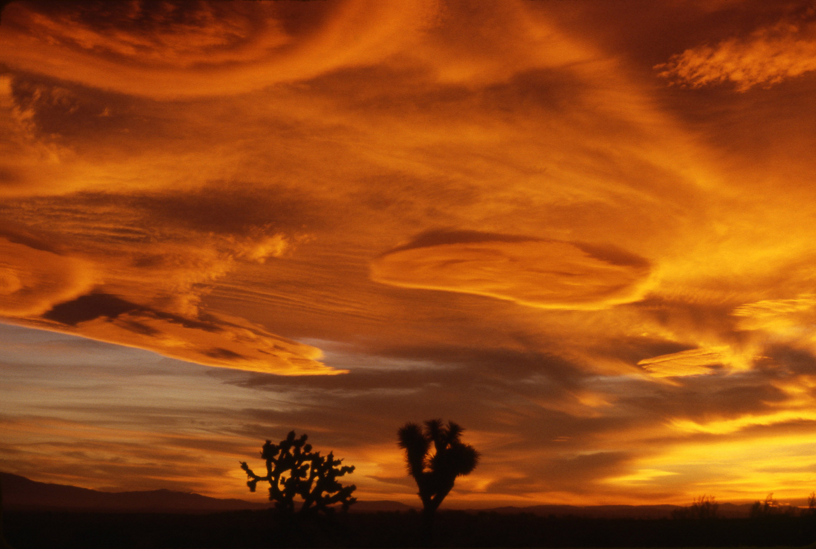
I do believe the colours will balance better after some texture work, but have you considered altering the skybox and adding a bit more blue/purple to it? Something more like:
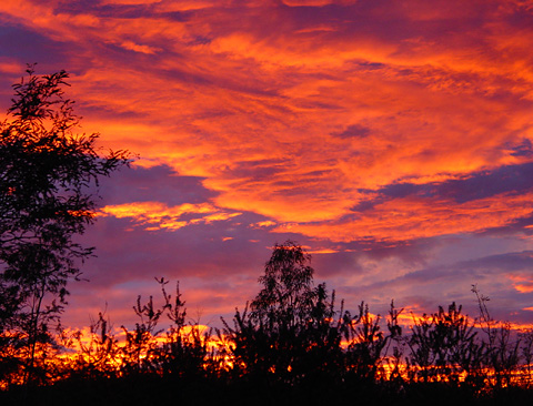

At the very least i believe more clouds are needed. I'm sure the 'burning red' sunset is meant to tie into the Furnace namesake, however I do believe it needs a little more variation. Perhaps something like this:
Not AS 'busy' of course, but I think you understand what I mean. The layouts pretty solid atm, I'll mull over my thoughts later and let you know if I remember anything.
I do believe the colours will balance better after some texture work, but have you considered altering the skybox and adding a bit more blue/purple to it? Something more like:
At the very least i believe more clouds are needed. I'm sure the 'burning red' sunset is meant to tie into the Furnace namesake, however I do believe it needs a little more variation. Perhaps something like this:
Not AS 'busy' of course, but I think you understand what I mean. The layouts pretty solid atm, I'll mull over my thoughts later and let you know if I remember anything.

Randdalf
aa
- Feb 14, 2008
- 1,051
- 932
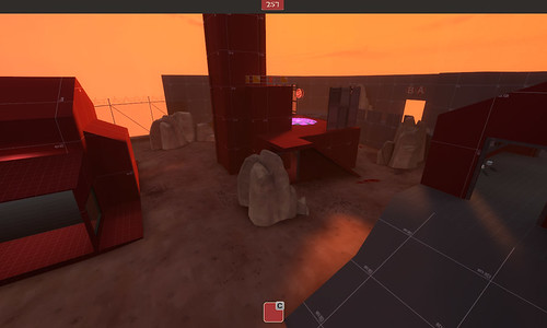
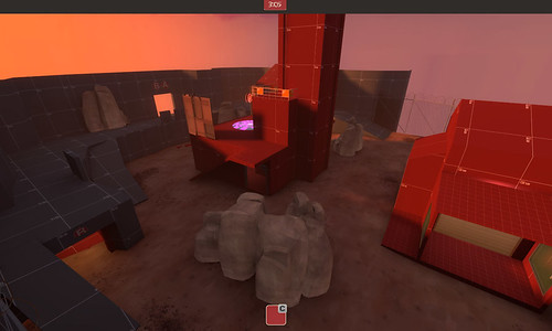
Ok so here's the revisions to C, cap point is now on the top, red spawn in one building rather than two, it takes red longer toget to C but blu can get there just as easily as before, you can now rocket jump up to that little balcony too for a nightmaris position of rockety doom. Oh, they also show off a bit of the new skybox. And yes I realise how dark the front of that building is, gunna add a light now.
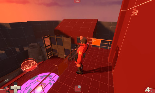

(click for larger versions)
(click for larger versions)
HojoTheGreat
L5: Dapper Member
- Nov 11, 2008
- 206
- 34
Yeah that's pretty much exactly what I had in mind  . Well done! Consider adding/stacking more dome-cloud skybox props to see if it has a nice effect, I think it's worth a try anyway.
. Well done! Consider adding/stacking more dome-cloud skybox props to see if it has a nice effect, I think it's worth a try anyway.That's much better, and the skybox has a better balance of colors imo. But my opinion usually sucks. That cap looks much better, and I can see the blu spawn/s have oriented away from the point, taking them a little bit longer to approach--just the distance I think will even things up a bit!
GrimGriz
L10: Glamorous Member
- Jan 2, 2009
- 774
- 133
Stop rubbing yourself against the walls
it's how i check for spies when I'm not a pyro
FreeLance_FoX
L6: Sharp Member
- Sep 6, 2008
- 353
- 173
The changes you've made seem to be for the better, certainly, but right off the bat I think it sorta feels like you're losing some of the essence of what makes furnace original.
I dunno if it's just me, but the change you made to C seems a bit drastic. I liked the idea of the two floors and the ramps on the back... perhaps you can find some middle ground between the totally open, uncovered point, and the two floored bottom-CP building. Adding a roof facade over the rear half of the top floor to allow a spot for soldiers/demos and then put the 1st floor back with a form of access to the roof to allow BLU a second path and red a place to set up a defense, hide heavier classes, etc.
If you don't know what I mean maybe I'll draw a diagram.
Also, I don't know if I like the new skybox. Electric orange was REALLY different and cool and I don't know if I can live without it. ;_;
- Feb 26, 2008
- 1,626
- 1,325
Reposting my suggestions:
-Up cap time to 30, 15 is in no way fun
-Give height advantage to blue spawners, too easy to camp in the initial hallway, and you can shoot shit over the top of the gates too
-Significantly reduce distance between A and B, A is in the middle of an enormous area and was not fun to defend nor attack
-Make the connections between the areas more simple
-Provide more cover where connections enter C (though it looks like one of the routes already does this)
-Can scouts double jump from the AB tunnel to C's CP now? This point'll get wrecked in comp if so
Using this overhead please suggest to me how exactly:
A) The routes are complicated
B) They can be improved at all without compromising vis
Because they really are not complex at all.
I'll also say this: A and B in furnace are closer than they are in gravelpit and when we tested it with 9 a side all comments coming from players were that A was nearly spot on and far nicer to attack and defend.
- Feb 26, 2008
- 1,626
- 1,325

A couple ideas, as always I may be wrong:
Upper left ? area: Makes the area feel too big, more or less useless space except for engineering and maybe spies+snipers
Middle left black: Move spawn back so that attackers can see both exits at once
Bottom left green: Break up turn earlier so the pathway feels less long
Green arrow below ?: Same deal sorta, make the angle sharper so the path feels less cumbersome
Middle building near A: Open it up a bit, make it take up a bit more gameplay space
Middle green lines: these paths are more or less the same length. In Gravelpit one of the tradeoffs for taking the path through C is that you expose yourself to C and any defenders spawning there. Redirect these tunnels through C, this'll give an extra entrance to the area as well which I believe it could use. Use 90 degree angles to block sight with a diagonal hint across their corners. The curved displacement feel isn't always the way to go
Top right, green squares, black path: These corners are just sentry locations, boring, Remove them and make the path more linear, if you want to keep the same amount of space then consolidate the green squares into a larger space
Black arrows, middle right: Move red spawn back, compensate with respawnwavetime. Players will suffer longer walks if the respawn times are shorter. Gives advantage to faster classes/clever movement (demo/soldier jumps) on defense. Move back cp C, that short gap is too short
Bottom right green: Path is kinda windy. Simplify to sharp turn, or use that green square space for something more clever
Bottom left black arrow: Move the fence up to be flush with the walls around it
Middle ???? in black: This is gonna be some crazy displacement with some fences around it, I think? It feels like a nuisance in testing: you can see to the other side but not maneuver over it... idk this one's the most vague
Hope it helps
I agree with a lot of what Mangy said, but I'll just post my own image since there's at least one thing I disagree with him on.
1. Orange arrow
So, as Mangy said, move the red spawn and C building back to open the area up. This will prevent instant scout caps and make it feel more vertical without actually making it so (by removing the rj from the outer ledge onto the CP).
2. Orange arrow
Move the blue spawn away from the doors. This will not only make it less complicated, but will allow engineers to put sentries outside the spawn area and have players see them when going either way. It will also cause teams to group together during setup more instead of splitting to the two sides.
3. Purple X
Remove this alcove, but leave the other one right by it. Mangy suggested removing both, but I think the other one provides an excellent ambush area for sentries, demomen, spies, pyros, etc. Also, you'll notice that the path from A to B on GP plays really boring since it's just a straight shot through. By adding open areas on the paths you make the gameplay in those tunnels a little more dynamic instead of just forcing players to run forward or back in them. I also think the one on the B/C path should stay. The reasoning with these two is that they're on the blind side for attackers, meaning they're natural ambush locations.
4. Green lines and blue X's
This is my big suggested change. I didn't follow what Mangy was saying here, so my suggestion may be the same or opposite. The green lines are the walls of a unified central route on the map. Basically it ties together all 3 locations and eliminates two of the other paths (kind of). The blue X's show that those two paths would be removed since they're combined into the middle route.
The result is that there's still a quick path between A and B, and that there's two routes from A to C and two routes from B to C. It's just simplified so on the C side you only see 3 incoming paths and at A and B you only see 2 outgoing paths.
For comparison on GP you see 4 incoming (since the B paths are basically the same since they're so close) into C. On GP you have 2 outgoing from B (the two directly to C really count as 1 and the 1 to A is the second). You also have 2 outgoing from A (1 directly to C that branches into 3, and 1 to B).
Overall I think reducing the incoming paths to C will make things harder on the attackers while making it a lot easier for players to find their way around and communicate with each other.

Also, I like the changes you made to C. I think it'll play a little nicer, especially in competition, and looks impressive as well. I do think there's a slight lack of protected sentry locations, but I'm not sure where you can improve that. You do have a downward slope on both sides like GP, which are ideal and expected spots.
You also have the near ledge to catch people as they come over, but I think you could really lock down this point and make things hard for attackers by making an alcove under that front ledge. Something like this...

Basically, look where the green is. This would be an alcove underneath where engineers could put sentries that would be able to hit people as they dropped over the top. There's a tradeoff since enemies that rj overhead might get a slight boost from the sentries and be carried to the CP better. This is very similar to the overhang at Gold Rush 2-2, right next to the path. It makes things very hard for attackers without having to make any other changes to that area (although moving the building back is still a good idea).
I don't think this area is OP because demomen can still hit it from the windows on the side or from the ledge on the other side, plus ubers can attack by going down the ramp or taking the lower route from B.
1. Orange arrow
So, as Mangy said, move the red spawn and C building back to open the area up. This will prevent instant scout caps and make it feel more vertical without actually making it so (by removing the rj from the outer ledge onto the CP).
2. Orange arrow
Move the blue spawn away from the doors. This will not only make it less complicated, but will allow engineers to put sentries outside the spawn area and have players see them when going either way. It will also cause teams to group together during setup more instead of splitting to the two sides.
3. Purple X
Remove this alcove, but leave the other one right by it. Mangy suggested removing both, but I think the other one provides an excellent ambush area for sentries, demomen, spies, pyros, etc. Also, you'll notice that the path from A to B on GP plays really boring since it's just a straight shot through. By adding open areas on the paths you make the gameplay in those tunnels a little more dynamic instead of just forcing players to run forward or back in them. I also think the one on the B/C path should stay. The reasoning with these two is that they're on the blind side for attackers, meaning they're natural ambush locations.
4. Green lines and blue X's
This is my big suggested change. I didn't follow what Mangy was saying here, so my suggestion may be the same or opposite.
The green lines are the walls of a unified central route on the map. Basically it ties together all 3 locations and eliminates two of the other paths (kind of). The blue X's show that those two paths would be removed since they're combined into the middle route.The result is that there's still a quick path between A and B, and that there's two routes from A to C and two routes from B to C. It's just simplified so on the C side you only see 3 incoming paths and at A and B you only see 2 outgoing paths.
For comparison on GP you see 4 incoming (since the B paths are basically the same since they're so close) into C. On GP you have 2 outgoing from B (the two directly to C really count as 1 and the 1 to A is the second). You also have 2 outgoing from A (1 directly to C that branches into 3, and 1 to B).
Overall I think reducing the incoming paths to C will make things harder on the attackers while making it a lot easier for players to find their way around and communicate with each other.
Also, I like the changes you made to C. I think it'll play a little nicer, especially in competition, and looks impressive as well. I do think there's a slight lack of protected sentry locations, but I'm not sure where you can improve that. You do have a downward slope on both sides like GP, which are ideal and expected spots.
You also have the near ledge to catch people as they come over, but I think you could really lock down this point and make things hard for attackers by making an alcove under that front ledge. Something like this...
Basically, look where the green is. This would be an alcove underneath where engineers could put sentries that would be able to hit people as they dropped over the top. There's a tradeoff since enemies that rj overhead might get a slight boost from the sentries and be carried to the CP better. This is very similar to the overhang at Gold Rush 2-2, right next to the path. It makes things very hard for attackers without having to make any other changes to that area (although moving the building back is still a good idea).
I don't think this area is OP because demomen can still hit it from the windows on the side or from the ledge on the other side, plus ubers can attack by going down the ramp or taking the lower route from B.
Last edited:
- Feb 26, 2008
- 1,626
- 1,325


OK I've got _a2 out, addressing nearly all of the things people have brought up.
Heres the list of changes:
Link: http://forums.tf2maps.net/downloads.php?do=file&id=978
Heres the list of changes:
- Renamed capture C to C
- Increased lighting in all indoor areas.
- Added more health over entire map.
- Increased cap times to closer to Gravelpit's (A/B longer, C faster).
- Unified red's spawn into one building and move it slightly further from C.
- Enlarged entire C area, makeing the building more open.
- Extended B building slightly providing more space inside and underneath as well as opening up the windows to allow shooting in/out easier.
- Opened up B's roof to be rocket jumped onto.
- Adjusted spawntimes so red take slightly longer and blu slightly less.
- Added A B and C indicators on HUD.
- Slightly shrunk the A arena.
- Reworked paths between points slightly.
- Moved blue's spawn so that (with only one door) they can see both exits.
Link: http://forums.tf2maps.net/downloads.php?do=file&id=978