Flurry

KotH Flurry RC5

Jack5

L4: Comfortable Member
Apr 6, 2018
189
37
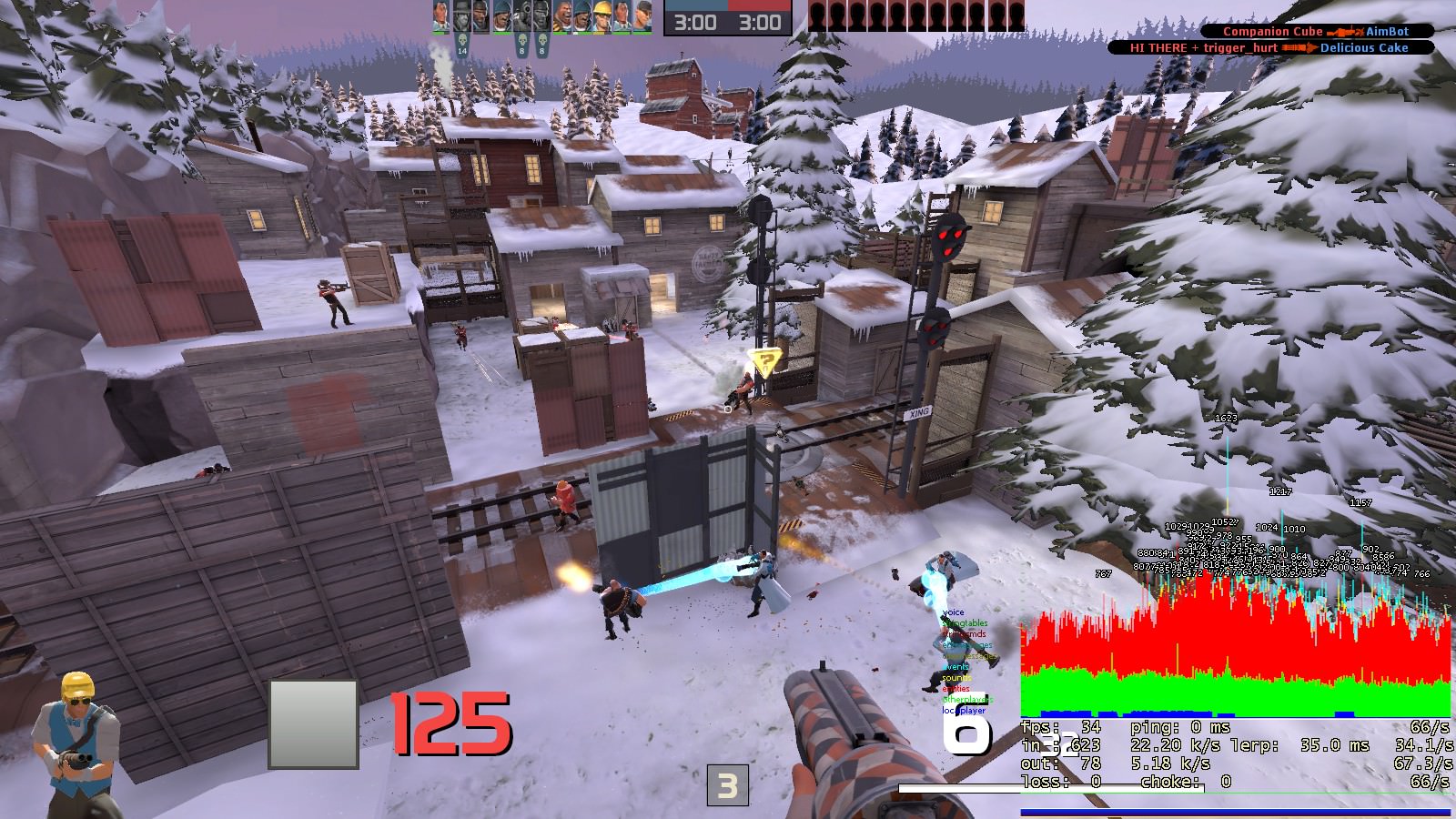
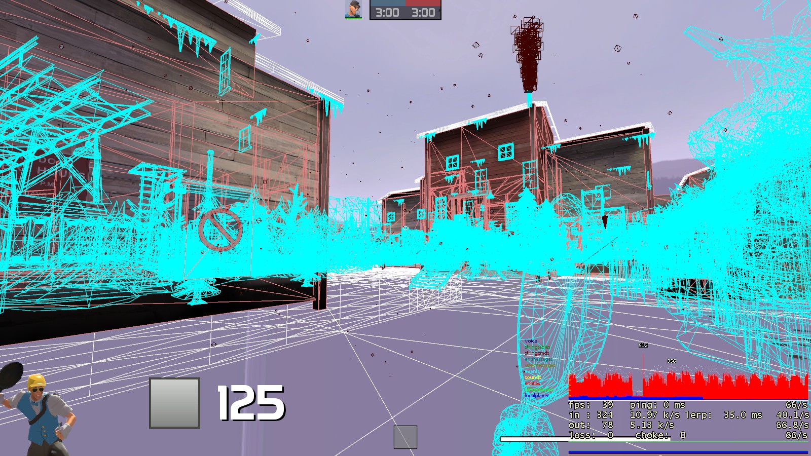
Glad to see that you've done everything you can to optimise the map in its current state. Unfortunately, because the map is so straight it is really hard for the Source engine not to render everything in-game, since you can see far too much when looking directly forward. This reduces the FPS on my machine to around 28 FPS when looking at 21 bots fighting on on the capture point. Here are some images as an example:
NESGmaH.jpg

rorLEs1.jpg

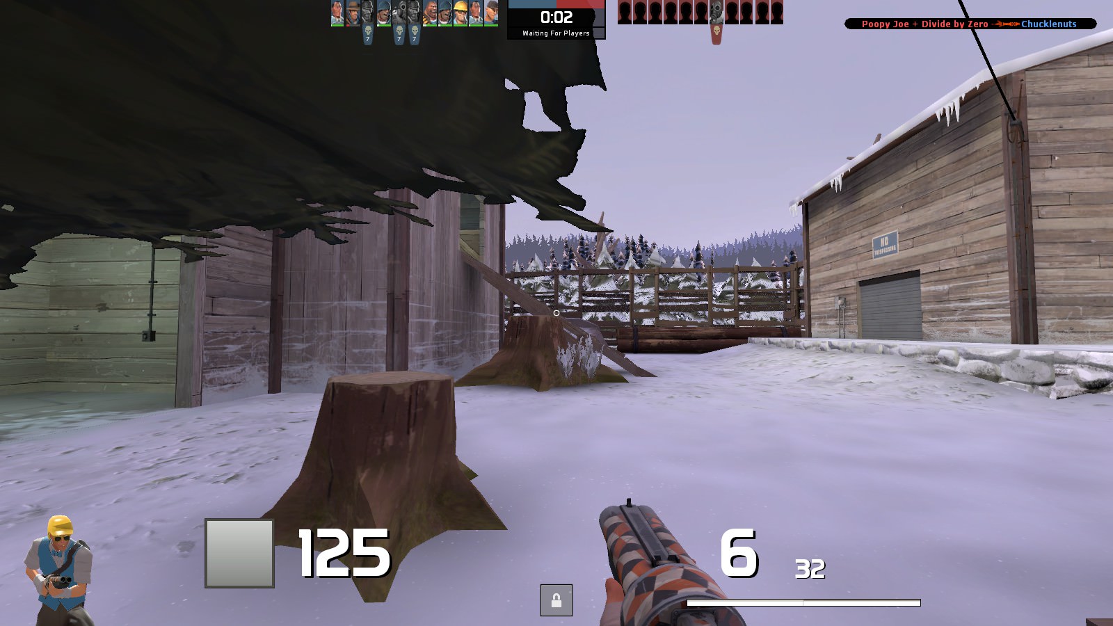
My suggestions to fix this issue are to give props more restrictive draw distances, and to curve the map in a sort of U shape, with the height advantage at the very far end from each spawn. This will mean repositioning and possibly completely reconstructing the buildings at each end of the map to match each end of the U shape. For example, in the below picture, the building on the left will be moved towards the camera, with the doorway furthest away from the camera pushed out so it is visible from the camera, and the building on the right will be rotated and fit behind the camera.
mvbymeh.jpg
 

Cincomma

bonk sploosh
aa
Aug 2, 2017
429
413
My suggestions to fix this issue are to give props more restrictive draw distances, and to curve the map in a sort of U shape, with the height advantage at the very far end from each spawn. This will mean repositioning and possibly completely reconstructing the buildings at each end of the map to match each end of the U shape. For example, in the below picture, the building on the left will be moved towards the camera, with the doorway furthest away from the camera pushed out so it is visible from the camera, and the building on the right will be rotated and fit behind the camera.
Sorry but, in my opinion, that would be far too much of a task to undertake. I know you're giving me constructive criticism (which is great) but I'm not the best at completely changing the layout of my map. I haven't gained enough experience to be able to do such a task. And, making the map a 90 degree turn map will make visleaf hell
 

Cincomma

bonk sploosh
aa
Aug 2, 2017
429
413
:cap:Big Changes are coming to Flurry!:cap:

Flurry is changing! I've been working on RC6 for a while and will continue until everything is in ship-shape. I added some height variation right after the first transition building, as well as removing the flank route over the bridge. The reason behind this is the flank route provides a massive high ground that explosives classes can use to their advantage. There is much more cover around the point as well; I added a little shack to make the point more defendable. BLU side spawn took a huge overhaul as well. Instead of just a little shack in the middle of a forest, now it's a giant building with garages and catwalks! Now, I have a little question. Should the tall buildings near mid be accessible by a staircase at the bottom? Tell me if that's a good idea or not, I'm not too sure if I should implement it. All right, that's all for now. Pictures are coming soon, and I will continue working on my favorite project!:medal:
 

Cincomma

bonk sploosh
aa
Aug 2, 2017
429
413
I've decided that flurry's gonna get a huge face lift with aesthetics and building shapes. This is mainly for optimization purposes, I can add some parts here and there to put some skyboxes on building roofs. The update wont come for a while since the payload contest is taking place and I want to focus on that. Expect flurry getting an update after the payload contest ends.