Resource icon

PL Flowerlab b5b

Waffe

L5: Dapper Member
Dec 2, 2012
230
203
What kickstarted this project was a 'vision' I had just before I went to bed of a long slope with a narrow and long building beside it.
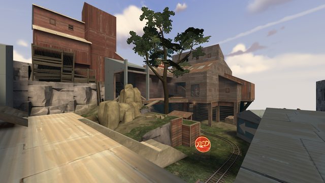
I drew some crude concept art of what then has become the connector between A and B.
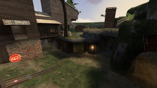
In my mind this would be a mountainside alpine village, using the rottenburg theme.
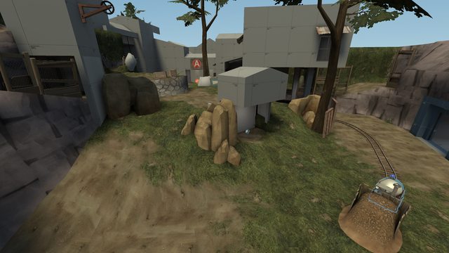
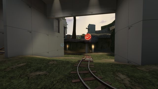
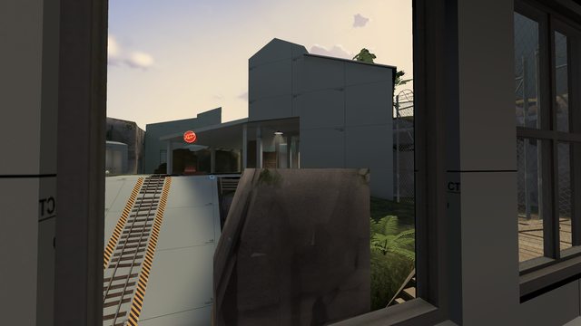
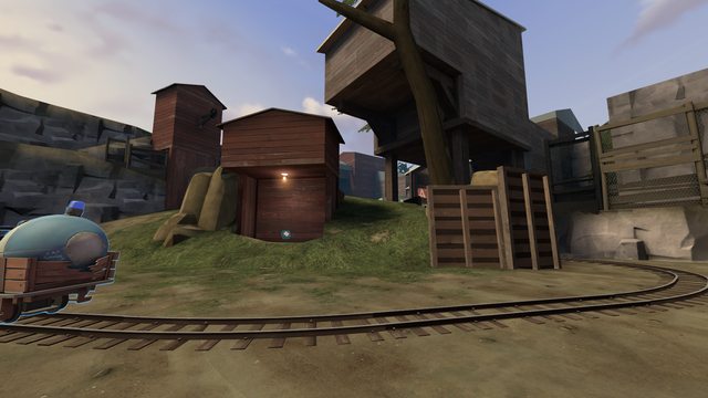
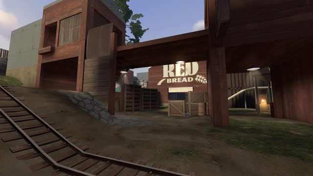
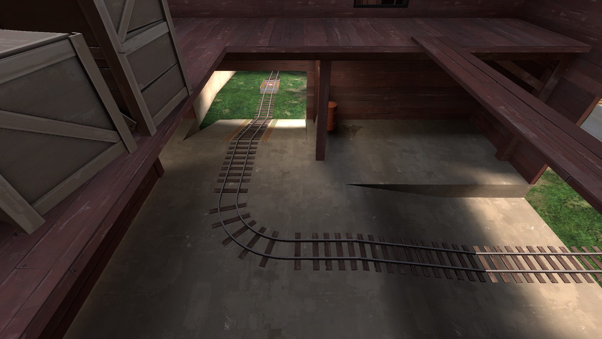
The next morning I drew a bird's-eye-view of the connector, barn and B point. The B point itself was inspired by barnblitz and my 72h map.
Everything between A and B has remained fundamentally the same, and I used this area as some sort of guiding for the rest of the map.

After B, I designed A.
I thought about using badwater's design but fixing some gripes I had with it, as well as including something original.
The tunnel in badwater's A feels disconnected and, while providing an interesting flanking route, is fairly uninteresting.
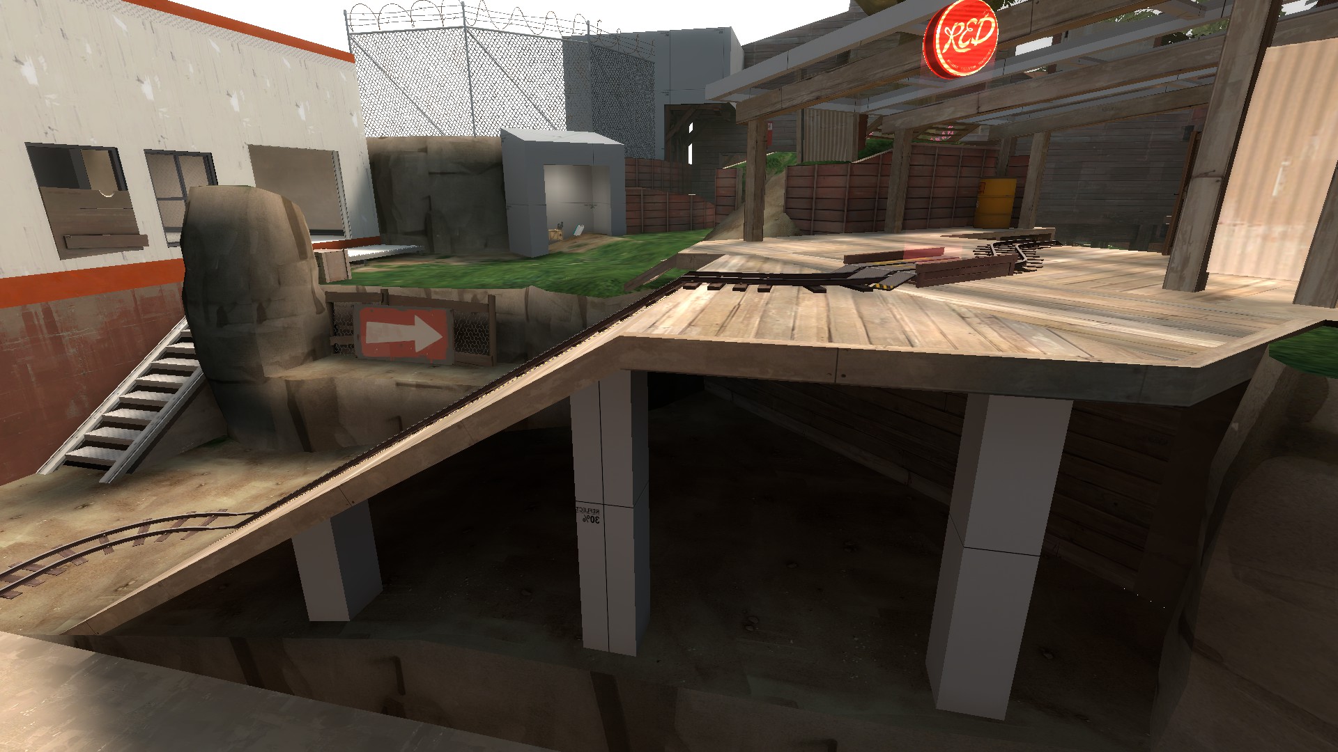
So the idea for A was this: a long slope or hill, over which BLU must push with all its might.
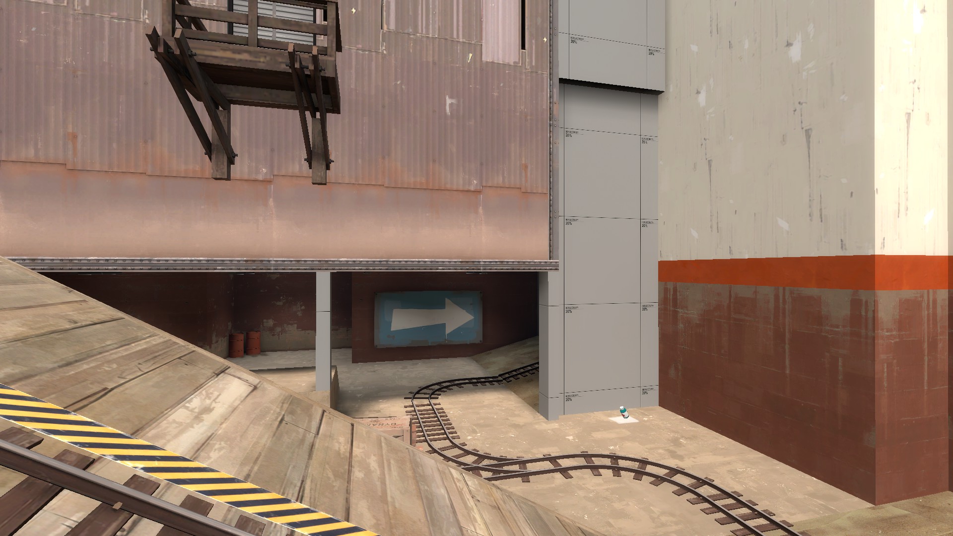
The track was to be on lower ground aside the hill.
I pictured chaotic mayhem as rockets and bullets up and down as the setup time ends.

r94pxI9l.png


This version was quickly altered to more fit the previously mentioned idea.

s3T8ZeSl.png


Later, I thought to myself that pyros and medics aren't going to approve of the design and added some cover.
This conflicted with my initial idea of a very open and epic first fight, and even after the change the cover wasn't sufficient enough.
I decided to skip to the spawn area and work on the hill later.

To further push this idea of total mayhem and chaos right after the setup, I planned to use multiple exits covering a wide area.
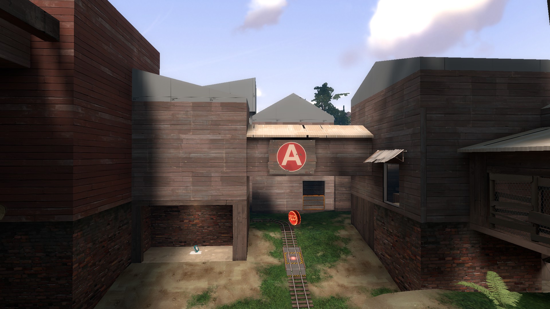
Eventually the spawn became a lot like gravelpit's.
Because of the long distance between BLUs first spawn and the B point, I decided against nobuilds in spawn, again like in gravelpit.
This is to ensure BLU teleport entrances to be safe from harassment and to give BLU engineers a chance to setup early on.
I also wanted to encourage both teams' engineers to setup at the choke at B.

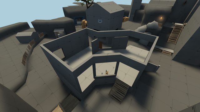
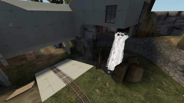
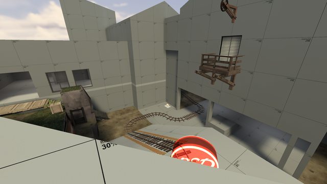
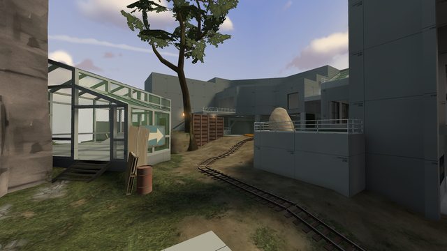
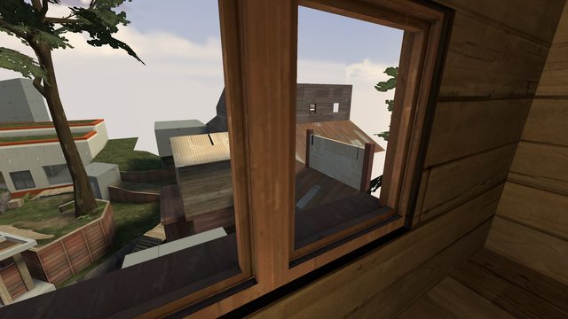
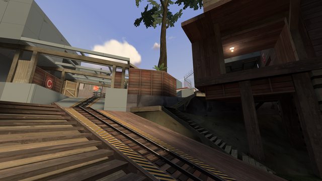
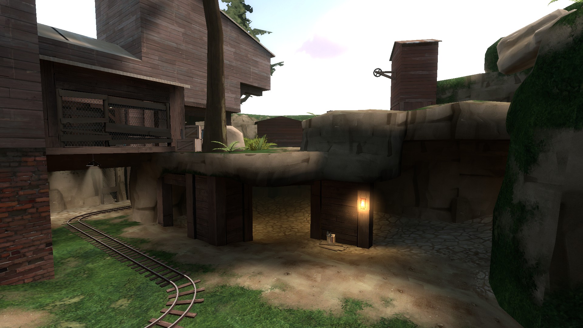
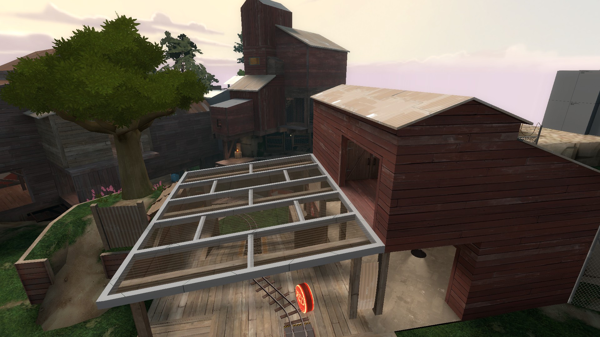
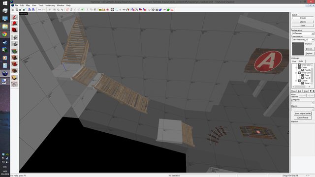
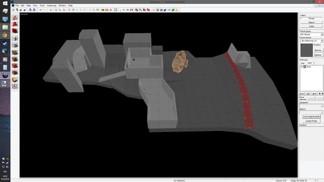
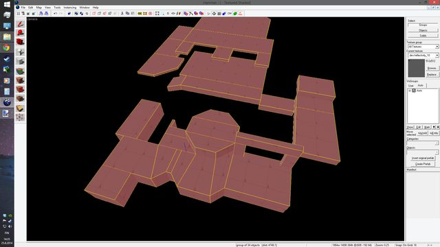
The slope & stair combination (picture below) was inspired by the addition of the BASE jumper, and I envisioned soldiers gliding down long distances and wreaking havoc on the dirty peasants below.
This inspired me later on with the C point - more of that below.

hKtFIZbl.png


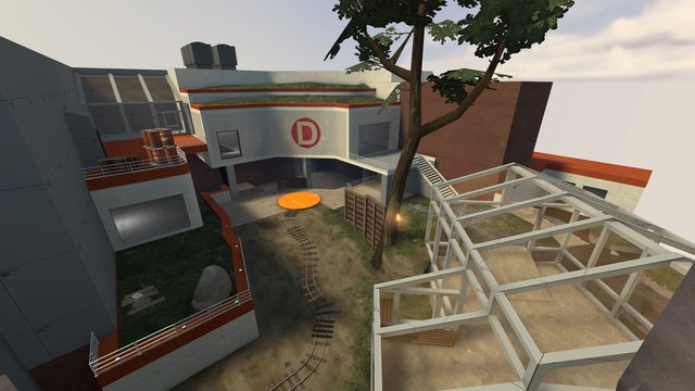
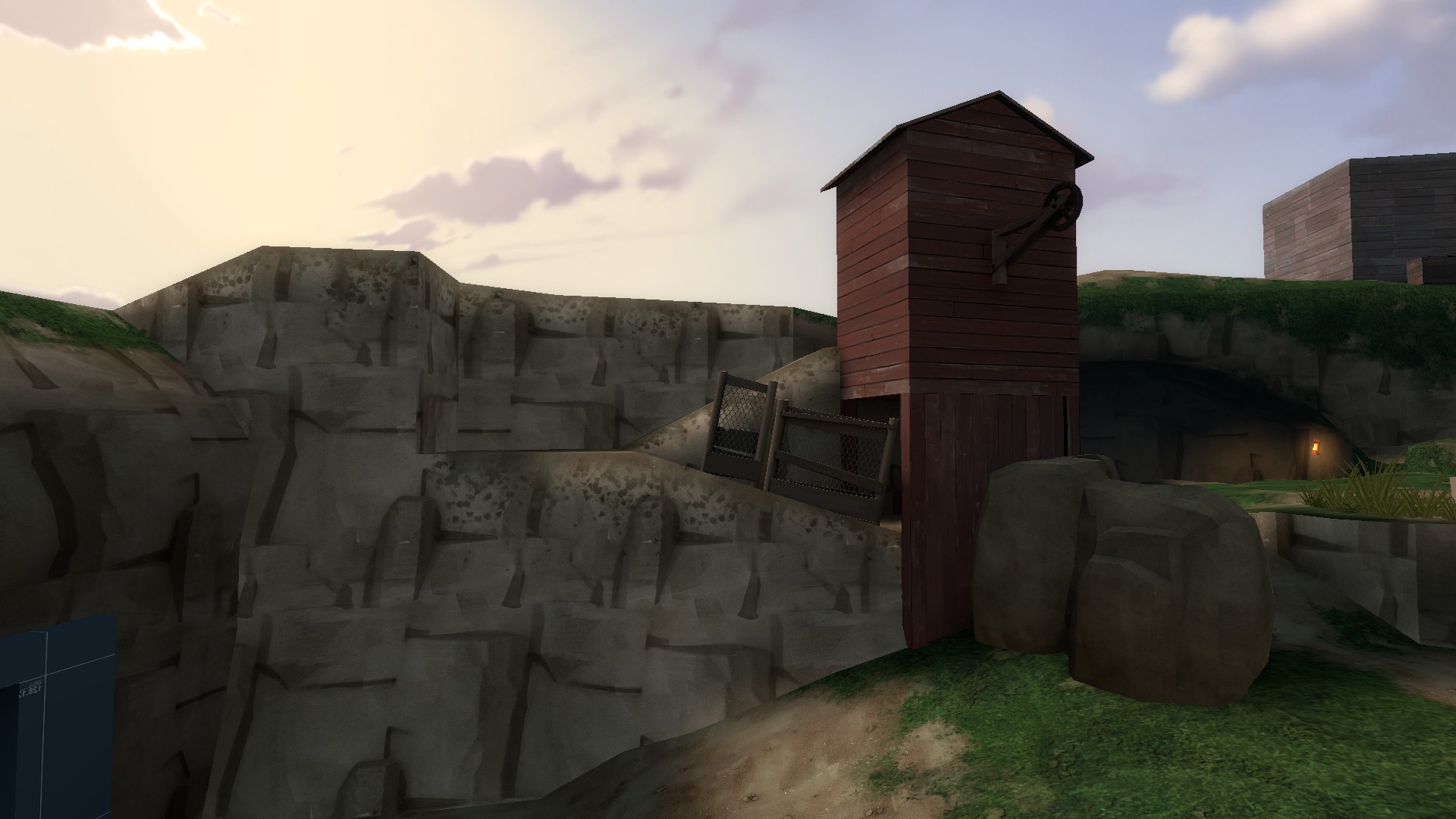
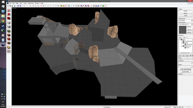
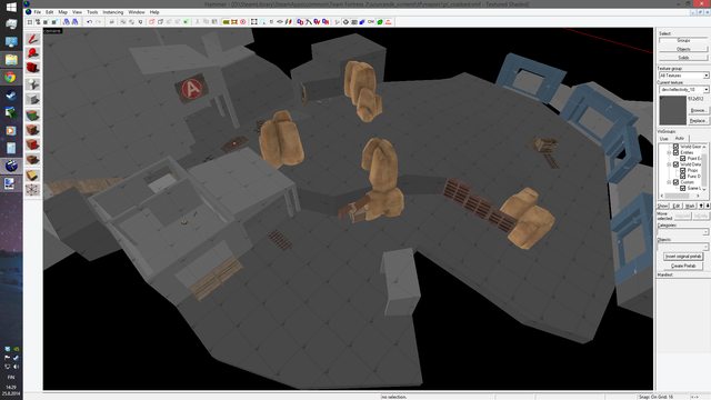
Early in development, I figured the map could be divided into two parts, as in an outer base (or facade, whatever you like to call it) and an inner base.
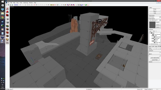
The C point was going to be the transition from the rustic and primitive exterior to the industrial/spytechy inner base.
I came up with the idea of a dropdown spawn for RED - just a gimmick which would make the point more memorable.
First I thought of centering the whole C area around a single tower (just like in gravelpit) and giving the attackers open highground.

2HnQIXPl.png


Frankly, this layout would be way too simplistic, open and boring.
Back to the drawing board!
The dropdown idea made me think of giving it a secondary use later on, making the room change its purpose after capping C.
I can't quite remember how I came up with the layout for C, but I remember it starting with the stairs right of the building (BLU's perspective).
The previously mentioned stair and slope combination made me think of using stairs and slopes next to each other, the former to be used for fast surprise attacks and the latter for a more careful approach.
The highground was to be in RED's favor as this was the second to last point.
However, given the long respawn walk for BLU, I made the area between B and C very hard for RED to push.
This doesn't mean that it's impossible, but encourages BLU to build up a base and holding to it in case of a push.
It also makes it a bit [citation needed] harder to harass the BLU spawn as RED

The last point was a struggle.
I had plenty of ideas but none seemed to work.
First I got the idea of turning badwater's third point into a final, but with a pipe running just above the ground from one side to the other (this was to be used as cover).
This idea could work, but I decided against it, as it just didn't feel right to me.

nitbNySl.png


h6vKNSSl.png


---

Next up was a railgun inside a big concrete structure.
This area was to be thematically like gorge.
As I couldn't figure out how to add some more height to it, I scrapped the idea.

PAnb5rYl.png


0iudeLNl.png


---

I had some mapper's block and worked on other projects for a while.
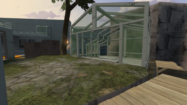
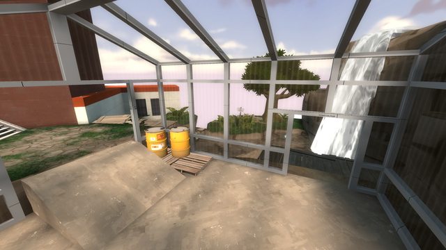
Later, during my vacation, I made a sketch of a greenhouse which in turn made me think 'why not have a greenhouse in your map?'.
This along with playing pl_octagon, which reminded me that octagons exist, I made a third effort at last.
I borrowed elements from upward, badwater and sleekcrete and though about using a small patch of greenery as the centerpoint of last.

tKqIk6rl.png


I had a more detailed version of this but I forgot to save it
This layout couldn't be easily connected to the previous part and I had problems of having the map looping into itself.
Scrapped again.

The greenhouse idea did affect the map's theme.
After playing borneo and loving its use of vegetation, I now imagined this map in a savanna-like forest or something.

Then finally, after a month or so I detailed on paper a last point with three different height levels.
I had no idea how it would play out when drawing it, but it turned out cool looking nonetheless (at least for me).
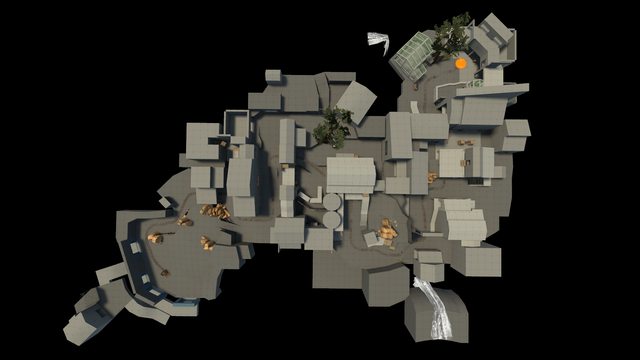
After plenty of sightline fixing and scaling tweaking the basic layout for the whole map was done and playble.
I had my friends over to test sentry spots and overall scale/feel of the map.
I also used bots just to get a feel over the combat (I find this very useful).

WqyOefdl.png


I felt mixed about the map's gameplay.
The first point was always a wipe and a bore (I blame the bots for this), most of A-to-B connector was too open/overscaled and the barn was underscaled.
C point along with last was OK.
I had my doubts on only having two entrancs to last, but I leave this to be looked over by you.

Anyways, from playtesting with bots I then tweaked the scaling and found myself redesigning A.
Basically it's the same design with a building and a higher highground slapped onto it.
I added proper cover to the hill and also downscaled it slightly.
I also gave the map the 'barnblitz respawn' (where the defenders respawn instantly on capture) - this was necessary to keep BLU from seizing the barn (@ B) before the defenders had a chance to setup

Bunch more tweaking was done.
I went through the whole map and changed pickup locations to be placed in more obvious locations and added proper lighting.
I also added doors after A which unlock on cap, both to promote its usage (seeing the door open should attract players to investigate) and to counter sneaky plays before A is capped.

As I continue on this map, I will be making sure to document what problems the map has and how I went to solve them (in detail!).
 
Last edited:

RubbishyUser

L7: Fancy Member
Feb 17, 2013
414
488
Nice to see that pl_octagon was good for something! This looks like a nice payload map from first impressions, and I enjoyed reading your words on how you developed it to a1. Look forward to playing it in a gameday soon!
 

Pocket

Half a Lambert is better than one.
aa
Nov 14, 2009
4,694
2,579
Already looks impressive; can't wait to see how it plays.
 

Waffe

L5: Dapper Member
Dec 2, 2012
230
203
a2b Update!

DOWNLOAD

After the first playtest I realized that the scaling was definitely off.
As a scout I was bumping on the walls a lot and felt restrained.
The track didn't offer much space to fight in, and many pathways felt just a bit too narrow.
Also I noticed players getting lost at start, but I blame them (damn fools).
Glad to get plenty of feedback, showing that people cared about / liked this map.

Checklist of things to be done:

ALL: Widen track's fighting space
Clipping
A: Enlargen first area of contact
Change the buildings up a bit
Distinguish the A point from B and C(?)
Make the point area interesting
B: Change up the bridge to aid RED in defending
Make the barn flank more interesting (and wide)
High ground flank area more inviting
Change the interior of the building next to A point (the stairs building)
C: Pre-C choke redesign
Redesign the point area at C
Add some more height variety to C
Widen C's flanks, mainly the one next to the track
D : Change up the entryways for BLU
Add at least 1 new entryway
Remove RED's third spawn

I flipped A as the highground fitted better to be on the left side (BLU's perspective) than on the right.
Then I removed the old, boring buildings and essentially doodled until I got an interesting design.
The main thing I wanted to accomplish with the redesign was to give RED space to defend, while BLU has the high ground advantage.
The easy way out was to encourage RED to place sentries near the highground.

I then did some minor scale adjustments on B, adding 32 or 64 units of width to certain walkways that I (and probably others) felt to be too narrrow.
The connector/choke between B and C definitely needed a redesign.

I made a few different sketches incorporating terraced ground and waterfall/-s.

I liked the C building so I held onto it. I rotated it 45 degrees using my patented 45 degree rotation trick for brushwork.
I copied an idea from a long lost version of pl_cactuscanyon, adding water whcih the cart was to be pushed through. This was because of many reasons. Firstly it would introduce water as an aesthetic component before the last point.
Secondly, it allows for crazy rocketjumps. Thirdly, it's more organic.

Last point was changed so that the greenhouse would have more of a use. The upper left cliff was redone to a flank.

Lastly I redesigned the buildings before A point (again)

From:

6Ia2dmll.png


WRIyigEl.png

Mirroring your map wrecks every prop

To:

ZeUkjOjl.png


G9YliBul.png


Feel free to share your opinions about the layouts (I admit there is not much to compare from).

After this update I've becoming to worry about map lenght. I'll check that at the next playtest
The A point still seems boring IMO, I'll think about it later.
 
Last edited:

HQDefault

...what
aa
Aug 6, 2014
1,056
535
What happened to updating and testing the map? This was such a good start, heck, almost the framework for a finished map in my opinion.
 

Waffe

L5: Dapper Member
Dec 2, 2012
230
203
What happened to updating and testing the map? This was such a good start, heck, almost the framework for a finished map in my opinion.

UPDATE HYPE LATER TODAY :O

I work so slow, I'm sorry, but perfection takes time to achieve right lol
 

Waffe

L5: Dapper Member
Dec 2, 2012
230
203
a3b UPDATE!

DOWNLOAD ZIP
DOWNLOAD BZ2


ALBUM

Major changes:
- New layout for A and C
- More height variation! Yay!
- +50% Trees

I always check the demo multiple times, from different perspectives. The in-game text and voice chat is very helpful as it shows legitimate first impressions.

This was my post-second test TODO-list:

------------------------------------------------------------------------------
Map is too big, cut C? (C is an optimization problem as well)
I'm still not happy with A
Forward spawns
"Confusing", always some fool on RED goes left at start
Areas that look like you can go there, but no
Sentry spots at last
4 scouts, 4 soldiers on BLU last...
- Forward spawns
- Too open
- Maybe caused by the layout of C?
Cart bug (RED can't block capture?)
Spam over spawn, maybe just block grenades? Might not be pretty with a skybox
------------------------------------------------------------------------------

First, I redesigned A. This time with more emphasis on height, and it gave the area some additional complexity. I also tried (and hopefully succeeded) to give defenders better sentry spots at A. Added ways up to the highground for the defenders, made the sentry spots at AB connector weaker. The flank doors are now open at default - this might cause the defending teleporters getting massively violated...

Then I did the same for C. Previous version was IMO meh and also unoptimizable.

Made a couple of designs, one with a 270 degree downward spiral which turned out cool but too large, so I melded this new design with the previous (a2b) one. It made it shorter, and maybe fixes the problems with the last point being hard to capture and the majority of BLU choosing scout/soldier.

Lastly I did minor tweaks and fixes...
I added doors to the windows at the barn to keep the players from getting lost at the start. I used this for other windows that also needed it. I also refined the optimization to save some compilation time. The aforementioned bug with the cart seems to have sorted itself out, I have to doublecheck this...

Now I have to see how the finale plays out. I did some redistribution of the healthpacks, but even with the shorter distance for BLU to traverse, the fixes might not be enough... We'll see!

EDIT: Updated and fixed a clipping issue
 
Last edited:

Waffe

L5: Dapper Member
Dec 2, 2012
230
203
Quick update!

Download a4

Added textures to displacements
Fixed yet another major clipping bug
Change to B->C connector: The flank building is now one-way for attackers, giving them more control over said flank.
Small changes
Added some props

A:
g3gpNZKl.png


C:
KuuRSp0l.png
 
Last edited:

Waffe

L5: Dapper Member
Dec 2, 2012
230
203
a5 Update!

Added fog
Minor enviromental lighting changes
Removed a flank from C
Reworked last:
- Entrypoints changed
- Greenhouse changed a bit
- Minor tweaks
Made a new viable sentry spot at A->B connector (see if you can find it)
Some details all around

I am currently planning the aesthetics and style (unless I find something wrong during the playtest)
Theme: Some place with vegetation and mostly wooden buildings

TODO list:

Displacement work
Optimization: fix prop fade out distances, might start placing some occluders

A5uJ7ovl.png

- Fog

81Ogpsvl.png

- Fog

oqdXuP8l.png

- Fog

qXIGiDxl.png

- The flank building is a bit closer

t8GAdZ5l.png

- View out of the flank building window

10mhscSl.png

- Dropdown room has now a proper flank route instead of a finicky window

0Js3UzBl.png

- Last (not much has changed, but it looks cool, right?)

AA7MTADl.png

- Hopefully the greenhouse has got some more use now. The waterfall-flank route is now accessable from inside the greenhouse

DOWNLOAD .ZIP

DOWNLOAD .BZ2

----------------------------------------------------------------------------------------------

This was my TODO list after last week's test, this time quite short:

- Note: 7v7 average...
- Last is still crap, better fix it soon...
- Scouts OP at last?
- Make C somehow holdable for attackers, maybe remove the house flank?

Let's see if I'll know better what to do with the last point after today's test.
 
Last edited:

Pocket

Half a Lambert is better than one.
aa
Nov 14, 2009
4,694
2,579
OK, I'm gonna go ahead and need you to never post full HD screenshots as PNGs ever again. I could have downloaded the actual map several times over in the time it took this page to finish loading.
 

Waffe

L5: Dapper Member
Dec 2, 2012
230
203
One month later...

Notes written down after fourth test:

- Still hard to cap last
- Dat sentry spot
- B feels too open
- harribo(?) noted how most of the sentries get outranged easily, does this even need fixing?
- ^ Yes, make C less wide

Right after the test something just struck me when looking at last.
I noticed in Hammer that it can be easily and perfectly be cut from C at a 45 degree angle.
This reminded me of cp_sleekcrete where I used this angle to reflect the other half of the map.
So I decided to try that out since I felt that could fix an issue with the flow of the map.
After mirroring last and fixing all the problems caused by the procedure, I honestly see no drawback in leaving it like this.
The main flank route switched places with the one-way flank, making the map flow feel better.
It also made the main flank route a tiny bit shorter of a walk for the attackers.
Lastly, I think it made the pickup distribution much better.
Whether or not this makes last easier for BLU to capture, I don't know.
I won't be nerfing last that much, as it first needs a bit testing with this latest change.

Note: I won't try to balance the map by changing respawntimes, that's just lazy

I also "removed" the sentry spot on the RED's left (now on the right) roof.
I just couldn't find a way to nerf it properly, so I blocked it.
The area can still be used for a good defensive sentry at another, less aggressive angle.

Moved B cap forward a bit, as a result of the roll forward zone created in the a5 update.
This was because scouts could ninjacap B quite quickly.

Began texturing B, which I've always used as a reference point or an origin for this map.
Classic red barn style, with highly contrasting roof/text, clean looking.
The buildings around A point are going to be a bit more muddy and deteriorated.

Next I textured last, to which I used a tennis centre I visited in Portugal as reference.
That place had a really nice orange and white combination, which I tried to emulate here.
I made the "sentry spot" bright red-orange and added some greenery to the roofs.
I made the last a bit shorter to promote the use of the greenhouse and alternate sentry locations nearby the greenhouse.
I removed the way up from the "pit" area just after C, as I saw this place had little to no use and benefited RED more than BLU.

I really disliked the C point. It was WAY too wide and lacked a real purpose.
I couldn't really envision it being something that belonged in the map.
Also after the recent flipping of the last point the focus of the defenders had changed, and I felt I had to address that.
So I opened up the building (containing the second RED spawn) for the defenders, making it an important area for both teams to control.

vB37epVl.png


I strongly disliked the flank building 'cause it felt plain unnecessary.
So in order to narrow down the C-area, I removed any access to the flank by the BLU team.
I changed the flank building to cater towards BLU snipers and anyone looking to surprise attack the enemy.
I decided to use the waterfall for the design of the building, making it a watermill of some sort.

AGMEUEIl.png


The new sniper spot seems very powerful, as it has great range, but I'd imagine it'll be hard to abuse it since:
a) The room is fairly small, giving the BLU sniper less room to dodge projectiles and also increases any splash damage from rockets.
This also makes the spot less practical for multiple snipers to use
b) The sniper spot is so high up it becomes harder for the sniper to aim down on the people.
c) The single window can easily be covered by a defending sniper, who has got many more spots to watch it from.
d) Health and ammo is a long way away from the spot

It's very hard to hit the sniper though... meh, we'll judge it later

------------

I took a break from detailing and optimized the B and C areas.
I split them up into own separate areas with area_portals connecting them (yell at me if this is somehow taboo).
I've used this method quite excessively in coalbed, so knowing whether or not it's recommended would help out...
Anyways, this made the view out of the sniper spot a bit buggy. I couldn't really fix this without melding the areas back together, so I placed a sign to hide the "cut"

OZH2rBil.png


I'll mention how I split these areas up but kept the windows visible to both sides.

HWwelkvl.png


As you can see, I made a small func_areaportal nearby the windows to avoid skyboxes splitting up the building.
Again, I'm mentioning this because I'm uncertain whether or not this is the best method...
I could later make it so the areaportal gets disabled when not in the sniper spot or something

I think I need a break with this map, so I'll put this to the gameday as for now. Hopefully we can see some improvements... I'll fix some things tomorrow, before the test.

Download b1
 
Last edited:

Waffe

L5: Dapper Member
Dec 2, 2012
230
203
Bumping with images
5FKIkI7l.png


qexagDWl.png


7WDb9OKl.png


qPLAepBl.png


6wUiUAhl.png


rJWY1yhl.png
Detailing has never been my forté, so feedback is greatly appreciated!

Also a quick update to coalbed_b1a, get it HERE
 
Last edited:

Waffe

L5: Dapper Member
Dec 2, 2012
230
203
b2 Update! (now fixed)

- DOWNLOAD B2FIX-

PLEASE CHECK THAT I'VE PACKED THINGS CORRECTLY

Checked timing on C, lowered RED respawn times as a result. I could've made the RED to spawn closer, but that new spawn would cause confusion after C is capped. With the new changes I hope there's going to be more resistance on C.

Bunch of small fixes, including:
- Added a door to the AB connector flank (on BLUs left) to prevent spawn RED spawn harassment at the start of the game.
- Minor changes to C point:
. Removed the unnecessary flank (which was way too abuseable as a BLU spy)
. Gave the dropdown a purpose by adding a minor flank-ish thing
. Added a small side room for dispensers/sentry nests
. Made the window to the point a better sniping spot for RED
. Made the sniping spot (for BLU) a bit weaker by adding more cover for RED
- Clipping stuff
- Added a bit more lighting, also rendered with HDR and StaticPropPolys
- Made custom textures in order to make the lighting whiter. Also made a better glass texture for the greenhouses
- Imported the Borneo props... So beautiful
- Tried to simplify color palette

Pics:

- ALBUM -

2NfjXA5l.png


----------------------------------

TODO list for b3:

Custom detail props for grass texture
Cubemaps
3D skybox
Fix fade distances
Detail work everywhere
 
Last edited:

RubbishyUser

L7: Fancy Member
Feb 17, 2013
414
488
OK, I promised a long cross-examination, and here it is. Since I have only played it once, I'm going to reserve the real deep gameplay cross-examination till the next time I play it. Here are my first impressions.


2014-12-25_00001.jpg


These rocks are like marshmellows, man, no weight at all. If you'd painted them white you could convince me they were clouds. Unfortunately, there's not much you can do about it here - the other side is a hill, so it'd be a bit nonsensical to try and convert it into a building like you would in a normal circumstance. Still, you can but try.

2014-12-25_00002.jpg


Just want to mention that thanks to the building, that actually looks like a path that is supposed to be reachable by a blue soldier. Extend those fences to block off that silly notion.

2014-12-25_00003.jpg


So I mentioned to you previously that the A point was super unremarkable, and gameplay can confirm. My suggestion is to abandon protocol and stick a great big satelite dish on that building to the left on the sign (which you may then want to convert entirely to brick, to support it's weight), or some such similar prop. Why? Blue players will be able to see it from the base of the hill, drawing them up and telling them where to go far better than the sign does.

2014-12-25_00004.jpg


I said I wasn't going to go into gameplay but I'd like to point out that in our games, this warehouse was hotly contested and the space immediately outside was not. That's another indication that the point should be inside rather than out.

2014-12-25_00005.jpg


This sniper spot demands way more traffic than it deserves thanks to its wide staircases and good lighting, especially since it achieves little. Opening it up would give the attackers insane height advantage however. I'm afraid my suggestion is to axe it, streamlining the routes attackers can take.

2014-12-25_00006.jpg


At this point I'd like to say you do an excellent job placing "point" arrows for the blue team (the ones that say A, B, C, etc.) but there are none for red. Gravelpit is a great example of a map where they do this - there's a sign telling Blue players in the area where the point is, a sign telling Red players in the area where the point is, and even a sign telling the players standing on the point what the point is! And then on top of that they have signs for both teams telling them where to go for each point over every single exit. It couldn't be clearer. Here, I'd reccomend adding a sign on the red house to the right and one giving B's location in some way behind the tree.

2014-12-25_00007.jpg


So the clipped area underneath is calling out for some props. How about some actual coal? You've named this map coalbed and there is no indication anywhere of any mining operation. This name would be better reserved for some Foundry or Goldrush-esque map. Also, see that full health and ammo? That building sees way too much traffic from both teams for it to be that small. Make that larger and cut into that fenced off area a bit more, make it a real refuge.

2014-12-25_00008.jpg


During the gameday some people were complaining about being lost, which I think is completely unfair since every point is basically made out of a left flank, a right flank and the middle-where-the-cart-goes-which-is-always-at-a-height-disadvantage. Simplify your geometry a but by taking out this column and merging those doors. Dead-ends like this usually make me think I can find health and ammo and sometimes that leaves me deadly disappointed.

2014-12-25_00009.jpg


Here, I suspect, is part of the reason why people were getting lost: stuff is lit wrong. And I don't mean that there are lighting errors, but that your lighting is deliberately drawing the eye away from where they should be looking. Here, the correct path is both darker than the surrounding buildings and has a darker texture as well. The eye is drawn to both detail and bright areas, which this place doesn't have. To top it all off, this arrow is barely visible from the top of the hill - move it to above the track pointing downwards to get people's attention.

And finally, though I'm too lazy to take any pictures of it, my rule of thumb is that there should always be 256x256x256 area of air around the cart. This means that players can stand on the cart without getting pushed off or in some cases even stuck, can hug the side of the cart for protection at all times, ensures that since players want to congregate around the cart, that the cart path is never too narrow, and because it's generally more visually appealing. There are certain spots - going into the barn at B, the minecart in the siding after C, and some others I can't remember - exactly those issues occur. Fix these if possible!
 

Waffe

L5: Dapper Member
Dec 2, 2012
230
203
B3 UPDATE!

Download pl_coalbed_b3.bz2

This is a minor update to implement gameplay changes for the Gameday test. These changes are as following:
- The underground area at A is a bit different (but who uses that anyway?)
- The stairway up from the A point to the AB battlements open when the cart is pushed halfway to the B point. This should give/gives RED an opportunity to setup at the battlements before retreating to inside the barn.
- The B point has been moved to the barn. I never designed the barn being the "centre piece of B", so I hope it'll still play good.
- As the B point is moved inside, the flank route now leads inside until B is capped.
- Removed the sniper spot

Other stuff:

- Added squintik's Angkor tree models (as a bit of an experiment)
- Added signs (under protest)
- Toyed with some lighting stuff
- Clipped better, except BLU spawn cuz it's funny to jump there
- Made the greenhouse glass darker, and the rgass a teeny weeny bit less saturated

This update is a bit rushed, I admit. Changing some of the buildings lead to pop-up problems, vvis cutting into buildings and other stuff. Also, not much has changed visually because - as I mentioned - this is more of a gameplay focused update

Pics:

wM8uDEnl.png


ALBUM LINK FOR MORE

TODO:

Almost everything I said in the previous TODO
Custom skybox texture
Some optimization to fix the vis issues I've created with this update

PS.
Regarding the map name, I will change it.. later
 
Last edited:
Oct 6, 2008
1,947
445
add in some phantom lights to lighten up some of the dark shadows? some of the places seem especially dar for an outdoor map
 

Egan

aa
Feb 14, 2010
1,375
1,720
Just a small thing, I think you should put something in the corner here, some small detail prop that leans against the wall like the mop & bucket or something that fits the style better. That way people who are coming down this ramp don't think it's a doorway to the other side of the building, but see the leaning thing or other detail and just 'know' that it's a small alcove.

UncjpPa.jpg


I think the map is playing pretty well around first & second. I enjoy defending third/C on the tall balcony things but the attackers seemed to have trouble coming up from such a low point. That could have been unbalanced teams in the instance, should at least look out for that area in the next versions/tests.
 

Waffe

L5: Dapper Member
Dec 2, 2012
230
203
I guess I could announce that I'm basically redesigning C and last. I didn't like how the C point played out (yesterday's test confirmed that for me) and, while the last was enjoyable, I didn't feel like it belonged in this map.

Also, people keep telling me the map is noicy, but as detailing-blind and stupid I am, I have no idea what exactly they are referencing to and how to fix it.
 

Waffe

L5: Dapper Member
Dec 2, 2012
230
203
Here's an update that took me just over a year to make!

pl_flowerlab_b5a (packed and repacked version)

Major changes:
- The C point was completely redone
- However, the last point remains
- Aesthetics(?)
- Name change to something relevant

Minor changes:
- added a second cabinet to blue spawn
- improved env. lighting
- removed waterfalls
- tons of stuff I can't remember

Teasers:
20160318_12.jpg 20160318_13.jpg 20160318_16.jpg 20160318_18.jpg


Full album
 
Last edited: