first time creating map, asking for suggestions for improvements

justyn_sly (piss man)

L1: Registered
Jan 31, 2023
35
7
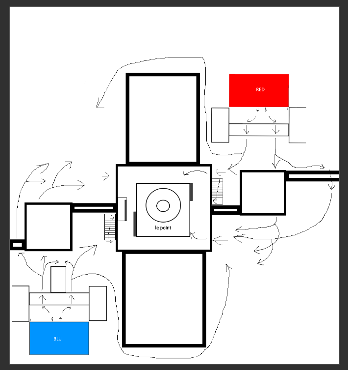
as the title says, im new to mapping, i created this layout of my first map and i wanted to ask for improvements i can do for it (being honest, the 2 main ways to the point was slig
1675189616646.png
htly inspired by sawmill, im an uncreative person lol) the gray boxes in the cp building is supposed to be covers
 

Waffe

L5: Dapper Member
Dec 2, 2012
230
203
it's a bit hard to tell since the doorways are not drawn so I'm judging by the arrows.

My main take from this layout is that the combat would happen in the flanks and not at the point where it would matter the most. I believe this since the flanks seem to be much more wide/open and therefore invite more players to fight. Also, the team holding the point might have an easy time to shut down the enemy team's fastest route to the point, forcing the enemy team to flank. The lower and upper flanks seem very long to me, and might be left sort of unused (except for the sneakiest players.)

You might want to make a koth map where the point is not the most interesting area (such as harvest) but splitting the teams into three areas (two large flank areas and also the point area) might make the combat too "thin" and less engaging. I suggest making the general layout more of a rectangle first, as flanks are always very long in a square map. Then I would try to emphasize the mid area somehow, for instance, by enlarging it.

EDIT: the number of paths seem fine btw
 

justyn_sly (piss man)

L1: Registered
Jan 31, 2023
35
7
it's a bit hard to tell since the doorways are not drawn so I'm judging by the arrows.

My main take from this layout is that the combat would happen in the flanks and not at the point where it would matter the most. I believe this since the flanks seem to be much more wide/open and therefore invite more players to fight. Also, the team holding the point might have an easy time to shut down the enemy team's fastest route to the point, forcing the enemy team to flank. The lower and upper flanks seem very long to me, and might be left sort of unused (except for the sneakiest players.)

You might want to make a koth map where the point is not the most interesting area (such as harvest) but splitting the teams into three areas (two large flank areas and also the point area) might make the combat too "thin" and less engaging. I suggest making the general layout more of a rectangle first, as flanks are always very long in a square map. Then I would try to emphasize the mid area somehow, for instance, by enlarging it.

EDIT: the number of paths seem fine btw
thanks for the feedback, i might try to improve the layout and also add a border around it so that the corner flank areas wont be very large

(and also probably fix some stuff like the high ground in the point and the random wall that i forgot to add to the red side)
 

justyn_sly (piss man)

L1: Registered
Jan 31, 2023
35
7
1675264781258.png

i have added some borders to make the corner flanks smaller and also added some details that i forgot on red side for symmetry, i might add some other stuff to improve later cuz idk what else to do