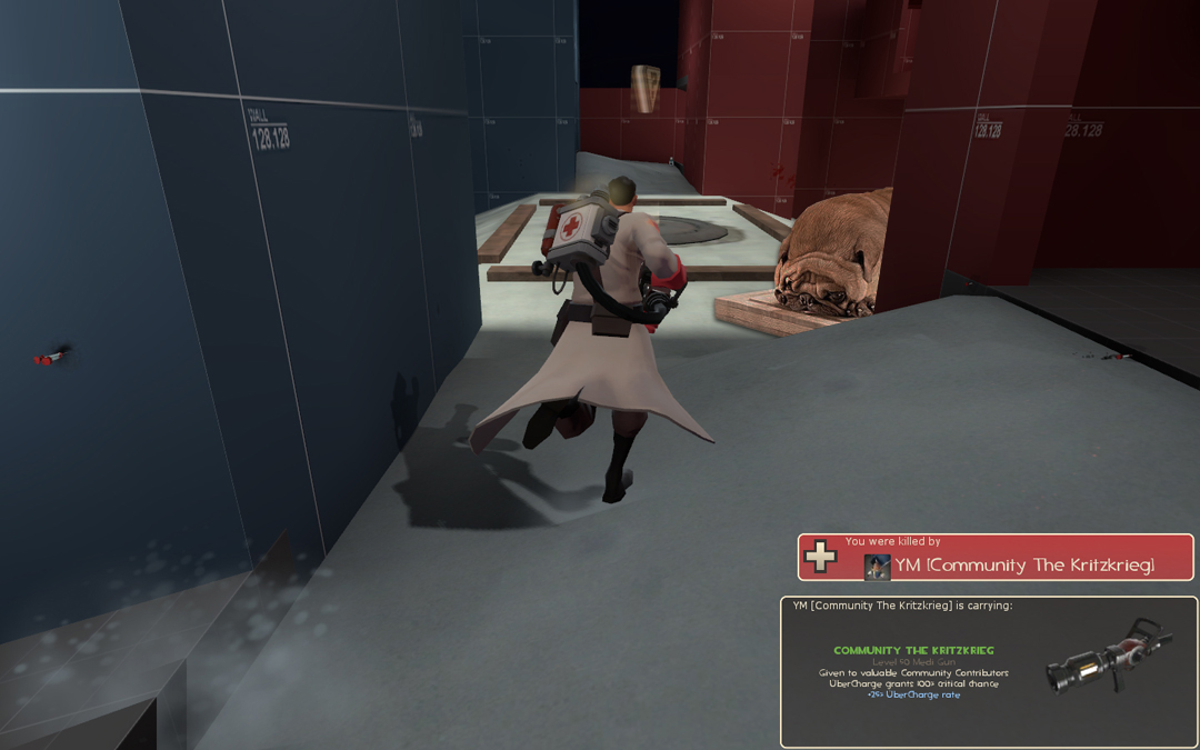
File Cabinets

Model File Cabinets 1.0

Rexy

The Kwisatz Haderach
aa
Dec 22, 2008
1,798
2,533
File Cabinets

Release: Feb 27, 2010
Author: Alex "Rexy" Kreeger.
E-mail: Kreeger242@live.missouristate.edu
Version: 1.0.0

Zip contains:

*This fantastic readme file!
*6 model files (118 kb)
*6 texture files (1 mb)

Extract to: "SteamApps\[username]\team fortress 2\tf" directory to install.

**YOU ARE NOT PERMITTED TO MODIFY ANY OF THE FILES FOUND WITHIN THE ARCHIVE, OR REDISTRIBUTE.
 

Void

Local Man Unable To Map, Sources Say
aa
Sep 14, 2008
1,873
2,984
There's not enough room in there to file all the thanks you're going to get.
 
Jan 20, 2010
1,317
902
Whoa, that demoman looks like he's covered in vaseline.

Also, these are awesome. Rexy, I love you.
_kiss.png


Post so I can thank you.
 

Penguin

Clinically Diagnosed with Small Mapper's Syndrome
aa
May 21, 2009
2,039
1,484
A-K for Alex to Kreeger.
 

Pocket

Half a Lambert is better than one.
aa
Nov 14, 2009
4,699
2,581
Running gag is running. Also sweet filing cabinet is filing. I mean sweet.
 

grazr

Old Man Mutant Ninja Turtle
aa
Mar 4, 2008
5,441
3,814
I think he's trying to pay homage to the more abstract art style of TF2. I also believe they look odd with concave sides. It kinda works though.
 

Dr. ROCKZO

L8: Fancy Shmancy Member
Jul 25, 2009
580
159
Tapp, Blender Noob to Pro is probably the best way to learn all the basics, then just browsing Blender Cookie for more interesting tuts is probably the way to go.

Rexy, Amazing Job as always.
 
Feb 14, 2008
1,051
931
Rexy uses LightWave afaik
 

Acumen

Annoyer
aa
Jun 11, 2009
704
630
cool beans again ! you must have been through with your exams, when you pump out that stuff on an hourly basis :D

again the heavy paintstrokes kinda bug me. it's something im having problems with imitating the valve style myself, also. their strokes just look different.
i think with the cabinets, less stroke would be more - one horizontal, one vertical and leave it at that, i'd say. cause when you use 3-4 of them it gets really heavy on the contrast side of things. even on your preview screen i think it shows the effect. i'd really prefer a downbrushstroked version :)
 

The Gentlemanne

L4: Comfortable Member
Jun 18, 2009
170
94
"I find your faith in Dogbread disturbing"
 

Pocket

Half a Lambert is better than one.
aa
Nov 14, 2009
4,699
2,581
Actually, now that I've seen it in the game, I'm having to agree with Acumen on the texturing. I've noticed this in your models in general, including those metal doors and the forklift. The "neutral" cabinet looks like army camo.

The off-centered label cards were a nice touch though. I can't remember the last time I've seen a file cabinet whose labels weren't askew.