Feedback Please!

chrisamundo

L2: Junior Member
Apr 2, 2018
63
11
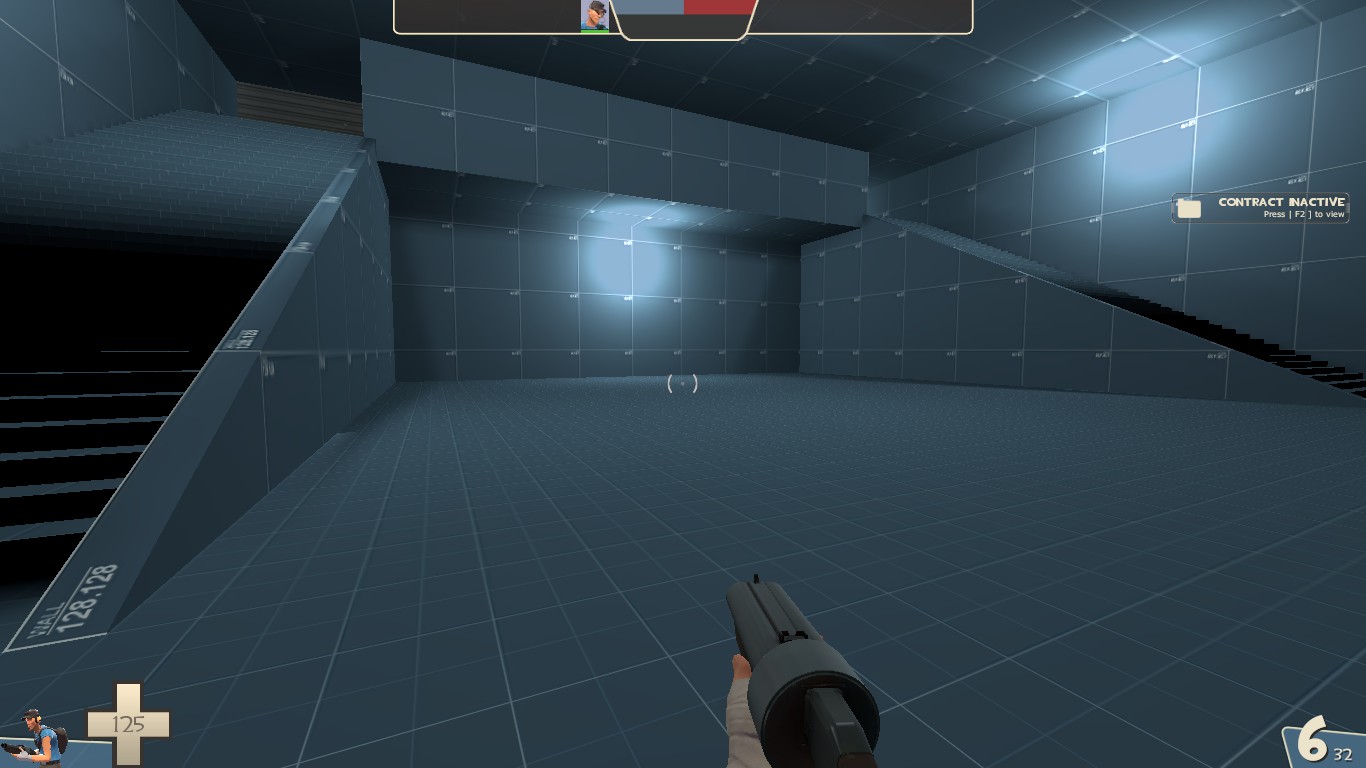
Hey guys, I'm working on a map called cp_wantigal, and I just wanted your feedback on this screenshot I took of some really early development of the map, to get some really early feedback on my map.
20180413122148_1.jpg

What do you guys think?
 

skipperlink

L1: Registered
Aug 4, 2015
41
8
If this is a spawn room it seemes a little big but no real issues. spawnrooms can be relitivly simple. but if this is a play area its still big and too open. the height is good but you need to make it more... playable? like add height that people can walk on and fight over.
TL;DR too big and not enough stuff in it.
just play around with some ideas and you will get it :)
 

chrisamundo

L2: Junior Member
Apr 2, 2018
63
11
If this is a spawn room it seemes a little big but no real issues. spawnrooms can be relitivly simple. but if this is a play area its still big and too open. the height is good but you need to make it more... playable? like add height that people can walk on and fight over.
TL;DR too big and not enough stuff in it.
just play around with some ideas and you will get it :)
I can understand what you are saying there, but unfortunately we can't read each other's minds, because I'm designing a choke point here, and you (obviously) didn't know that, as I said before, we can't read minds. But thanks for the feedback anyway :)
 

skipperlink

L1: Registered
Aug 4, 2015
41
8
I can understand what you are saying there, but unfortunately we can't read each other's minds, because I'm designing a choke point here, and you (obviously) didn't know that, as I said before, we can't read minds. But thanks for the feedback anyway :)
ahh i see well then what i could say about it is those are a tricky thing I personalyhavent made any real /good/ chokes but give both teams a good foothold. and look at other valve maps for inspration and ideas :)
 

chrisamundo

L2: Junior Member
Apr 2, 2018
63
11
ahh i see well then what i could say about it is those are a tricky thing I personalyhavent made any real /good/ chokes but give both teams a good foothold. and look at other valve maps for inspration and ideas :)
I just want to add that this choke is BLU team's final cap, (as this is a CP map), just so you know :)
 
Nov 28, 2017
130
119
So this is a 5cp gamemode? And the picture is your current layout for a final cap?

Best thing you should add is cover for the blu team and the cap point behind the cover. Also another thing I have never seen people do is put the cap point below ground, so if you could make a valley on where the light is and put the cap in it, it could be very interesting.
 

Da Spud Lord

Occasionally I make maps
aa
Mar 23, 2017
1,339
994
There's only so much that can be suggested without playing on the map itself. Like skipperlink said, the area looks a bit open and flat, but aside from that, it's hard to judge without jumping in-game and seeing it, especially since we have only 1 screenshot and no idea what the surrounding areas look like. In TF2, each playspace interacts with adjoining playspaces, and one area may work really well or really poorly depending on the space around it. One other tip that I'll offer though, don't make the room symmetrical, at least not out of laziness; symmetrical rooms generally look lazy (except for at the mid area of a symmetrical map, which you have admitted this is not). Making the room asymmetrical allows you to diversify the gameplay and make each route in and out have its own advantages and disadvantages.