DuskTown

KotH DuskTown A11

Redbr34

L1: Registered
Jan 29, 2021
17
2
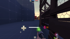
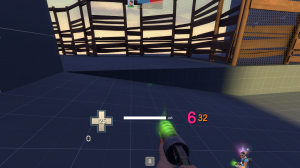
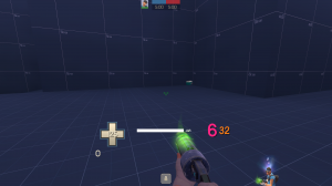
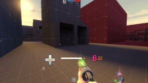
DuskTown - My first proper map for TF2

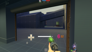
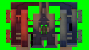
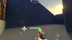
This will be my first proper map for TF2, so I require any playtest, so I can make this map fun as possible.

As you can see it has dev textures, its because I want to be everything fine before adding proper textures.

Known problem: Yes I know that the holes on capture point ceiling are spammable, if its really really, reaaally bad, I will open up like on Suijin.

View attachment 141825
 

Skylark

Super Gay Developer
aa
Aug 9, 2018
163
373
Why did this go directly into B1?

This looks like it should be A1 and should be judged as alpha, by calling it B1 you're just going to get feedback telling you that it should be alpha. Beta is for after you have completed the alpha stage, and the alpha stage is for core layout and there doesn't appear to have had any testing.
 

Redbr34

L1: Registered
Jan 29, 2021
17
2
Why did this go directly into B1?

This looks like it should be A1 and should be judged as alpha, by calling it B1 you're just going to get feedback telling you that it should be alpha. Beta is for after you have completed the alpha stage, and the alpha stage is for core layout and there doesn't appear to have had any testing.
I am calling beta because for me Alpha is when I was testing alone with bots just testing the point and designs, then the entire map. Which now i want people opinions
 

Skylark

Super Gay Developer
aa
Aug 9, 2018
163
373
I was testing alone with bots

Bots don't test maps, it's no better than running around the map with nothing. You need to let other people test in alpha, because there's always issues, and if by some fluke there aren't issues (although I can spot a bunch just from the screenshots there's going to be more) then well done you can then move onto beta and you only waited a day longer. However that never happens, by making it beta you are also then saying that you don't care for feedback relating to layout changes while subjecting people to a map that has dozens of issues that would have been caught and fixed in alpha.

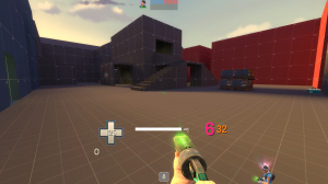
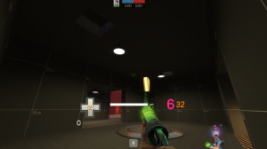
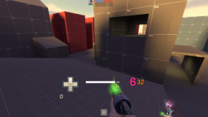
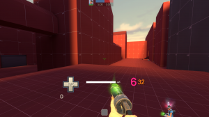
I had a run around and this is some of the feedback you're ignoring because you think it's ready for beta and didn't find out because testing with bots doesn't count as testing (with screenshots supplied)
  • Overscaled, massively
  • Massive sightlines
    • Long one from mid into spawn
    • Along the sides
    • Through mid and connectors
  • The placement of pickups don't make sense, health and ammo are never placed together and on one side of the map there are 3 full healthkits
  • Slope leaving the tiny spawn exit door (why is it small) doesn't line up with the higher ground (total height variation in ground is 80hu and it slopes towards spawn rather than away)
  • Mid is flat with just the cap building having unprotected stairs leading into an enclosed room with holes in the floor just big enough to fall down
  • This map seems to have been designed assuming that everyone is a jumping class, there are many rooves which require a jumping class to get to and it's the only height variation on the map other than the exposed stairs which are visible from 4 long sightlines
  • The cap area is claustrophobic and with holes into it allowing defenders more defence making attacking tedious.
  • Spawns are long and seperated
  • The map is so wide
  • There are 5 routes to mid, however 3 are just cramped corridors going uphill (they're just going to exist to give snipers sightlines)
This is why we test, this is why everyone starts at a1, I really hope you don't waste time detailing this. Beta isn't just a name to say that you're confident, it tells the testers you're polishing the map and not making huge changes and that nobody should suggest large changes (people will assume this map has been tested before, assume that the obvious feedback has been submitted before and ignored). Alpha for layout, Beta for detailing and tweaks, RC it's finished and just needs any final issues fixed.

hl2_2021-01-30_22-18-28.png hl2_2021-01-30_22-18-35.png hl2_2021-01-30_22-18-42.png hl2_2021-01-30_22-18-51.png hl2_2021-01-30_22-19-02.png hl2_2021-01-30_22-19-10.png hl2_2021-01-30_22-19-20.png hl2_2021-01-30_22-19-41.png hl2_2021-01-30_22-20-26.png hl2_2021-01-30_22-23-11.pnghl2_2021-01-30_22-18-17.png
 

Redbr34

L1: Registered
Jan 29, 2021
17
2
Yeah, I am still learning TF2 designs, now from what you said I agree, and going to move it to A1 instead of Beta. I Actually Had fun playing with bots and some few friends getting the quick look on it. I Just wan't to make a cool map.

I wasn't going to detail right away, i was going to leave it as for the final release, and after patching adjustments. My way was adjusting the main layout on alpha, then testing with players on beta and adjusting with small or bigger changes and the detail for release. I don't wan't to ignore suggestions and etc. But if you think doing that way is better than the way i am doing, than i will change it.

I am not sure about the scale, for me its fine, plenty of room to move around.

Pickups will be easily moved or removed from feedback.

Is it mid being flat a bad thing?

The capture point building i got inspired from Suijin and Harvest, but if the map plays better with the point on a platform or just open i will change it then.

"Spawns are long and seperated" sorry i didn't get what you mean't with it, is it because it takes longer to reach the capture point?

"The map is so wide" since my plan wasn't to detail the map on beta, i can change it with no problem.

"There are 5 routes to mid, however 3 are just cramped corridors going uphill (they're just going to exist to give snipers sightlines)" Yeah it sounds like a lot now, Idk how to change it in relation to snipers sightlines, but i accept suggestions.

I am going to edit the version to A1 and adjust one thing on the capture point and update for the playtest, because i don't know how it plays out with only players.

Also don't take BadMesa seriously, i was experimenting with it.

Well thanks for the response, i didn't meant to sound rude with my first response, i just want this map to turn out good in the end.
 

Skylark

Super Gay Developer
aa
Aug 9, 2018
163
373
Is it mid being flat a bad thing?

Mid being flat means that fights are dull, having an area with varied height variation introduces a lot of new ways fights are carried out.


"Spawns are long and seperated" sorry i didn't get what you mean't with it, is it because it takes longer to reach the capture point?

I mean that because the map is so wide it has forced you to make a really long spawn that stretches across the map rather than being more like a squashed hexagon


Will be interesting to see where this ends up
 

Redbr34

L1: Registered
Jan 29, 2021
17
2
Last edited:

Redbr34

L1: Registered
Jan 29, 2021
17
2
A3a Changes:

-More lights around the map.
-Spawn's courtyard are less thin.
---
A3b Changes:
(These are massive changes that i can easily swich to A3a incase they don't work)
-Extended the stairs to the wall of top mid, so mid is kinda less open.
-Added planks connecting bottom mid to capture point second floor.

Read the rest of this update entry...
 

Redbr34

L1: Registered
Jan 29, 2021
17
2
-Added some details with reflective textures.
-Safe teleporter spots for both sides on mid.
-Clipped some stairs sideways.
-Added a diagonal wall to fill useless space in the middle.
-Fixed a exploit that I forgot to fix and wasn't found on playtest.
-Lights are brighter.
-The extended stairs on mid now has a second underpassage.
-Patches for pickups.
-Extra ammo added on mid.

Read the rest of this update entry...
 

Redbr34

L1: Registered
Jan 29, 2021
17
2
-Removed two healthpacks from middle.
-Changed two medium healthpacks from middle to a small one.
-Added more health to the courtyards for both teams.
-Added a broken windown on the Capture point entrace's wall.

Hopefully its easier to attack.

Read the rest of this update entry...
 

Redbr34

L1: Registered
Jan 29, 2021
17
2
-Added a custom dusk skybox, to represent more the map's name.
-Increased the ceiling of the medpack room, and extended the wall back and added a mini wall.
-Made the height variation of the medpack room taller.
-Added textures for some floors.

Read the rest of this update entry...