Feedback:

-displacements in the tunnels with these supports leave a lot to be desired. I feel like the supports should be right on the cave wall instead of having these gaps

-window could use a frame to look better

-can see the nodraw brush under this water

-elevator could use higher cubemap reflections

-joe's locker doesn't make sense here. There's no rockets or anything involving him and really doesn't fit the map

-could use higher cubemap reflections

-I feel like the staircase here should just fill the whole space. The area on the left still acts as a ramp for stairs so I don't really see why it's there

-you use a lot of these barrel clusters throughout the map and many in places which don't make sense for them to be. In order for these to be there a forklift would have had to put it there, but this spot an many others only have stair access and just don't have the space for that. You can do something more interesting instead of these barrels.

-remember to vary the textures on stairs so it doesn't repeat as often

-mannhattan fireworks doesn't make sense with the rest of the map theming

-I feel like there's a better texture to use for displacement side walls that blends better with the ground

-overlay's messed up here

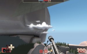
-would be neat if the clouds moved like on 2fort

-these stairs are very awkward. There's hardly any space between the walls and them and they make an odd triangle behind them which is annoying to get out of

-why is the lighting so yellow here?

-clip it smooth

-detail sprites go through the floor here, happens a good bit throughout the map too.

-trigger_hurt brush in the pit uses force to push players back up out of it when they die. This usually can lead to crashing so you may want to change it

-clip it smooth

-this door is kinda awkwardly shoved in there

-I feel like the change of textures here doesn't look quite right. Maybe have the red metal just be wood or include a trim on the top instead of it just being on the side

-floating pully thing

-this exit from blu spawn onto this roof is neat but it makes me feel like I can jump onto the other roof, even though I can't. Needs a better explanation as to why I can't with how close they are besides "you just can't"

-clip it smooth and fixt the weird textures

-I can't figure out what this place is supposed to be. Is it a mine or a lumber mill? It's got signs and props that fit both throughout it. I feel like it should gradually go from one to the other. Start with lumber mill signs and the lumber wood piles but gradually phase those out instead of using them and mining stuff from start to finish

-why is this minecart bumper prop in a wide open play space if it's not going to have collision on it? just remove it I say

-really like the look of this spot

-fence prop inside the wall here is full black

-more lumber piles. You really seem to like these and I feel there's better and more interesting alternatives then just stacking them all over the place.
That's all for now. Layout seems interesting and I hope to see it in a test soon so I can play it. Looking forward to how this map develops.