Looking forward to the update. We played your map on our server for the first time the other night (finally got people to listen to my suggestion) and a bunch of people said it's now one of their favorite customs. We have a couple of players that said it's their new favorite sniping map as well, which may be a bad thing.  For reference it filled our server... 11-12.
Obviously you've made some changes already, but I'll list out my recommendations anyway.
1. The red lighting in certain areas make it completely impossible to tell which team people are on. I'd like to see some white lights mixed in so you can catch glimpses of the person's actual color.
2. A few of the open areas are a bit too open. I'd love to see a single small building, crystal formation, etc added to those areas to help provide a bit more cover.
3. For some reason the sky is overly bland for me. I know it's intended to some extent, but I'd love to see it have a bit more warmth. Alternatively have you tried night/space skies while leaving the lighting in the map the same? Those might make the colors in the map itself stand out even more.
4. If gates are one-way, they should be marked for the team that cannot enter. It'll help the flow a little bit.
5. Something about blue's forward spawn bothers me. The arrow outside is an absolute requirement since the spawn feels like it's facing the wrong direction. If there's a way to move it to the other wall and rotate it, I think it would feel more natural. That's a very minor issue, though... just pointing it out in case you were considering it anyway.
6. You might want to consider changing the texture on the side of things from the texture on top. Right now stairs don't really pop, whereas if you used just a slightly different texture on the front face it'd really make them stand out and add some visual contrast.
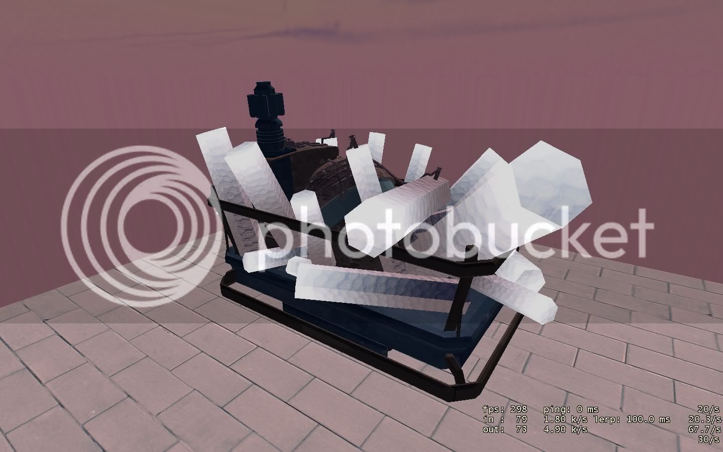
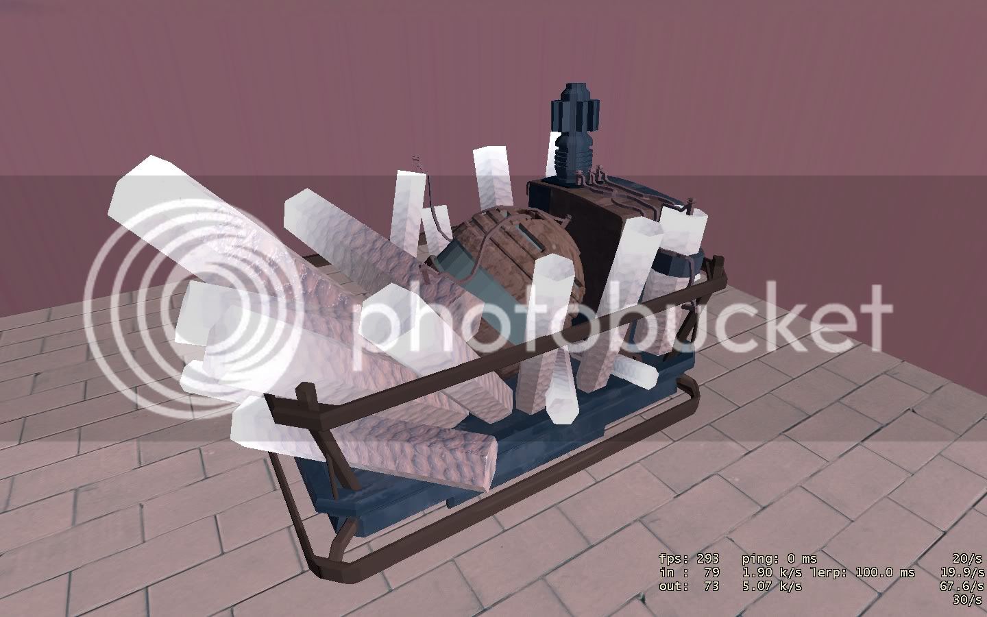
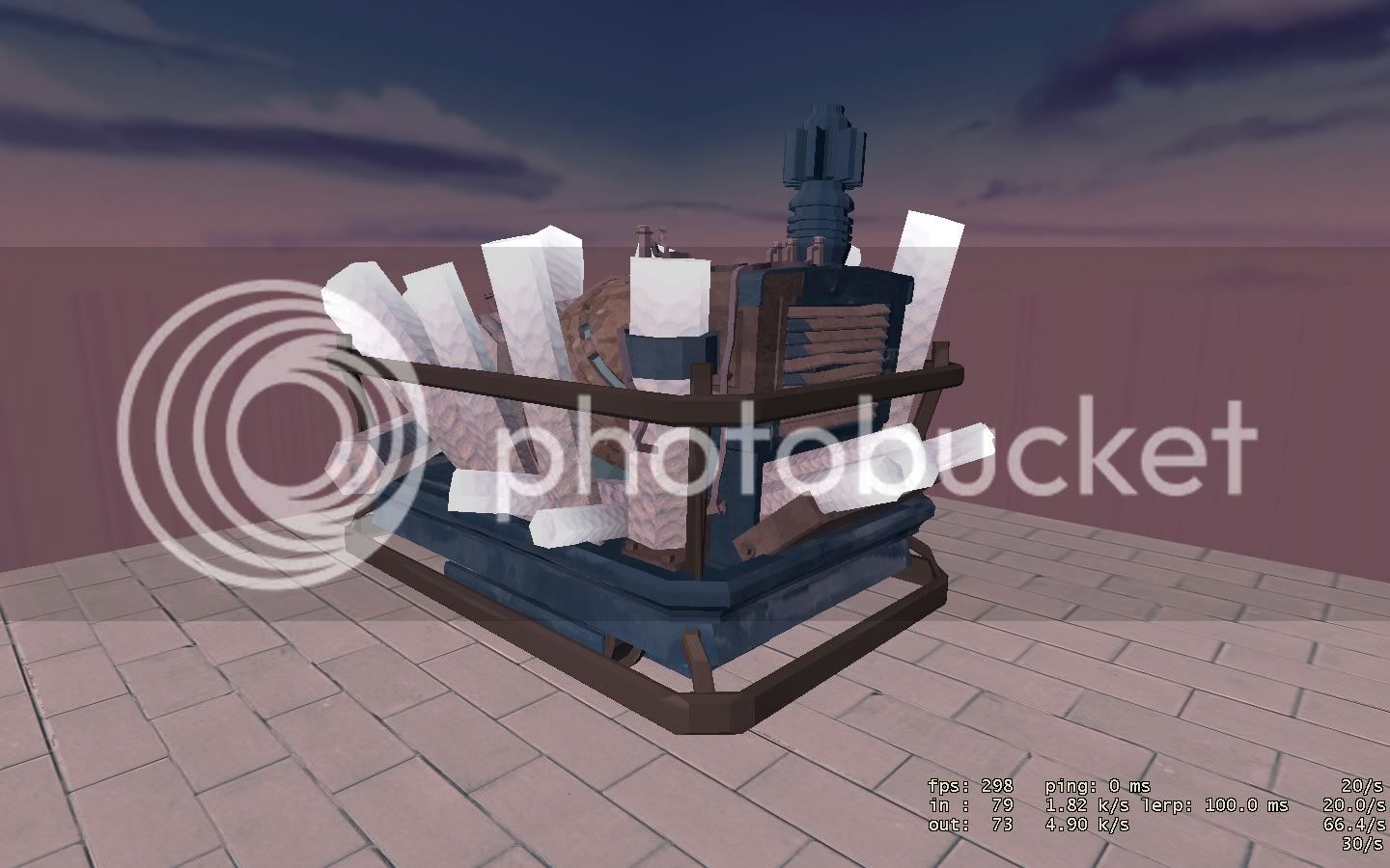
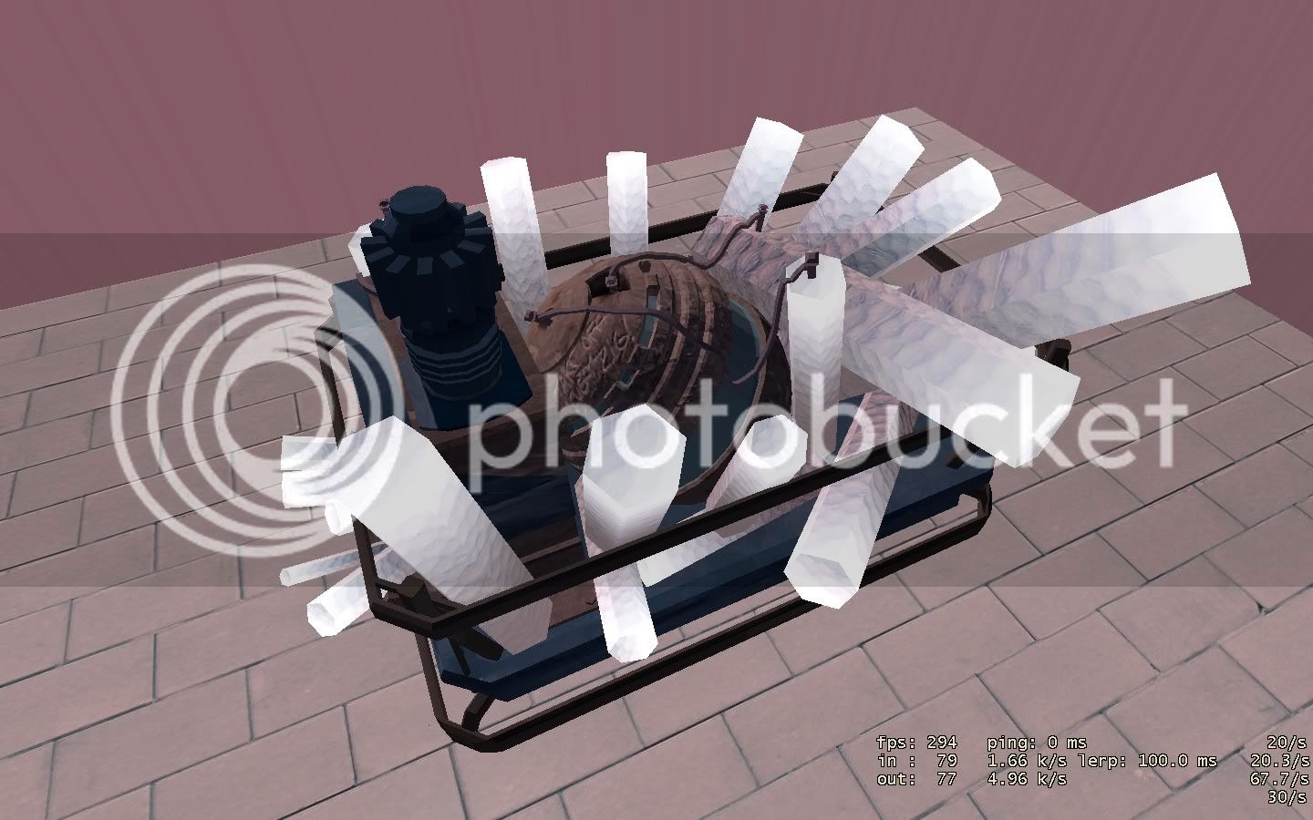
Overall I really enjoy the map. Nicely done... I'm looking forward to future versions, especially with the new cart.


