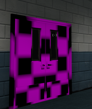
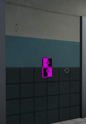
Not sure if this applies to the 3CP version too but you have a missing model here.
A few things here; This capture zone feels
really small for 5CP, and absurdly small for 12v12 gameplay. A few things to note here is that I really think you should put hazard tape surrounding the actual capture zone. The area looks really strange without them present. I really think substituting the ramps for staircases would make it look better but that is really up to you there.
I honestly believe you should move your mid capture zone to here; I think it'd allow for much more engaging combat as explosive classes could jump onto the point and quickly turn the tides of battle, as well as a sentry on mid isn't overwhelmingly powerful since the best angles leave it super exposed to both spam and snipers. Sightlines onto here aren't really bad and while I imagine people would complain about them I think it would be worth looking into.
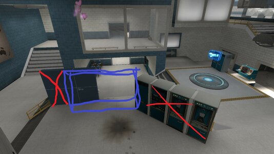
Why is the back of a fridge facing the staircase? lol
These elevator doors (and up/down signs) feels really weird being this reflective. There's not really any sunlight on them to warrant its reflectivity? Nor is there any artificial lighting.
A sentry right here (demonstrated with the wrangler since idk how else to really show it) can see all four routes into last and personally I don't think that's great. I would really recommend shifting around the cover here a bit.
Something like this would work probably. Last should be defendable by Engineers but not overwhelmingly oppressive.
I think that sums up my thoughts on Canaveral rn. Feel free to ask me anything, idm taking a second look. Originally just meant to point out bugs but I found these few gripes with the map and I didn't wanna withhold any feedback. I'm really liking your map so far!


