bridges

CP bridges b4

Apr 14, 2013
662
344
Wow! look at this! b3 released*!

(for Idolon: a3 released!)

I got to the point where, although the map is detailed and is in the beta stage, I need it to be playtested. The map went through some significant layout changes, and I really do need to see if it is any good. It would be great help if you could test the map, even if it seems like it's already pretty solid - There is no replacement for real people playing the map.


changelog:
-Detailed BLU spawn's exterior so it doesn't look so boring. Added some more detail inside BLU spawn as well.
-Replaced the bridge between blu spawn and A with normal buildings. Map now officialy has one bridge only.
-Changed some detail around A
-Changed the B bridge to look more realistic
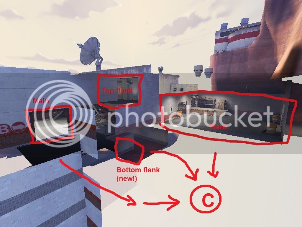
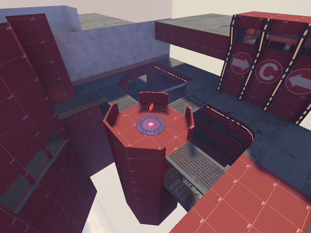
-All-new point C, and heavily modified B<=>C connectors
-Fixed most of the problems mentioned in feedback, both from the feedback section and the voting thread. Thank you everyone for the great feedback!
-Minor stuff
-Temporarily disabled the 3d skybox.

To do:
-2nd artpass (gutterpipes, windows, light cables and switchs, and more!)
-Light pass (color correction!
-Fixing reflections and cubemaps
-Fix the shared spawn "camping" issue
-3d skybox
-More optimisation, areaprotals and hint brushes, func_details and stuff


DOWNLOAD BZ2
 
Last edited:
Apr 14, 2013
662
344
After getting various (and conflicting) answers over at the chat, I'd like to ask if I can still add this map to impomptu's. I mean, it is not yet finished gameplay-wise, and needs testing in order to become balanced (as said in previous post- many of the parts have never been play-tested), but it is a beta-phase map, heavily detailed, got lots of playtime already, etc.
 

Pocket

Half a Lambert is better than one.
aa
Nov 14, 2009
4,701
2,583
Like, max tris or actually max brush faces? Either way that's impressive.
 
Apr 14, 2013
662
344
Here's the line from the log:
Code:
Brush 681483: ParseDispInfoChunk: nummapdispinfo > MAX_MAP_DISPINFO
Here's interloper's second opinion:
brush 681483: parsedispinfochunk: nummapdispinfo > max_map_dispinfo side 0 texture: nature/blendrockground006

Description:
You have too many/too big displacements

Solution:
Destroy, or simplify, some of your displacements

See also:
MAX_MAP_DISPINFO


This error will cause your map to fail compiling completely

The way I see it, "too many displacements" = "over the displacement limit". I might be wrong. Anyway, I already fixed it... I was, as I said, building the displacements badly.
 
Apr 14, 2013
662
344
IT'S BACK!!!!
It's been a long, long time. But it's time to change the oil, replace the battery and see if it still runs.


I plan on starting to work again on this map, this time finishing it. I want to make it good and better-playing, and then finish the detail. I think that I'm pretty close.

I removed all the stupid 3d skybox. I hate making 3d skyboxes as I never seem to make them right. For now it doesn't really matter anyways, so I'll make it again later on.
I don't know what to do with this map, as I've tested it multiple times, but didn't seem to find a real issue that is fixable, without making a whole area from scratch. And by this point, I have no intention of doing that.

Here's my interpetation of the map's gameplay current state. Comment if you disagree please, because I want to hear more opinions!!

The first cp is somewhat hard to attack due to it being an uphill battle, which is a feature that's not going to be removed. I'm working on making it easier, with more cover for BLU, and maybe some less significant change of heights.
The first point requires full cooperation, and every member of the team doing his best. Playing like that, is not that fun, especially when against a good team/an engineer team.
Defense has got a constant height advantage, while BLU is at a constant disadvantage. This gives the explosives classes- mostly the demo and soldier, a HUGE advantage since they have a much easier time hitting the enemy with splash damage. I try to give BLU demo/soldiers the advantage by making easy rocket-jumpable windows, that once are clear (and clearing small defensive buildings is, too, a work for pipes and rockets) are a great leaping spot for a direct attack on the point.

1st-2nd connector seems fine. right-side connector is not much used so I need to think of some way to make it more useful, Since left-side is much shorter, and does not have any massive disadvantages.

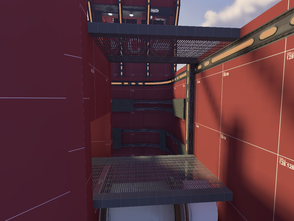
The 2nd cp is, well, what you could expect a cp on a long narrow bridge to be- a flat and narrow choke with only one small flank, but a massive flank, that goes way behind the point. It seems to be actually in favor of the BLU team, as they seem to get it every time they go past 1st.
The bridge is not going to be removed, since it was a really hard work to make, and it will be easier to simply make a whole new map.
And yet, it seems kind of fine.

2nd-3rd connectors are fine.

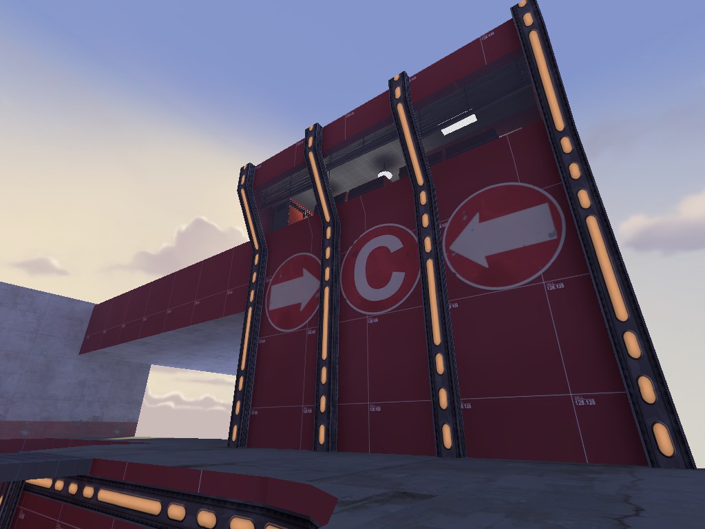
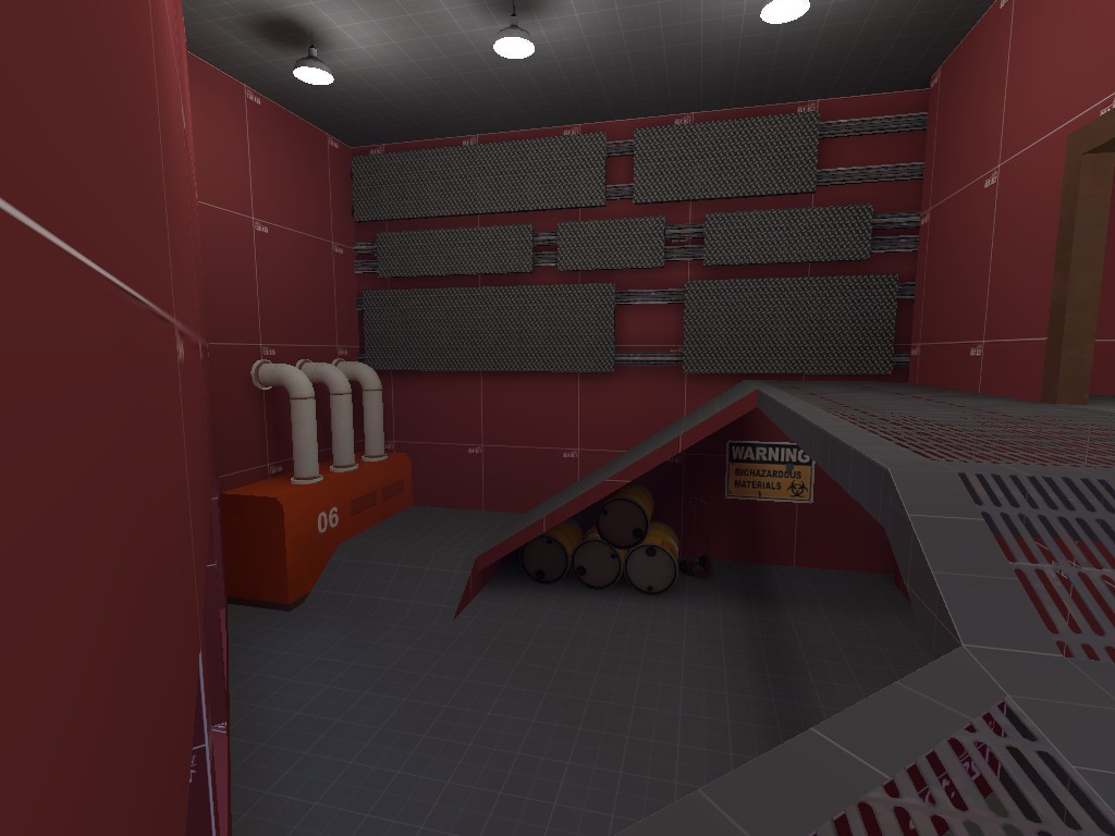
The (New!) 3rd cp is Hard to attack. It has flanks, but they are useless because they all lead BLU directly to the cover-less point. The point's room is high and wide yet short, and that leads to BLU being unable to get out of the small doors. RED can protect all 3 enterances at the same time without trouble. They even sometimes manage to push back through supply storage area (BLU's left flank). The best comparison I think of is Gorge's last, but so much harder that even without Gorge's Famous sentry nest RED can fully protect it.
I plan on making it longer so that the point is further away from main enterance, and make BLU left flank more flanky, by adding cover and changing the enterance door direction so it's less defendible for RED. And add more cover to the ledge around the point.
 

Moonrat

nothing left
aa
Jul 30, 2014
932
585
Oh, and the Cap Time is god awful, it are the main reason BLU always loses, we can't cap because it takes about 50 years for the point to finally give up, meaning that you have to go through multiple waves of RED enemies, which is no fun for BLU. In the time it took for BLU to cap 1st, RED could have had 2 Ubers, and that would eradicate anyone on the point. I think that the cap time should be lowered....
 

ExtraCheesyPie

L420: High Member
Jan 29, 2015
485
151
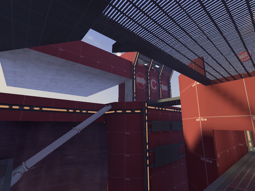
Gorge-like? Lol, the last 2 screenshots look just like the first cap of gorge, down to it being a bridge. Doesn't help that you used the same theme for it, with similar interior passages.

Yeah I know it's different :p The map is great, keep it up!

But really, it does feel like Gorge X Badlands.
 
Last edited:
Apr 14, 2013
662
344
Well, that is sort of what it is- Gorge X badlands (& hydro) themed.
I can assure you that gameplay is radically different though. (not necessarily in a good way...)
The only map with similar cp setup is mountainlab (manor) and that had no fwd spawns, while mine has. Besides, the way the 1st point is designed isn't like any other cp in game, due to the huge height disadvantage BLU is being put into. And 2nd's bridge is IMO more like Doublecross than Gorge.

I'm still working on this, mostly on cp timings and the 3rd cp, which is planned to be rebuilt (again...)
 
Apr 14, 2013
662
344
B4 soon
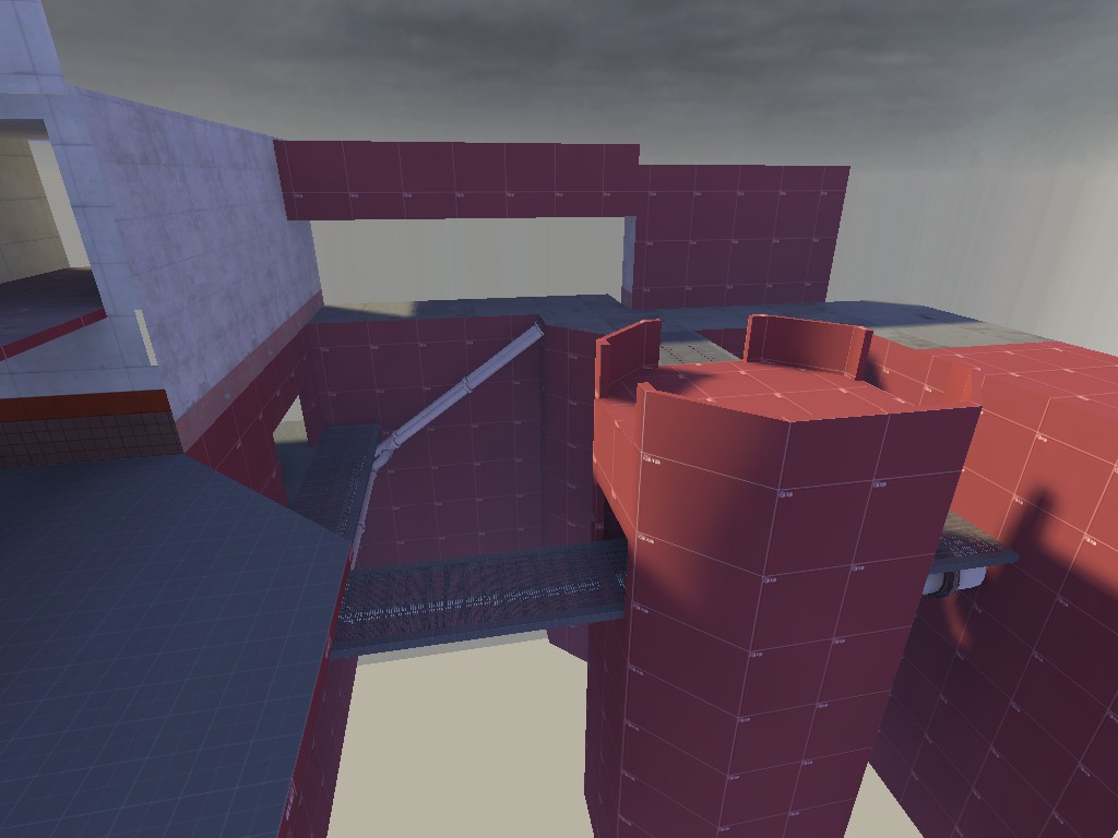
Much more optimized this time

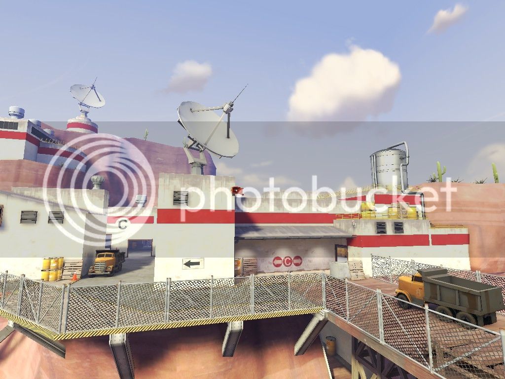
2015-06-05_00004_zpsqxbwxn2k.jpg

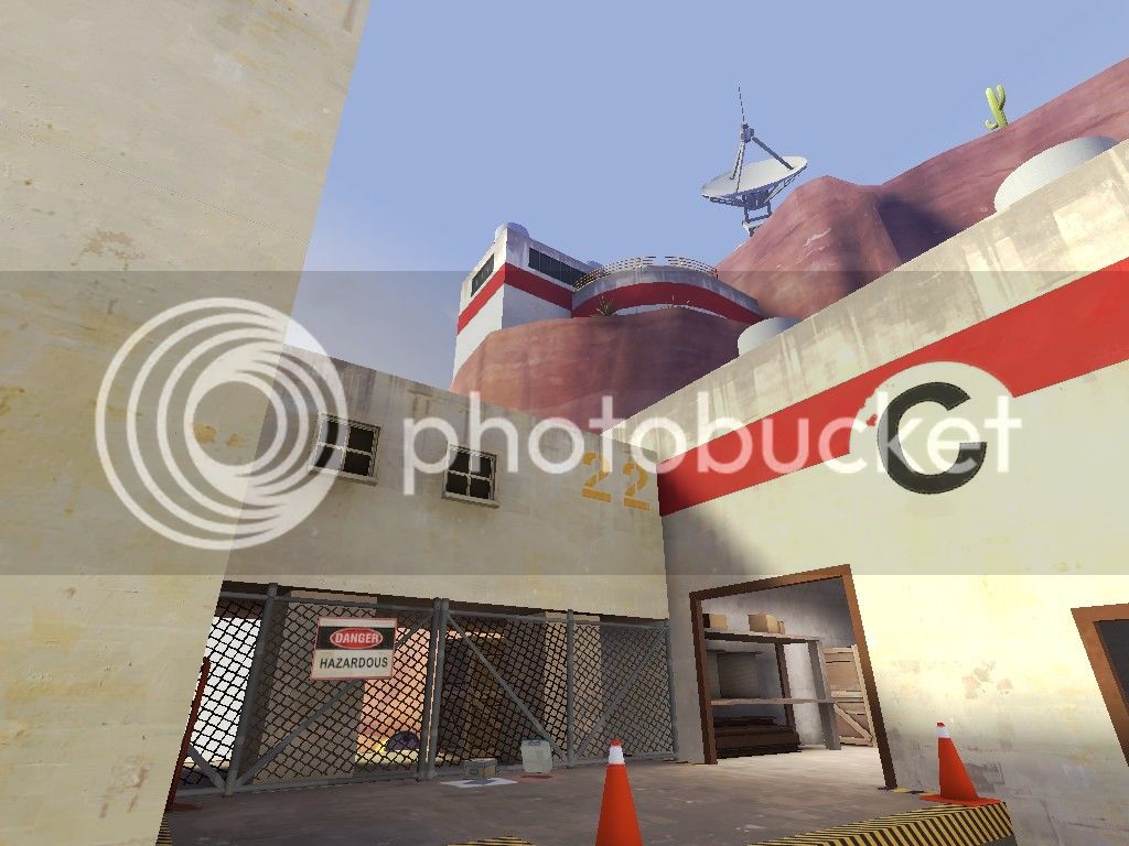
2015-06-05_00005_zpsd3rodqyq.jpg

2015-06-05_00009_zps2hhp0ttz.jpg
 

Kraken

Few more zeros and ones for the site to proccess
Dec 21, 2014
430
121
How have i not seen this? This looks bloody brilliant.