Borneo

PL Borneo rc4

  • This map is featured! Our best maps, all together in one place for your viewing pleasure.

heyo

L2: Junior Member
May 14, 2008
71
59
Updated

-Removed many routes to create more choke points in general.
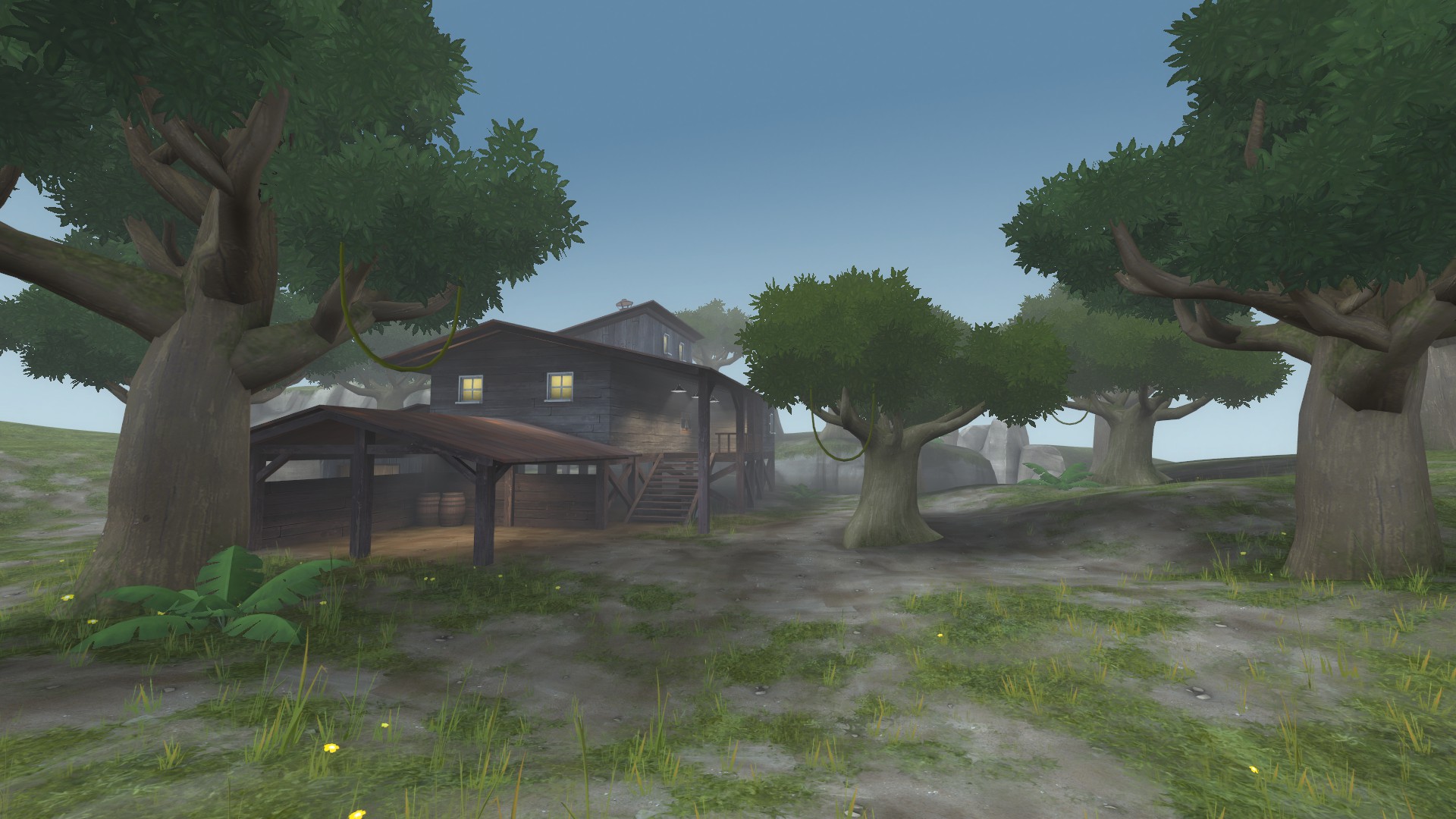
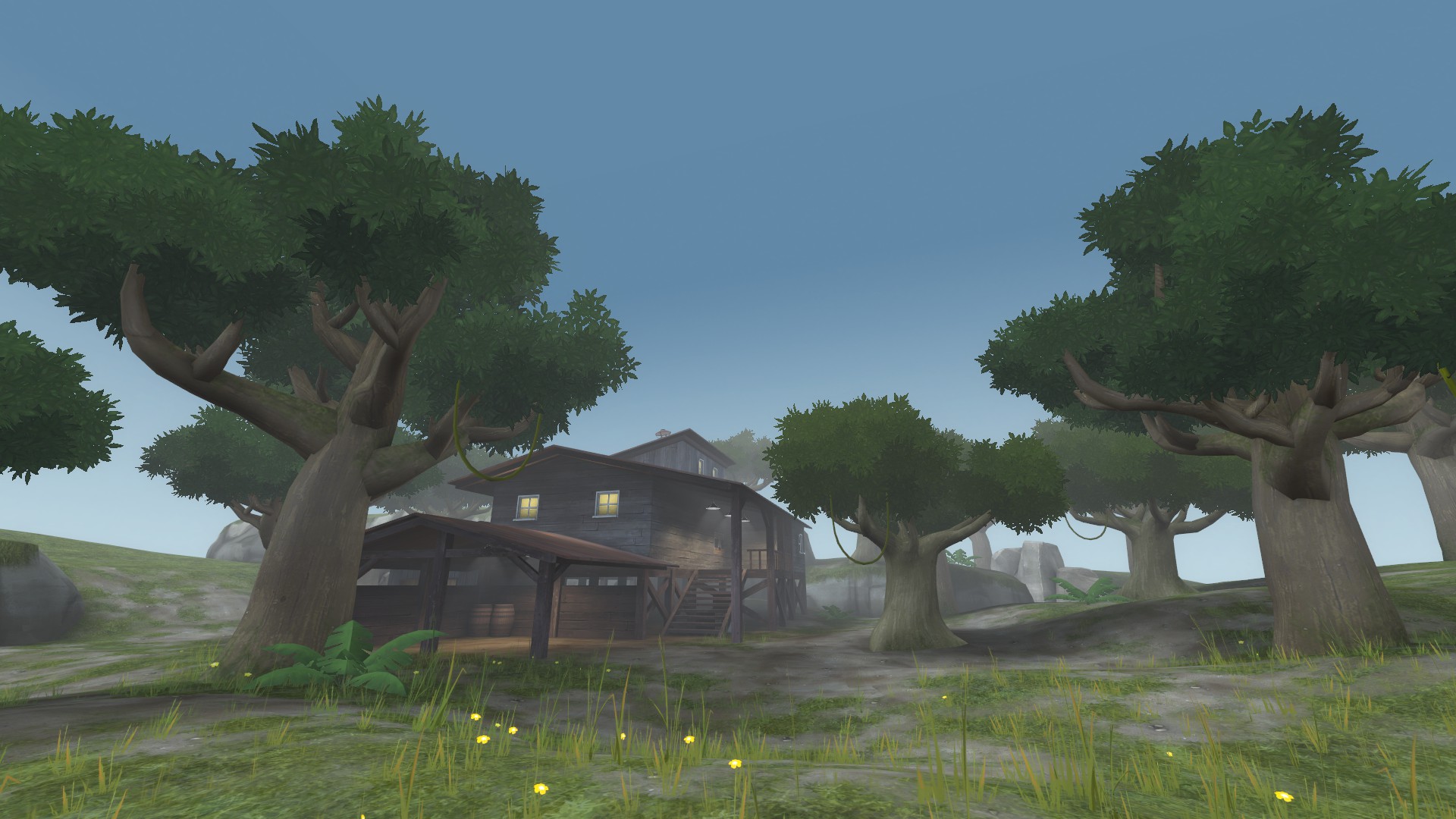
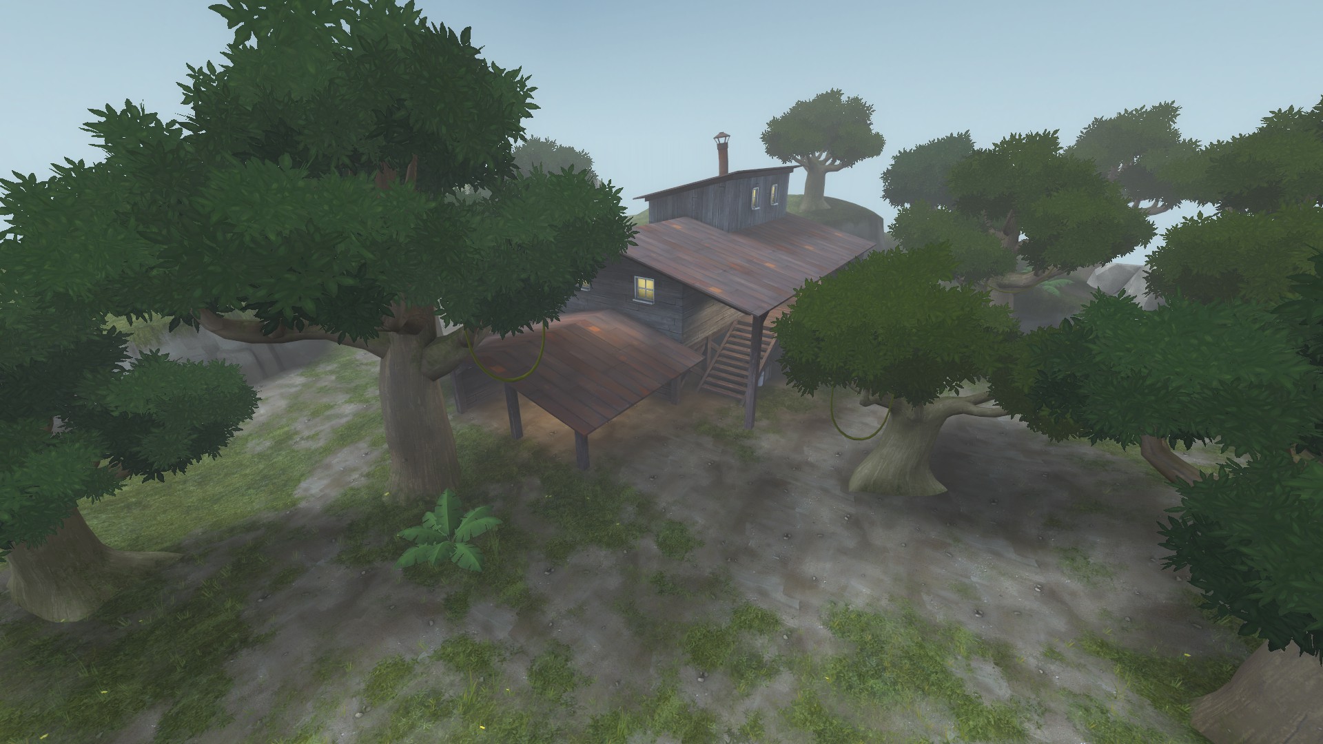
-Added an interior route through the building in area 1.
-Added a nook in the wall under the building in area 1.
-Removed blues flanking route behind the building in area 1.
-Added a big high up hill/cliff in area 2 to buff defense.
-Removed stairs up to defensive building in area 3.
-Redid building in front of alley at final.
 

heyo

L2: Junior Member
May 14, 2008
71
59
I've decided that the map is really not working well in its current form. I'm going to redo major parts throughout the whole map.

I think the issue is that it's too chaotic right now. My theory is that the paths are not splitting off into seperate areas enough so it creates big spammy/chaotic areas.

Does anyone have any other theories as to it's not playing too well right now?
 

honeymustard

L9: Fashionable Member
Oct 26, 2009
698
574
I really enjoyed it except for the first chokepoint - was a bit too tight there (could have used another route to the side or a one way route for BLU) and the red spawn was a little close. The rest seemed pretty good though.
 
Feb 14, 2008
1,051
931
I really hate the second point, it's like fighting a war trying to even get close to the cart there, sentries seem to have a particular advantage. The 3rd point was peculiarly easy compared to the second, and the last point played just right. I would however liked to have seen more "spread" of the team on the final point, because we basically all ended up bunched up on the right hand side so we could uber into their sentries.
 
Last edited:

heyo

L2: Junior Member
May 14, 2008
71
59
Updated
-Redid all the areas. Each area has the same basic shape as before but I have added things to split the paths up more. The track has also gotten longer in general.

Hopefully this will fix the chaos the map had before.

New screens up as well.
 

heyo

L2: Junior Member
May 14, 2008
71
59
Updated:
-In area 1, opened up a space under the big defensive platform and added a door there that goes into the big building.
-In area 1, removed flanking route through the big building.
-In area 1, segmented the big defensive platform to have a low part and a high part.
-In area 1, made right side entry to building with cap higher up.
-In area 2, widened bridge.
-In area 2, extended blue entry building forward and expanded the platform connected to it.
-In area 2, lowered the entry to the back route.
-In area 3, removed left door in offensive side route.
-In area 4, removed right flanking route through the concrete building infront of the final building.
-In the final building, expanded area around red's right spawn exit and moved blues entrance to the building over.
 

heyo

L2: Junior Member
May 14, 2008
71
59
Updated:
-In area 1, split up the flanking route behind the platform to make it harder to get through.
-In area 1, lowered blues right exit to ground level.
-In area 1, outside blues left exit moved the stairs up to the defensive building further back.
-In area 2, removed the stairs in the flanking route.
-In area 3, made defense have a high up entrance into the secondary tunnels.
-In area 3, moved right entry to cap building further to the left and higher.
-In the final building, made whole left side of the interior lower.
-In the final building, added a nook in the wall on the tracks level.
 

heyo

L2: Junior Member
May 14, 2008
71
59
Updated
-In area 2, added flanking route stairs back but made a long path to take them so it's risky for offense.
-In area 3. redid the secondary offensive entrance into the area. It's now closer to the other entrance and defense has a high ground over it.
-In area 3, raised up wooden platforms around cap building to give defense more of an advantage.
-In area 3, where the ground used to dip under the level the cart is on, it now is raised there as a hill area so defsense can better move up and control the area.
-In area 4, turned defensive sentry building into a raised platform area so it now can be used for all kinds of defense besides SGs.
-In the final building, redid most of it, making it wider and more open and redoing the entrances.
 

English Mobster

L6: Sharp Member
Jul 10, 2011
355
299
Ran through this map in preparation for gameday.
A lot of the initial areas feel cramped and don't give a lot of vertical space to classes such as the Scout, who need that vertical space to stay alive. While this does get better as the map goes on, some of the opening areas are a death sentence for Scouts.
I would open some of the hallways up a tad more vertically, to give Scouts and the like a chance to use what they're good at and stay mobile.

E: Oh, yes! I found a bug on the final cap. The cart did a little somersault over the capture zone and landed sideways on the other side, without blowing up. I'm going to guess your final path_track wasn't far enough over the cap, and it made the cart bug out. I suggest you take a look at it.
 
Last edited:

heyo

L2: Junior Member
May 14, 2008
71
59
Updated:
-In area 1, replaced the big building with a hill area, and redid the defensive positions there.
-In area 2, added more routes in the secondary entrance hallways.
-In area 2, when blue caps they now cannot go through the chickenwire door until the big track door is fully open.
-In area 2, added a second exit to red's spawn area.
-In area 3, raised the defensive building in the middle of the area.
-In the final cap building, made pillars thicker and track longer.

I think the map is ready to start detailing.
 

heyo

L2: Junior Member
May 14, 2008
71
59
Updated:
-In area 1, made the red building have an interior and made the outer platform bigger to create more of a chokepoint in that spot.
-In area 1, added box tree.
-In area 1, added a sentry shack behind the red building.
-In area 2, added another route for blue that goes up from the building the cart comes out of to the cliff area.
-In area 2, widened the door to the flanking route and removed the glass in the window.
-In area 2, the bridge now has 2 walls on each side at the top.
-In area 2, added stairs up to the defensive side to add another route for blue.
-In area 2, moved red's spawn back to area 3.
-In area 3, redid rock layout and turned rock wall into a hill.
-In area 3, moved middle platform further back towards defense.
 

heyo

L2: Junior Member
May 14, 2008
71
59
Been working on the jungle theme for the map. I've made a little jungle scene to test it out in. Here's the progress on some of the models/textures:

test_jungle_scene_010043.jpg


It has taken me lots of effort to figure out the best way represent the leafs visually. Feedback and suggestions are always appreciated.
 

honeymustard

L9: Fashionable Member
Oct 26, 2009
698
574
Looks great! Maybe a bit too cartoony though - I think lowering the brightness of the leaves a little bit, and upping the contrast, might help them look a bit better.
 

heyo

L2: Junior Member
May 14, 2008
71
59
Looks great! Maybe a bit too cartoony though - I think lowering the brightness of the leaves a little bit, and upping the contrast, might help them look a bit better.

I took your suggestions. I slightly upped the contrast between the top and bottom leaf clumps. Or did you mean more contrast between individual leaves? Think this is any better?:
test_jungle_scene_010048.jpg

test_jungle_scene_010049.jpg
 

heyo

L2: Junior Member
May 14, 2008
71
59
They still look like leaves from Tarzan...

I think detailing is what it needs more of. Right now its just a few colors...

Maybe reskin the fallen leaves texture green? and borrow that?

Well in the real map there probably won't be this many trees in one area in the foreground. Most trees will be in the background.

And funny you say they look like the leaves from Tarzan, that was one of the movies I used for reference. I chose to make the leaves out of clumps put together rather than branches with transparency. People usually don't make them this way because it's less realistic but there are some upsides to this way:

For instance, if I made them the other way I don't think they would look impressionistic enough for TF2. Also, they would also lose a lot of the 3d form you see when you look at them from a distance. Since these trees are primarily going to be in the background I think this clumpy way is the better way to go.

I agree it does need more detailing. I'm currently working on making more bushes and plants for the ground. Also I will be adding a bunch of flowers and such for the ground to give it a bit more color.
 

Languid

L5: Dapper Member
Oct 9, 2009
240
256
i think they fit the tf2 style nicely. I'm more concerned by how you make branches, they just jut very awkwardly out of the trunk