Blackcomb

CP Blackcomb A2

toopliss

deer
Dec 5, 2015
59
78
Blackcomb - A 3-cp attack/defend map set in a snowy alpine.

A attack/defend control point map entry for the Connect 5 contest.


BLU is trying to take control of RED's sawmill facilities and log resources while RED does whatever it takes to stop them.
 
Last edited:

Simulacron

L-3: Simulated Member
aa
Feb 17, 2016
313
326
I loaded up the map on an empty server and ran around for some time, and this is the feedback I got. Remember, I'm trying to help you improve your map and not want to make it down.

Here are my thoughts:
First off all the map feels sometimes a little bit like a labyrinth. There are so many rooms and routes in your map that make it very hard to orientate. You forgot to add arrows leading the player to the points which make it even more complex to understand. I would suggest you go through each route after another and ask yourself: "What is the purpose of this route? Do I need it?"
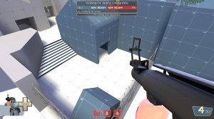
This area for example isn't needed in my opinion. You almost need to go behind blu spawn and it doens't lead anywhere:
20180114160106_1.jpg
When you exit blu spawn arrows could really help to navigate. When I left the spawn I was unsure where to go because of all those possible routes:
20180114155949_1.jpg
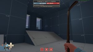
For blu spawn itself: I feel like this area is misleading. I thought there was an exit, but it was just a window:
20180114155723_1.jpg
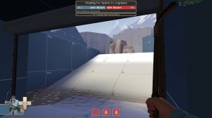
Why would I ever take this exit? The defenders have the highground and I have nowwhere to go after I left spawn:
20180114155734_1.jpg
You could try removing this exit and instead use the area I pointed out above as a new one.

Clipping:
The next important thing is the clipping on your map. It seems like you used blockbullet to block areas of, as I couldn't find any clip-brushes. The problem with blockbullets is, that, as the name says, it blocks bullets. This causes problems like this:
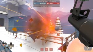
20180114155918_1.jpg (The area behind this fence also feels like it is accesible, make sure it looks blocked of)
You can esaily fix this by replacing all blockbullet extures with clipping textures.
Also, why are there trigger brushes on the top of the roofs? I couldn't find out what they were doing.
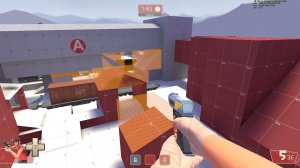
20180114162152_1.jpg 20180114162159_1.jpg

Water:
Next thing: Why does this water hurt you. It's not enough to kill you, but it is annoying:
20180114160029_1.jpg
It also fells inconsistent that this body of water doesn't deals any damage:
20180114160601_1.jpg
I would remove the damage effect all together. It's never fun to get punished by the enviroment.

Trains:
You can get stuck when you ride the last wagon of the train:
20180114160256_1.jpg
The trainbell ringing non-stop is also very annoying. Why does it ring if the train comes by all 10 seconds? The sound is normally used to indicate, that a train is coming but by letting the train arrive so often the purpose of the sound is kind of missed. Just remove the sound or make it less loud at least.

Optimisation:
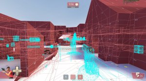
Please optimize your map. I didn't had any framedrops, but when you enter the detailing phase you should already optimze your map so far that only one big arera is rendered at a time. This is not the case for you map:
20180114162311_1.jpg 20180114162336_1.jpg

Sniper-Sightlines:
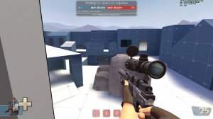
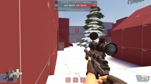
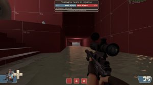
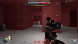
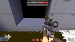
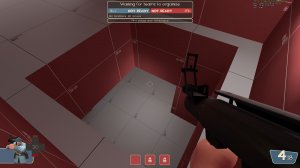
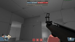
I couldn't find any major sighlines, but these are the ones I encountered. Playtesting will tell if they're a problem:
20180114161000_1.jpg 20180114161155_1.jpg 20180114161328_1.jpg 20180114161339_1.jpg
The only one I think is worrying is the one at spawn, as the sniper can see all three exits.

Random other stuff:
A ramp that is missing the front part:
20180114160049_1.jpg
Missing texture:
20180114161024_1.jpg
Drop-dpwn, that causes fall damage:
20180114160512_1.jpg
Brushes z-fighting:
20180114160038_1.jpg
I fell like this saw is not needed. It could be missed, when walking out of the water which causes a random death for the player which isn't fun at all:
20180114160614_1.jpg
Weird looking stairs, which look like you would fall through:
20180114160849_1.jpg


This concludes my thoughts on your map.
I hope these suggestions help you in your development.
 

toopliss

deer
Dec 5, 2015
59
78
Here are my thoughts:
First off all the map feels sometimes a little bit like a labyrinth. There are so many rooms and routes in your map that make it very hard to orientate. You forgot to add arrows leading the player to the points which make it even more complex to understand. I would suggest you go through each route after another and ask yourself: "What is the purpose of this route? Do I need it?"

Yeah I was kinda doubting that myself, I thought that map needed more variety in routes so I decided to keep that part in for at least the area between blu spawn and first cp. Kinda toned it down for the routes leading to second cp and onward. I guess this is more so that I didn't plan and the entire map is laid out with a stream of consciousness.

This area for example isn't needed in my opinion. You almost need to go behind blu spawn and it doesn't lead anywhere:
20180114160106_1.jpg
When you exit blu spawn arrows could really help to navigate. When I left the spawn I was unsure where to go because of all those possible routes:
20180114155949_1.jpg
For blu spawn itself: I feel like this area is misleading. I thought there was an exit, but it was just a window:
20180114155723_1.jpg
Why would I ever take this exit? The defenders have the highground and I have nowhere to go after I left spawn:
20180114155734_1.jpg
You could try removing this exit and instead use the area I pointed out above as a new one.

You know what I'm just gonna rework the entire blu spawn and the transition area to first cp. Thanks for the suggestions.

Clipping:
The next important thing is the clipping on your map. It seems like you used blockbullet to block areas of, as I couldn't find any clip-brushes. The problem with blockbullets is, that, as the name says, it blocks bullets. This causes problems like this:
20180114155918_1.jpg (The area behind this fence also feels like it is accessible, make sure it looks blocked off)
You can easily fix this by replacing all blockbullet textures with clipping textures.

I blame my laziness for that because I was clipping ramps at first, would fix it in the next version.

Also, why are there trigger brushes on the top of the roofs? I couldn't find out what they were doing.
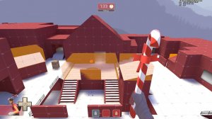
20180114162152_1.jpg 20180114162159_1.jpg

Those are nobuilds, I thought that engineers could just sentry jump up there and set up shop for sentries in a spot that blu has no easy way to get rid of other than a uber push. Might be overthinking it in the first place but it wouldn't hurt imo.


Next thing: Why does this water hurt you. It's not enough to kill you, but it is annoying:
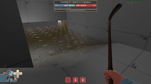
20180114160029_1.jpg
It also fells inconsistent that this body of water doesn't deals any damage:
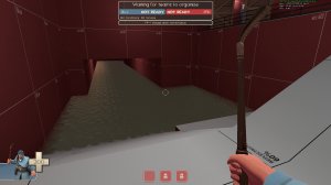
20180114160601_1.jpg
I would remove the damage effect all together. It's never fun to get punished by the environment.

The idea was that if you're in the outdoors during the winter, water would be cold enough to cause frostbite, but eh, screw logic I guess. Will remove the trigger hurt.

You can get stuck when you ride the last wagon of the train:
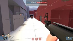
20180114160256_1.jpg

Will add more clipping to the train.

The trainbell ringing non-stop is also very annoying.

Will remove it.

Please optimize your map. I didn't had any framedrops, but when you enter the detailing phase you should already optimize your map so far that only one big area is rendered at a time. This is not the case for you map:
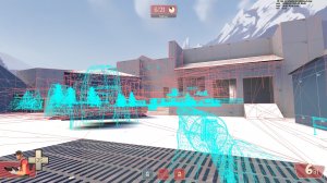
20180114162311_1.jpg 20180114162336_1.jpg

Personally I feel that the best point to start doing optimization is from the transition from alpha to beta stages of the map, it just makes for quicker iterations of maps during the alpha stages where it is needed at most. Throwing in more area portals won't hurt though, probably would do that at least.


Random other stuff:
A ramp that is missing the front part:
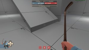
20180114160049_1.jpg
Missing texture:
20180114161024_1.jpg
Brushes z-fighting:
20180114160038_1.jpg
Weird looking stairs, which look like you would fall through:
20180114160849_1.jpg

Will be fixed in a2.

Drop-down, that causes fall damage:
20180114160512_1.jpg

Noticed it too while running around, decided to leave that in as a type of risk-reward for blu players storming into red territory.

I fell like this saw is not needed. It could be missed, when walking out of the water which causes a random death for the player which isn't fun at all:
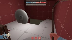
20180114160614_1.jpg

It's more of a joke than anything, I thought it might fit the sawmill theme I might go for with the second point so I left it there, though now that you mentioned it that would be frustrating for the player. I'll figure something out.
 

toopliss

deer
Dec 5, 2015
59
78
Change log:

  • Remade BLU spawn and area leading up to first cp
  • Opened up area right to first cp
  • Fixed players getting caught up in the train(maybe?)
  • Added more signs for directions
  • Altered one of the routes leading from first cp to transition area to second cp
  • Removed moving saw in water route to second cp
  • Slight adjustment to the room connecting said water route and other routes leading to second cp

Read the rest of this update entry...