CP Artpass GoobaTheViking
- Thread starter Gooba
- Start date
You are using an out of date browser. It may not display this or other websites correctly.
You should upgrade or use an alternative browser.
You should upgrade or use an alternative browser.


lucky
¯\_(ツ)_/¯
- May 25, 2009
- 583
- 145
Hmm not really no!
But I guess you would like me to be as picky as possible
I'm just going to go based on the images I can see...
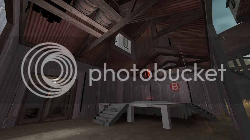
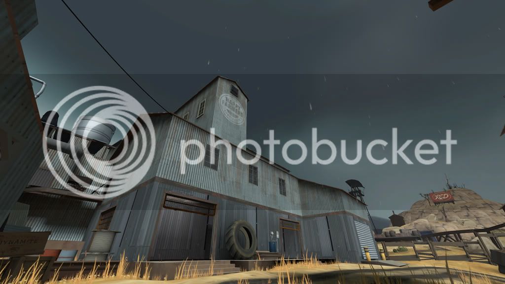
screen#2, point A - looks like you have a lot of lights clustered next to each other; something to think about when doing your lighting pass, but you should have fewer for sure. Don't in any way confuse this with making it darker D;<
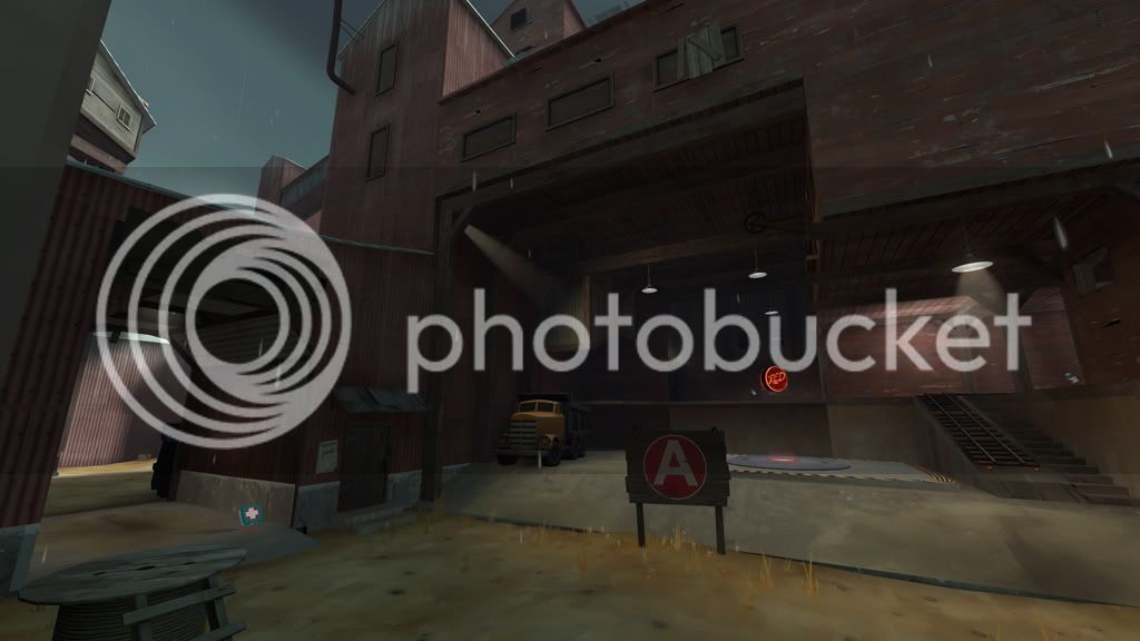
The overlay for the tires seems to end a bit abruptly (from what I can see), so try and get that sorted. If there's not an end overlay, then I'm sure Void would make one .. it's been a while since I fired up hammer so I don't know. Plus it's kinda hard to see in the picture.
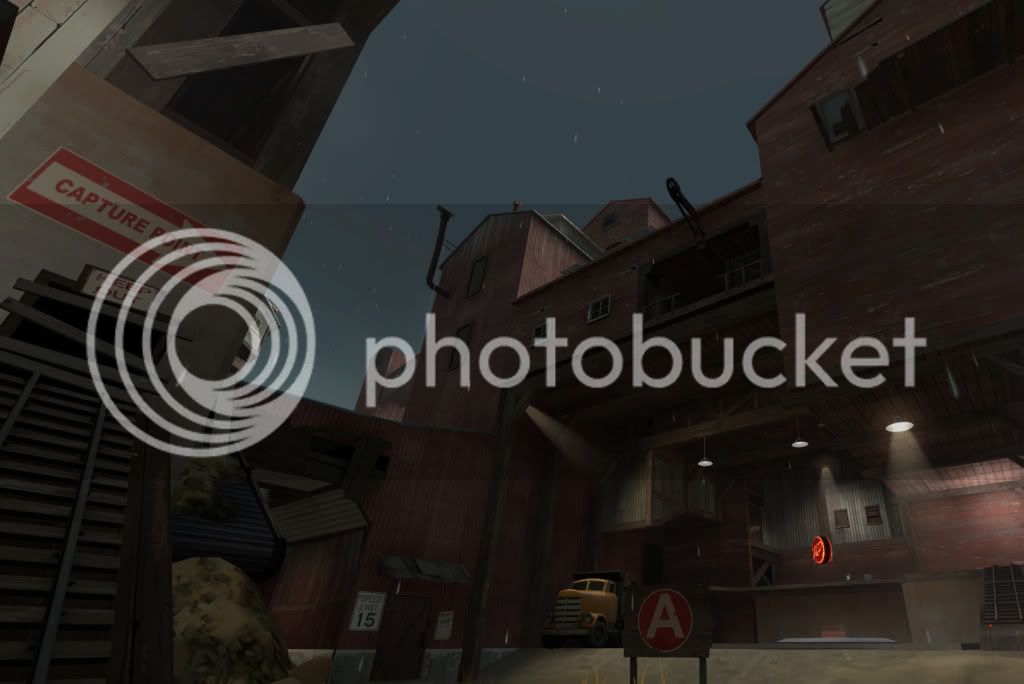
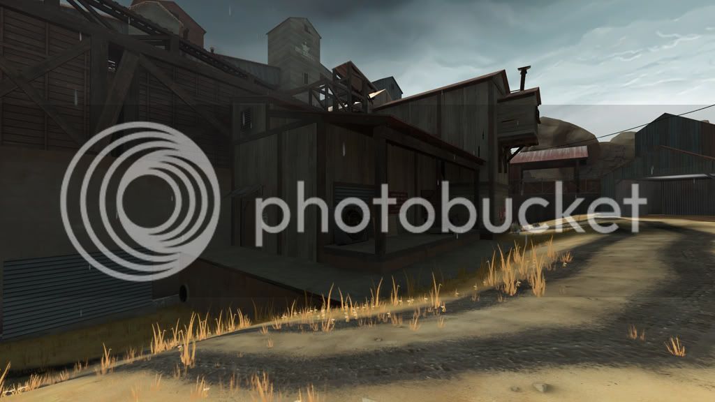
I'm not too keen on the sloped structure @ screen#3 mostly because of the opening in it not working well with the sloped roof. I would prefer you made it something different, so that it looks as awesome as the rest of the map
The wall to the left of it looks kinda bland too I guess... all I would suggest if you're up for changing, is to make a seperate layer where the roof line is. Top of the slanted roof, that part.
The light coloured wood in #4 (the yellowy one) I would keep to the more whiteish one, I feel it sticks out a bit too much otherwise.
Add some more overlays to your map, and it's golden IMO
I don't think I'll be able to get more picky! But I'll try if you ever post more screens.
Get to work on your lights and stuff!
But I guess you would like me to be as picky as possible
I'm just going to go based on the images I can see...
screen#2, point A - looks like you have a lot of lights clustered next to each other; something to think about when doing your lighting pass, but you should have fewer for sure. Don't in any way confuse this with making it darker D;<
The overlay for the tires seems to end a bit abruptly (from what I can see), so try and get that sorted. If there's not an end overlay, then I'm sure Void would make one .. it's been a while since I fired up hammer so I don't know. Plus it's kinda hard to see in the picture.
I'm not too keen on the sloped structure @ screen#3 mostly because of the opening in it not working well with the sloped roof. I would prefer you made it something different, so that it looks as awesome as the rest of the map
The wall to the left of it looks kinda bland too I guess... all I would suggest if you're up for changing, is to make a seperate layer where the roof line is. Top of the slanted roof, that part.
The light coloured wood in #4 (the yellowy one) I would keep to the more whiteish one, I feel it sticks out a bit too much otherwise.
Add some more overlays to your map, and it's golden IMO
I don't think I'll be able to get more picky! But I'll try if you ever post more screens.
Get to work on your lights and stuff!
- Jul 24, 2010
- 72
- 66
Haha, thats what I'm talking about alecom, thank you. That's the kind of stuff I like to hear. I Agree with you on the slanted roof part near A, looking at it again, it seems ridiculous. As well as the giant boring wall. Those were some of the first things i made, when I really didn't know exactly what the theme or surrounding buildings were going to be.
I've already changed the wall in #4, I just haven't gotten a new screenshot of it.
Thanks for the help.
Here's a couple new screens of stuff I'm working on.
I've been avoiding working on B until now.
I've already changed the wall in #4, I just haven't gotten a new screenshot of it.
Thanks for the help.
Here's a couple new screens of stuff I'm working on.
I've been avoiding working on B until now.
- Apr 19, 2009
- 4,460
- 1,724
the boards on the right window up top look bad.
http://i1036.photobucket.com/albums/a449/Goobatheviking/new9.jpg
http://i1036.photobucket.com/albums/a449/Goobatheviking/new9.jpg
- Jul 24, 2010
- 72
- 66
Thats good to know Vergil! I love them irrationally as well.
New screens!
Is the window a little better Gamer?
I re-did the ramp here, and made it into a conveyor of sorts. It turned out pretty cool methinks.
This outside is the wretched blue spawn, which I hate with a passion. I will probably destroy it and start over. Any suggestions are welcome.
And the rest of the screens
New screens!
Is the window a little better Gamer?
I re-did the ramp here, and made it into a conveyor of sorts. It turned out pretty cool methinks.
This outside is the wretched blue spawn, which I hate with a passion. I will probably destroy it and start over.
Any suggestions are welcome.
And the rest of the screens
- Jun 11, 2009
- 704
- 630
there's some weird contrasting lighting and shadow between your sky-some buidlings-the floor. it goes from light to dark to light to dark. i don't know i think there's something wrong with the sunlight usage. i don't really like how the shadows fall on that picture.
some parts feel really well thought of and other parts just look random.
the barrels up there for example:
http://i1036.photobucket.com/albums/a449/Goobatheviking/new10.jpg
these make not so much sense and look weird, imo
also the windows copied and pasted and rotated 5-6 times on the same facade looks not so good either, even though you tried some planks to spice it up
http://i1036.photobucket.com/albums/a449/Goobatheviking/new9.jpg
overall you got a nice thing going with your entry. liking it a lot
Vergil
L1: Registered
- Jul 31, 2010
- 23
- 9
also the windows copied and pasted and rotated 5-6 times on the same facade looks not so good either, even though you tried some planks to spice it up
http://i1036.photobucket.com/albums/a449/Goobatheviking/new9.jpg
overall you got a nice thing going with your entry. liking it a lot
He changed that to this, didn't he?
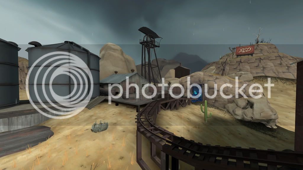
What's that glowy blue ore in the mine?
- Jul 24, 2010
- 72
- 66
Acumen, thanks for the comment.
The barrels where somewhat of placeholders, because B is still very much under construction. Its hard to make B work with the rest of the map due to its thin walls and odd roofing, which is also why I haven't changed the similar building outside of blue spawn.
As for the copy/pasted windows I had already fixed that here.
Vergil, are you asking why is the blue ore there? The ore is a special mineral that Red has found while mining coal. So they have transformed their facility into harvesting this new mineral to further Red's agenda. Obviously Blu will not let Red have this new mineral all to themselves, so they are here to capture the Coalmine. Thats kind of the story I have going for it, which I've been trying to weave through out the map. Plus glowing blue stuff looks cool.
In which picture do you not like the shadows? I know what you mean by the strange lighting in places and I'm trying to fix it, but I'm not really sure whats causing it. For example, the props become very dark in places where there is quite a bit of light( even when the prop is not in the ground). I'm thinking its because I have been compiling with the VIS and RAD settings to fast instead of normal.i don't really like how the shadows fall on that picture.
The barrels where somewhat of placeholders, because B is still very much under construction. Its hard to make B work with the rest of the map due to its thin walls and odd roofing, which is also why I haven't changed the similar building outside of blue spawn.
As for the copy/pasted windows I had already fixed that here.
Vergil, are you asking why is the blue ore there? The ore is a special mineral that Red has found while mining coal. So they have transformed their facility into harvesting this new mineral to further Red's agenda. Obviously Blu will not let Red have this new mineral all to themselves, so they are here to capture the Coalmine. Thats kind of the story I have going for it, which I've been trying to weave through out the map. Plus glowing blue stuff looks cool.
Vergil, are you asking why is the blue ore there? The ore is a special mineral that Red has found while mining coal. So they have transformed their facility into harvesting this new mineral to further Red's agenda. Obviously Blu will not let Red have this new mineral all to themselves, so they are here to capture the Coalmine. Thats kind of the story I have going for it, which I've been trying to weave through out the map. Plus glowing blue stuff looks cool.
Should be a red ore.
- Jun 11, 2009
- 704
- 630
sry, for not recognizing that change with the windows. guess i scrolled too fast and didn't pay proper attention
i can't really put my finger completely on the lighting. it just differs from screenshot to screenshot a lot.
lemme see..
http://i1036.photobucket.com/albums/a449/Goobatheviking/new10.jpg
it's basically very bright, yet i only see one tiny lightbulb on the left and the rainy/dark sky as potential light sources
http://i1036.photobucket.com/albums/a449/Goobatheviking/3.jpg
very bright on the left side, daylight basically, and on the right very dark shadows. there's also shadows on the left light blue building but it's nowhere as dark as on the right side
http://i1036.photobucket.com/albums/a449/Goobatheviking/7.jpg
alsmost fullbright scene
http://i1036.photobucket.com/albums/a449/Goobatheviking/6.jpg
same contrasting shadow/lighting in one single scene. the highest building in the centre is darkened, yet i can't see where its shadow comes from. the terrain is totally lit again
http://i1036.photobucket.com/albums/a449/Goobatheviking/2.jpg
same here, left totally lit, 5m to the right complete darkness
http://i1036.photobucket.com/albums/a449/Goobatheviking/1.jpg
left bright, right side drops a shadow. i mean, it can be like that but why is the stuff on the left side not casting any shadows
i really think it's just some settings with your sunlight entity. like it's too low angled or something like that. i don't know. do you use custom settings for the light_environment or standard official maps settings ?
- Jul 24, 2010
- 72
- 66
Red ore? I can't believe I didn't realize the Blu/Red connection. Silly me.Although the reason I did not use red ore is because red lighting is more attention grabbing than blue methinks, and I don't want everyone to stare at the glow instead of killing each other. I am reconsidering it though.
Thanks again Acumen. I'm using the sawmill settings with a few tweaks for the skybox. I agree that its not working very well in most areas. I think it is also amplified by where I'm taking the screenshots from, it doesn't look quite as bad in game where you can see everything. I guess be testing different settings for that though, so any suggestion are welcome.
The odd lighting in B is because I haven't deleted the original lights yet, hehe.
Although the reason I did not use red ore is because red lighting is more attention grabbing than blue methinks, and I don't want everyone to stare at the glow instead of killing each other. I am reconsidering it though.
You just have to find the right color of red. A pure red would be too bright (but works good for the blue--though is still a bit too saturated IMO).
Try in the neighborhood of #f04637, #ec5a4b, or #eb6e5f, with shadow colors #b23226, #af4235, #af5146:
████████████████████
████████████████████
████████████████████
████████████████████
████████████████████
████████████████████
I am definitely going to try the red thing
If red doesn't end up working out, try and find a neutral color, like purple (a nice, rich, amethyst) or green (deep emerald).
Vergil
L1: Registered
- Jul 31, 2010
- 23
- 9
Vergil, are you asking why is the blue ore there? The ore is a special mineral that Red has found while mining coal. So they have transformed their facility into harvesting this new mineral to further Red's agenda. Obviously Blu will not let Red have this new mineral all to themselves, so they are here to capture the Coalmine. Thats kind of the story I have going for it, which I've been trying to weave through out the map. Plus glowing blue stuff looks cool.
Thanks. Very interesting.
I second the idea of maybe trying green, but I love green to an irrational degree similar to rain.