KotH Stallone b2
- Thread starter Bakscratch
- Start date
You are using an out of date browser. It may not display this or other websites correctly.
You should upgrade or use an alternative browser.
You should upgrade or use an alternative browser.


My problem with the route going inside the hotel was that it wasn't very hotel-y. Seemed very utilitarian to me. Maybe you have some plans for that, but right now it seems very drab.
Was it more of the textures I used or the whole inside area? as in did you not like it just because I textured it differently?
I say it was a mix of both. From the outside, it's obviously a hotel, but once you're inside, that seems to change completely. Most hotels would have a lobby of some sort. Front desk, chairs, sofa, etc. Then there would be some hallways branching off.Was it more of the textures I used or the whole inside area? as in did you not like it just because I textured it differently?
Yours is just a bit empty room with a room on either side. How do people get to the upper levels? There doesn't appear to be any stairs or elevators leading there.
Obviously still in alpha, but considering how textured everything is, I just thought I'd throw in my two cents.
Edit: And yes, the colors are very monochromatic.
Ice Crystal
L2: Junior Member
- Feb 28, 2013
- 78
- 91
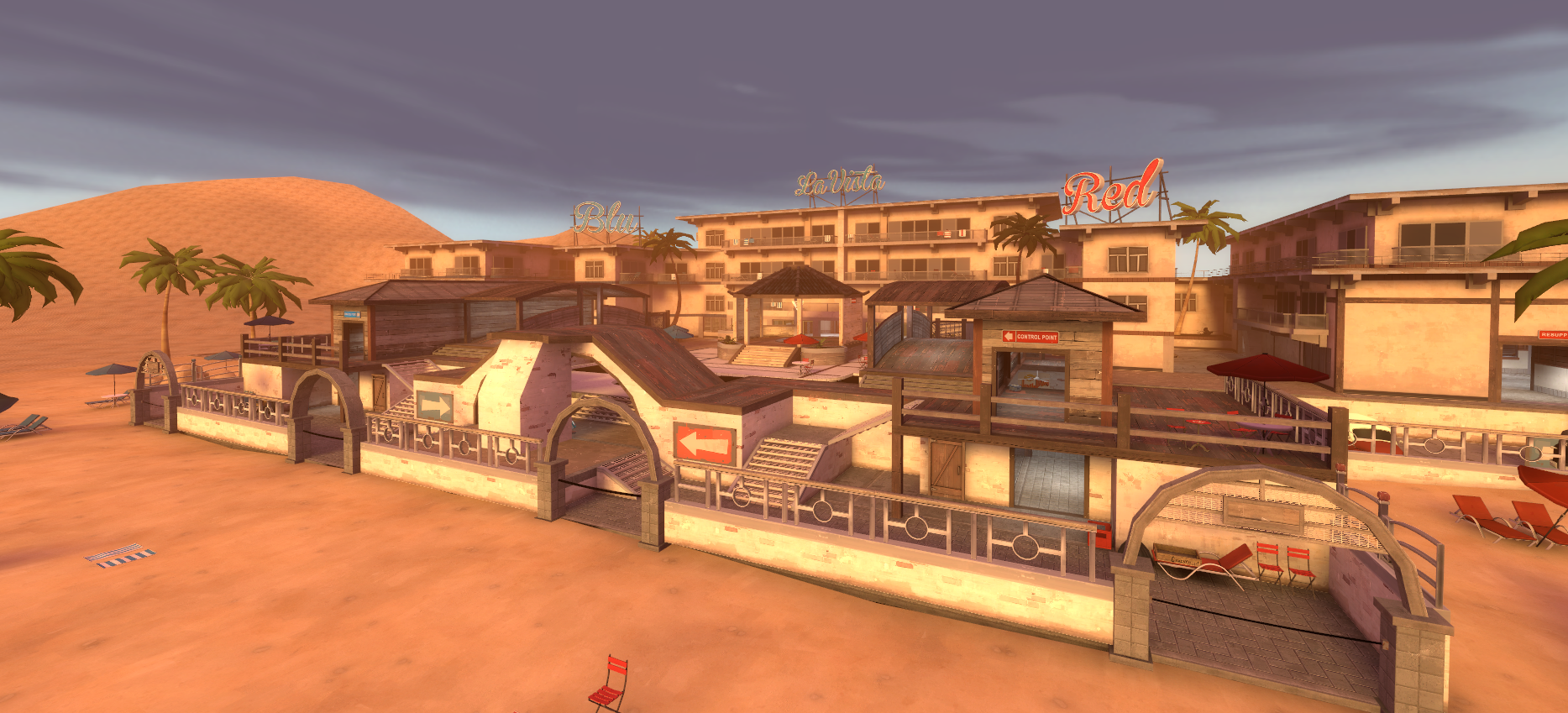
I played it for the first time recently. The spawn seemed a bit easy to camp and the area next to the beach didn't see a lot of use. Other than that it was fun and played well. Good detailing too.
Congrats bakscratch making Stallone in UGC 4v4 summer season! I love the detailing on this map! You can tell you spent a lot of time on it.
After we playtested your koth_ferrous in Highlander, I kinda felt bad it didn't work great in HL. It's still a great pub map and when you told me to look at this map, I thought you were dropping a map on me for no reason. I was wrong! I looked at it for a bit and said it can work in 4v4s. The only issue with 4s with it being a new gamemode is getting playtests properly done by actual teams and not mixes. I was confident it can work, just had to get people to play it and let the 4v4 admin team know about it. So thanks for being patient with me and hanging in there in there the last couple of months! I'm so excited to see this in UGC and the development the map will make as it keeps improving! Thanks bakscratch!
After we playtested your koth_ferrous in Highlander, I kinda felt bad it didn't work great in HL. It's still a great pub map and when you told me to look at this map, I thought you were dropping a map on me for no reason. I was wrong! I looked at it for a bit and said it can work in 4v4s. The only issue with 4s with it being a new gamemode is getting playtests properly done by actual teams and not mixes. I was confident it can work, just had to get people to play it and let the 4v4 admin team know about it. So thanks for being patient with me and hanging in there in there the last couple of months! I'm so excited to see this in UGC and the development the map will make as it keeps improving! Thanks bakscratch!
Thanks Redrum! cant wait to see what happens in the future.
B1 is here
-Widened doors inside
-added stairs to lower beach route
-changed health packs and ammo
-clipped of all under stairs (stop sticky trapping)
-lowered arch roof around mid to stop the big height advantage
-areaportaled map
-clipping is now a lot better around map
-added nobuild to ramp by pool
-changed angle of spawns to face correct place
-added signs
-detailing
DOWNLOAD
SSX
aa
- Feb 2, 2014
- 392
- 411
My stupid little OCD rant time!

Probably really old news to you as I've noticed, but the time it takes for players to get from the spawn to the point is really insane, I tested it myself, and it took me 5 seconds max to get to this point by playing with just the scout. Soldiers and Demomen could wipe the entire control point clean in literally a few shots flat, especially if it's a tight with other players.

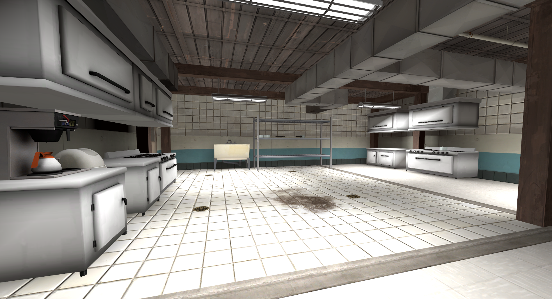
You probably haven't gotten around to this yet, but just want to add it in. The spawn rooms are really under detailed, and I can see what you were going for as to making them look like the kitchens to the cafe's outside them. So I'd probably add in some sorta stoves, ovens, and other industrial kitchen styled items. Maybe add a window in the back of it to still give it that, "We've got a secret base in here" idea.

Once again, probably still a WiP, but I feel like you're skybox can be worked with a bit, give it more detail, or more of a beach theme to it. More beach chairs, some shacks and life guard towers, towels out on the beach, and so on.
Probably really old news to you as I've noticed, but the time it takes for players to get from the spawn to the point is really insane, I tested it myself, and it took me 5 seconds max to get to this point by playing with just the scout. Soldiers and Demomen could wipe the entire control point clean in literally a few shots flat, especially if it's a tight with other players.
You probably haven't gotten around to this yet, but just want to add it in. The spawn rooms are really under detailed, and I can see what you were going for as to making them look like the kitchens to the cafe's outside them. So I'd probably add in some sorta stoves, ovens, and other industrial kitchen styled items. Maybe add a window in the back of it to still give it that, "We've got a secret base in here" idea.
Once again, probably still a WiP, but I feel like you're skybox can be worked with a bit, give it more detail, or more of a beach theme to it. More beach chairs, some shacks and life guard towers, towels out on the beach, and so on.
evanonline
L420: High Member
- Mar 15, 2009
- 485
- 273
I gave the map a runaround today. I really like it!
A minor nitpick I have: I feel like the pool in the middle should be deeper; the way it just barely grazes above your head doesn't feel right to me--I feel like if you're going to have water that you can be fully submerged in/swim in, it needs to be abundantly clear that it's deep enough to be swimmable.
A minor nitpick I have: I feel like the pool in the middle should be deeper; the way it just barely grazes above your head doesn't feel right to me--I feel like if you're going to have water that you can be fully submerged in/swim in, it needs to be abundantly clear that it's deep enough to be swimmable.
Oh sweet dang yes. I've been wishing for industrial-kitchen stuff ever since the artpass contest; one of my out-of-the-way rooms was meant to be a cafeteria and I had to cleverly conceal that the kitchen was devoid of detailing.You probably haven't gotten around to this yet, but just want to add it in. The spawn rooms are really under detailed, and I can see what you were going for as to making them look like the kitchens to the cafe's outside them. So I'd probably add in some sorta stoves, ovens, and other industrial kitchen styled items. Maybe add a window in the back of it to still give it that, "We've got a secret base in here" idea.
@shadowslasher11
Image 1: yeah I know, but its mostly due to that the point is easyish to cap. Also the map is more towards less players.
Images 2: yeah that is what i'm hoping to do soon.
Image 3: Yeah skybox is really temporary atm so I will do more on it soon.
@Nerdbot
Yeah that's a nice idea, but I feel if it was deeper I feel it would disrupt gameplay a lot as people would get stuck in the bottom. Plus I feel that it would be more abused then helpful
@stevethepocket
Yeah I don't wanna make it so it blocks the spawn areas but It should work fairly well.
Some other thoughts I had today:
If you're planning to add a blue skin for the velvet ropes, I suggest going with a color very similar to the "neutral" purple in Aly's Suijin roofs. It's kind of a royal purple that works better for something like that than a straight blue would. And if you do the decompile/recompile process right (compensating for the usual 90-degree rotation bug) and remember to always pack it, you can totally make your multi-skin copy the exact same path and file as the original with no side effects.
Speaking of blue, I know the convention is to use slightly muted colors and I've criticized other maps for not keeping this in mind, but some of your custom props could stand to be brighter in color. Remember, it's a beach resort!
You gotta get somebody to make you some better vehicles. Sports cars, station wagons, those old Volkswagen vans, stuff people would drive to the beach in. I'm assuming you already know this and those delivery vans you have right now are meant to be placeholders, but just in case.
Your skybox has two suns in it. See if Owly-Oop would be interested in painting you a custom "sunset in paradise" skybox. He's good at painting skyboxes.
SSX
aa
- Feb 2, 2014
- 392
- 411
Lookin sexy. Though it seems a bit too smooth. Add a tad more detail?
The problem, I think, is that the gradient on the sides of the units is blurring into the AO shadows and making the shadows look too diffuse for the harsh lighting in the room. Other than that, though, pretty impressive stuff.
Also wooden ceilings are all wrong for an industrial kitchen. And, for that matter, any other rooms in the map that you may have used them in.
Also wooden ceilings are all wrong for an industrial kitchen. And, for that matter, any other rooms in the map that you may have used them in.
RubbishyUser
L7: Fancy Member
- Feb 17, 2013
- 414
- 488
WHY IS THIS MAP SO SEXY AAAAAAAAAAAAAAAAAAAAAAAAAAAAAAHHHHH
Seriously though, this map is good looking it's starting to detract from the gameplay. I forget to kill the demoman I'm staring at because I see the surfboards hanging up against the wall and the lazily rotating fan and a lolipop sign and the sunset streaming in and then the grain of the wood and the deck chairs and the shuttered up shops and the tiling and the ahh.... <3
Also: kitchen spawnrooms: too cute. then they lead out to a cafe and I feel like I'm in a real world place. Hell, my non-mapping friend said "it feels like a Call of Duty map, but I don't know why. Certainly not any particular one". I know why. It's because this map is far more detailed than any TF2 map that it reaches a point only companies with 100s of detail and modelling employees could reach. It's like every spot is accounted for. Oh god I'm gonna climax again.
I pointed out in the game day that you've added bts areas in the hotel, but you haven't detailed them yet. Get on that, and then you'll have pretty much stuffed the entire map.
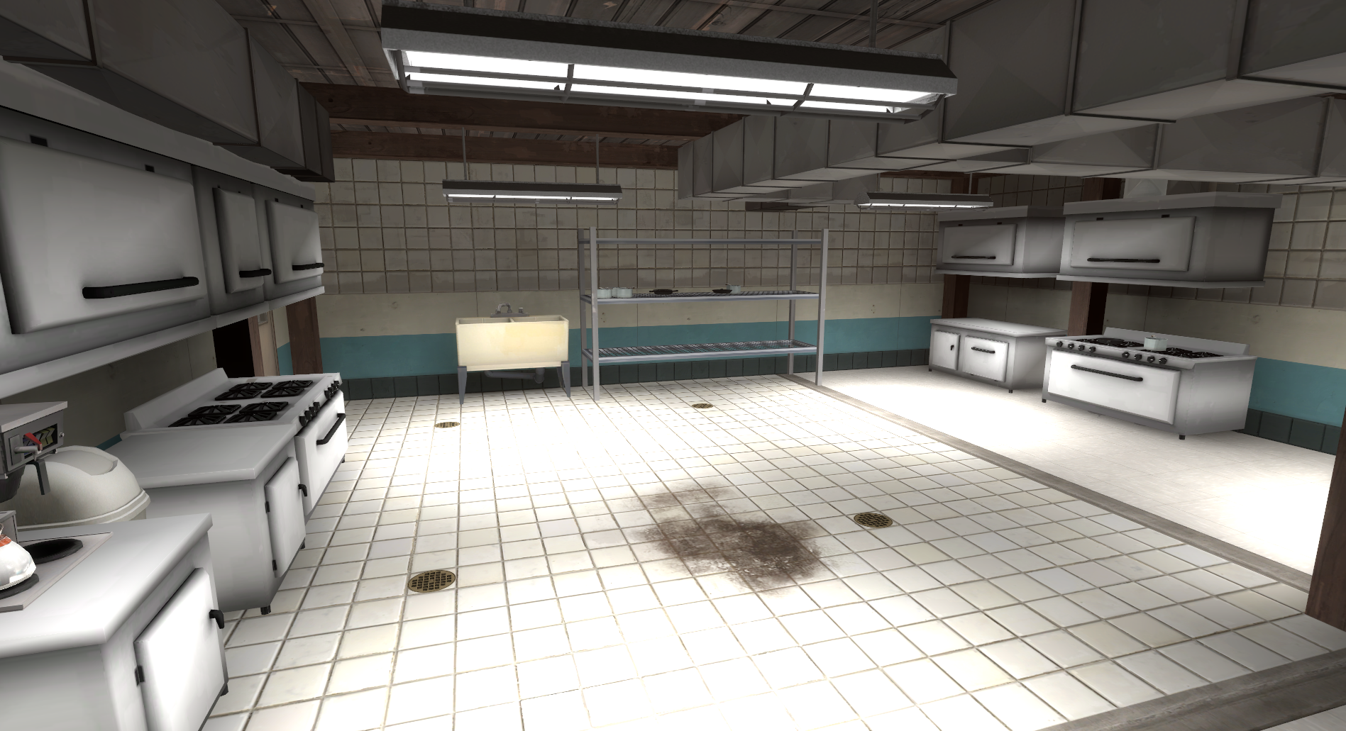
A couple things I realized about your kitchen:
One, your coffee maker is embedded in the countertop. If it doesn't fit otherwise, that means your cupboards are too low. I'm not sure why you have exactly one cupboard per appliance, either; is that how industrial kitchens are normally laid out?
Two, that sink is conspicuously overscaled compared to everything else and doesn't really match the rest of the room in either case. Come to think of it, the trash can is kind of overscaled too, unfortunately. Sadly, the scaling in this game is a joke to begin with; you may be stuck overscaling your props to match them and hoping nobody notices.
Three, your dials are pentagons. Save that level of severe polygon reduction for the second or third LOD model.
Four, where is the refrigerator?
Five, that stuff you've got going on with the wall is a mess. Tile to concrete to tile again? Just use that striped tile/concrete texture (and by the way, when did Valve update that texture? I could have sworn the stripe used to be darker; that's why I went and made my own custom version that I've been using in my own maps) at the standard height and either leave it at that or replace everything above the colored tiles with the white tile.
I'll have to remember to fly around this map sometime and revisit this thread with points about other areas. There's so much excellent detailing in this map that it makes some of the other spots stand out as kludgy.