- Aug 18, 2009
- 181
- 82
The map was completed and submitted for the Artpass Contest.
Credits:
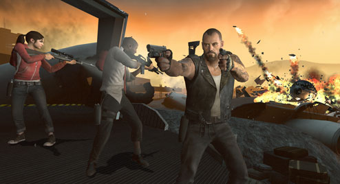
Images:
Final pictures gallery
Work In Progress pictures gallery
Videos:
Old video
There is going to be a new video soon showing all the iterations of the map.
Mediafire mirror (zip, 25,8mb)
Credits:
- Acumen: Birch trees models, Grain machine model, Chutes models, Reskin of grain elevator model, Open grain sack model
- Gooba: Dusk skybox texture, suggestions for the map
- Wilson Wankhouse: suggestions for the map
Images:
Final pictures gallery
Work In Progress pictures gallery
Videos:
Old video
There is going to be a new video soon showing all the iterations of the map.
Mediafire mirror (zip, 25,8mb)
Last edited:


 )
)
