Furnace

Furnace b2

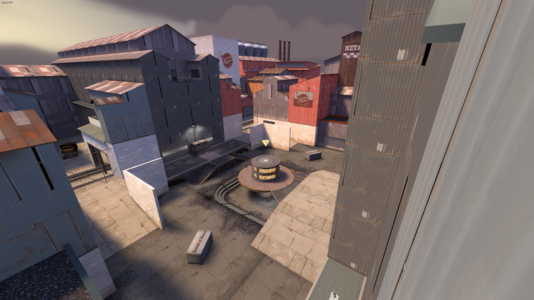
It's been a little while since I released the last version. I was not happy with how fast I did the last artpass and wanted to really blow it out of the water with this one! Its still not finished, but its a LOT better than the last version. Hope the next version wont take another year to make (it really only took me about 2-3 weeks total of time im just really lazy).

Major Changes:
-Overhauled both spawns to look and play better
-Added a Concrete Block Prop on both sides so that medic has something to play around where their soldier dies. Also for scouts to jump up if Ultitrio is being played
-Added textures all over the map to make it look better
-Added some trains (epic style)
-Added a 3D Skybox

Minor Changes:
-Better lighting all over the map
-Clipping added all over the map

Only Change that matters:
ADDED THE FURNACE (its time)

I'm really happy with this update and how the map looks now. There are a few places that still need an overhaul, but I thought I would save those for b3 when the time comes. I also wanna add some goofy funny secrets in the map which would be awesome, but you'll have to find those on your own B)

Shoutout to my friends and the Ultitrio Discord for playtesting and pushing me to finish this version, I swear Ill get the next version out before 2024
furnace b2 pic 1.png
furnace b2 pic 2.png
furnace b2 pic 3.png
furnace b2 pic 4.png
furnace b2 pic 5.png
furnace b2 pic 6.png
furnace b2 pic 7.png
Finally moving the map into beta with my first artpass of the map! I'm new to texturing maps, so hopefully it looks good to someone other than me. Not everything I wanted done got done (team buildings not being copy/paste, 3d skybox, etc) due to time constraints with wanting this version out before the map was played in UGC, but ill get working on those changes for the next version!

Major Changes Include:
- First Artpass of the Map
- The small "garage" section of each teams spawnrooms was moved slightly further away from the point to make the wall not completely flat, which shouldn't affect gameplay too much

I hope this version plays well, which it should due to almost no major changes to the layout of the map. Expect the next version to be even better (hopefully). If you have any criticisms of the map, don't be afraid to let me know so I can try and adjust it!

Attachments

  • furnace b1 pic 1.png
    furnace b1 pic 1.png
    2.4 MB · Views: 129
  • furnace b1 pic 2.png
    furnace b1 pic 2.png
    2.6 MB · Views: 133
  • furnace b1 pic 3.png
    furnace b1 pic 3.png
    3.4 MB · Views: 133
  • furnace b1 pic 4.png
    furnace b1 pic 4.png
    4.1 MB · Views: 138
  • furnace b1 pic 5.png
    furnace b1 pic 5.png
    4.2 MB · Views: 143
Spend a little bit making all the changes to the map. Beginning to think that this map is reaching the end of alpha. Or maybe not, who knows!

Major Changes Include:

- The bridge, point platform, and the high ground by the lower spawns have all had their height reduced to make combat a bit less spam-ey and also give the map a more coherent feel (you can see more of the map at once and don't have to aim at the sun to direct hit someone on high ground)

- Lowered the height and radius of the "nipple" point to make it easier for medics to play around it and be able to heal their teammates

- The one-way windows in each spawn have been changed to shutter windows for consistency in textures and also to make it more fair for defending teams to not have their every move be watched without them knowing. I have also added hazard tape markers for where you can open the shutter.

- The high ground ramps by each lower spawn door were moved forward to make it less awkward to get onto. They now match up with the small ramps leading away from the spawn door.

- The small ammo pack on the bridge was changed to be a medium ammo pack to incentivize playing around the bridge more often

Minor Changes Include:

- Optimization in the form of putting nodraw textures on (almost, idk if I got them all) every non visible surface

- Ramps leading to under the point have been changed to fully textured stairs (I was in the mood to actually add details to the map) and the area underneath was lowered to make room for the point itself being lowered

- The small health pack underneath the point was moved to the other side of the pillar to be less cramped next to the stairs

- Retextured parts on and around the point, most notably adding hazard tape textures around the cap-able area and changing the texture of the "nipple" point to add more variety

That should about do it for changes that I remember making. May have been a few other things I forgot to mention, but they must be small for me to not remember. I also included updated pictures of the map for accuracy. Anyway, thanks to anyone for reading all the way down here, if anyone even did. Enjoy the map and give me feedback if you'd like!

Attachments

  • furnace a9 pic 1.png
    furnace a9 pic 1.png
    1.7 MB · Views: 140
  • furnace a9 pic 2.png
    furnace a9 pic 2.png
    1.9 MB · Views: 143
  • furnace a9 pic 3.png
    furnace a9 pic 3.png
    2.1 MB · Views: 138
  • furnace a9 pic 4.png
    furnace a9 pic 4.png
    1.8 MB · Views: 140
  • furnace a9 pic 5.png
    furnace a9 pic 5.png
    1.8 MB · Views: 146
I had tried out water in the map in the last two versions, and it made it really easy to high bomb and get away with it, so I decided to just remove the water completely (and maybe save the idea for a future map). I also decided to keep the lower spawn door facing to the side since it felt a little better than being visible immediately out of spawn.

Change in this update include:

- Spawn room changes to change the layout, decrease the thickness of some wall to make it more spacious, and include a one-way window
Reasoning for this change is to give attackers an advantage, but not too much of an advantage (i.e. water jumping to the skybox and killing the medic anywhere)

- Lowered the height of the skybox
The skybox felt really high and I decided that I would lower it a bit and see how it feels once its played from here

- Changed the area by the lower spawn door to remove water and add a ramp to have a bit of high ground by spawn. This change also removes the health pack doors and just places a health pack on top of these ramps.

- Removed some lighting due to changing the angle of the sun to give more visibility throughout the map

- Removed HDR cuz I didn't want to set it up and also I was tired of being semi-blinded by not doing it correctly (who even uses hdr anyway lol)

I'm hoping these changes will make playing the map a lot more fun, especially for medics who now have a small ramp to play around and be able to dodge some spam (hopefully not too much). This map be one of the last versions in alpha if it goes well! Please give me any feedback you can if you happen to play it!
Part two: electric boogaloo of me adding water to an ultiduo map. The main problem with water in ultiduo is that not only it provides height with massive jumps, but it also gets rid of fall damage. This version allows for both massive jumps and no fall damage, but with a twist.

Changes:
- Reoriented the lower spawn door on both sides to come out of the side of the building instead of the front
- Lowered the ground outside the lower spawn door so water could be added.

My main goal with this update is to make it so that soldier have an easier way of jumping up to the top of the nipple point. In previous versions, some people had trouble jumping all the way up. By the time they jumped all the way to the top, they had absolutely no height advantage. There were two ways of solving this issue. The more obvious choice was to raise the height of the lower spawn door. My issues with this change was that it would make the map feel more cramped, add more ramps, and make the higher spawn door feel a little less used. So, I came up with the crazy idea of adding water to an ultiduo map! To which everyone I told about said "No Nuke, thats a terrible idea don't do it!". Well, its a little late for that now. Besides, adding water like this takes out most of the possibility of using it to avoid fall damage due to it being tucked away into a corner while still allowing for soldiers to gain great height on the point (trust me, ive tested it for a long time). So yeah, thats the update, tell me what you think. Oh, and heres some pictures in case you don't have time to go in game!

furnace a7b pic 1.png
furnace a7b pic 2.png
furnace a7b pic 3.png
Yeah, I added water to an ultiduo map, what about it? Seriously though, I am trying out using water in this map to alleviate the problem of not being able to jump high enough onto point without just getting denied. Hopefully it will help with that.
I have another version coming out that I think will make this idea work better though, so keep an eye out for that one!

Changes in this update:
-Added water in front of both lower spawn doors to make it so Soldiers are able to jump higher from low ground
Cap times and spawn times were too long so I fixed that. That's all this update is.

Changes:
- Changes Cap Time 18s >10s
- Changed Spawn times to be 2 times faster than previous versions
This update brings some changes to the original layout from version a4b, but also includes some brand new stuff.

Changes Include:
- Widened the map by 64 units and lengthened it by 128 units
- Added a lower ground area to under point so you don't bonk your head
- Added a small health kit under point to incentivize not standing on point the whole game
- Added some brand new stairs in the middle of bridge so you aren't stranded once falling off
- Removed collisions from all door frames

Attachments

  • furnace a5 pic 1.png
    furnace a5 pic 1.png
    1.4 MB · Views: 181
  • furnace a5 pic 2.png
    furnace a5 pic 2.png
    1.5 MB · Views: 181
  • furnace a5 pic 3.png
    furnace a5 pic 3.png
    1.3 MB · Views: 176
  • furnace a5 pic 4.png
    furnace a5 pic 4.png
    1.6 MB · Views: 190
This version of the map is one I made mostly for fun. It changes the layout of the map from being a mirrored symmetry to a rotational symmetry. Along with this massive change, there is a few smaller version changes that make the map play a little better.

The Changes include:
- Removing collision on all door frames (begone movement impairment!)
- Lowered the floor underneath point so you stop bumping your head on the roof
- Added small health kits to either side under the walls blocking the spawn doors
- Overhaul of the point area to fit the rotational symmetry style
- Added a ramp to either side of each team bridge for easy access

A few of these changes will be applied to a future version of a4a, such as door collision and the lowered floor.

While I do think that this is a very good version of the map, I may end up turning it into a completely different map, separate from Furnace all together. I just don't think It would fit the style I would be going for.

Attachments

  • furnace a4b pic 1.png
    furnace a4b pic 1.png
    1.5 MB · Views: 151
  • furnace a4b pic 2.png
    furnace a4b pic 2.png
    1.4 MB · Views: 151
  • furnace a4b pic 3.png
    furnace a4b pic 3.png
    1.5 MB · Views: 154
Changes:
- Complete rework of the platform near and under point
- Reduced the height of the bridge and connecting geometry
- Added walls that block off vision of the bridge side spawn doors
- Reworked the spawn so that player spawn an even distance from either door
- Changed the size of the door opening trigger to make it harder to spam from spawn
- Moved the resupply cabinet further away from spawn doors making it more difficult to spam from inside spawn
- Added new lighting to brighten up dark spots
- Extended the height of the skybox and the surrounding walls so rocket jumping is easier