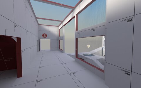
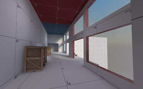
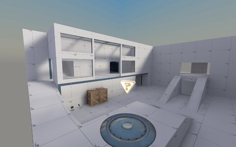
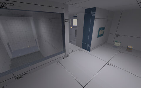
Replaced the white dev textures with a lower reflectivity version as well as tweaking the lighting and HDR settings in order to practically ensure that the map's lighting is no longer too bright.

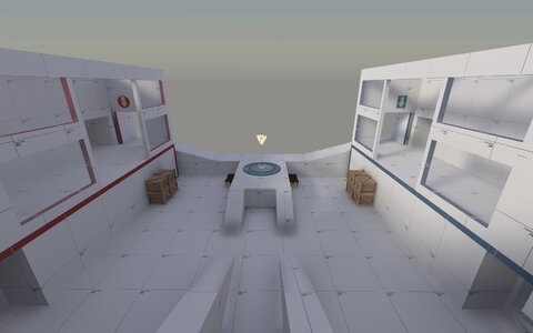
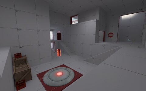
Very very minor changes gameplay wise, added a railing to the walkway next to the middle point so players won't fall off as easily, moved a few props around, fixed the lower blu spawn door clipping into the floor above.

This doesn't mean I'm honing in on this design, though. I still have some crazy layout ideas I want to test out in future versions. However, I think getting the lighting to an acceptable level is a more important priority, since it can be difficult to tell if an issue with the map's gameplay is due to layout/logic or players not being able to see.

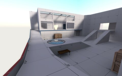
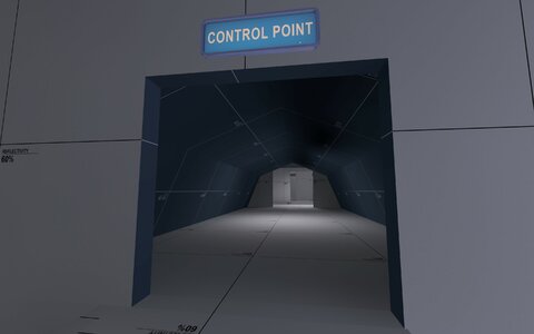
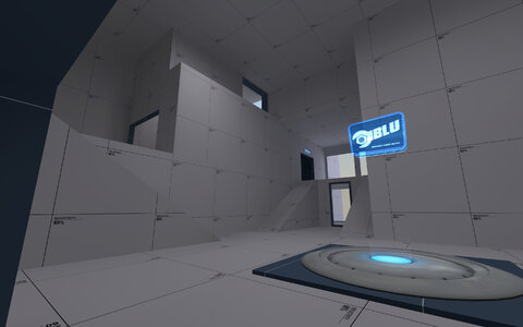
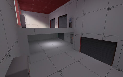
As of right now I'm fairly happy with how the map plays, but it is a bit simple, and I think all 3 routes essentially being long hallways isn't ideal. Mid is fun to fight in, and I think last is decent, but the areas in between kind of feel like liminal spaces, and I'll be looking to fix that in future versions.

Attachments

  • 90_0036.jpg
    90_0036.jpg
    353.6 KB · Views: 5
I made the difficult decision to scrap my previous mid design and make a completely new mid. I really liked the old one and think it was fun once you got the hang of it, but people brought up some good points about it feeling quite cramped and the verticality being a bit too much. So, I made an area with more horizontal space and less vertical space. There's definitely still a big aspect of verticality to it, but now it should hopefully not be too overwhelming.

The rest of the map is completely the same layout-wise, the only significant gameplay change being the last point having a slightly slower cap speed.

Also toned down the lighting quite a bit so it should hopefully be less blinding for players using HDR.

Attachments

  • 90_0013.jpg
    90_0013.jpg
    446 KB · Views: 12
  • 90_0014.jpg
    90_0014.jpg
    426.8 KB · Views: 12
  • 90_0015.jpg
    90_0015.jpg
    423.9 KB · Views: 12
  • 90_0016.jpg
    90_0016.jpg
    374.5 KB · Views: 12
Last playtest I received quite a bit of feedback that the layout was confusing (and "spaghetti-ish") so I've made a few drastic changes to try and streamline routes a bit.

I closed off one of the routes leading from last to mid and made it harder to get from one of the routes to another. This will hopefully make it so players can more easily get a grasp on where enemies might be coming from at any given time. Frankly, I think it might be overkill, but that's kind of the point. I expect this version of the map to be quite chokey, and hopefully in future versions I can find a happy medium (I already have some ideas on how to achieve that, but I want to see how this version plays just for reference).

I also added some props on last so people could climb up to the level above, and added an extra health/ammo pack near mid.

Attachments

  • 90.jpg
    90.jpg
    338.6 KB · Views: 22
  • 90_0003.jpg
    90_0003.jpg
    234.5 KB · Views: 19
Fixed a small issue with the map's layout
Balanced the lighting so hopefully it should no longer be blinding in some areas and too dark in others.

Made mid easier to hold (by adding a "back spawn" for the defending team and giving them slightly longer respawn times) and last easier to cap (by literally moving it closer to mid lol), so hopefully it should play less like koth and more like 3cp.

Added a new flank in mid, added a new section of highground in the area that is now "last."

Attachments

  • cp_acrophobia_a20000.jpg
    cp_acrophobia_a20000.jpg
    429.4 KB · Views: 27
  • cp_acrophobia_a20001.jpg
    cp_acrophobia_a20001.jpg
    516.5 KB · Views: 21
  • cp_acrophobia_a20002.jpg
    cp_acrophobia_a20002.jpg
    415.9 KB · Views: 26