Theory

CP Theory a18

worMatty

Repacking Evangelist
aa
Jul 22, 2014
1,258
999
This is my experience playing a defending engineer at A.

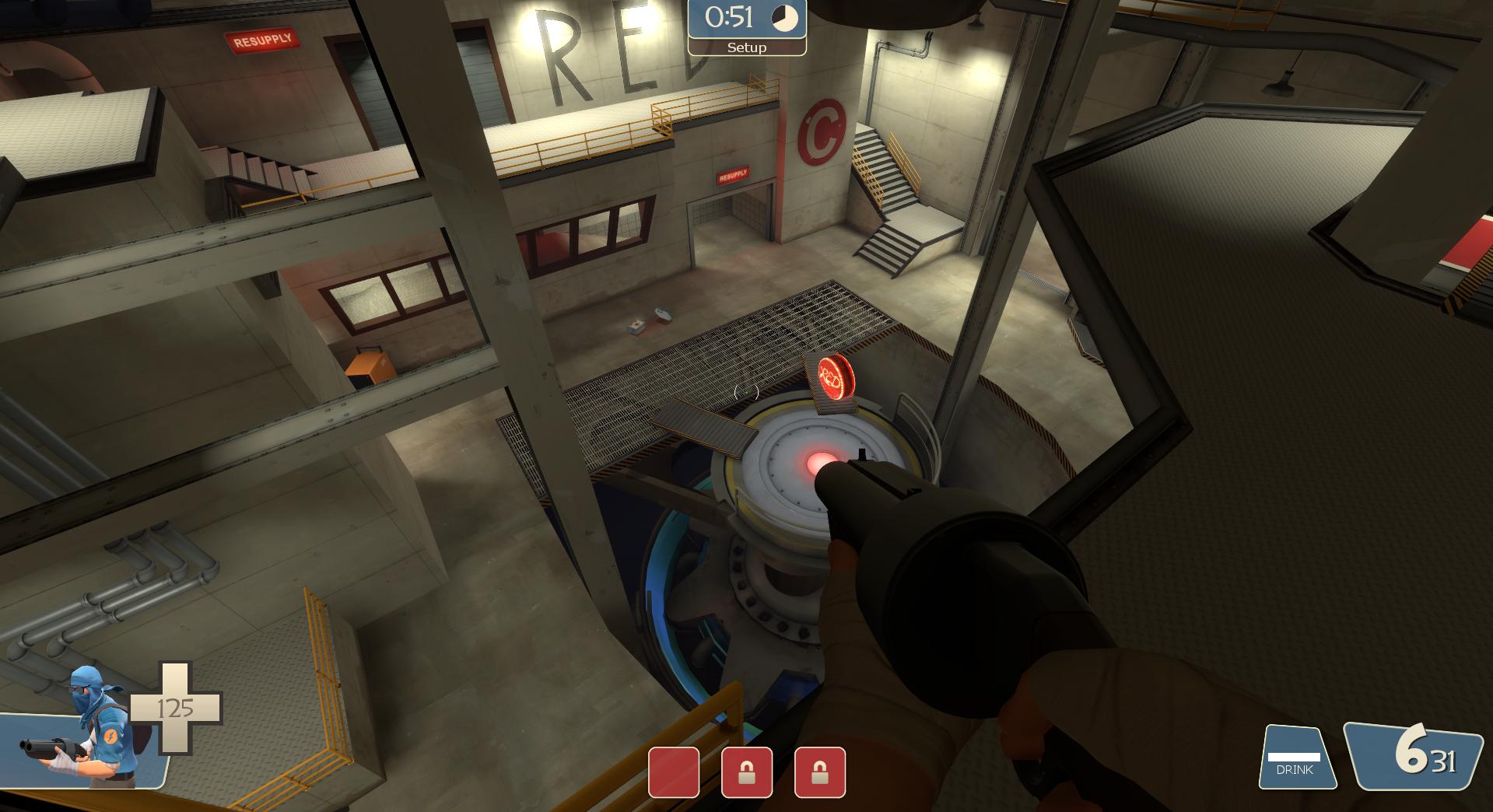
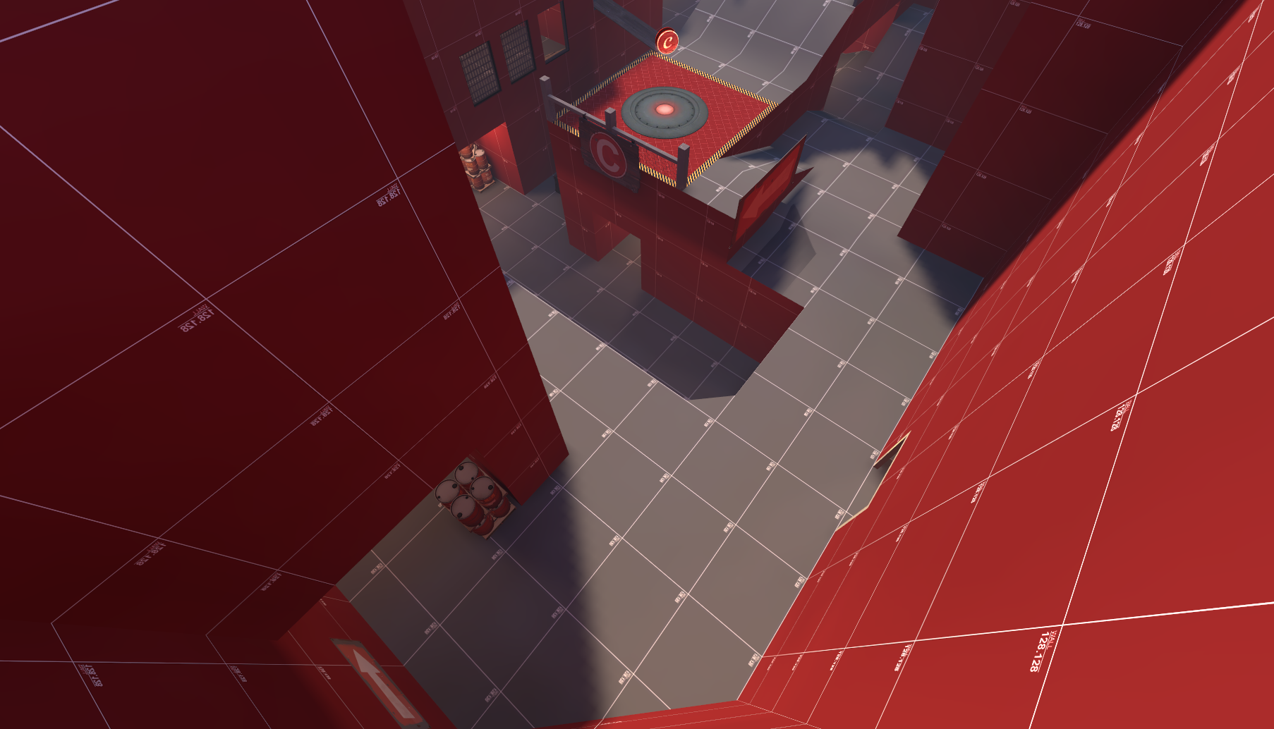
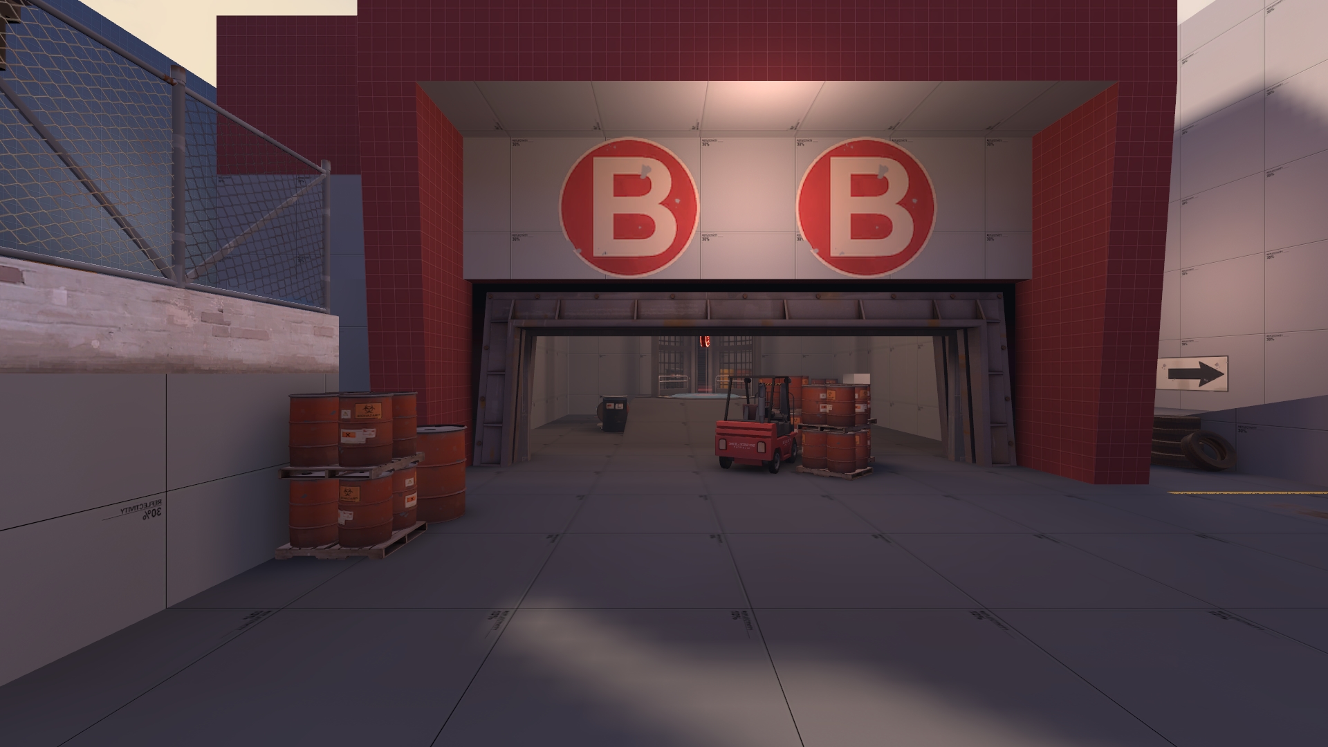
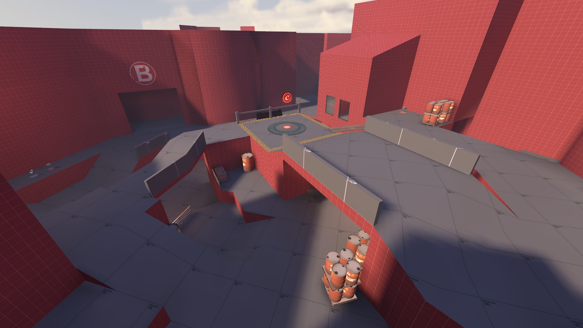
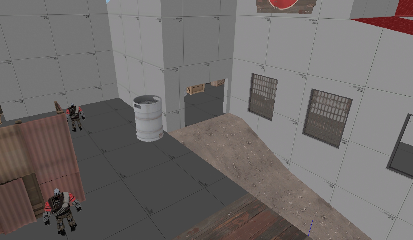
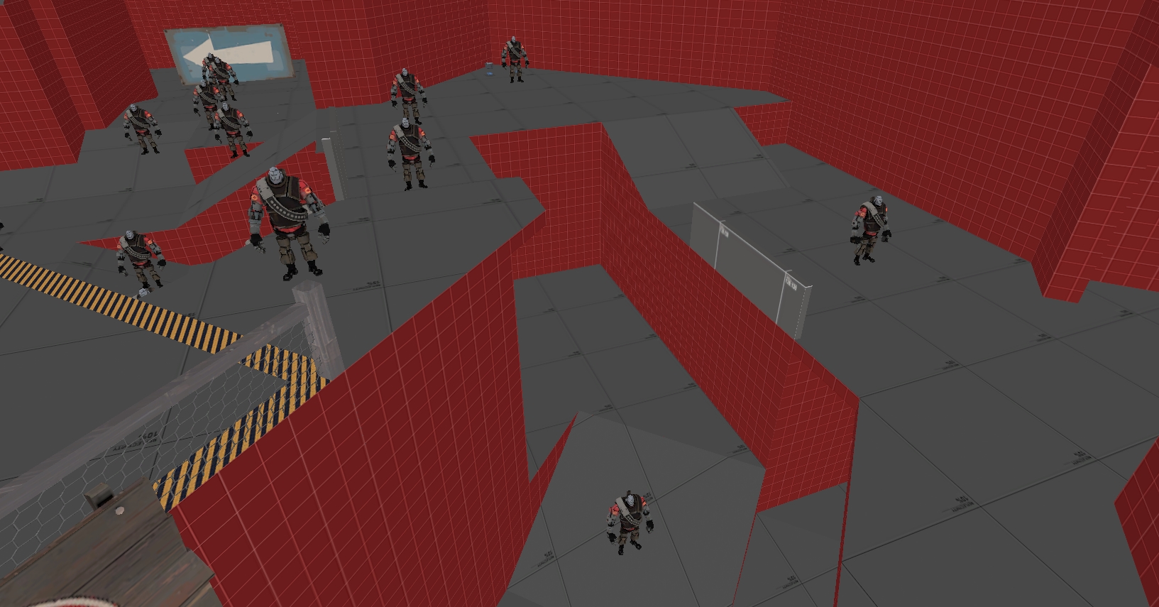
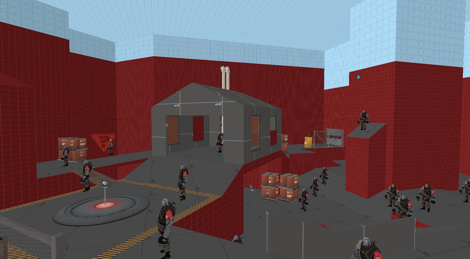
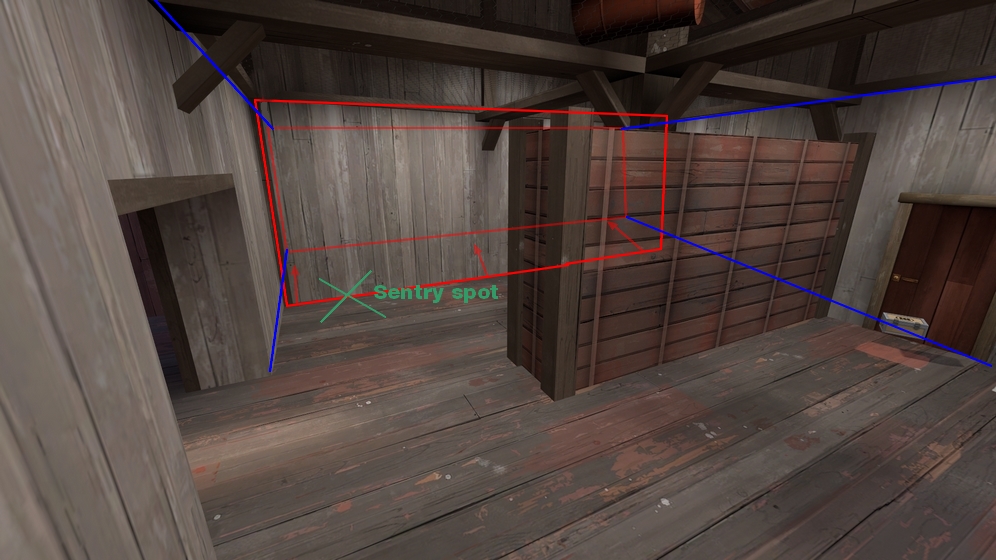
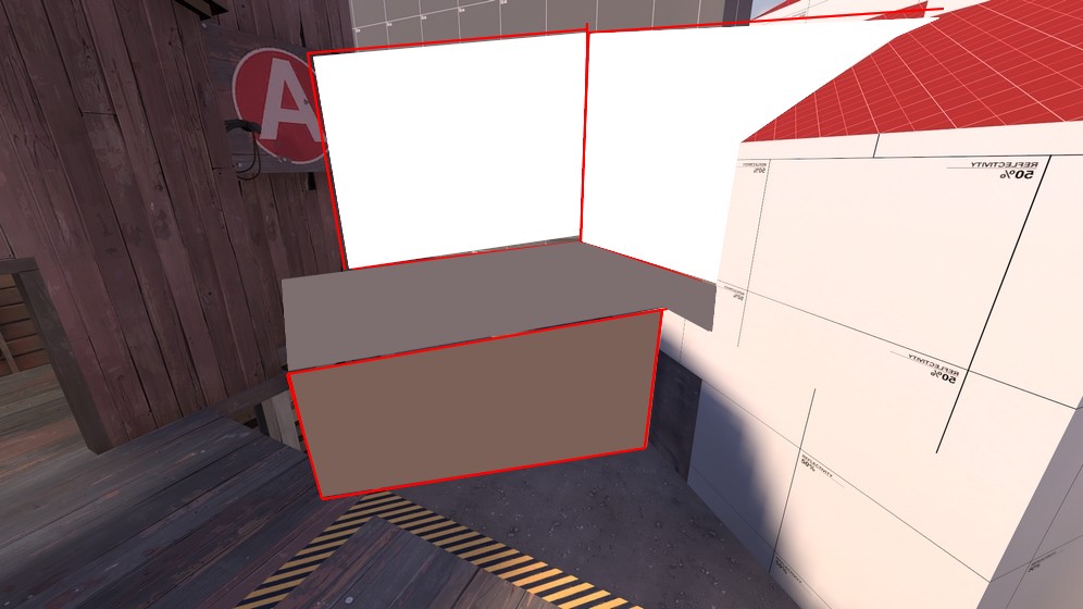
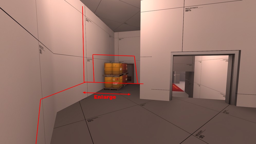
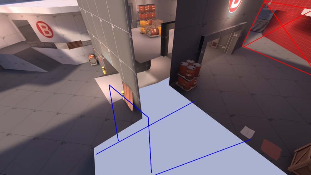
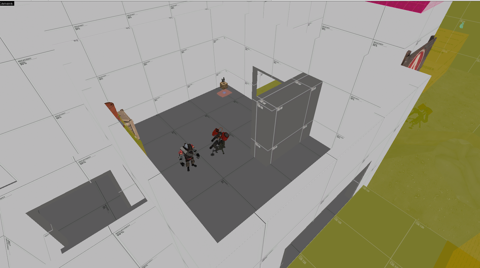
Note that sentry range is about 11 x 128 unit blocks, so if I put a sentry at 1 or 2, then it would be more in cover but out of range of the opposite side of the bridge.

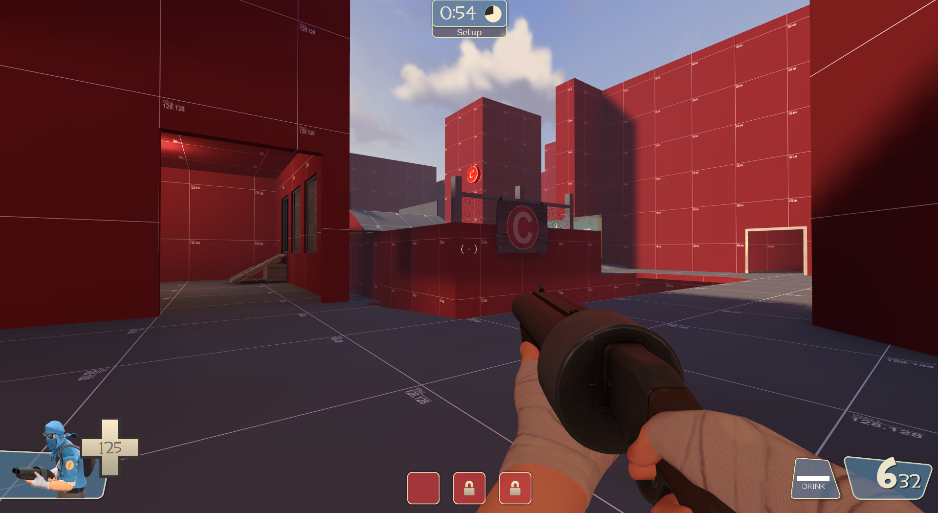
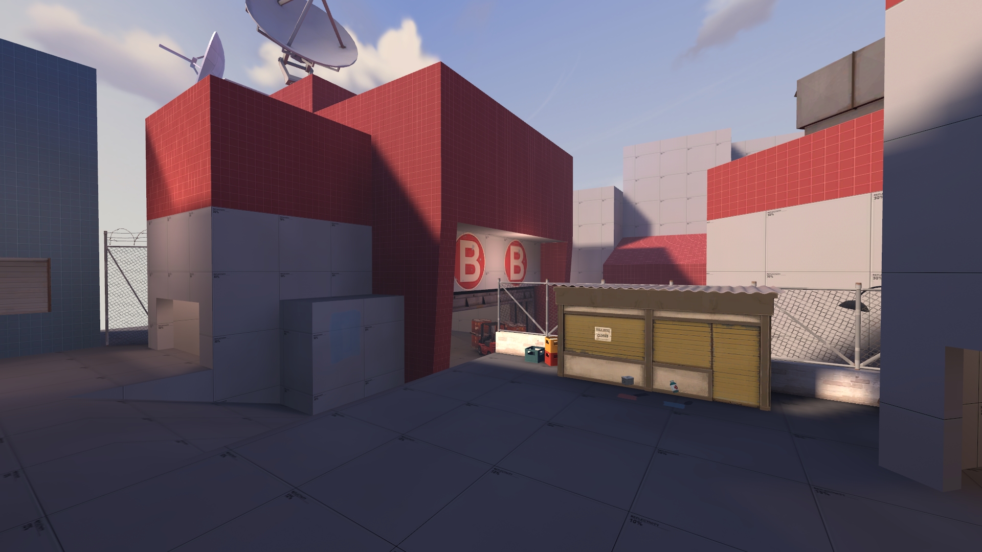
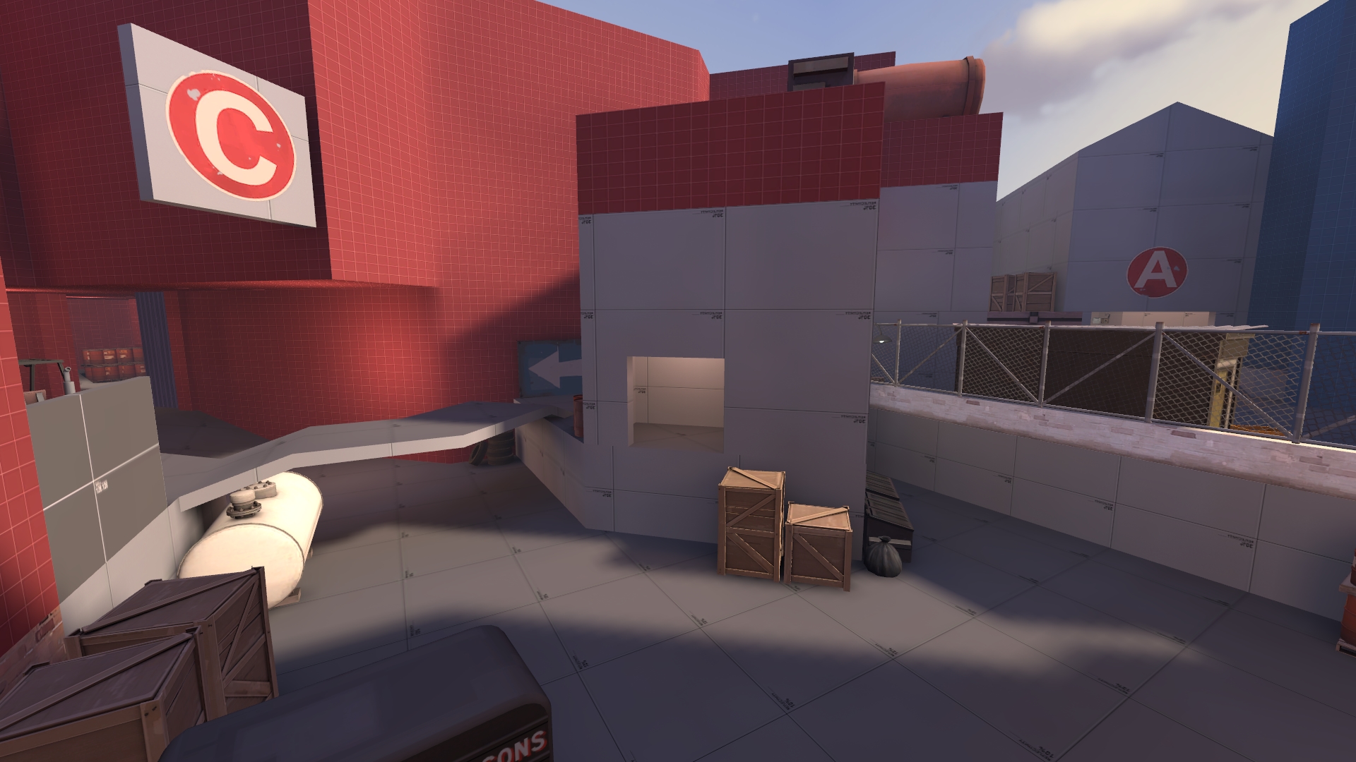
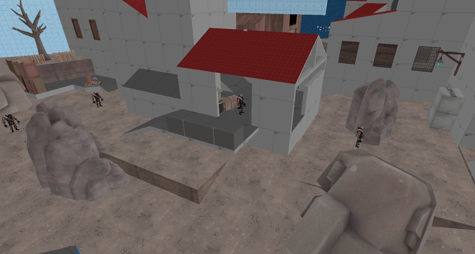
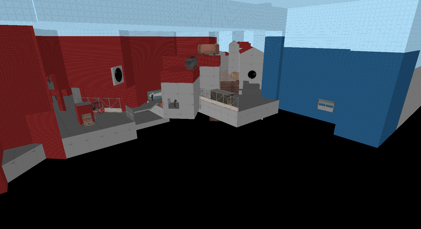
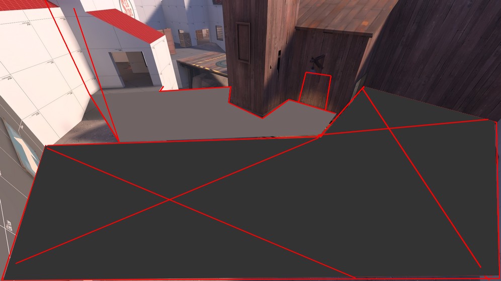
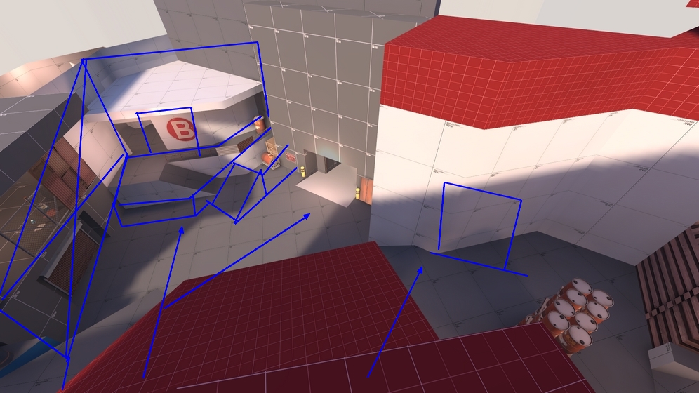
The map author has to be careful not to give engineers a place where they can build, keep their stuff alive and suffer little pain. You've done well to make building a sentry nest a risky thing here at A. But as an engineer I feel like there is no solid foothold, and anything I build could be destroyed easily. It's hard to keep my buildings alive, and because one good push is all it takes from Blue, usually, for them to capture the point and take everything out, I feel like my time would have been better spent as a medic or pyro, because I would probably have done a better job of keeping the enemy back.

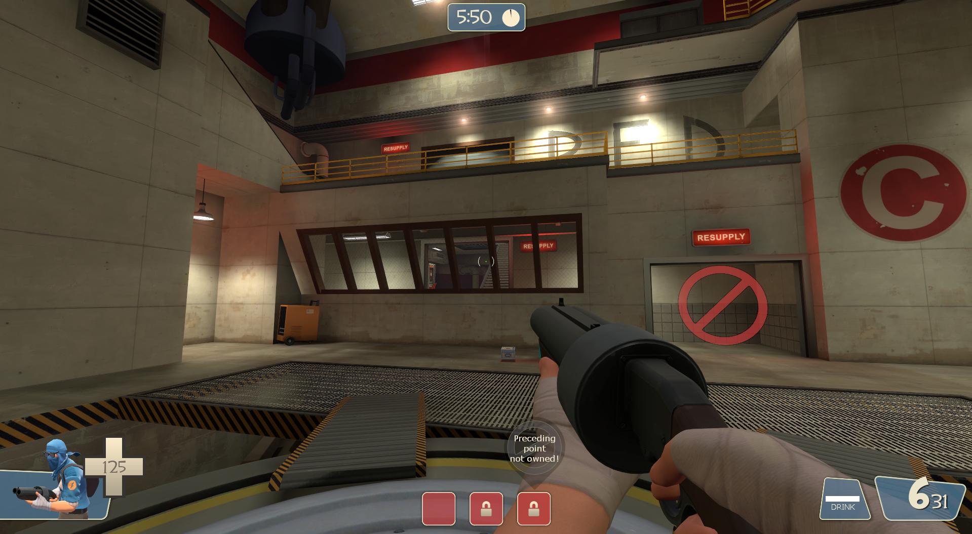
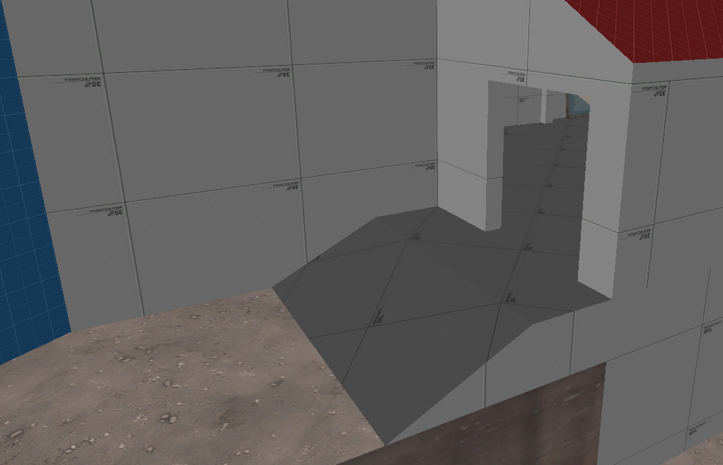
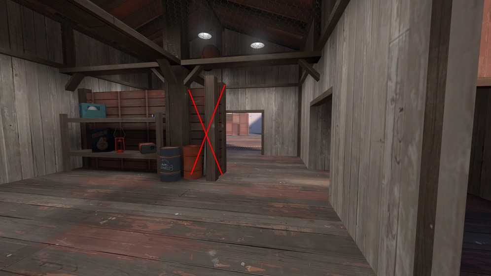
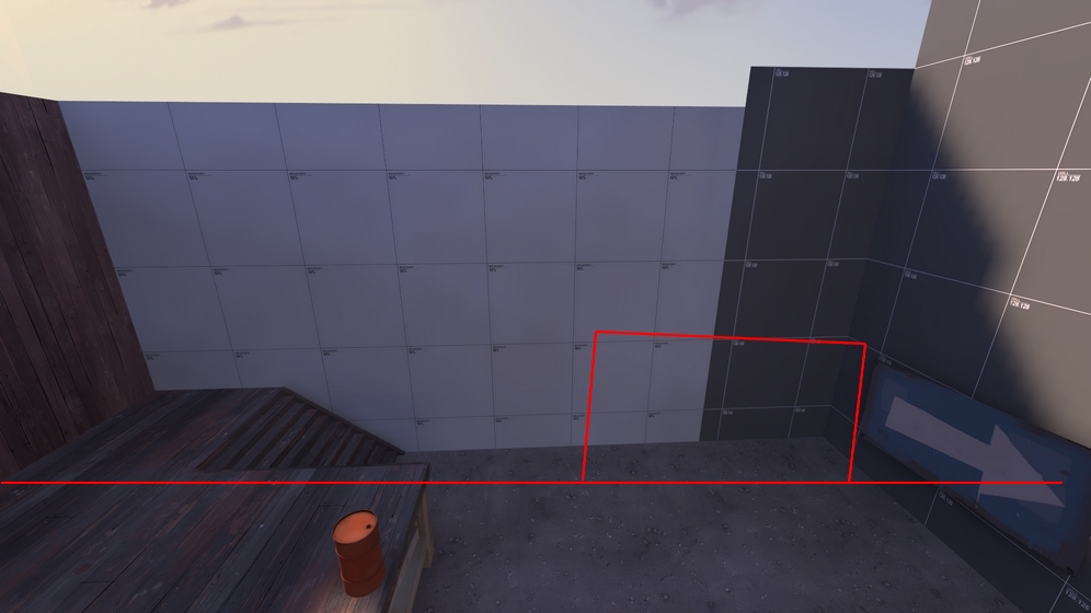
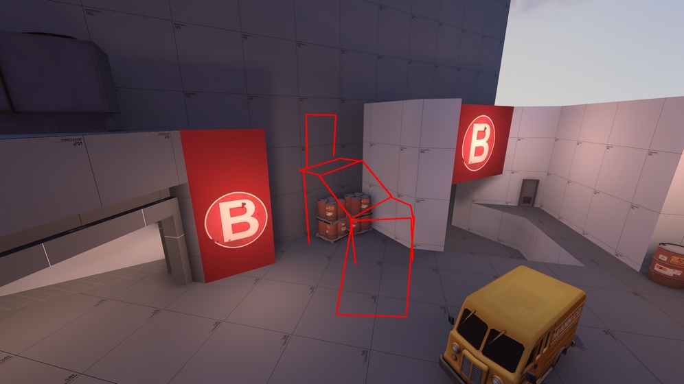
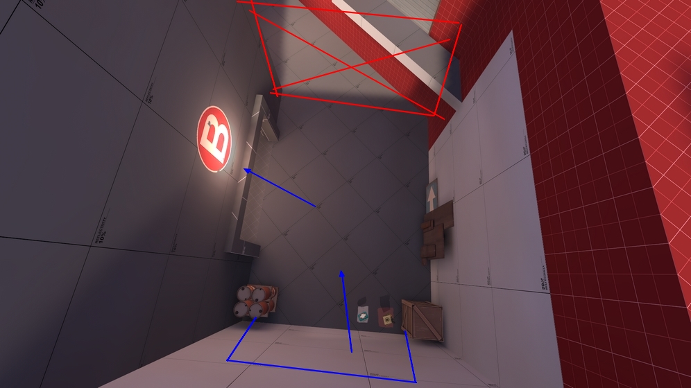
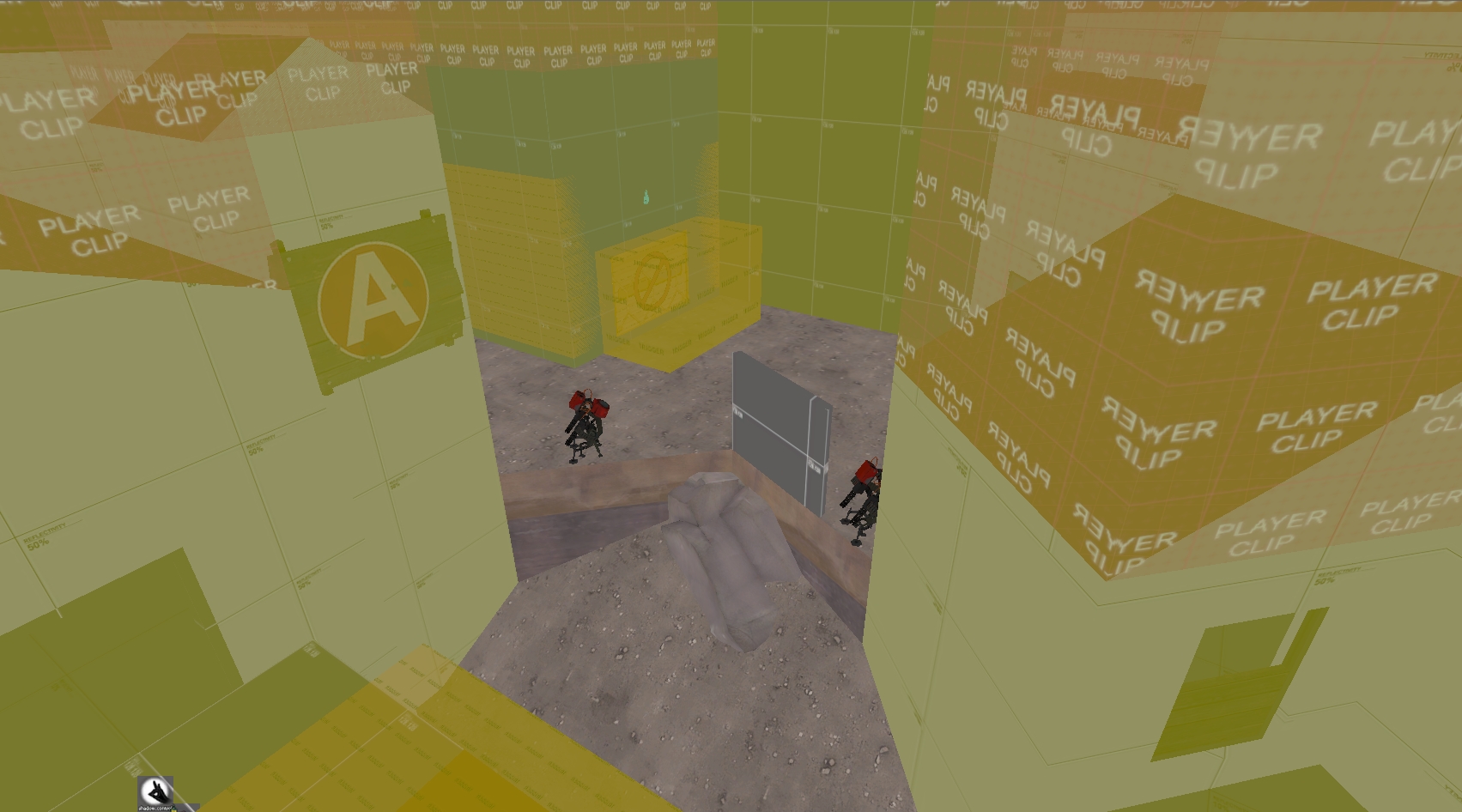
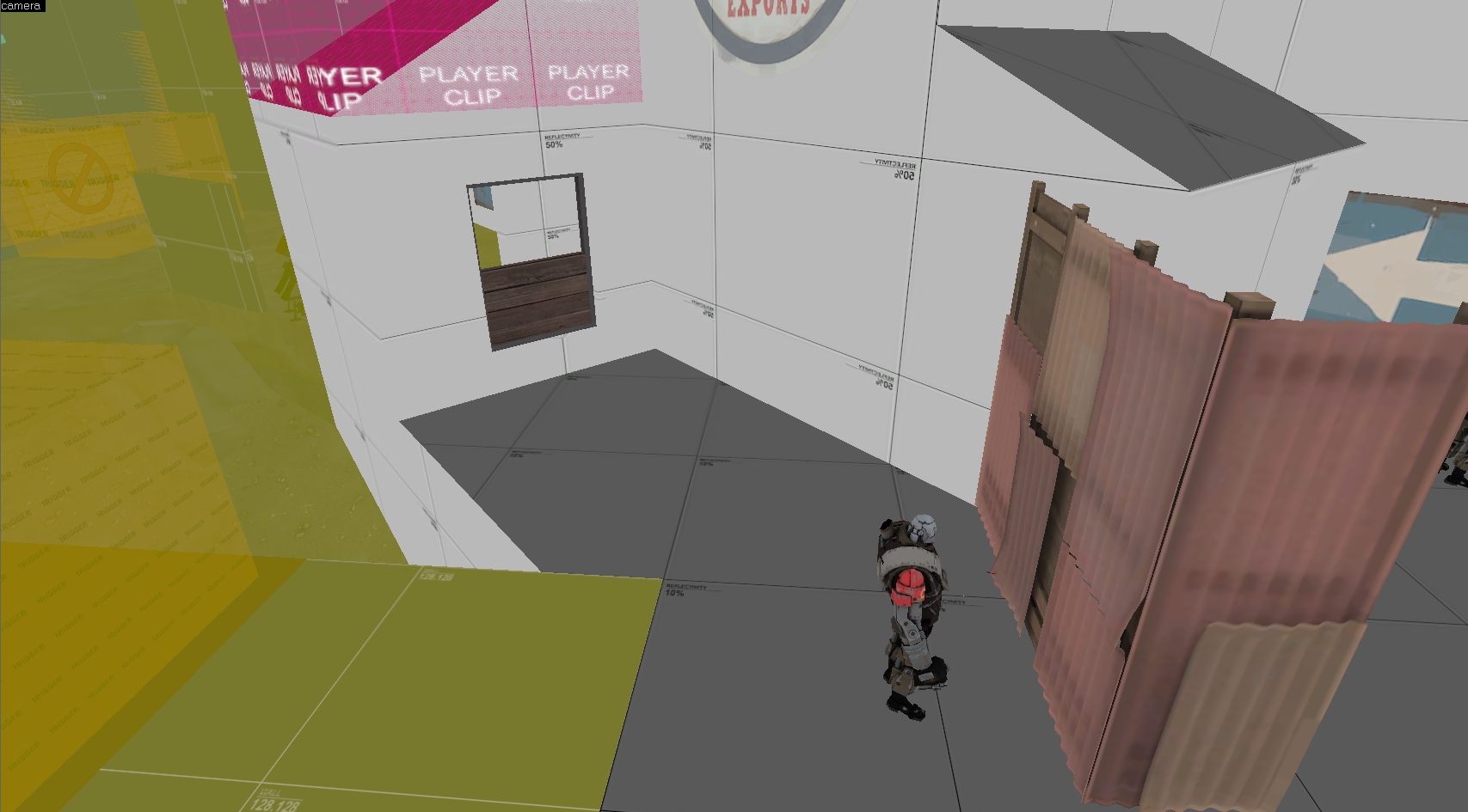
Sometimes if it's too hot up ahead, with my sentry and dispenser, I will place a teleporter exit further back, out of the way. However, in the area preceding A, there are no little buildings, or corners, or dips, or clusters of props that I might use to hide a teleporter exit from the vision of an advancing enemy or sneaky spy, and the area is very long and open, so if Blue push through, they are bound to take my teleporter out, too.

8tGLWcq.jpg


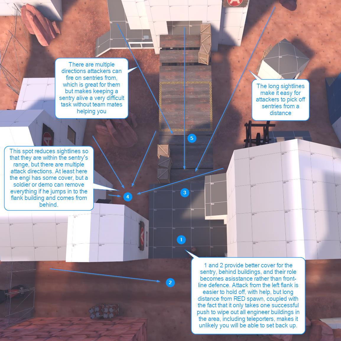
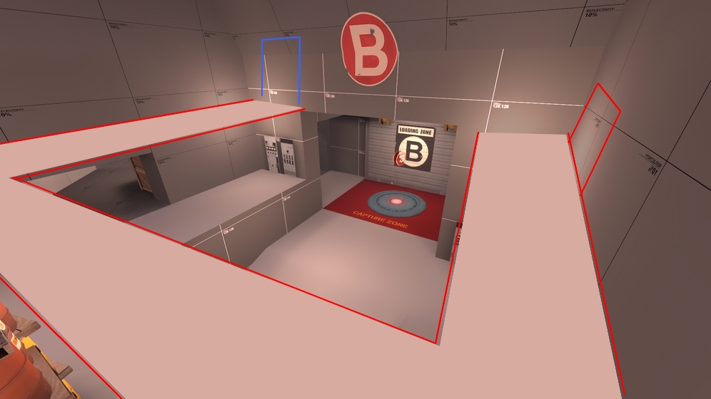
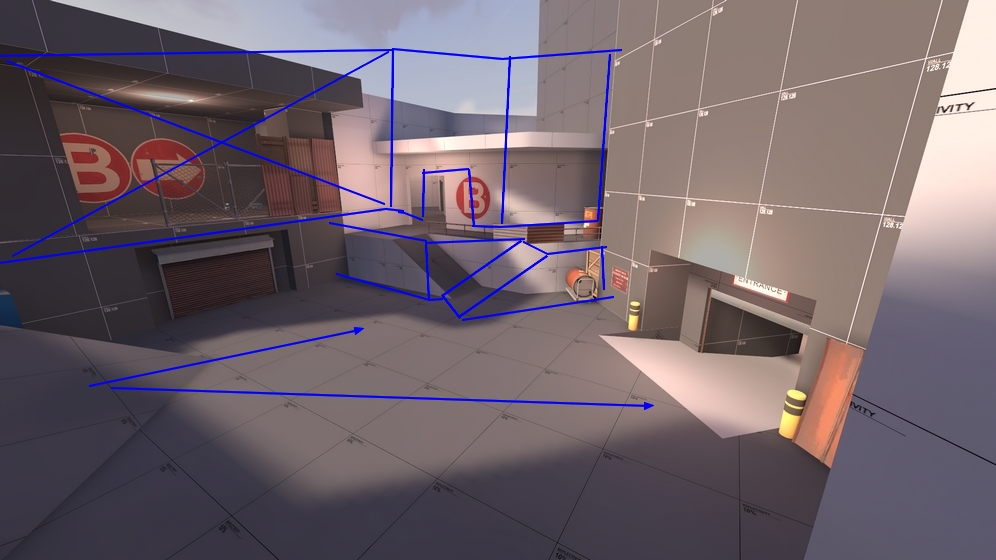
Now, I am not an expert engineer. And what I am talking about is not bad stuff unless you think it's bad. You have designed this map and what I have described might actually be exactly as you wanted. Afterall, there are three points to capture and A should be the easiest. But as a defending engineer at A, it does not feel satisfying. When defending as an engineer, if I feel like I helped the team even though we lost the point, I am happy, but I don't get that feeling here.
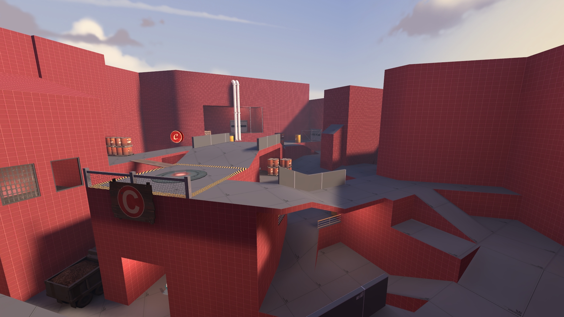
 

taxicat

L1: Registered
Dec 29, 2012
43
152
I'm still not sold on your idea that C needs a main ramp, though -snip-

Not so much of a main ramp per se, but more of a safe and consistent route to approach the area. Example here:

EZPnCOy.jpg


Blue has an insane height advantage and a very safe retreat area with health and ammo and only one path for Red to flank them. However, as soon as they drop down onto the cap point:

8CJOiUo.jpg


Now Blue has a height disadvantage to Red's upper spawn and is standing in front of a death pit, easily attackable from three angles while Red has better access to the health and ammo. Attacking the area is easy, but holding it is hard. On theory your "safe area" with an easy way to attack C or retreat feels like it's here:

utwgsOT.png


But after you've spammed it out with nades, rockets, and minigun fire, it doesn't feel natural moving on to the cap point. You could drop down and the walk around this path:

CdZmeJX.png


But this leaves you vulnerable to sentries hidden there or anyone just spawning. There's also this area on the right side which is much better:

1s5hof8.png


This just seems weird how one side has a much easier time reaching the cap point than the other. It feels like there should be some kind of connector here:

0uVXnWE.png
 

tyler

aa
Sep 11, 2013
5,102
4,621
This is my experience playing a defending engineer at A.
I think this is 100% right. I'm not really a great engineer and I definitely lean toward making their spots weak on my maps, I think, solely to avoid an area becoming too problematic. But your insight has let me understand how I took that outlook and went too far with it. That's an immensely helpful post, Matty. And you should be having fun even when you lose a point, you're right.

You also raise a good point about clutter. I haven't added a lot of props to this map yet because I was trying to avoid detailing too much ahead of time, but you've reminded me that hiding teleporter exits (and other stuff like that) is just as important to map balance. With that in mind, the next version will also be slightly more detailed to support that stuff.

Not so much of a main ramp per se, but more of a safe and consistent route to approach the area.
Ah, okay, I see what you mean now. Yes, that's why I earlier said that the surrounding geometry would need to change more than the point itself. When I talk about C as a point, rather than an area, I mean something like this. So yeah, I definitely agree with you. That's sort of why the dropdown is in that hut next to C, but it doesn't work the way I wanted it to. Your connector idea is a better solution. Though, it's probably better to rethink the entire area to some degree. Anyway, that's an immensely helpful post.
 

tyler

aa
Sep 11, 2013
5,102
4,621
a13 is out

ydFp8kg.jpg


a13:
- reduced the size of A
- increased buffer between blu spawn and A
- completely new B point/area
- red has a shortcut right to A before A is capped
- blu gets a forward spawn after B is capped
- changed some of the routes on C, to put it lightly

0ZP8WU3.jpg

Fz6ddMk.jpg

cSqmXVe.jpg

R3I2yO5.jpg

bKTXjSm.jpg

FEz2IJR.jpg

eOHS8Xg.jpg

er6GabK.png


picture.php
 

tyler

aa
Sep 11, 2013
5,102
4,621
I put out a14 today. It makes some minor adjustments to the blu spawn area, cap times, respawns, and sightlines on B. No new pictures as it's almost the same.

I'm working on an a15 with a reworked B and further changes to the blu spawn area and a few to A. I may also make some changes to C in a15 but probably the majority of them will come in a16.

2swQ7rB.jpg
 
Last edited:

tyler

aa
Sep 11, 2013
5,102
4,621
Here's a peek at a15.

e26JUD2.jpg


This door on A is being moved to give RED some more options. The door on the other side that leads there was often missed by players on the way to the point, so I've added a light. Hopefully that works.

vghhXFu.jpg


To further cause BLU to diversify their routes to the point, I've also moved the ramp into this building a bit further out of the way. I made it a bit easier to hole up in, though, and the low roof to the side is now easier to get on. In the way back you'll notice I spruced up that corner. It's a dumb space no one will ever use, but it isn't flat ground or more rocks, and it can be used for medics/spies/snipers/whatever.

xy2P9Ho.png


This one-way door is gone. I found I was just really confusing players of both teams constantly, and no matter what I did it wasn't becoming clear version to version. I've also realized the general power of this area for engineers, which was unexpected, but is welcome. The previous adjustments to the other door near here are intended to support this a bit so the whole back area is more useful to them, and thus they fall back to B better as well.

hZOFbp8.png


I'm still thinking about how to rework B. Right now that area of the vmf is just void while I think on it. Up until this point, the map has been me combining various control point ideas together in different ways, trying to figure out what works and what doesn't.

In a13 and a14, I went the farthest I've ever gone and built everything in service of a layout that is very compact by necessity. Before finalizing the entrances to C, I settled on a layout for B that was a little simple compared to the rest of the map, and didn't really consider how it linked up to C after the fact. I also realized that if I am going to have a tiny point, it doesn't work unless RED can spam into it. The layout doesn't support that at all, probably because I built that B point in like 2009 and was an idiot then.

68tr5n7.jpg


Speaking of C: I've simplified this route here just by separating them more and basically cutting out a half-level where like 3 staircases met. That allowed me to put a little breathing room here. I removed a railing, too. That should make the routes feel a bit more strategic for BLU, and more manageable for RED.

GvVJzwK.jpg


I'm not sure how I feel about this yet, and it could change or be removed. I'm trying to improve RED's options and feeling of protection, and I'd also like to cut down on the visibility around the general area. I make a lot of structures in my maps that get heavily reworked, removed, or both before release, and this feels like it will be reworked a bit. But I need to consider the implications of this house as it is first and then probably preemptively solve the problems it would create and so on.

That's about it for now, really. I have some other plans for the side of C I didn't talk about, but it's too hard to describe without having started on it, and it will likely go through the same process as the above house will. I'm back in school so my time to work on maps is greatly reduced again.
 
Last edited:

tyler

aa
Sep 11, 2013
5,102
4,621
Haha, well, to get a13 out (which I made about 90% from scratch, very little was used from a12) I worked on it for 8-12 hours a day for about six days straight. I'm not redoing as much now, but I'm back in school, so my time to work on it is severely limited. It could be a little while before a15 is out.
 

Kube

Not the correct way to make lasagna
aa
Aug 31, 2014
1,342
1,849
Well, you're just first with everything today, aren't you :chord:
 

tyler

aa
Sep 11, 2013
5,102
4,621
I'm at that point where I'm kind of treading water on this map. I've made several basic iterations of a new B point; some wildly different than what I had, but most fairly similar.

ihYcERN.jpg yYzUMUU.png

Here's some angles on the B I think I'd like to go with. It's a weird split cap though and I feel like it's just going to be too weird. I guess it'll be easy to reduce it to a regular cap if I need to. My idea here started as having a split cap across a gap, and I couldn't think of a way to justify it other than twin door controls. Then things went from there, and I ended up with functionally something similar to what I had before. But more interesting, I guess. It definitely feels more like a fully formed idea than the old B.

RcHmPau.png

I've got these weird connectors though. They're necessary to have enough routes to ease player travel, but I probably have to rethink how everything works. In the above shot, the left-hand stuff should be primarily used by BLU, while the large entrance would be more separate and somewhat neutral.

I plopped it into the main map and I'm not sure what I think about it.

B06uGqw.jpg

I didn't like it when it was on grid, so I rotated it 45 degrees and it looks better. But I'd have to vertex edit everything to be back on grid. I also have to think about where I place it exactly relative to A and C, because part of this redesign is to address it being defendable and too far for RED. I'm also rapidly approaching a point where the majority of my map is at a 45 degree angle, meaning I should have planned it better.

What I should probably do is strip it down a bit, vertex edit it onto the grid at a 45 degree angle, and then rethink all the routes to it before going further. I'm kind of just posting this to think through it in a more structured way than usual, plus I think people tend to find this stuff interesting. I haven't had too much time to work on this due to several complicating factors, but hopefully I can make more time soon. If anyone has anything they'd like to say about what I'm working on at the moment, feel free.
 

tyler

aa
Sep 11, 2013
5,102
4,621
a15:
- new B, split cap mechanic (think gullywash). red has a shortcut here now too.
- some changes to the area before and around A
- increased signage
- simplified some stuff
- moved the plank on C and added some more geometry
- changed a trick jump at C
- many many tiny things or tweaks

5597
5598
5599
5600
5601
5602
5603
5604
5605
5606

Read the rest of this update entry...
 
Last edited:

tyler

aa
Sep 11, 2013
5,102
4,621
a16
- opened up the building between blu spawn and A a little, and widened the small bridge outside it
- deleted the small health/ammo and sniper fence on the building to the side of A
- put a wall in the building between A and B that mostly BLU uses
- got rid of barrels near blu forward (dont like how this looks atm)
- moved one of the doors to B (may revert this)
- deleted the one way door to B, moved the route to a much better spot
- made the side ramp (small shed) to the upper platform attacking C walkable
- put nobuild on the props in the middle of B
- removed a sniper spot at A (removed tires -> keg)
- increased starting time
- increased time given for capping A
- removed weird clip brush in blu spawn
- adjusted signage in some spots
- fixed some problems no one noticed


5784


5788
5785
5790
5787
5789
5786

Read the rest of this update entry...
 
Last edited:

RaVaGe

aa
Jun 23, 2010
733
1,210
Ok i'll leave you some feedback here.

1.General impression :

Good :​
    • The design is great and the layout is really solid.
    • Great use of heights.
    • Good use of chokepoints.
    • Fairly balanced layout.
Bad :​
    • Pacing could be better, control points feels too long to capture.
    • Lacks of good spots for engineers.
    • Long walk to join the battle area.
2. Impression on A :

Good :​
    • Great design.
    • Good amount of paths.
    • The battle is happening on the control point.
    • Chokepoints are ok.
Bad :​
    • Hard for an engineer to set up his sentry in a good sentry spot, also no obvious spots for them.
    • Hard to retake the area when the BLU team is on the control point.
    • The control point area is too large.
3. Impression on B :

Good :​
    • Great design.
    • Potential to be the best CP of the map.
    • Chokepoints are ok.
Bad :​
    • Not enough paths to attack the control point.
    • The BLU team is attacking from the side, what you want is a frontal battle.
    • Could use more height variation.
    • Had a hard time to find metal as an engineer, could be on me.
    • No propper sentry spot, also no obvious spots for them.
4. Impression on C :

Good :
    • Nice use of height variation.
    • The fight tends to happen near the CP.
    • Chokepoints are ok.
Bad :
    • Too much height variation in fact.
    • The design isn't good.
    • The control point area is bad.
    • No propper sentry spot.
    • Most of the areas feels useless
    • Not fun to defend neither to attack.
I could go on but IMO C need to be changed completly, think about a new idea for your last control point.

5. Design changes.

1.CP A :​

Image0001.jpg

You need a good sentry spot in that area, move back the wall to give room for engineers
Image0002.jpg

Delete some of that cover to give the engineer a good view of the CP
Image0004.jpg

This whole area feels too large, shorten it
Image0005.jpg

Second view

2.CP B :
Image0008.jpg

Make a forward spawn there, joint it with the actual forward spawn for C
Image0009.jpg

Something like this
Image0010.jpg

Make a doorway there, which lead to
Image0011.jpg

There (the blue door), I feel like this area need some height variation
Image0012.jpg

Another view
Image0013.jpg

RED entrance to the higher area
Image0014.jpg

That B point need another route for the BLU team, block that path for the REDs
Image0015.jpg

Like this
Image0016.jpg

So because of this new route, that left side will be useless and unused, cut it down but keep the same indoor path
Image0017.jpg

Another view, please go for a more frontal battle there.

3.Now about C :

I'm sorry about that, but C doesn't make it, it lacks of too many things to be a good CP even with a lot of changes, redesign it from scratch, the chokes are good so keep them, even though it need some work but we'll take a look at that after. Your main goal here is to refine the control point area, a good example for you could be the last control point of gorge, there's a nice height variation while the gameplay is focused near the control point area, take a look at the last control point in the first stage of cp_blorav, it takes the same formula into another way.
But overall pretty solid map, just need some more work to make it excellent. Good job man !
 

tyler

aa
Sep 11, 2013
5,102
4,621
Besides doing everything Ravage suggests, I'm going to try lowering C to about half or 1/3 its current height and restructuring the final area to support that better. I don't really know what that's going to look like just yet but it seems like literally no one enjoys the verticality of it.
 

nitewalker

L2: Junior Member
Aug 5, 2014
64
141
i think the vertical element could potentially be really enjoyable if it didnt put the attackers in such an awful disadvantage
 

tyler

aa
Sep 11, 2013
5,102
4,621
It's weird because over the versions people have said that but BLU still wins most the time.
 

tyler

aa
Sep 11, 2013
5,102
4,621
I've begun more or less doing what Ravage suggested. Also, I converted to using manifests, and holy hell it's amazing.

So this room beside A has changed, hopefully to help with sentry spots here.

wiH02Nr.png


I wasn't really sure about the viability or sightlines though so I tried to make the side area more usable too.

CJLAteN.jpg


Also, yeah, I decided to just add a blu forward spawn here (yellowed out in the back). I was basically assuming that there should be only one forward spawn, like in Gorge and other 2CP maps, and some community 3CP A/D maps. But even before Ravage put this in his feedback I had decided I needed to. Not because people asked for it, but because of the similarity in size and design between 3CP A/D maps and 5CP push maps. 5CP maps, because of their size, have 2 forward spawns for each team.

I'd assumed I should be using a certain number of forward spawns based on the game mode. But in reality, I should have a number of forward spawns corresponding to the layout and design. Which makes perfect sense when you think about it like that.

Then I did this because it seemed logical:

1TIlTgW.jpg


The boards are there chiefly to stop players leaving the blu spawn and going straight through and missing all the arrows that make them turn nearly 180 (!) degrees. Unfortunately, there just isn't a better place to put the forward spawn, so I'm doing my best to avoid it. I assume they aren't going to jump into the hole under the point they now own, but you can't win them all, so. Upside of the windows is sneaky demo plays.

Here's the new courtyard between A and B.

ityD8Ai.jpg


You'll notice the farthest path is missing, and also, the ramp to the white building on the right is different.

The third path into B has moved over here, where it should have been this whole time:

8NQVDzS.png


It's a one-way door with the hand on the other side. The overlay that is black there on the wall is a blue arrow, and I figured having this room around it would make it a bit more inviting. There's also a B sign you can't see right now. I did it like this because I didn't want to make the other side walled off like Ravage suggested because I'm not sure how I would deal with the dead end it'd create or how I'd move the shortcut exit. There's just not a lot of space there.

B itself has a new entrance where Ravage suggested, leading to a balcony area:

8F53oSU.jpg


BLU's entrance is on the left, and RED's is on the right.

Next I take on C. I'm going to try to make something similar to what I have now, but lower, with both teams going downward to the point. I'm going to try to reduce the size of it from RED spawn to the opposite walls too. The idea is to make it more accessible, but also more spire-like for both teams, rather than just for BLU. Then we'll see what happens.