Hi guys! Let's talk about Mann vs Machine. Specifically, the maps themselves, because analyzing the waves seems hard and not that useful.
First let's look at some overviews.
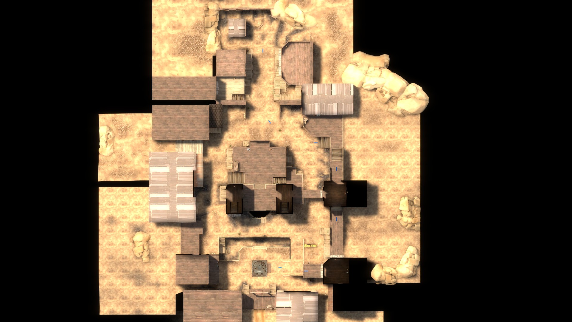
Coaltown
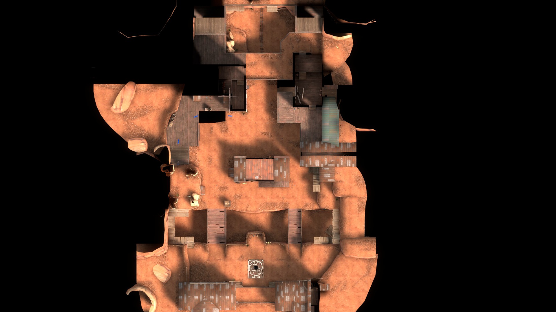
Decoy
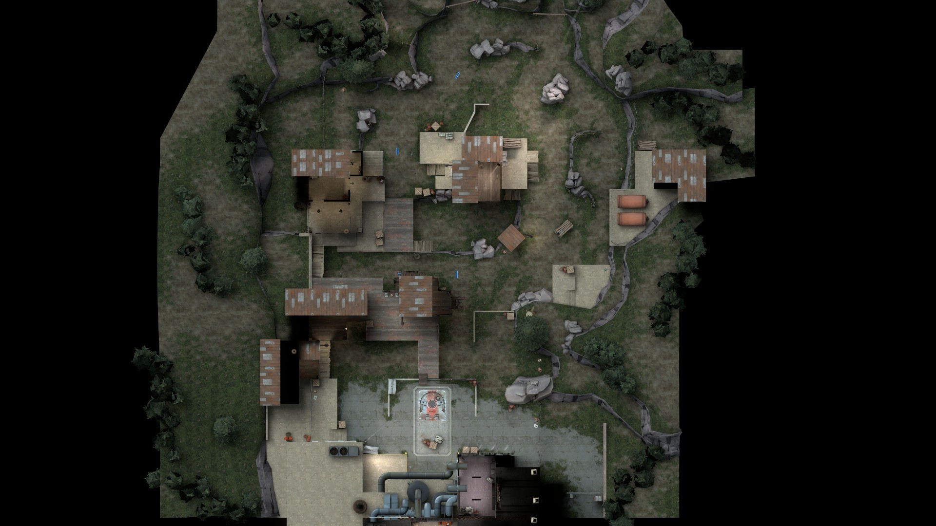
Mannworks
There are a few common design concepts in these images. Can you tell what they are? There are also some pretty key differences as well, though.
The main thing these maps have in common is that they are a straight line. They are dead simple. There is nothing to them. They are short and they are basically boxes. The other thing they all have is something I've been thinking of as "the spine": they all have a raised area in the center of the map, drawing players to a high ground that is always useful. The "arms" of the map, the outer high ground, are often less used, if used at all. (The exception to this might be Mannworks, where the spine is cut in half and the arms are more viable hold points.)
Here are some images of how bots move around the map. Notice that they always bend around the spine.
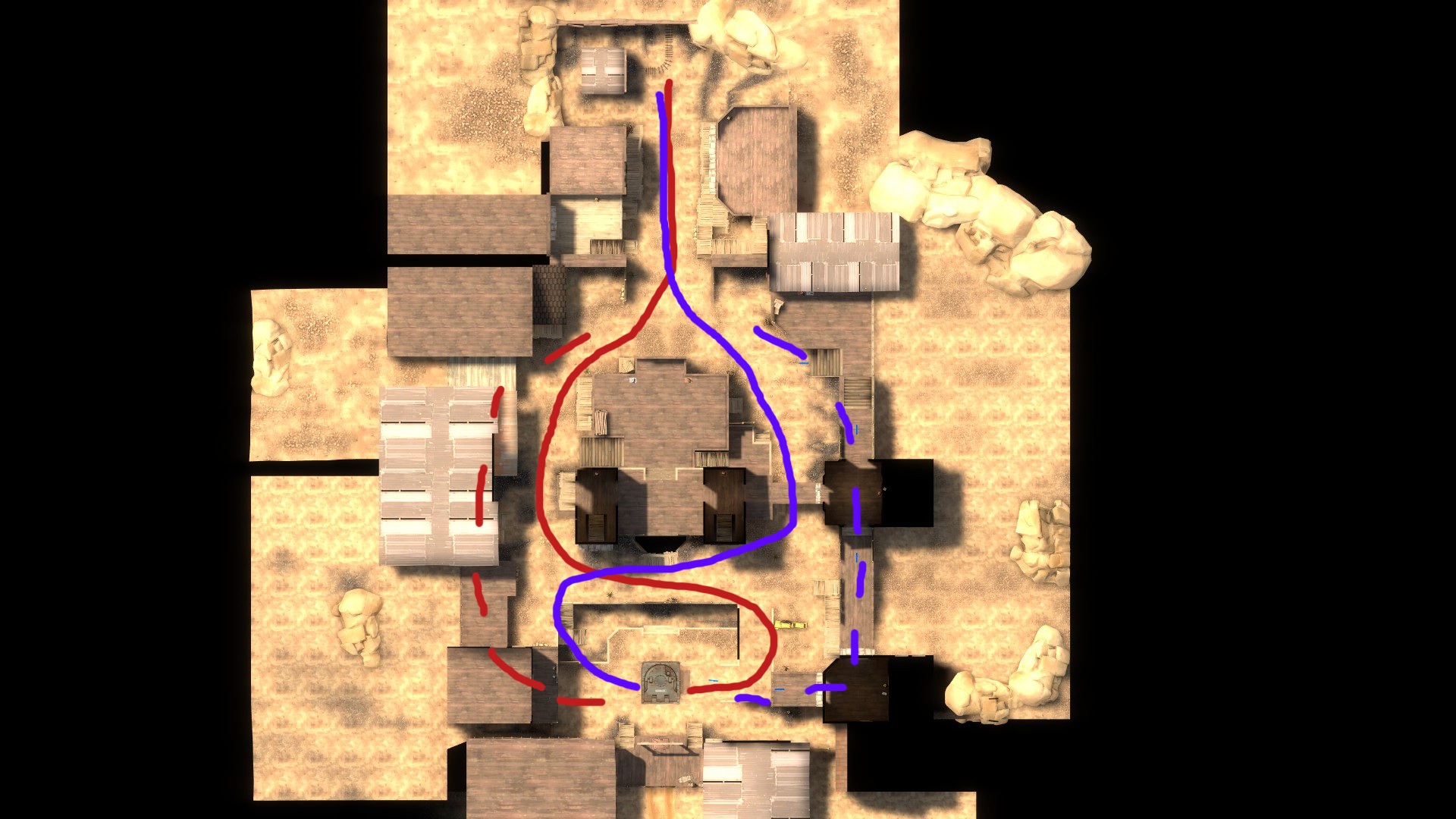
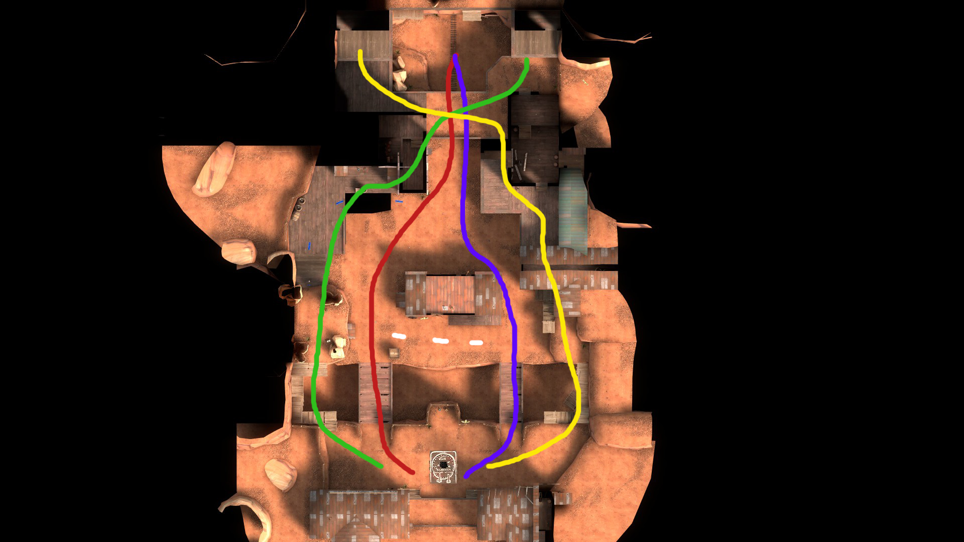
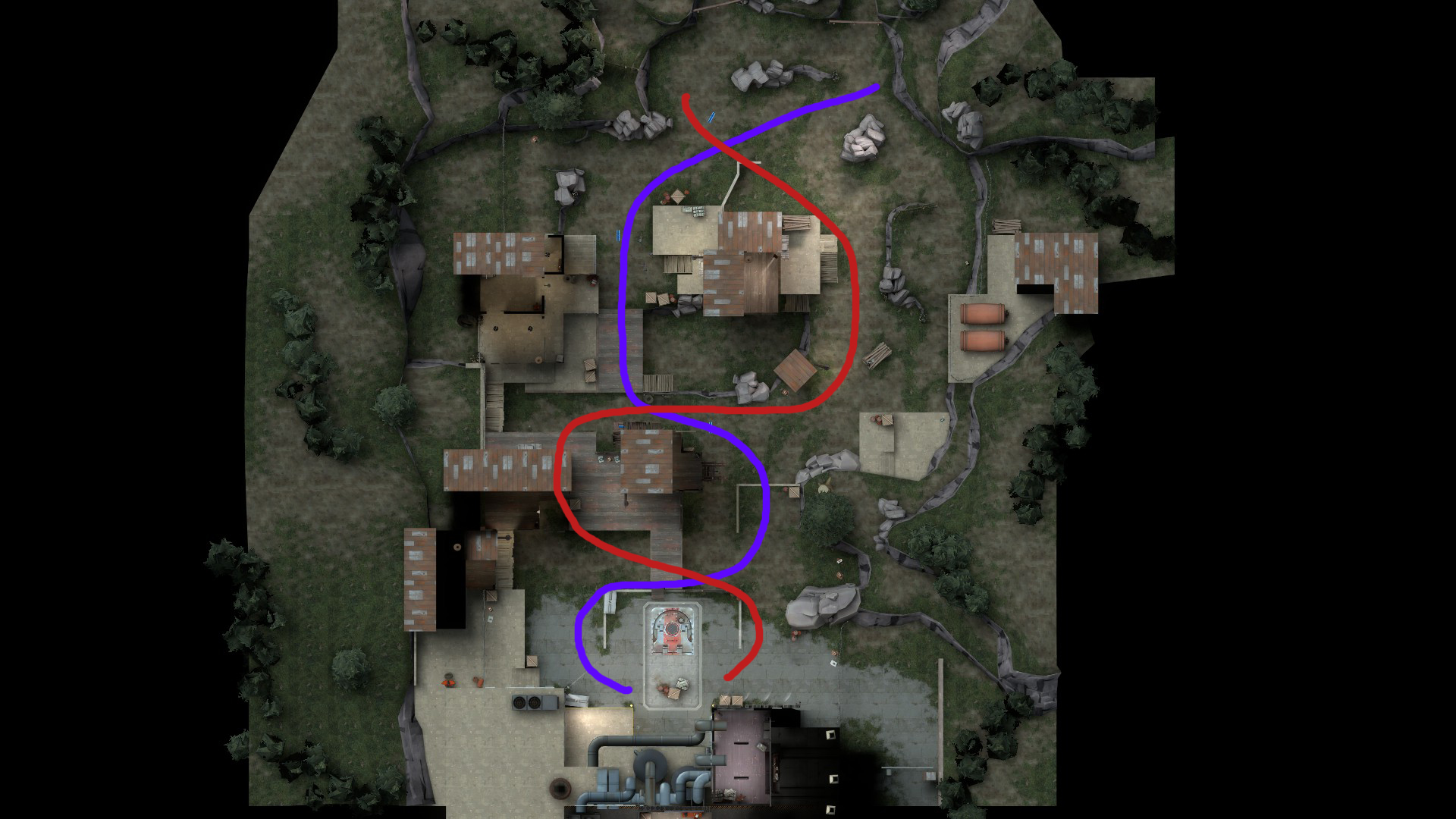
What does this do? It makes each map have the same, basic framework. The geometry changes, but the way you play the maps does not. This means the player is comfortable defending against the robots immediately, because of the similarity and simplicity of each MVM map. Though Mannworks has a broken spine, and Decoy has a short one, they all deliver the same experience: get on the high ground in the middle for the best way to kill robots below you, no matter what path they take.
All 3 maps also include some way to push bots back or delay them. On Coaltown, there are 2 deathpits. On Mannworks there is a shallow trench, and on Decoy, a large trench. The spine and the ability to push bots back are things that I see as features your map has to have--it doesn't matter how else you do it, but these are core.
The other thing the maps all share in common? This last thing you can't really tell from above. It's a total lack of detail, even in the 3D skybox.
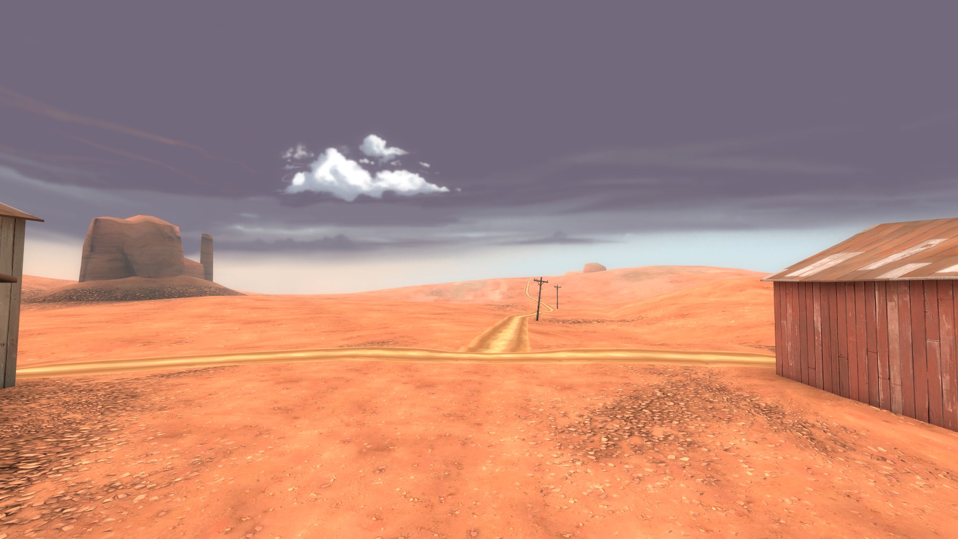
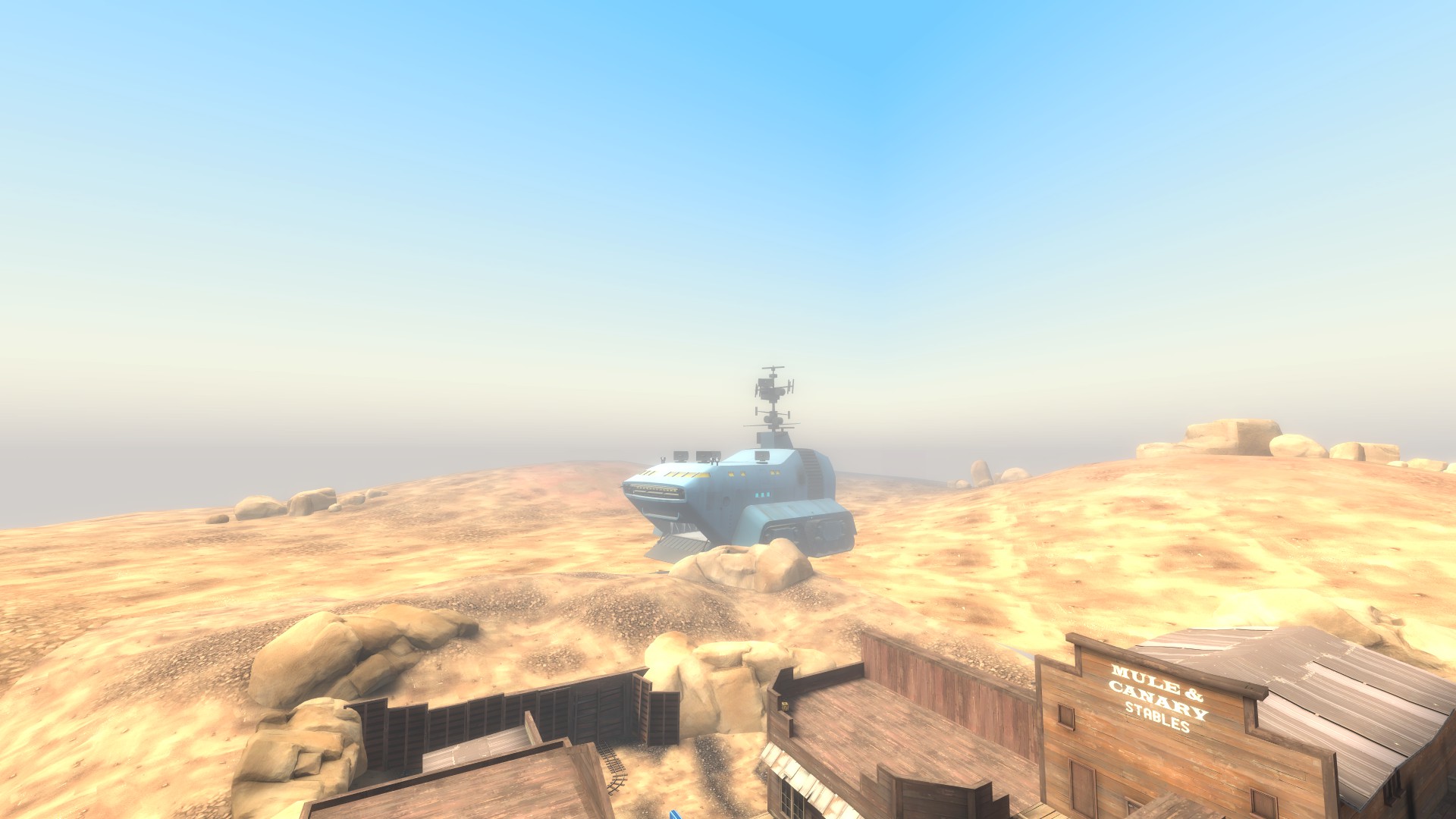
Check out these sweet 3D skyboxes!
Now I want to talk about each map in specific detail.
We'll start with Decoy because I think it's the simplest.
Like I said, it has a short spine. But it's powerful.
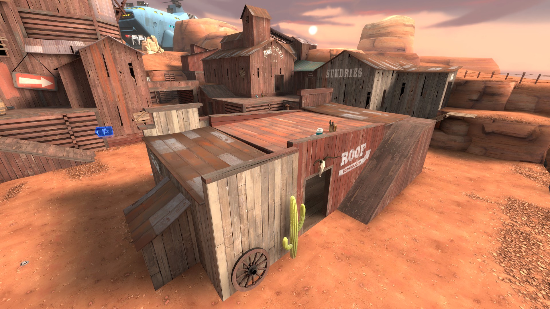
The large pickups really help sell this spot despite the lack of viable cover and size
This building, with the large health and large ammo, can have a sentry on top that sees almost the entire map. The way Decoy is laid out, bots basically funnel through a straight corridor before being split by the spine, then they cross a bridge. A well placed (or quickly moved) sentry can see almost the whole map with the Wrangler. But that range comes with a price: exposure.
Many engineers opt to build to the side, instead. Decoy also features largely exposed side routes.
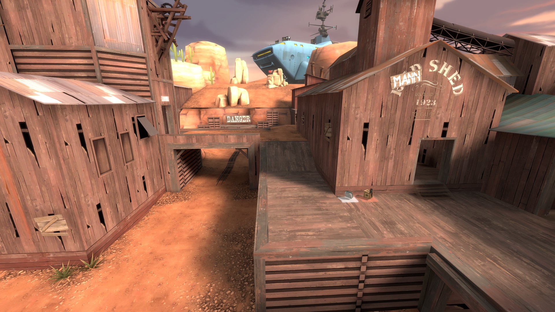
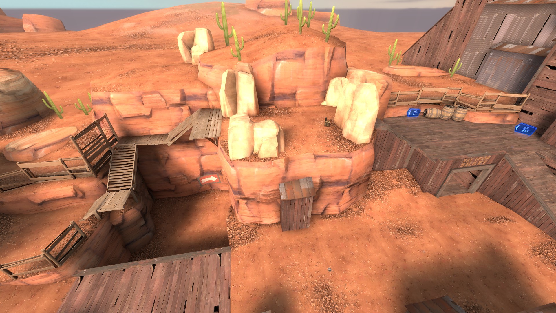
Crafty engineers may build in these areas, or on the platform just to the right of the second image which I forgot to take a screenshot of. This gives them increased safety, but they have to prepare for the waves coming better. They may also find themselves moving around a lot on higher difficulties.
Decoy also employs a large trench right before the bomb hole to help deter bots and funnel them into a tight space.
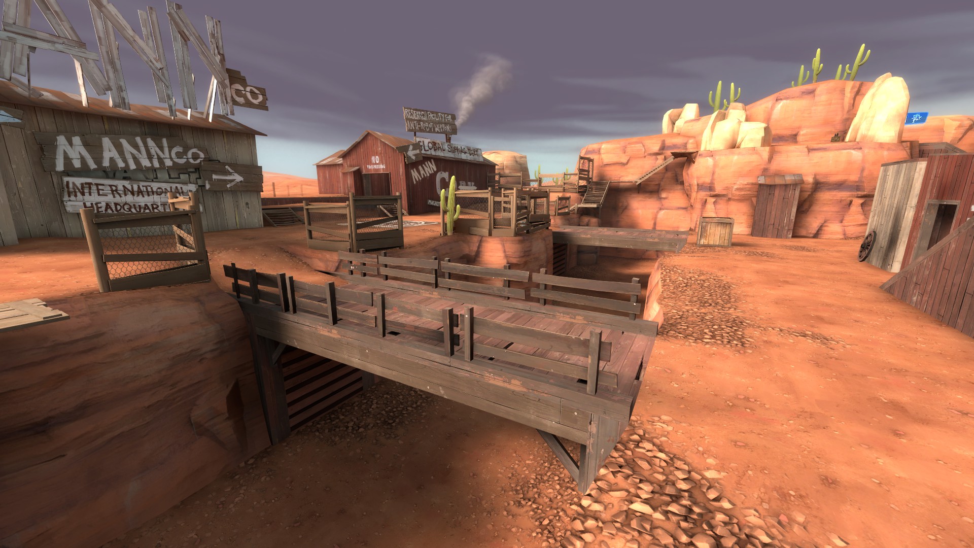
Decoy is the shortest map, so it's important to have something like this to delay bots and also waste their time. It takes a long time to get back up to ground level. Even players are likely to get frustrated should they fall down, and they can jump, unlike the bots.
The outer routes the robots rarely take are also important, though. As near as I can tell--and I may be wrong here, please correct me if so--failing a wave will increase the chance that bots take the outside paths to the bomb hole. This does two things: Puts them against a wall, so it's easier for them to absorb splash damage, and makes the focus shift to 1/4 of the map, rather than the entire center.
One thing I think is really important is the start of Decoy.
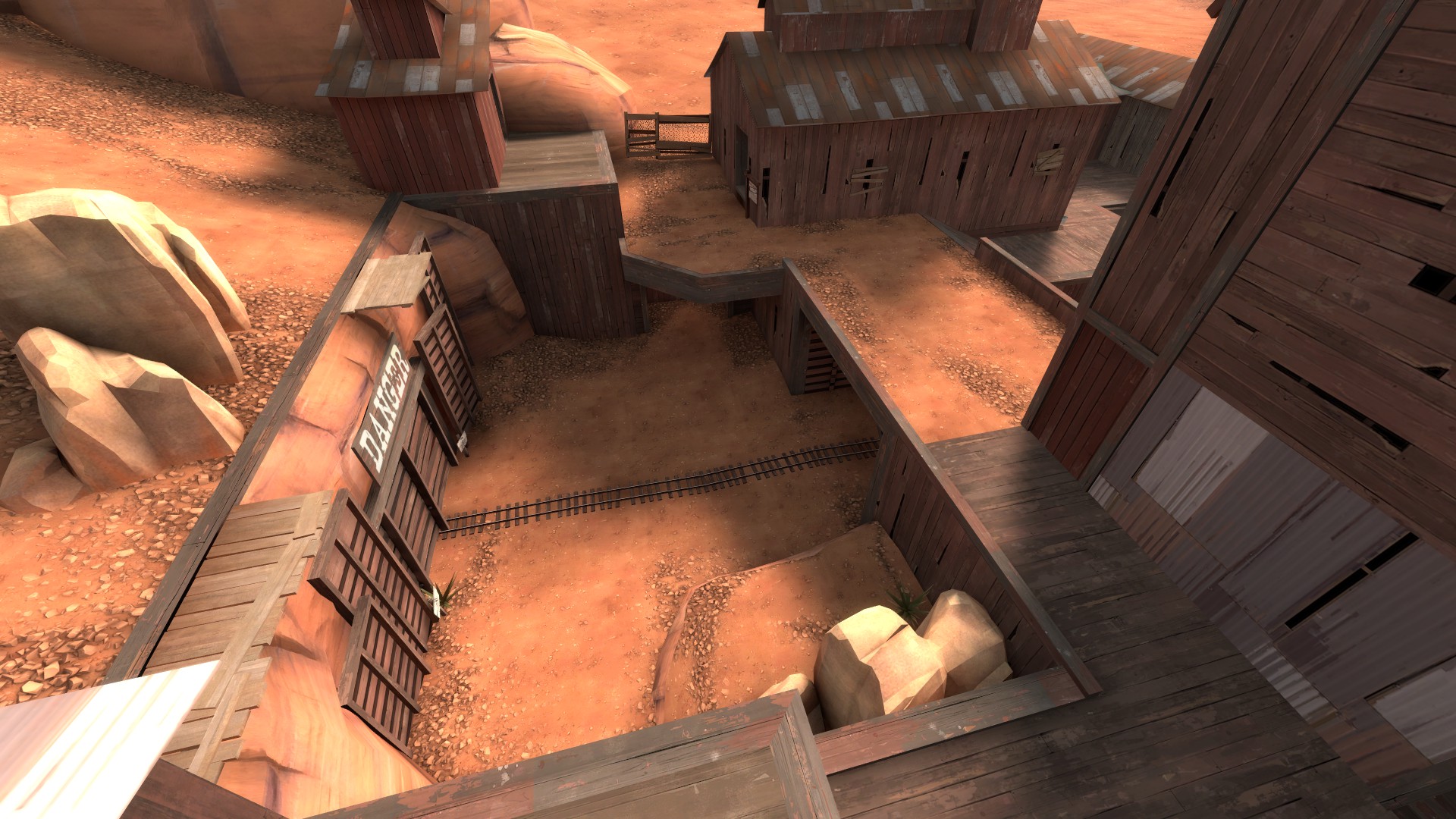
I really do not like the start of Decoy when I am playing Scout, Pyro, or Spy. In MVM, all three of those classes need a lot of breathing room, especially when all the bots are clumped in the starting area. The way this area is set up, there's only a small closet and an irritating jump route to hide in/escape with. It's pretty unideal compared to Mannworks and even Coaltown, which I'll cover later.
I'll also note that Decoy, as with the other maps, has two spawn doors facing each other. Why? I don't know! Probably so that Valve could heavily detail a couple areas as normal without impacting FPS? Because it's neat? Because symmetry is nice? I'm not sure!
Snipers are always hinted to open, easily seen spots. They don't get hinted to windows.
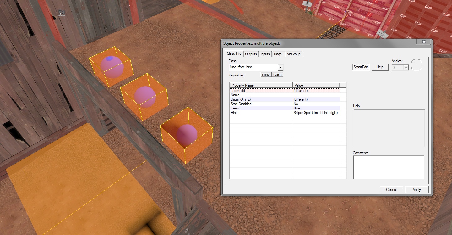
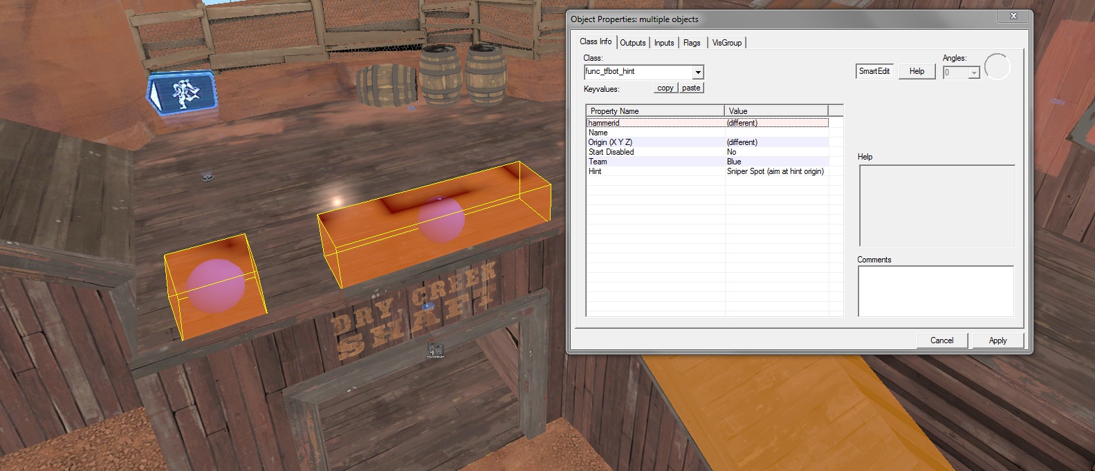
Multiple hint nodes in a single area will make a Sniper have a chance to move between shots or take a new position after being attacked
Keep your snipers in open locations. Coaltown also does this, as does Mannworks.
Now let's move on to Coaltown.
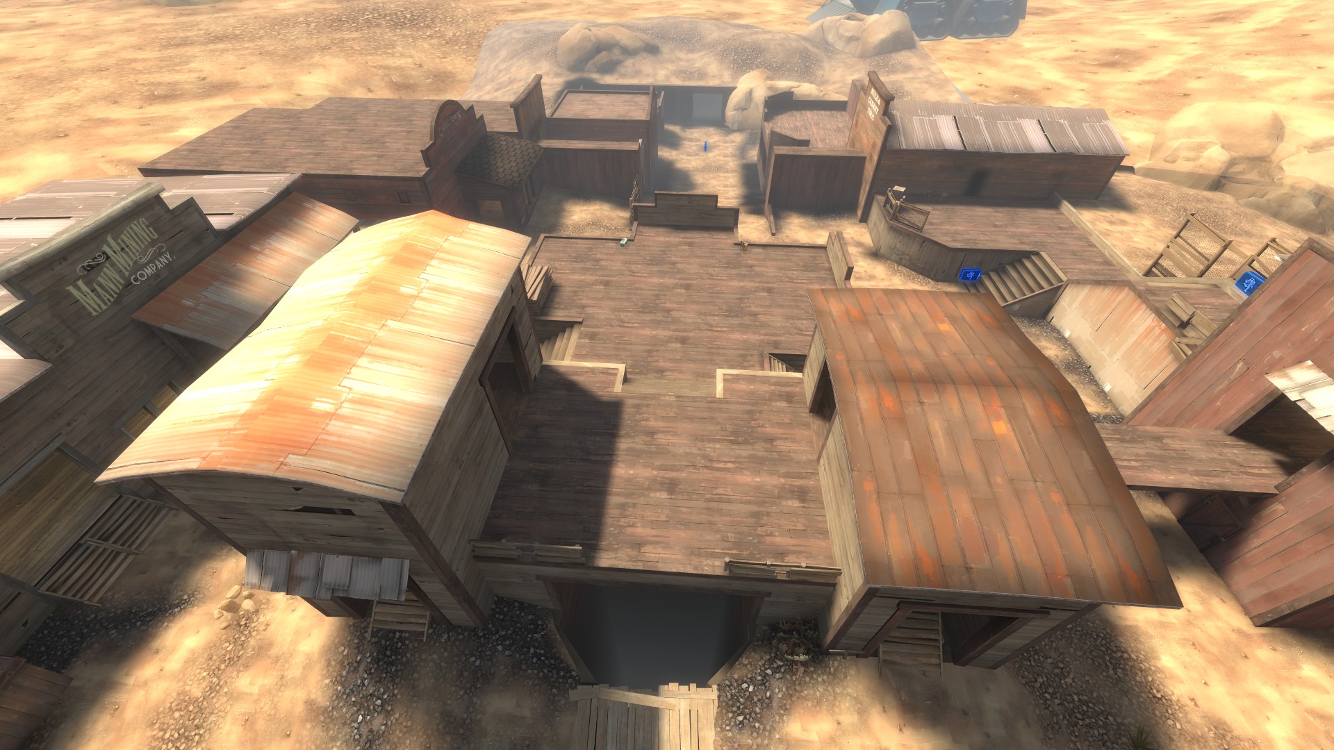
Coaltown's spine is pretty significant and covers a lot of the map. It is a longer map though. One thing that should be taken note of is that the pickups are more spread apart here, though not very significantly. But it does mean that an engineer needs to take 1 or 2 seconds longer to refill his health and ammo, and those are 1 or 2 seconds that will lose you the game.
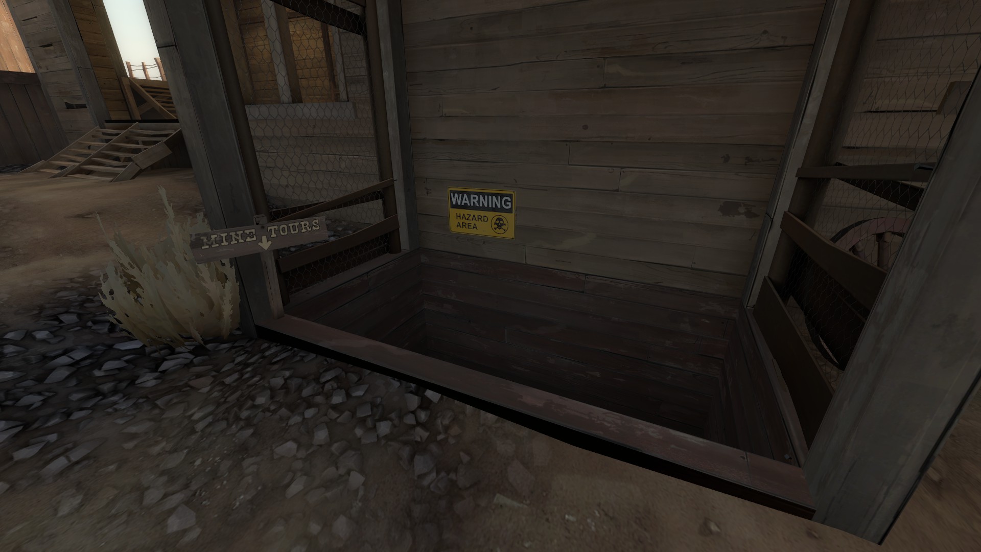
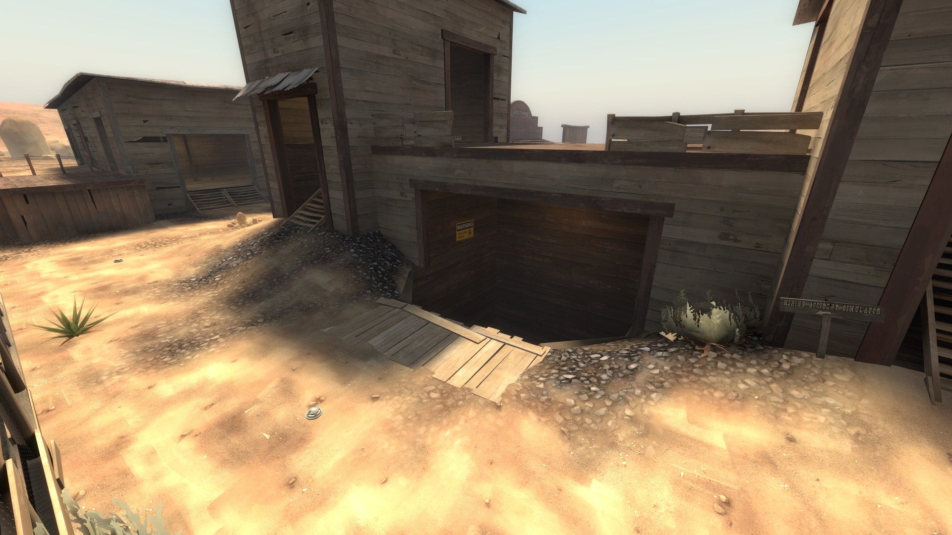
Coaltown is the only map to feature death pits. Both pits are relatively small and can be hard to use. Contrary to what some people think, killing bots with them gives you their money without you having to collect it--you don't lose the money.
Coaltown puts extra emphasis on the upper ground beside the main routes.
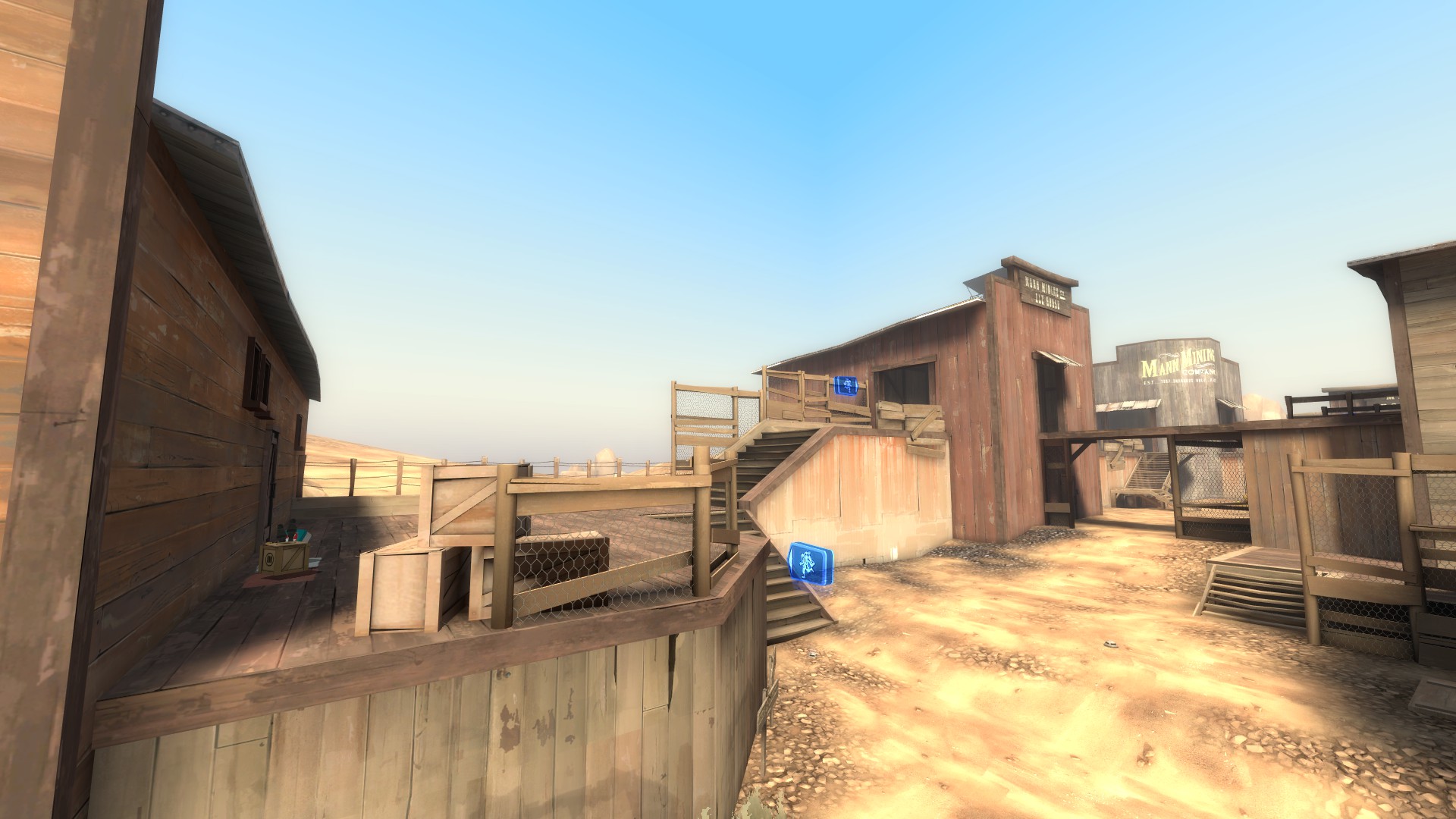
The side routes are more likely to see use, as they are lower (less time spent climbing stairs) and have pickups very near to the main routes. The side areas near where the bots drop down are similarly more useful than Decoy's, as you aren't completely cut off from your team (visually) if you make use of them.
Coaltown is also a great example of using func_nav_avoid to stop bots from going to certain areas.
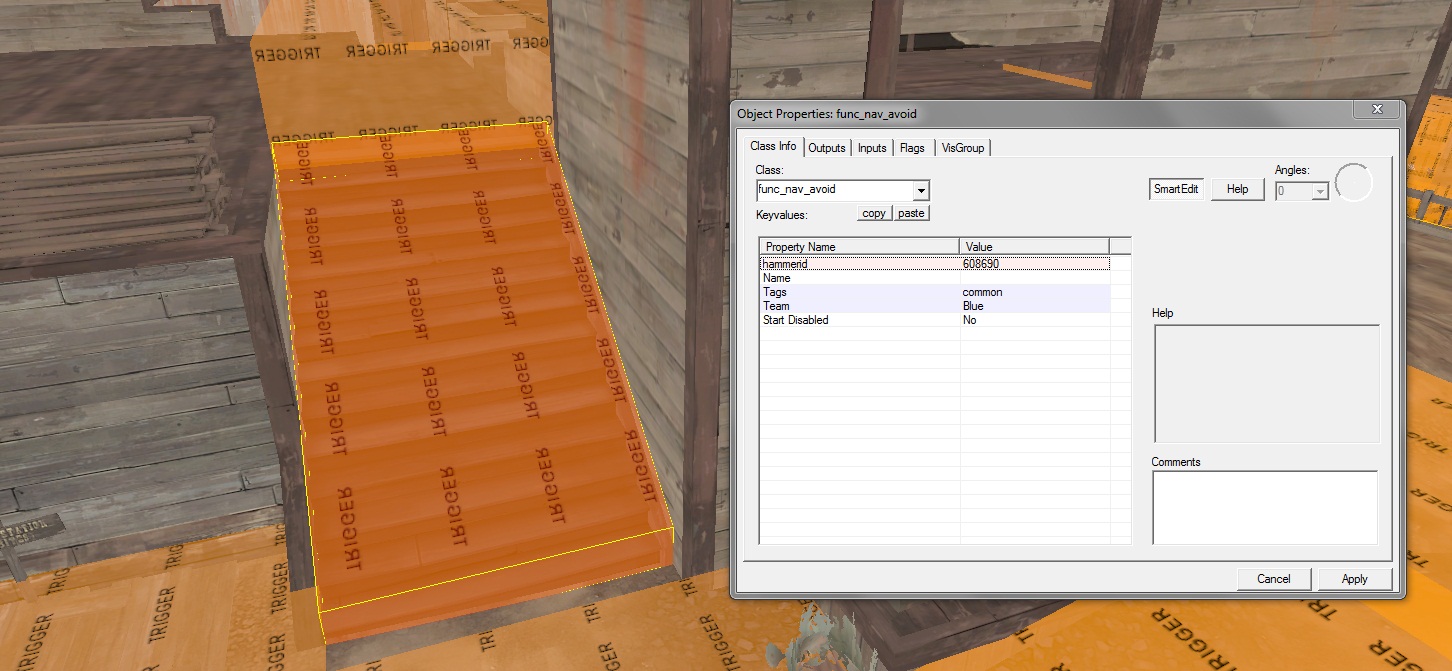
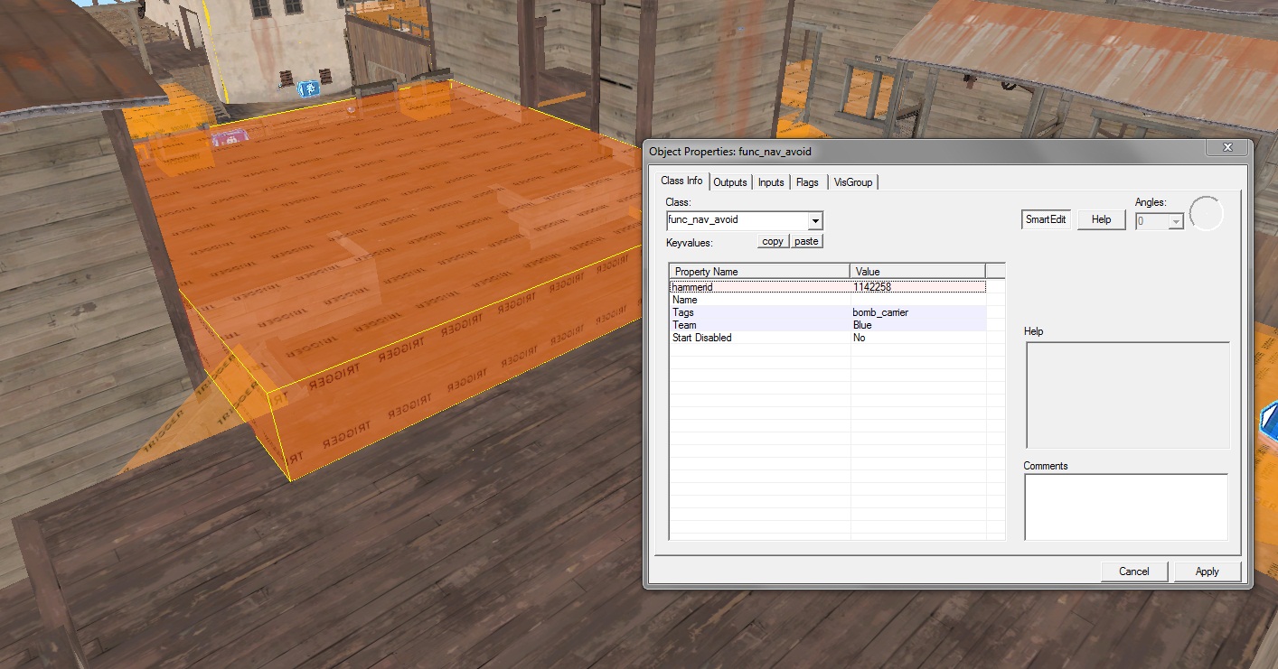
Bots really don't want to travel these areas
It's important that in addition to editing the nav mesh for your bots, you tell them places they don't want to go. This will go a long way toward focusing combat and increasing the "tower defense" feeling on your map.
Coaltown's bomb hole is interesting, because it dips into a lower area for both bots and players, similar to CP2 on Gorge.
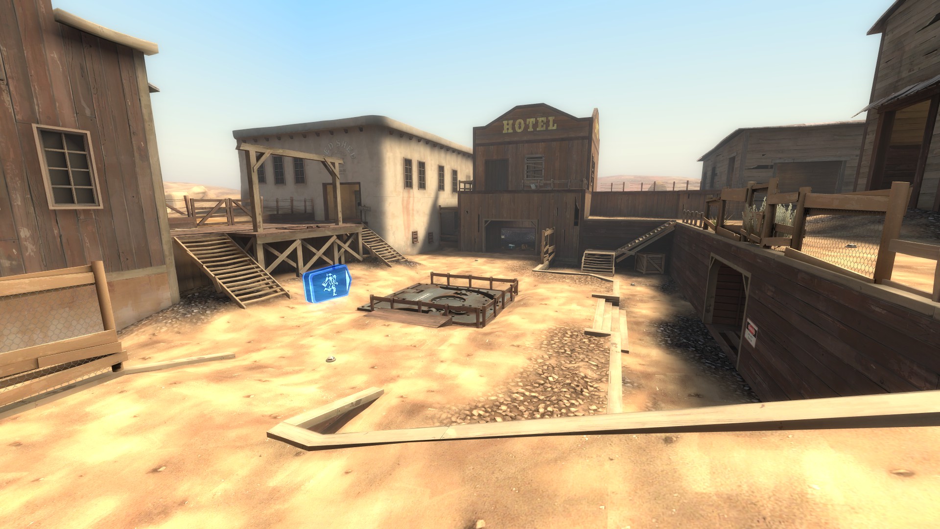
Decoy has the spawn slightly above the bomb hole, Mannworks has it on the same level, and Coaltown puts it down deep
This makes building near the spawn more attractive, as it's easier to watch bots come at you, and then they're below you, so they are easy to spam. The final area on Coaltown is probably the most interesting for this reason; doing the most damage means getting down in the pit with the bots and giving them the height advantage, which is dangerous.
Now, let's return to the start of the map.
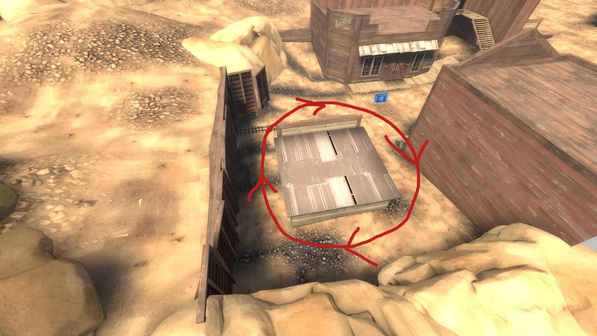
Coaltown improves on Decoy here. There's more space between the buildings, and in addition, there is some actual useful cover to get behind. Support classes are far, far more useful at the start of waves because of this. When areas of a map aren't a death funnel, players are happy.
Last but not least, let's go over Mannworks.
Mannworks is the most complex MVM map because it has two spines.
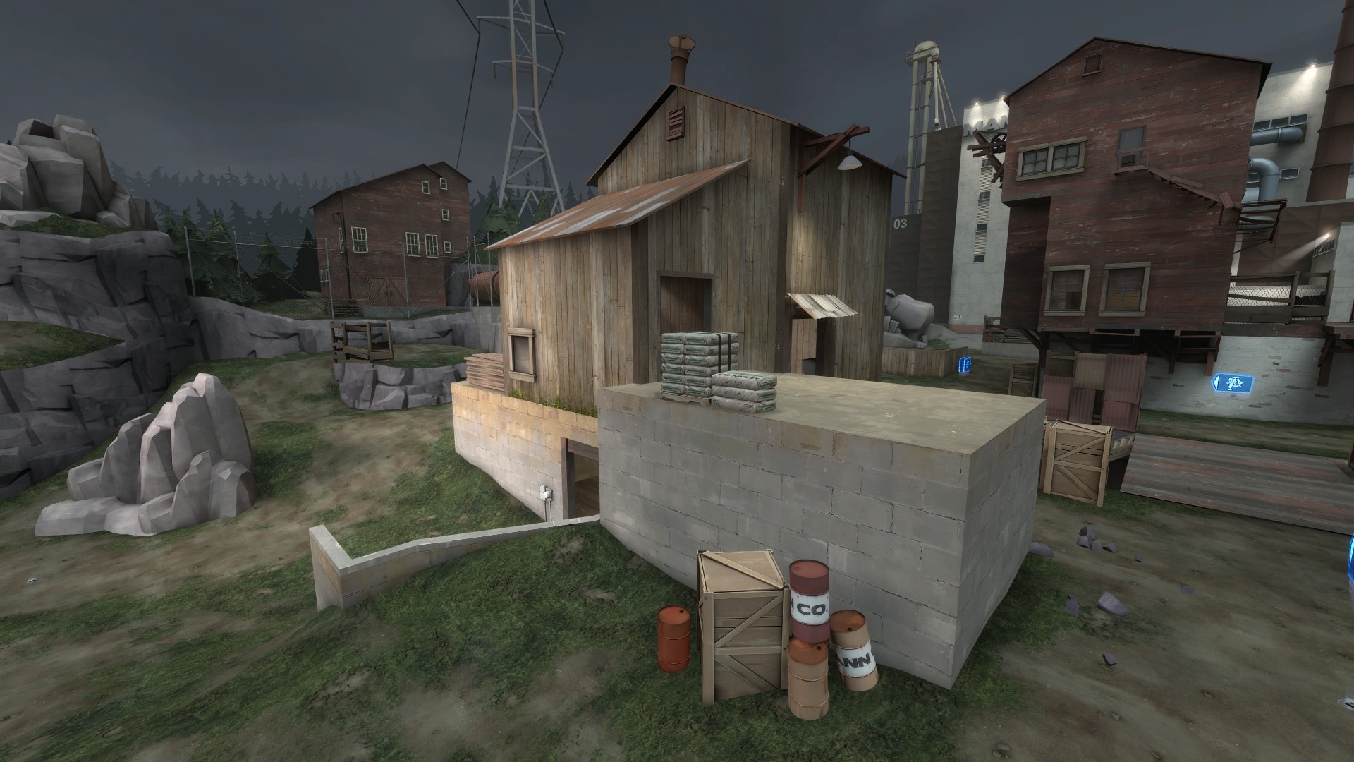
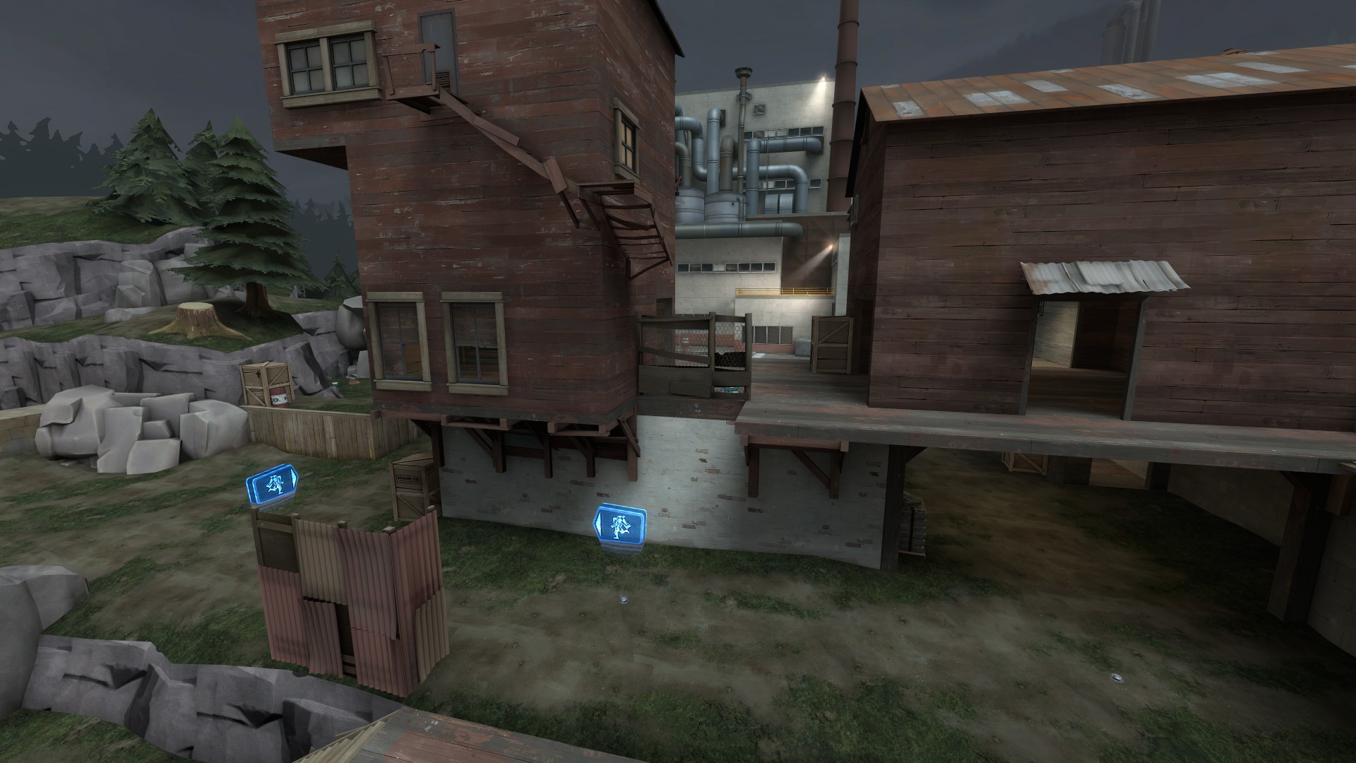
The two spines here basically mean the bots weave around one more time, giving them more places to be missed by players and meaning engineers need to cover more ground. Most of the middle ground is a shallow trench, by far the most useless of the setback areas on each of the maps.
The forward spine is a great hold because it contains a lot of health and a large ammo, but retrieving the pickups means breaking line of sight to your buildings and the enemies, making them slightly less tantalizing. The second spine is all but useless; engineers are better off building on one of the side routes near the bomb hole because of the proximity to pickups and because if you do build on it, you're turning your back on enemies pushing in. But if you can handle that, it becomes a very powerful spot, as it's the closest high ground to the bomb hole.
The side routes on Mannworks are largely useless--the ones in front, adjacent to the first spine, are decent for engineer camps, but as anything else they don't deliver.
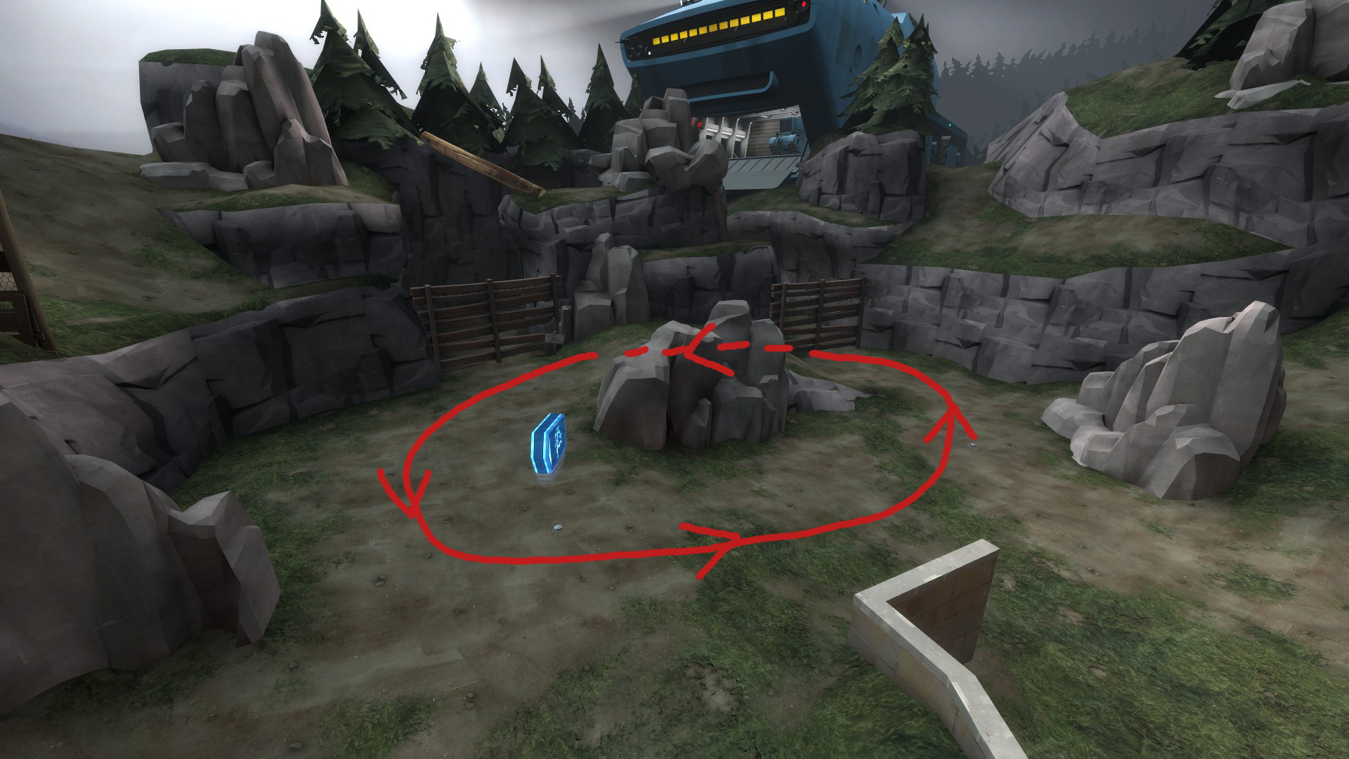
The start of Mannworks is very open, which is great for support classes. On the other hand, this means bots aren't really funneled down any one path immediately, and classes that rely on splash damage or penetrating multiple targets have a harder time taking down multiple bots.
Now, let's talk about how the maps are built.
MVM maps are boxes.
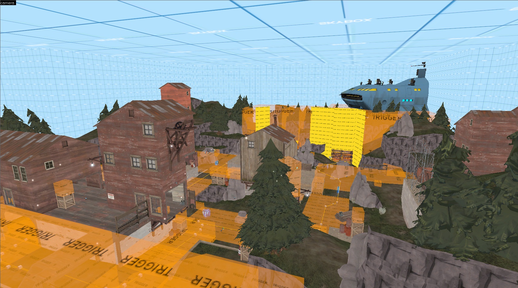
They pretty much all look like this
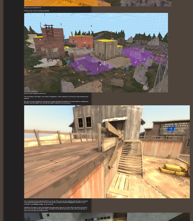
The scary thing is, they are also barely optimized.
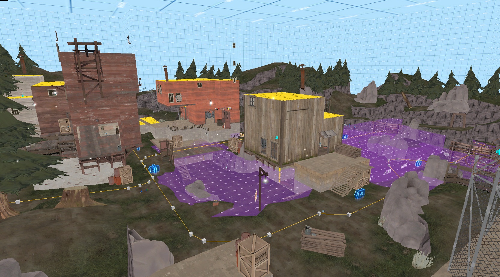
One HINT brush, areaportals, and that's all
The thing to keep in mind, though, is that almost all the geometry in them is absolutely vital to cutting visleafs and aiding to cull geometry.
But that isn't to say that does a lot. The maps are still poorly optimized. Valve handles this in kind of an odd way: underdetailing. Remember those 3D skyboxes? That kind of aesthetic applies to basically everything, actually.
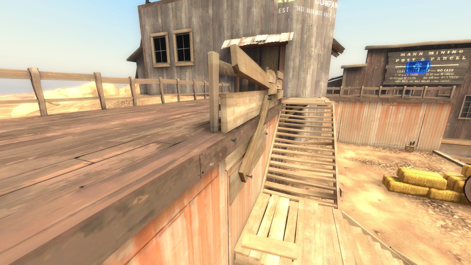
This is an example of the most detailed something will ever get. There's just too many projectiles and moving bots on screen for things to get more complex than this. You won't really see the rich scenes of Mountain Lab depicted in Mannworks, or the intricate trim from Badlands on Decoy. It's just not there.
Look back at the images I've shown you--the detail level seen on other maps just isn't there. There's not even any sign of life in other areas of the map: no side rooms for detail, no evidence of life outside the map, nothing. In fact, there's only one spot I've seen on any of the maps that use detail sprites.
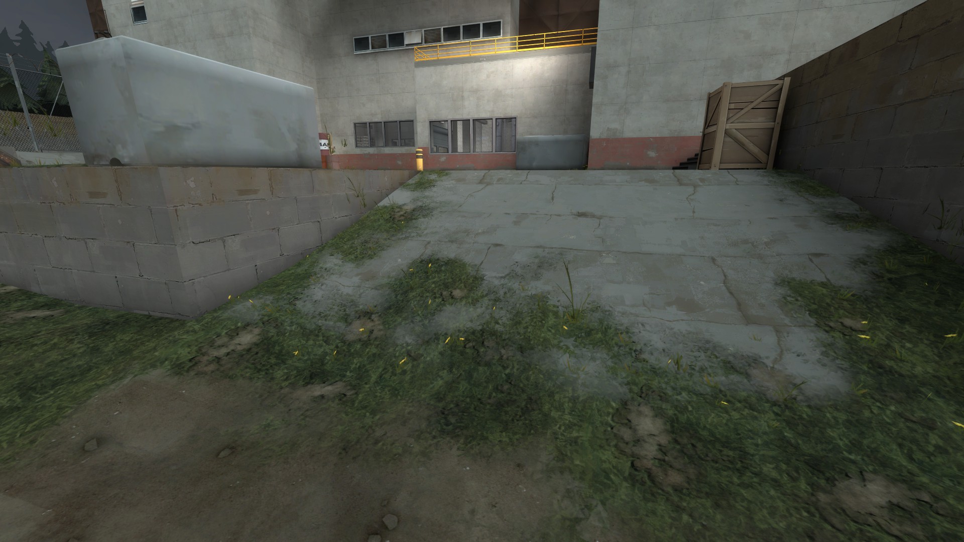
One blend texture, barely used
Closing notes
The basic thing to take away from this?
Good luck, and let me know if I should expand on anything!
First let's look at some overviews.

Coaltown

Decoy

Mannworks
There are a few common design concepts in these images. Can you tell what they are? There are also some pretty key differences as well, though.
The main thing these maps have in common is that they are a straight line. They are dead simple. There is nothing to them. They are short and they are basically boxes. The other thing they all have is something I've been thinking of as "the spine": they all have a raised area in the center of the map, drawing players to a high ground that is always useful. The "arms" of the map, the outer high ground, are often less used, if used at all. (The exception to this might be Mannworks, where the spine is cut in half and the arms are more viable hold points.)
Here are some images of how bots move around the map. Notice that they always bend around the spine.


What does this do? It makes each map have the same, basic framework. The geometry changes, but the way you play the maps does not. This means the player is comfortable defending against the robots immediately, because of the similarity and simplicity of each MVM map. Though Mannworks has a broken spine, and Decoy has a short one, they all deliver the same experience: get on the high ground in the middle for the best way to kill robots below you, no matter what path they take.
All 3 maps also include some way to push bots back or delay them. On Coaltown, there are 2 deathpits. On Mannworks there is a shallow trench, and on Decoy, a large trench. The spine and the ability to push bots back are things that I see as features your map has to have--it doesn't matter how else you do it, but these are core.
The other thing the maps all share in common? This last thing you can't really tell from above. It's a total lack of detail, even in the 3D skybox.


Check out these sweet 3D skyboxes!
Now I want to talk about each map in specific detail.
We'll start with Decoy because I think it's the simplest.
Like I said, it has a short spine. But it's powerful.

The large pickups really help sell this spot despite the lack of viable cover and size
This building, with the large health and large ammo, can have a sentry on top that sees almost the entire map. The way Decoy is laid out, bots basically funnel through a straight corridor before being split by the spine, then they cross a bridge. A well placed (or quickly moved) sentry can see almost the whole map with the Wrangler. But that range comes with a price: exposure.
Many engineers opt to build to the side, instead. Decoy also features largely exposed side routes.


Crafty engineers may build in these areas, or on the platform just to the right of the second image which I forgot to take a screenshot of. This gives them increased safety, but they have to prepare for the waves coming better. They may also find themselves moving around a lot on higher difficulties.
Decoy also employs a large trench right before the bomb hole to help deter bots and funnel them into a tight space.

Decoy is the shortest map, so it's important to have something like this to delay bots and also waste their time. It takes a long time to get back up to ground level. Even players are likely to get frustrated should they fall down, and they can jump, unlike the bots.
The outer routes the robots rarely take are also important, though. As near as I can tell--and I may be wrong here, please correct me if so--failing a wave will increase the chance that bots take the outside paths to the bomb hole. This does two things: Puts them against a wall, so it's easier for them to absorb splash damage, and makes the focus shift to 1/4 of the map, rather than the entire center.
One thing I think is really important is the start of Decoy.

I really do not like the start of Decoy when I am playing Scout, Pyro, or Spy. In MVM, all three of those classes need a lot of breathing room, especially when all the bots are clumped in the starting area. The way this area is set up, there's only a small closet and an irritating jump route to hide in/escape with. It's pretty unideal compared to Mannworks and even Coaltown, which I'll cover later.
I'll also note that Decoy, as with the other maps, has two spawn doors facing each other. Why? I don't know! Probably so that Valve could heavily detail a couple areas as normal without impacting FPS? Because it's neat? Because symmetry is nice? I'm not sure!
Snipers are always hinted to open, easily seen spots. They don't get hinted to windows.


Multiple hint nodes in a single area will make a Sniper have a chance to move between shots or take a new position after being attacked
Keep your snipers in open locations. Coaltown also does this, as does Mannworks.
Now let's move on to Coaltown.

Coaltown's spine is pretty significant and covers a lot of the map. It is a longer map though. One thing that should be taken note of is that the pickups are more spread apart here, though not very significantly. But it does mean that an engineer needs to take 1 or 2 seconds longer to refill his health and ammo, and those are 1 or 2 seconds that will lose you the game.


Coaltown is the only map to feature death pits. Both pits are relatively small and can be hard to use. Contrary to what some people think, killing bots with them gives you their money without you having to collect it--you don't lose the money.
Coaltown puts extra emphasis on the upper ground beside the main routes.

The side routes are more likely to see use, as they are lower (less time spent climbing stairs) and have pickups very near to the main routes. The side areas near where the bots drop down are similarly more useful than Decoy's, as you aren't completely cut off from your team (visually) if you make use of them.
Coaltown is also a great example of using func_nav_avoid to stop bots from going to certain areas.


Bots really don't want to travel these areas
It's important that in addition to editing the nav mesh for your bots, you tell them places they don't want to go. This will go a long way toward focusing combat and increasing the "tower defense" feeling on your map.
Coaltown's bomb hole is interesting, because it dips into a lower area for both bots and players, similar to CP2 on Gorge.

Decoy has the spawn slightly above the bomb hole, Mannworks has it on the same level, and Coaltown puts it down deep
This makes building near the spawn more attractive, as it's easier to watch bots come at you, and then they're below you, so they are easy to spam. The final area on Coaltown is probably the most interesting for this reason; doing the most damage means getting down in the pit with the bots and giving them the height advantage, which is dangerous.
Now, let's return to the start of the map.

Coaltown improves on Decoy here. There's more space between the buildings, and in addition, there is some actual useful cover to get behind. Support classes are far, far more useful at the start of waves because of this. When areas of a map aren't a death funnel, players are happy.
Last but not least, let's go over Mannworks.
Mannworks is the most complex MVM map because it has two spines.


The two spines here basically mean the bots weave around one more time, giving them more places to be missed by players and meaning engineers need to cover more ground. Most of the middle ground is a shallow trench, by far the most useless of the setback areas on each of the maps.
The forward spine is a great hold because it contains a lot of health and a large ammo, but retrieving the pickups means breaking line of sight to your buildings and the enemies, making them slightly less tantalizing. The second spine is all but useless; engineers are better off building on one of the side routes near the bomb hole because of the proximity to pickups and because if you do build on it, you're turning your back on enemies pushing in. But if you can handle that, it becomes a very powerful spot, as it's the closest high ground to the bomb hole.
The side routes on Mannworks are largely useless--the ones in front, adjacent to the first spine, are decent for engineer camps, but as anything else they don't deliver.

The start of Mannworks is very open, which is great for support classes. On the other hand, this means bots aren't really funneled down any one path immediately, and classes that rely on splash damage or penetrating multiple targets have a harder time taking down multiple bots.
Now, let's talk about how the maps are built.
MVM maps are boxes.

They pretty much all look like this
The scary thing is, they are also barely optimized.

One HINT brush, areaportals, and that's all
The thing to keep in mind, though, is that almost all the geometry in them is absolutely vital to cutting visleafs and aiding to cull geometry.
But that isn't to say that does a lot. The maps are still poorly optimized. Valve handles this in kind of an odd way: underdetailing. Remember those 3D skyboxes? That kind of aesthetic applies to basically everything, actually.

This is an example of the most detailed something will ever get. There's just too many projectiles and moving bots on screen for things to get more complex than this. You won't really see the rich scenes of Mountain Lab depicted in Mannworks, or the intricate trim from Badlands on Decoy. It's just not there.
Look back at the images I've shown you--the detail level seen on other maps just isn't there. There's not even any sign of life in other areas of the map: no side rooms for detail, no evidence of life outside the map, nothing. In fact, there's only one spot I've seen on any of the maps that use detail sprites.

One blend texture, barely used
Closing notes
The basic thing to take away from this?
- MVM maps are simple
- They have a raised center area and raised edges, and bots always take the low ground
- There is always a way to reset or delay the bomb
- Pickups are often large
- The maps are barely detailed to preserve framerate
- The maps are short
Good luck, and let me know if I should expand on anything!
Last edited:


