WiP in WiP, post your screenshots!
- Thread starter Arhurt
- Start date
You are using an out of date browser. It may not display this or other websites correctly.
You should upgrade or use an alternative browser.
You should upgrade or use an alternative browser.
- Mar 20, 2012
- 391
- 806
While I'm a big fan of the play geometry in that area, the actual lighthouse looks very unstable structurally. You've got the interior spiral staircase of a lighthouse, the observation room at the top (with the heavy search-beam light) and the exterior shelling, all basically supported by two thin, windowed-walls around the cap-point.
It just looks very strange to me. I'm not quite sure how you could get more aesthetic support there without screwing with the gameplay of that area, though.
It just looks very strange to me. I'm not quite sure how you could get more aesthetic support there without screwing with the gameplay of that area, though.
Beetle
L9: Fashionable Member
- Aug 17, 2008
- 627
- 178
While I'm a big fan of the play geometry in that area, the actual lighthouse looks very unstable structurally. You've got the interior spiral staircase of a lighthouse, the observation room at the top (with the heavy search-beam light) and the exterior shelling, all basically supported by two thin, windowed-walls around the cap-point.
It just looks very strange to me. I'm not quite sure how you could get more aesthetic support there without screwing with the gameplay of that area, though.
I was thinking the same thing. Looks nice though.
While I'm a big fan of the play geometry in that area, the actual lighthouse looks very unstable structurally. You've got the interior spiral staircase of a lighthouse, the observation room at the top (with the heavy search-beam light) and the exterior shelling, all basically supported by two thin, windowed-walls around the cap-point.
It just looks very strange to me. I'm not quite sure how you could get more aesthetic support there without screwing with the gameplay of that area, though.
yeah that's the general feedback i've got so far from everyone
"it'll probably play well but i have no idea how to fix that"
i may or may not turn it into something different because as it is now i don't want to close up the doors or remove the windows, the openness of both contribute to the general look of structural instability
idk what i'm gunna do about it but as it is right now i'm not even sure if i'm gunna keep that layout, i have to have it tested first before i can make any permanent decisions
its not badlands, eh?
we'll see about that
Take your pick:
"It's not badlands"
"It's just badlands"
its not badlands, eh?
we'll see about that
this could be a line in the competitive mapper version of the expendables
Are you badlands, or what?
You ain't badlands, you ain't nothin'!
If you get caught being badlands, you'll be in deep 2fort bro.
T
The Asylum
nightwatch
aa
- Sep 7, 2012
- 638
- 501
takabuschik
aa
- Apr 14, 2013
- 662
- 344
This is art.
Me too!!
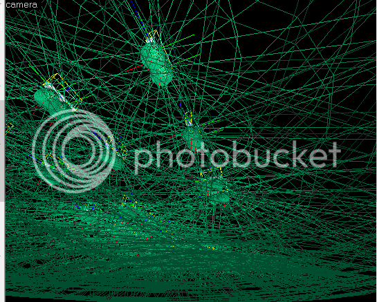
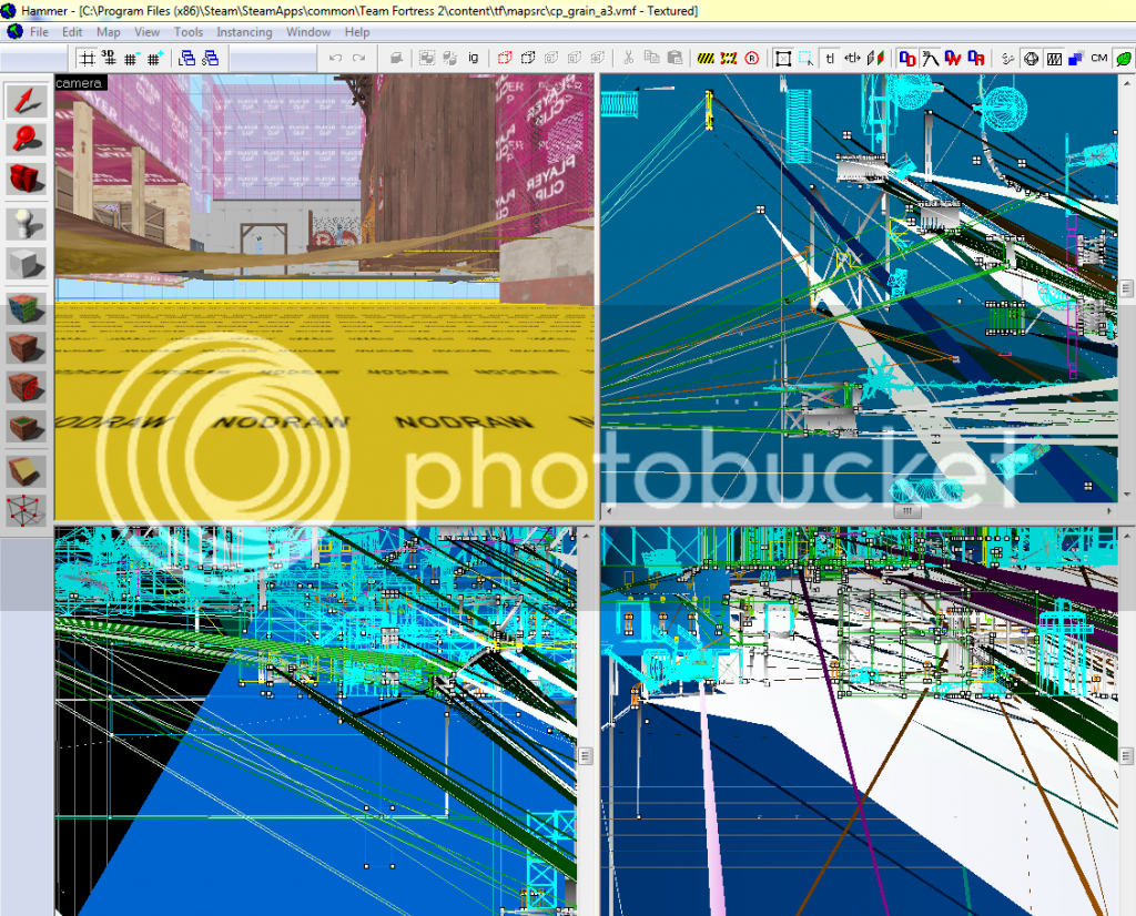
(I don't know what I've done wrong in the second pic, but it is bad)


