WiP in WiP, post your screenshots!

English Mobster

L6: Sharp Member
Jul 10, 2011
355
299
I've moved the gift tag over to be tucked in between the bomb and the cart itself and added the smoothing groups into the string, smokestack, and pressure canister.

Sel, what do you mean? All the colors have been pulled from the TF2 color palette, for the wrapping paper (although the stripes were actually pulled from a TF2 texture), string, text, and gift tag. Besides, gift tags typically tend to be about the same sort of color as the ones I used.

...That, and I seem to have lost my .psd source file. D:
 
Last edited:

Sel

Banned
Feb 18, 2009
1,239
2,570
It's not a matter of them not being on the colour palette it's a matter of the beige not fitting at all with the red/blues of the bomb wrapping.
 

re1wind

aa
Aug 12, 2009
644
588
it's changed a bit...only a little bit.

4D6962F3E829771BC7B5AF36EC06B1D29B9A09A7
 

Seba

DR. BIG FUCKER, PHD
aa
Jun 9, 2009
2,364
2,728
@kart: please don't use TF2 fonts in TF2. It doesn't work.
 

English Mobster

L6: Sharp Member
Jul 10, 2011
355
299
http://freeseo.xomba.com/files/images/normal_christmas_TAGS_FULL_PAGE.preview.png

try one of those, they're stick-on tags, basically stickers you draw on.

EDIT: to get more images of them for ideas, just google "christmas tags"
That leaves me with the same problem. The majority of the tag will still be that beige color, and that's bad. I think.

As of now, I've changed the font (I knew someone was going to catch me using the TF2 Professor font, I was just wondering if anyone was going to say anything about it) and added some team colored trim to the edges of the tag.

Although it's going to be used in a Christmas-themed map, I don't want it to look terribly festive, so I don't want to add a Christmas tree or anything on there. I'm trying to keep it holiday-ambiguous so it could be used for anything without being restricted to Christmas maps.

If it was a Christmas cart, I would have added lightbulbs all around the smokestack. :p

E:
A0F200F5BCFCED7E56870CC1FE9124CDD7650F64

01AF550E704732DB558774E4F6AB69E119330A14
 
Last edited:
Jan 8, 2011
397
393
I think it's perfect now, Mobster. The tag isn't obnoxious or in the way, but it gets the point across.
 

Sel

Banned
Feb 18, 2009
1,239
2,570
but it gets the point across.

uhm

what point?

I'm pretty sure the fact that at this point every player knows that the cart of their team colour is theirs. I still think the tag looks bad and should just be removed, but it is less bad than before now.
 

Sel

Banned
Feb 18, 2009
1,239
2,570
Why is your ground a team colour?

All that's going to do is confuse players as to which team owns the side of the map they're on, detracting from gameplay and adding nothing to aesthetics (It looks awful and clashes with the green of the cacti)

Also you have a thread for your map is it necessary to post the same images in two threads?
 
Last edited:

Sel

Banned
Feb 18, 2009
1,239
2,570
Go look up colour theory

Not even worth responding to =S

So i'm not allowed to post screenshots in the wip thread? :<

*sadface*

No, I'm saying it's redundant to post these things twice, once in a thread dedicated to your map, and then again in a thread that's dedicated to work that's too incomplete to warrant it's own thread.

OK, I know this kind of topics are annoying to some, but I kinda felt we needed one.

If you aren't ready to start a new topic yet, this is the place for you!

Any pictures are valid here, this is the WiP in WiP thread so we stop cluttering the forum with unfinished works
 

Penguin

Clinically Diagnosed with Small Mapper's Syndrome
aa
May 21, 2009
2,039
1,484
That pink is really, really hideous.
 

Ravidge

Grand Vizier
aa
May 14, 2008
1,544
2,818
On the topic of what goes in this WIP thread and what doesn't, sel is more right than rewind, but to be fair, any kind of distinction was forgotten long ago and now this thread is more or less a imagedump, hence why I don't bother looking at it most of the time.
 
Jan 8, 2011
397
393
I wonder if most of TF2 maps is just having a group period right now. So much yelling.

On the plus side, I'm finally realizing that I have a plan for this map and it might go somewhere.
 

English Mobster

L6: Sharp Member
Jul 10, 2011
355
299
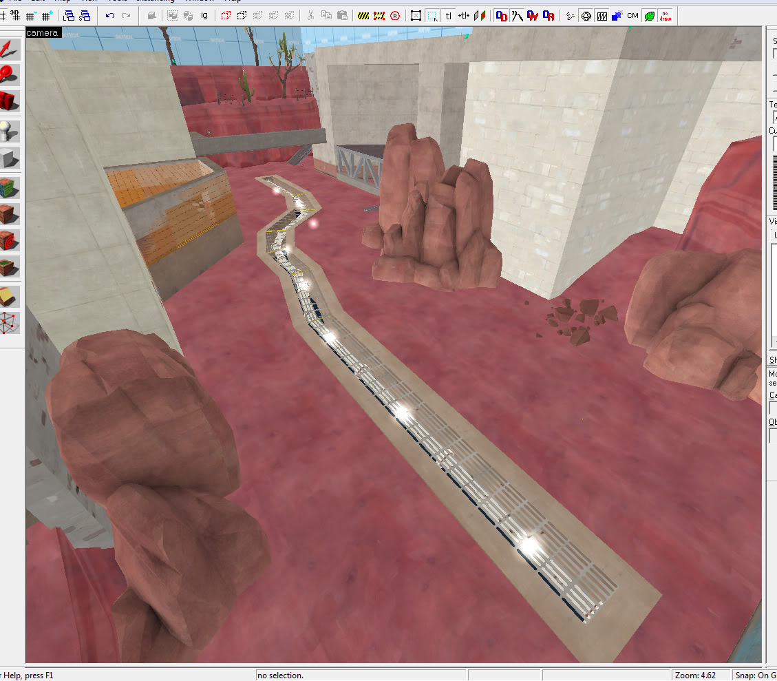
I agree wholeheartedly with the team-colored ground bit he said. It's WAY too red, and, outside of a base, will confuse players as to which part of the map they're on. The top half of the screenshot has that red ground clashing with the blu-colored concrete, and that's a SERIOUS no-no.

You have to approach TF2 like the playerbase is about 4 years old. Signs everywhere, objectives highlighted with that rim lighting, and team colors ONLY in areas that are under that team's control at the beginning of the map. Not that funky velvet cake stuff you got going on there.

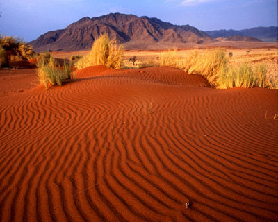
Speaking of which, that texture needs some work. It's not orange enough; nowhere do you see terrain that's that exact color. I don't know what you were going for, I'm assuming something like this:
The+Red+Sand+of+Sossusvlei.jpg

Take a look at that, then at your texture. A hue-shift of what looks to be the stock dirt texture isn't going to be enough. Even if you don't have any texture painting skills, take out your eyedropper tool and look at what color that dirt is compared to what you have in your texture. Your texture is WAAAY too red. It needs some orange in it somewhere.

E: Also, I've found this thread works best for immediate feedback on stuff. I've had several times as much feedback from images posted in this thread than images posted in my map threads. People look at this thread often, it's typically the thread that's been posted in most recently. To put it bluntly, people don't care about map threads until it's in beta, and even then they only care after they've playtested it a number of times (Gothic, Zinkenite, etc.).
 
Last edited: