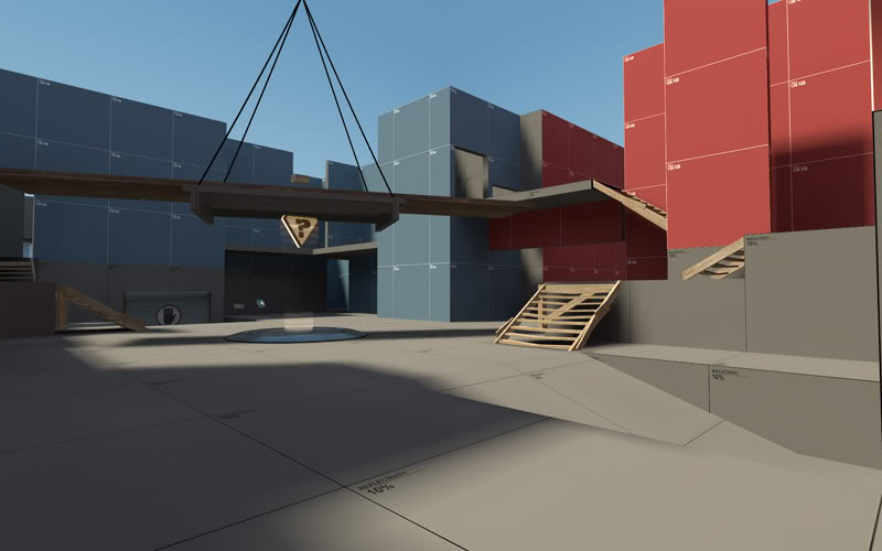
Koth_Vanguard

CP Vanguard rc2

  • This map is featured! Our best maps, all together in one place for your viewing pleasure.

fubarFX

The "raw" in "nodraw"
aa
Jun 1, 2009
1,721
1,985
cp_vanguard_rc3 | Download | the still in developement cp version
koth_vanguard_rc1 | Download | the NEW! koth version
koth_vanguard_event_HHH | Download | the halloween variant of koth_vanguard

special thanks to everyone from the construction pack/swamp pack and rexy for additionnal models
 
Last edited:

Ninjilla

L420: High Member
Sep 13, 2008
445
116
From what I can see, that mid point looks really nice, I think a heavy wouuld make quick work of it with it being so small. A lot of flanking paths?
 

Penguin

Clinically Diagnosed with Small Mapper's Syndrome
aa
May 21, 2009
2,039
1,484
Did you color correct this?
 

Mr. P. Kiwi

L5: Dapper Member
Nov 22, 2009
244
95
The middle looks really flat to me... Better change that, exept for that it looks really nice!
 

fubarFX

The "raw" in "nodraw"
aa
Jun 1, 2009
1,721
1,985
The middle looks really flat to me... Better change that, exept for that it looks really nice!

yes I'm trying to think of a structure I could put in the middle but I want to stay away from the habitual shack (suggestions appreciated).
 
Mar 23, 2010
1,874
1,699
looks like you went a lil overboard with sawmill props. mid looks a little cramped with height advantage surrounding it.

I'd have to play it to really criticize it though.
 

Ninjilla

L420: High Member
Sep 13, 2008
445
116
I think mid doesnt look too flat, the height variations around it seem good enough, more would be overkill, save maybe a 16 unit pedestal or something.
 

Fireman

L4: Comfortable Member
Mar 21, 2008
150
59
Perhaps consider lowering the amount of health in mid. Every time I'd get damaged from frolicking around your spawn, I'd just return to mid, do a circuit of the small health packs, and go back to my business. The defending team doesn't really need that much help camping the point.
 

fubarFX

The "raw" in "nodraw"
aa
Jun 1, 2009
1,721
1,985
I'm happy someone good took the name :)
lol I think you got me confused with someone else.
w/e, I'll try to do justice to the name ;)

anyways, here's what I've planned after the playtest today.
-shrink the 2nd capture point a little
-redesign everything from the final capture point to the area inbetween final and second cp.
-the mid seems to be okay so no big change there for now.

also, here's a quick capture of the mid for ya'll

mid.jpg
 
Last edited:
Mar 23, 2010
1,874
1,699
was a lot of fun

you should try that dual-layered cap thing on the bridge above the cap
 
Last edited:

gr8stalin

L1: Registered
Feb 27, 2011
9
6
We played Vanguard today in the New Map Weekend PUG group, it was pretty good in terms of layout, and we loved playing it. We ran into a few issues, though, and a number of players had suggestions/complaints.

1. Clipping on prop stairs needs to be added/fixed (bullet block too)

2. Mid is really narrow but really long. This might have been ok if we had more flank routes
(Mike d:] RIP Tim εїз: I'm gonna call this map koth_noflanks), but it was literally a straight walk into enemy fire. Mumble consensus was either that the mid should be wider or there should be some more/better flank routes.

3. Bigger capzone is needed, as players are spammed off the point really easily. Put capture area on wooden board above point as well?

4. EXTREMELY heavy friendly and not as sniper friendly as we first thought, we're working on a solution for this.

5. Medium health/ammo area is a gigantic death trap since there's really nowhere else safe to hold that's got a medkit/ammo pack. My idea was that you could leave a small pill where the current medium health and ammo packs are now and move them up here

6. One thing that was sort of annoying for our respective demomen was this area here on the right outside of the spawn, as they couldn't jump over it.

7. At mid, in the little cubbies with the small health and ammo, there's a tiny pile of cinderblocks which impedes backpedaling, and just makes that area a deathtrap.

We hope to see your continued work on Vanguard, Fubar, it's looking really good!