- Feb 26, 2008
- 1,626
- 1,325
So you've got a layout you want to make, but you don't really feel like fleshing it out; you want to "focus on the gameplay." You are falling into THE ORANGE TRAP. Believe it or not, you CAN make a map that's focused on your layout WHILE still retaining tf2's style. And you can do it easily.
Take a look at Badlands and Fastlane. Both look undeniably TF2, if a bit boring visually. But their construction is actually relatively simple.
This tutorial will show you how to style a map like badlands in one day from start to finish. It is not going to focus on layout techniques, and it's assuming that you can look up the entity work after your brushwork is finished. This tutorial is not for entity work, nor the skills you need to use the various tools in hammer. It's about efficiency and good planning. If you are unfamiliar with any of the terms or techniques used, please check the VDC or the other tutorials in this section. I suggest you know the following: Brush Creation and manipulation, the face editor, the Cut tool, how to Subdivide, paint & sew displacements correctly, placing Props. You also need to have gameplay and the associated entities in mind, but this is very well documented elsewhere.
Step 1 is to compose your layout. I did this in paint because god is it easy to use. However, since you are looking straight down at your map, you also have to visualize the heights of each of your areas.
We're going to separate our layouts into a general layout scheme:
Layer 1: The bottom of the map. 16 units tall.
Layer 1a: Displacementlevel. This is just a copy of the bottom, moved an arbitrary amount of units upwards. More if you're going to displace downwards or have water in your map, less if not.
Layer 2: Building bases. These are 256 units tall.
Layer 3: Building trim. A small layer, 16 units tall, resting on top of the building bases.
Layer 4: Building walls. A 240 unit layer.
Layer 5: Building ceiling. A 48 unit tall layer.
Layer 6: Extra space/building roofs. Arbitrary but let's say 256 units.
Layer 7: Skybox. 16 units.
So generally, all your main action will occur on Layer 2, with players running around on layer 1a. 2nd story action will take place in Layer 3-4, with players atop layer 2. The rest of the layers are for details.
Layout
So, decide what places on your layout will correspond to what layers, and color code them to help yourself. I personally drew the layers next to my layout to help me visualize it. Total up how many units your layers will take.

Now we go into hammer.
Create one large block 16 units tall to be your base layer. Make it as wide and as long as your entire level will be. Then copy it and move the copy however many total units your layers will take above the ground. Then create 4 walls around both brushes, making sure to seal the resulting box. Create a new visgroup and assign them all to it, label it SkyGround or something.
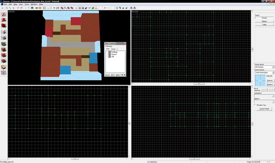
Duplicate the ground once more and then hide the visgroup. On this new duplicate ground, start cutting out the layout you created as seen from above. Use dev textures to color code it as your layout was.


Create visgroups for each color-coded segment. For example, I made "buildings" and "cliffs" (cliffs would be the "empty" parts of your layout; the ones that block it in to become a rectangle.)
Hide everything but your buildings. Drag them up to be the height of Layer 2+3+4+5= 560 units. Make cuts between each layer.

Now select Layer 2 of all of Blue's buildings. Texture them a concrete texture. Do the same for red with a wooden strut texture. Select Layer 3 of every building and texture a lightly colored wood. Select layers 4 and 5 for Blue's buildings and texture them a grey metal, one which has a grunge effect to wards its bottom. Align to bottom. Do the same for Red's buildings but with a vertical-oriented wood texture. Now, select 3+4+5 for each building individually and drag them out to be 16 units wider than layer 2 in every direction.

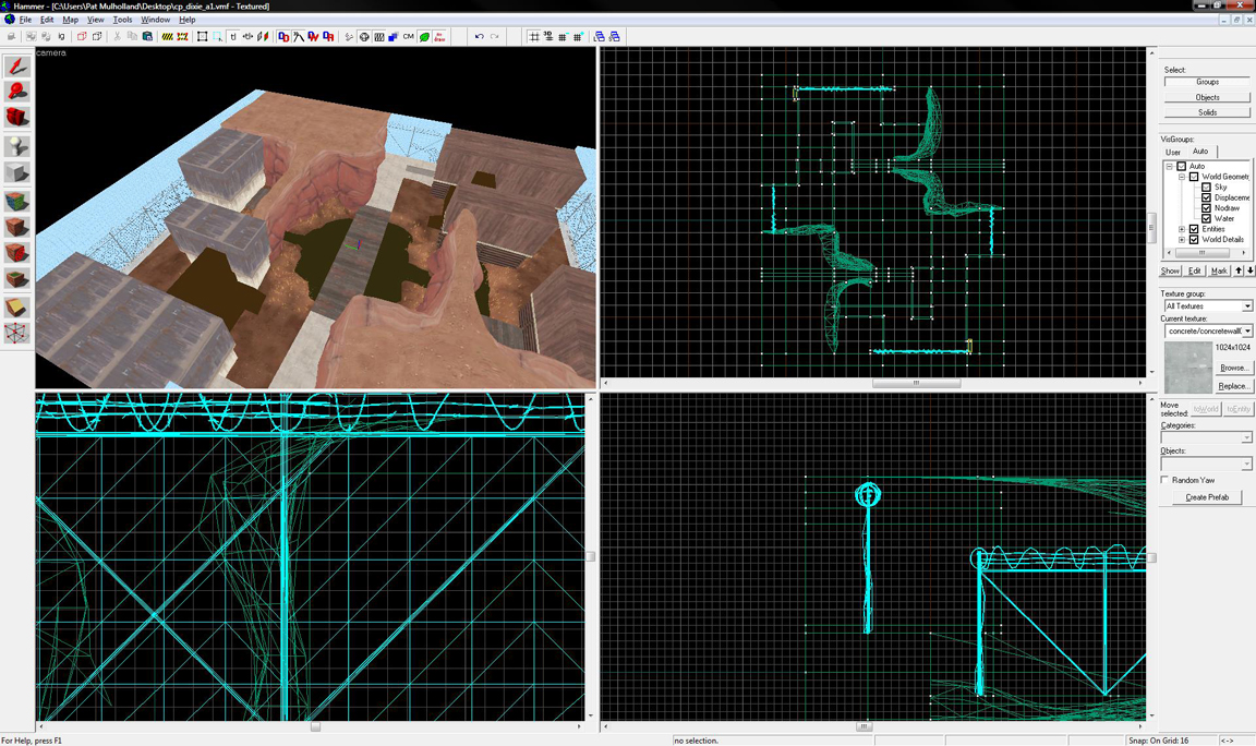
Enable everything in your visgroups, and drag your Cliff segments, cut out from the original brush, upwards to the level of the skybox (or at least that of your buildings). My cliffs are seen in the next screenshot as the large red brushes.
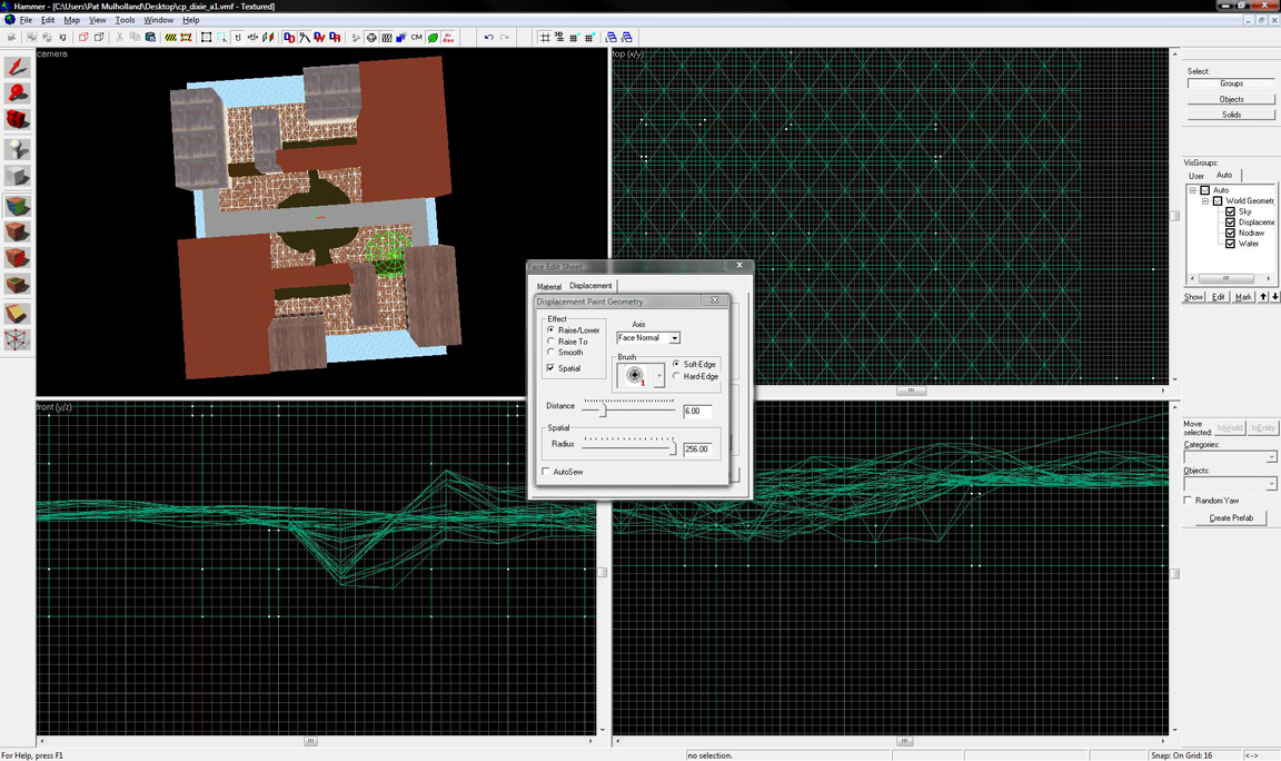
Now, copy Layer 1 again, move it X units above the original layer 1, where X is however many units you want your dirt to default to. Select its top face, texture to a nature dirt texture at scale .5, and turn it into a displacement of power 4. Choose Paint Geometry, set your brush to radius 256 and power 10, and start adding subtle variations to your ground. If you selected a blend texture (any ground material with BLEND in its name), then select Paint Alpha, set its power to 256, and start coloring around the edges of your buildings, etc.


Now, select all your cliffs and paint them nodraw. Select all of your cliffs and copy to the clipboard. Then shrink each cliff brush by 16 units on every face not touching another cliff.
Now, right click on a 2d view and press Paste Special. Press okay without changing any settings (it should be paste on center of original, no offsets, 1 copy). Texture these selected brushes to a cliff texture. Then select their top faces and pick a matching dirt texture. Make sure you scale them to .50 or they'll look repetitive.
Now, look at a subdivide tutorial and learn how to cut brushes so that they'll subdivide properly. Select all of the visible vertical faces of one contiguous cliff (visible ingame to players, that is) as well as their corresponding top faces. Subdivide the entire cliff, and then use a geometry paint brush of about 128 radius to make them look more natural; be sure to paint in both X and Y directions, as well as face normal/z. Do this for each section of cliff.


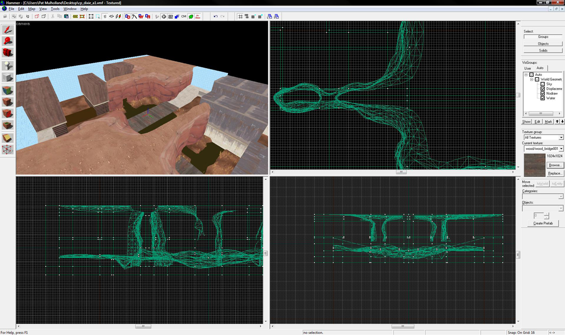
Add ramps/bridges wherever you need them. Ramps that extend to the ground are concrete, ramps that have little thickness are wooden or metal. Where your layout hits the skybox walls of your map, add a 32 unit-high concrete trim and the props_gameplay fences to block off that area.


Select the layer 4s of whatever buildings you need hollowed out. Cut them down to 16 units thick on their walls, with doors being 136 tall by 144 wide. Fill them in with lightly-colored doorways, each side being 8 units thick, to make them the doorway a total of 128 x 128. Inside your building, add a layer of 16 unit thick wood trim around the ceiling. Copy the smaller side's trim over several times to make rafters across the ceiling. Windows should be 96 units wide and 128 tall. Center them in the sides of buildings as you please. Cover each opening with an areaportal, make sure that, when including these areaportals, each building is self-sealed.

Add rock props into the sides of your cliffs and choose their skin to match the cliffside. Offset their angles to make them look integrated naturally. Disperse small props_foliage props throughout the level, concentrated in corners, bald-looking areas, etc. Try not to have too many in view at any one place.

Add angular roofs to your buildings; texture with spotty red metal for
red and various metals for blue. Make the roofs extend 16 units over layer 5 in each direction. Add supports to any bridges.

Now, go into props_minining. There are several small props, such as windows, vents, wooden overhangs, small lights, etc. Place these onto the most bald-looking faces of your building. Where a prop won't do, go into textures at overlays/. Select a few of the paint-swatch looking overlays, and apply them to the empty faces of your buildings. Brand logos are good too, just no spytech BLU and RED signs unless they're inside of a secret area/building. Add railing props where necessary.

If you did all this work correctly, it may have taken you 2 hours, if you're good. Now just add the gameplay entity system, basic entities (soundscape, light_environment, etc)and some basic lighting! You'd be surprised how simple it is to approximate the style of Badlands in only a very short amount of time. Granted you'll have to spend much more on tightening up the graphics, but hey, you've made a map in a day! I hope this helps you realize how simple it is to achieve a good time spent : effect achieved ratio. The right combination of textures, trim, props and displacements gives you a feel, when put together, that each could not when apart.
Take a look at Badlands and Fastlane. Both look undeniably TF2, if a bit boring visually. But their construction is actually relatively simple.
This tutorial will show you how to style a map like badlands in one day from start to finish. It is not going to focus on layout techniques, and it's assuming that you can look up the entity work after your brushwork is finished. This tutorial is not for entity work, nor the skills you need to use the various tools in hammer. It's about efficiency and good planning. If you are unfamiliar with any of the terms or techniques used, please check the VDC or the other tutorials in this section. I suggest you know the following: Brush Creation and manipulation, the face editor, the Cut tool, how to Subdivide, paint & sew displacements correctly, placing Props. You also need to have gameplay and the associated entities in mind, but this is very well documented elsewhere.
Step 1 is to compose your layout. I did this in paint because god is it easy to use. However, since you are looking straight down at your map, you also have to visualize the heights of each of your areas.
We're going to separate our layouts into a general layout scheme:
Layer 1: The bottom of the map. 16 units tall.
Layer 1a: Displacementlevel. This is just a copy of the bottom, moved an arbitrary amount of units upwards. More if you're going to displace downwards or have water in your map, less if not.
Layer 2: Building bases. These are 256 units tall.
Layer 3: Building trim. A small layer, 16 units tall, resting on top of the building bases.
Layer 4: Building walls. A 240 unit layer.
Layer 5: Building ceiling. A 48 unit tall layer.
Layer 6: Extra space/building roofs. Arbitrary but let's say 256 units.
Layer 7: Skybox. 16 units.
So generally, all your main action will occur on Layer 2, with players running around on layer 1a. 2nd story action will take place in Layer 3-4, with players atop layer 2. The rest of the layers are for details.
Layout
So, decide what places on your layout will correspond to what layers, and color code them to help yourself. I personally drew the layers next to my layout to help me visualize it. Total up how many units your layers will take.

Now we go into hammer.
Create one large block 16 units tall to be your base layer. Make it as wide and as long as your entire level will be. Then copy it and move the copy however many total units your layers will take above the ground. Then create 4 walls around both brushes, making sure to seal the resulting box. Create a new visgroup and assign them all to it, label it SkyGround or something.
Duplicate the ground once more and then hide the visgroup. On this new duplicate ground, start cutting out the layout you created as seen from above. Use dev textures to color code it as your layout was.

Create visgroups for each color-coded segment. For example, I made "buildings" and "cliffs" (cliffs would be the "empty" parts of your layout; the ones that block it in to become a rectangle.)
Hide everything but your buildings. Drag them up to be the height of Layer 2+3+4+5= 560 units. Make cuts between each layer.

Now select Layer 2 of all of Blue's buildings. Texture them a concrete texture. Do the same for red with a wooden strut texture. Select Layer 3 of every building and texture a lightly colored wood. Select layers 4 and 5 for Blue's buildings and texture them a grey metal, one which has a grunge effect to wards its bottom. Align to bottom. Do the same for Red's buildings but with a vertical-oriented wood texture. Now, select 3+4+5 for each building individually and drag them out to be 16 units wider than layer 2 in every direction.

Enable everything in your visgroups, and drag your Cliff segments, cut out from the original brush, upwards to the level of the skybox (or at least that of your buildings). My cliffs are seen in the next screenshot as the large red brushes.
Now, copy Layer 1 again, move it X units above the original layer 1, where X is however many units you want your dirt to default to. Select its top face, texture to a nature dirt texture at scale .5, and turn it into a displacement of power 4. Choose Paint Geometry, set your brush to radius 256 and power 10, and start adding subtle variations to your ground. If you selected a blend texture (any ground material with BLEND in its name), then select Paint Alpha, set its power to 256, and start coloring around the edges of your buildings, etc.

Now, select all your cliffs and paint them nodraw. Select all of your cliffs and copy to the clipboard. Then shrink each cliff brush by 16 units on every face not touching another cliff.
Now, right click on a 2d view and press Paste Special. Press okay without changing any settings (it should be paste on center of original, no offsets, 1 copy). Texture these selected brushes to a cliff texture. Then select their top faces and pick a matching dirt texture. Make sure you scale them to .50 or they'll look repetitive.
Now, look at a subdivide tutorial and learn how to cut brushes so that they'll subdivide properly. Select all of the visible vertical faces of one contiguous cliff (visible ingame to players, that is) as well as their corresponding top faces. Subdivide the entire cliff, and then use a geometry paint brush of about 128 radius to make them look more natural; be sure to paint in both X and Y directions, as well as face normal/z. Do this for each section of cliff.

Add ramps/bridges wherever you need them. Ramps that extend to the ground are concrete, ramps that have little thickness are wooden or metal. Where your layout hits the skybox walls of your map, add a 32 unit-high concrete trim and the props_gameplay fences to block off that area.

Select the layer 4s of whatever buildings you need hollowed out. Cut them down to 16 units thick on their walls, with doors being 136 tall by 144 wide. Fill them in with lightly-colored doorways, each side being 8 units thick, to make them the doorway a total of 128 x 128. Inside your building, add a layer of 16 unit thick wood trim around the ceiling. Copy the smaller side's trim over several times to make rafters across the ceiling. Windows should be 96 units wide and 128 tall. Center them in the sides of buildings as you please. Cover each opening with an areaportal, make sure that, when including these areaportals, each building is self-sealed.

Add rock props into the sides of your cliffs and choose their skin to match the cliffside. Offset their angles to make them look integrated naturally. Disperse small props_foliage props throughout the level, concentrated in corners, bald-looking areas, etc. Try not to have too many in view at any one place.

Add angular roofs to your buildings; texture with spotty red metal for
red and various metals for blue. Make the roofs extend 16 units over layer 5 in each direction. Add supports to any bridges.

Now, go into props_minining. There are several small props, such as windows, vents, wooden overhangs, small lights, etc. Place these onto the most bald-looking faces of your building. Where a prop won't do, go into textures at overlays/. Select a few of the paint-swatch looking overlays, and apply them to the empty faces of your buildings. Brand logos are good too, just no spytech BLU and RED signs unless they're inside of a secret area/building. Add railing props where necessary.

If you did all this work correctly, it may have taken you 2 hours, if you're good. Now just add the gameplay entity system, basic entities (soundscape, light_environment, etc)and some basic lighting! You'd be surprised how simple it is to approximate the style of Badlands in only a very short amount of time. Granted you'll have to spend much more on tightening up the graphics, but hey, you've made a map in a day! I hope this helps you realize how simple it is to achieve a good time spent : effect achieved ratio. The right combination of textures, trim, props and displacements gives you a feel, when put together, that each could not when apart.
Last edited by a moderator:


