Imagine you have a slope in your corridor, with a piece of wall going up, like this:
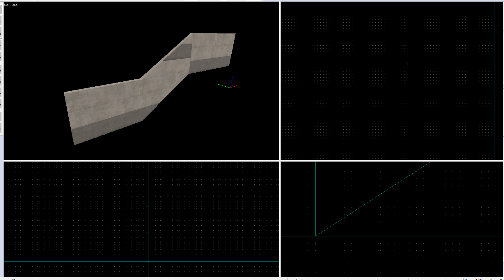
What would you do for it to look prettier? Use a beam? Maybe. Use alt-right click feature to precisely rotate it and position it? Would rather work for beams, doesn't look as cool on the walls.
But wait... there is actually a way to skew our textures! It has an extremely tricky workaround, but here's what we'll end up with today:
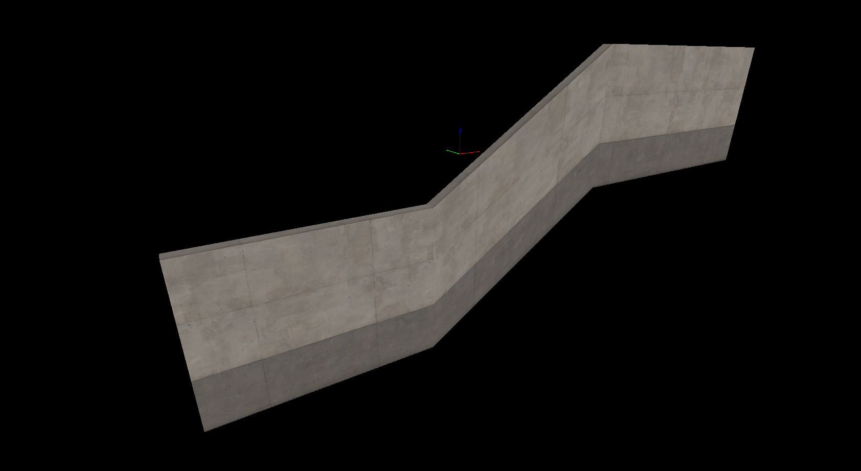
Flawless! Let me teach you how.
We will need Camera tool. It's ignored most of the time, and it's really not much use during usual mapping, but here we're going to take full advantage of its ability to set camera and camera target point on-grid in 2d viewports.
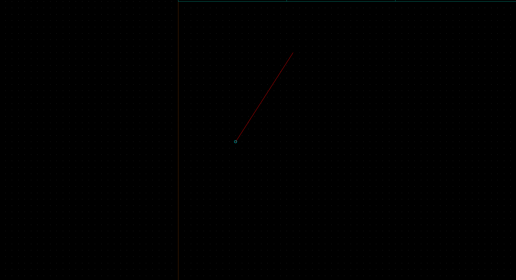
This is how our 3d viewport's camera looks like in 2d viewport. We can drag both the camera itself (the blue circle), and its target point (the exact place that will be in 3d viewport center), keep it all on our current grid and manipulate it in all 3 2d viewports.
Exactly what we need! Now, let's learn to position our camera properly.
We start with the top-down view (assuming our wall is vertical):
The orange brush is our skewed brush we work with;
The green ones are the regular walls we don't really do anything with;
The purple stuff is what I added to picture (line for measurement, a note that slope must be exactly 1:1):
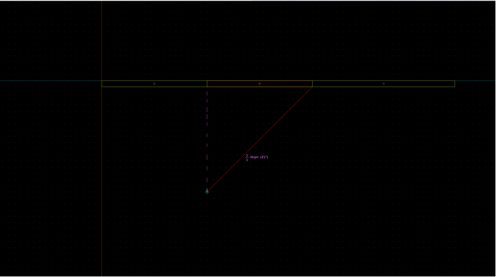
Once we placed our camera this way by dragging the circle on one end of the red line and the other end of it, let's move to the viewport that lets us view our wall from right/left. In my case it's the Side viewport. From now we'll be moving these 2 camera conotrolling points only up and down, or otherwise we can mess up what we set up in the topdown viewport! Check afterwards that everything is right!
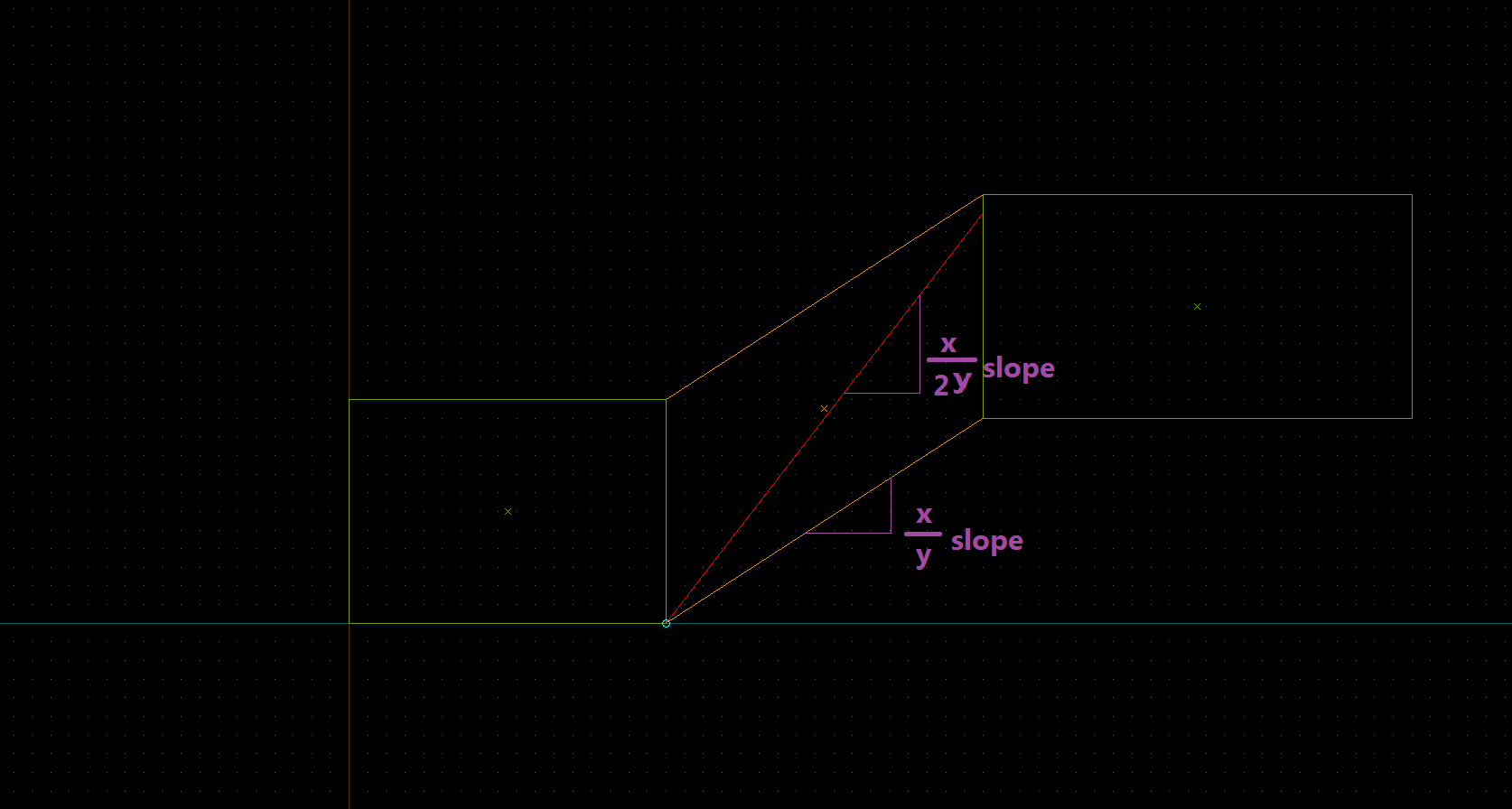
As you notice, the camera needs to be pointing at a steeper angle than our slope for this all to be working. This angle should be twice as steep as our original angle!
Here I'll show you how to calculate our angle with ease.
After we have done it, the helper triangle brush can be deleted.
We set the camera up! We still don't touch its position.
Now where we need to go is the Texture application window, which we can bring up by Shift-A or this button: in the tool window. Well, that's the very basics.
Ever paid attention to this button?
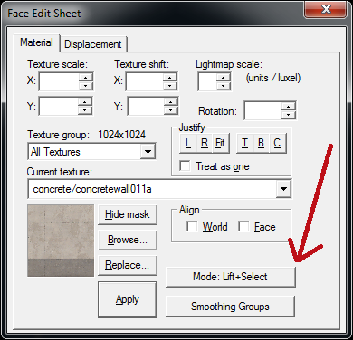
This is the mode selection button. Rarely, if ever, used because the mode by default is what we need almost always. Not now though. Once the button is clicked, a list appears:
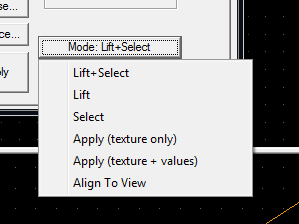
Let me explain what each mode is for.
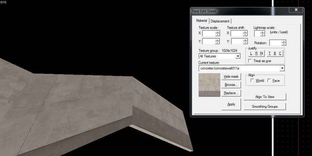
We'll need to find the number to scale the texture so the transition is flawless. Fortunately, Hammer is capable of that, thanks to Fit button. What do we do next:
First we need to know the amount of units it takes to use 100% of our texture's height. For this, take its height in pixels and multiply the texture scale used on the straight, not skewed walls. Texture I am using is 1024x1024, and my scale is 0.25, so it will take 256 units to fully use the texture height. If your non-skewed wall are just as tall as needed, you can skip the next paragraph.
My walls are 192 units tall (the straight ones) so we'll need to temporarily extend the skewed brush to fit it. Your wall might be taller than needed so you'll need to make it lower, it depends on texture and the scale.
First let's make one of straight walls of needed height so we can use it as a reference:
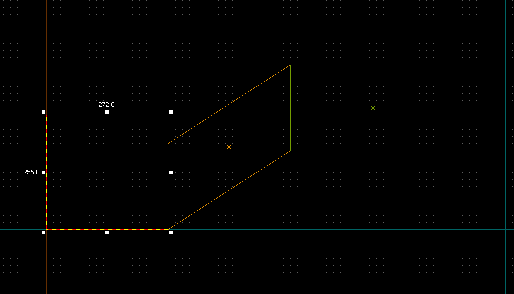
Then use Vertex tool (selection tool will work improperly) ro rise/lower the top edge of the skewed brush:
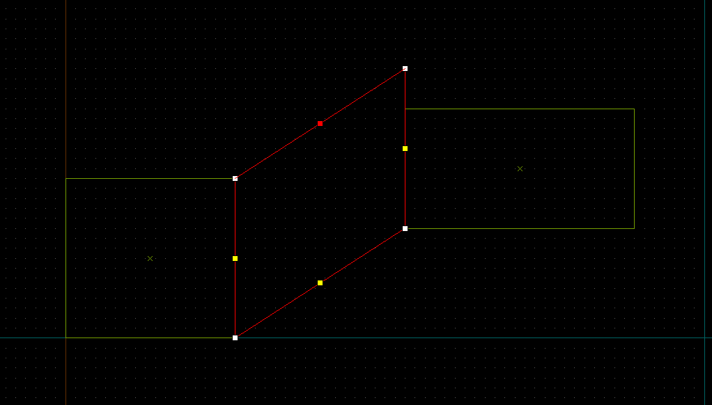
And now that we're sure our wall fits needed height, we can Fit:
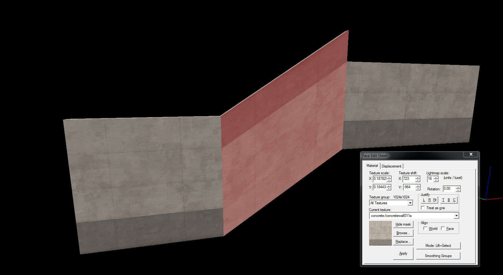
Hammer found us a perfect scale for the wall! Let's return walls back to the height they were. Copy the number from Y field to X field:
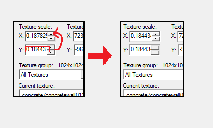
or you can leave 0.25 in X field for better alignment with straight walls.
Now, the texture is upside down. Well it's actually just rotated by 180 degrees, so we can fix it by rotating it by another 180 degrees. Sometimes it may be actually flipped. I'm unsure that may happen, but if it's the case, add a minus (-) before Y value instead of rotating by 180 degrees:
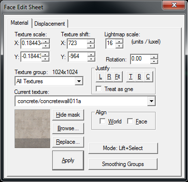
Once we've done either of these operations, hit the button with the B letter on it to justify our texture to bottom (assuming straight ones are aligned to bottom and it's intended to be so. If you align your textures to top, click T.). That's somewhat how it should look after everything:
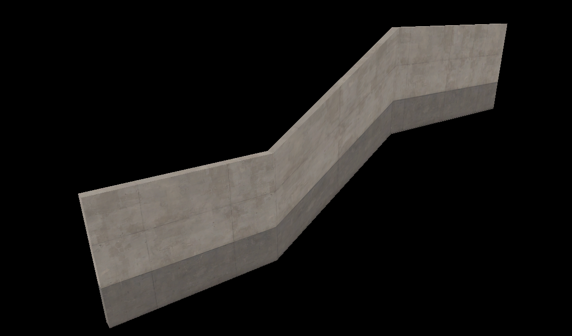
All we need to do now is align them by left-right which can be done by hands or you can use L and R buttons in certain cases.
And we have a skewed wall with perfect transition. Happy mapping everyone!
The guide is based on this one, but with few important additions and in a more popular place I guess.
What would you do for it to look prettier? Use a beam? Maybe. Use alt-right click feature to precisely rotate it and position it? Would rather work for beams, doesn't look as cool on the walls.
But wait... there is actually a way to skew our textures! It has an extremely tricky workaround, but here's what we'll end up with today:
Flawless! Let me teach you how.
We will need Camera tool. It's ignored most of the time, and it's really not much use during usual mapping, but here we're going to take full advantage of its ability to set camera and camera target point on-grid in 2d viewports.
IMPORTANT NOTE: Don't move the camera in the 3d viewports when operating with it! You will mess it up, and need to start over.
IMPORTANT NOTE: This way also skews lightmaps! There shouldn't be major problems with it, but it is true. Lightmaps of skewed and straight walls will probably be misaligned.
This is how our 3d viewport's camera looks like in 2d viewport. We can drag both the camera itself (the blue circle), and its target point (the exact place that will be in 3d viewport center), keep it all on our current grid and manipulate it in all 3 2d viewports.
Exactly what we need! Now, let's learn to position our camera properly.
We start with the top-down view (assuming our wall is vertical):
The orange brush is our skewed brush we work with;
The green ones are the regular walls we don't really do anything with;
The purple stuff is what I added to picture (line for measurement, a note that slope must be exactly 1:1):
Once we placed our camera this way by dragging the circle on one end of the red line and the other end of it, let's move to the viewport that lets us view our wall from right/left. In my case it's the Side viewport. From now we'll be moving these 2 camera conotrolling points only up and down, or otherwise we can mess up what we set up in the topdown viewport! Check afterwards that everything is right!
As you notice, the camera needs to be pointing at a steeper angle than our slope for this all to be working. This angle should be twice as steep as our original angle!
Here I'll show you how to calculate our angle with ease.
- Make a triangle brush, the same slope as ours, like that:
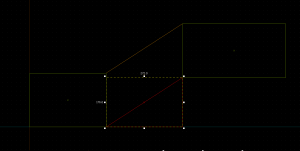
- Resize it so it's exactly twice the height. The marker of the center of the side should be here:
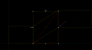
After we have done it, the helper triangle brush can be deleted.
We set the camera up! We still don't touch its position.
Now where we need to go is the Texture application window, which we can bring up by Shift-A or this button:
Ever paid attention to this button?
This is the mode selection button. Rarely, if ever, used because the mode by default is what we need almost always. Not now though. Once the button is clicked, a list appears:
Let me explain what each mode is for.
- Lift - once clicked on a face, its texture is shown in the small window at right.
- Select - once clicked on a face, it is selected.
- Lift + Select - combination of the above. Once clicked on a face, it is selected and its texture is shown. This mode is picked by default and is used the most.
- Apply (texture only) - applies currently highlighted texture to clicked faces (values will be set default)
- Apple (texture + values) - applies currently highlighted texture and selected values to clicked faces
- Align to view - Aligns clicked face's texture to the camera of the viewport it's clicked in. This is what we'll use.
It's skewed perfectly now! We can from now move the camera and edit it so it actually fits. Some work still needs to be done.IMPORTANT NOTE: After skewing, DO NOT forget to switch back to Lift + Select mode, or if you click on the texture, you'll align it to camera again! You can't Ctrl-Z that!
We'll need to find the number to scale the texture so the transition is flawless. Fortunately, Hammer is capable of that, thanks to Fit button. What do we do next:
First we need to know the amount of units it takes to use 100% of our texture's height. For this, take its height in pixels and multiply the texture scale used on the straight, not skewed walls. Texture I am using is 1024x1024, and my scale is 0.25, so it will take 256 units to fully use the texture height. If your non-skewed wall are just as tall as needed, you can skip the next paragraph.
My walls are 192 units tall (the straight ones) so we'll need to temporarily extend the skewed brush to fit it. Your wall might be taller than needed so you'll need to make it lower, it depends on texture and the scale.
First let's make one of straight walls of needed height so we can use it as a reference:
Then use Vertex tool (selection tool will work improperly) ro rise/lower the top edge of the skewed brush:
And now that we're sure our wall fits needed height, we can Fit:
Hammer found us a perfect scale for the wall! Let's return walls back to the height they were. Copy the number from Y field to X field:
or you can leave 0.25 in X field for better alignment with straight walls.
Now, the texture is upside down. Well it's actually just rotated by 180 degrees, so we can fix it by rotating it by another 180 degrees. Sometimes it may be actually flipped. I'm unsure that may happen, but if it's the case, add a minus (-) before Y value instead of rotating by 180 degrees:
Once we've done either of these operations, hit the button with the B letter on it to justify our texture to bottom (assuming straight ones are aligned to bottom and it's intended to be so. If you align your textures to top, click T.). That's somewhat how it should look after everything:
All we need to do now is align them by left-right which can be done by hands or you can use L and R buttons in certain cases.
And we have a skewed wall with perfect transition. Happy mapping everyone!
The guide is based on this one, but with few important additions and in a more popular place I guess.
Last edited:


