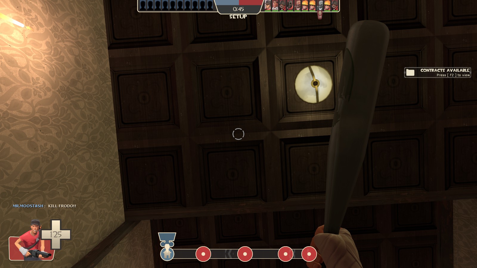
Slime Time

PL Slime Time RC1

MacRipley

L3: Member
Jan 15, 2015
134
274
Bella - A small-sized spooky payload map in progress!

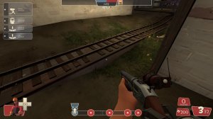
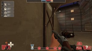
This is a fairly early WIP of pl_bella, for the checklist contest! Map is a small sized 3 point single stage payload map with a spooky aesthetic, and some custom assets. I also named the map after my dog.

Since this is in alpha stage, I'd appreciate some suggestions for routes or layout/element changes to make this a fun map for its size.
 

MegapiemanPHD

Doctorate in Deliciousness
aa
Mar 31, 2012
2,004
1,313
Here's some feedback for ya

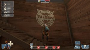
-The map looks pretty good so far but you're detailing is rather basic at this point. There are a lot of big empty walls and areas that could use something to make them interesting.
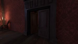
20190124133358_1.jpg
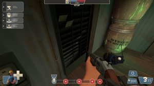
-I can see a wooden brush that clips through the wall in the room behind this door
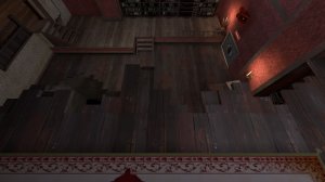
20190124133419_1.jpg
-the texture on the broken wood is misaligned
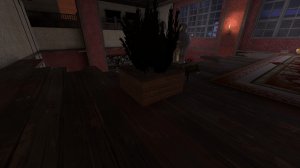
20190124133444_1.jpg
-This brick doesn't look right with the rest of the stuff in this room
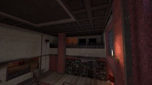
20190124133511_1.jpg
-That upper doorway could use at least a frame or something. It's just kind of a hole in the wall right now
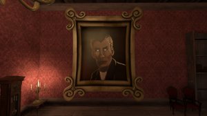
20190124133523_1.jpg
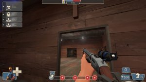
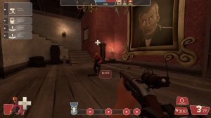
-This portrait is neat but the frame is so thick it just looks off
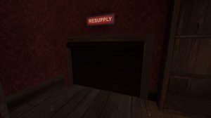
20190124133538_1.jpg
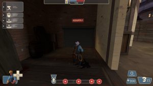
-This side of the door is overly dark. Try changing the lighting origin
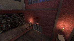
20190124133626_1.jpg
-The speakers here look very odd and don't fit the rest of the room
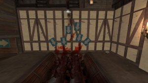
20190124133700_1.jpg
-I think you need more signs here. Just a few more
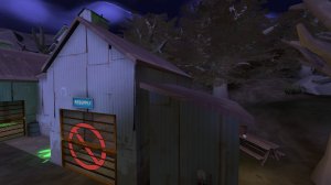
20190124133825_1.jpg
-Most of your rooves are super thick. They should be somewhere between 6hu and 4hu from what I find.
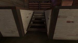
20190124133848_1.jpg
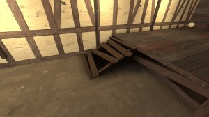
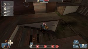
-not only do these hanging stairs not touch the ground at the bottom but there is some massive space between them. Stairs in TF2 or source in general are usually 8hu high by 12hu long
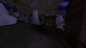
20190124133908_1.jpg
-This window is green for some reason
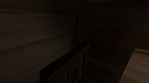
20190124133928_1.jpg
-The shadow of the full ammo above leaks through the floor and onto this wall. This usually happens when a brush is too thin and less than 10hu thick or if the map was compiled with fast settings
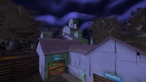
20190124133946_1.jpg
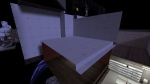
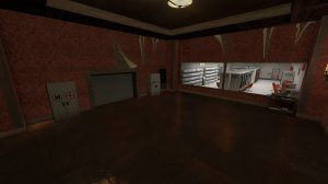
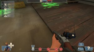
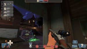
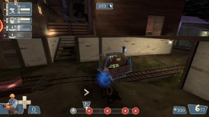
The building behind blu glowing green due to the "mysterious substance" is a neat touch but there's no visual reason given for it. I'd suggest opening the garage door in the spawn room to show an out of bounds area that includes something like a pool of green ooze or a bunch of barrels. Just something that looks like it would cause the glow.
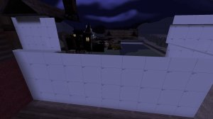
20190124134051_1.jpg 20190124134105_1.jpg
-All these walls that are behind stuff should have the nodraw texture since there's no point for them to be rendered
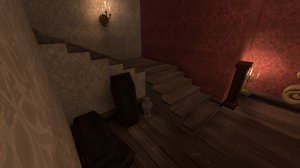
20190124134122_1.jpg
-These stairs would look better with a trim on the side, like the steps in mannmanor. Also they are too large plus there's some weird shadow difference between the walls of the steps which just looks odd
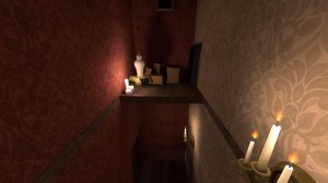
20190124134151_1.jpg
-It looks like I can rocket jump up here, which I shouldn't want to do
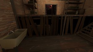
20190124134225_1.jpg
-The direct change from wood texture to black texture in the area with the barrels is odd
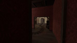
20190124134211_1.jpg
-The boxes under the stairs far off start to look weird at this distance. I think it's due to fading but I'm not sure
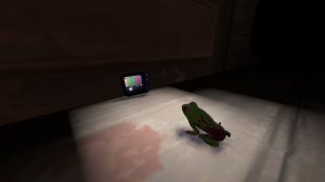
20190124134259_1.jpg
-cute
20190124134326_1.jpg
-the wood prop being used as a ramp digs into the concrete floor which doesn't work with that texture. If it was a ground texture it would make more sense
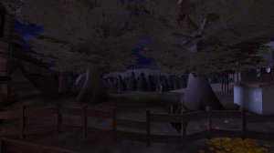
20190124134540_1.jpg
-The texture on the far off hill doesn't look right being some kind of rock texture
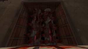
20190124134707_1.jpg
-This just stopped spinning at some point for no reason
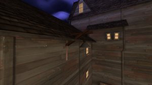
20190124134718_1.jpg
-There's a couple of these lights that clip through the rooves of buildings in this area
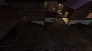
20190124134752_1.jpg
-This area is very bland and empty. I'd suggest putting some rocks or something on the left just to spice up the area

That's all for now. The map looks pretty cool so far so best of luck!
 

MacRipley

L3: Member
Jan 15, 2015
134
274
Hey thanks for checking it out!, Most of these issues have been fixed in the newest version which will be updated soon
 

MegapiemanPHD

Doctorate in Deliciousness
aa
Mar 31, 2012
2,004
1,313
Some of these where addressed and the map is getting there but I really hope this isn't the complete final version since there are still some things to work on. I hope I don't sound like I'm being hard on the map, I just think it has potential and want to see it and you reach that potential.

Anyway....here's more feedback >__>


-That's a dark area by the door

-Put some kind of trim between the wood and the tile under this door so there's more of a natural transition instead of a hard stop from one to the other
20190125111438_1.jpg
-Why is this area still here when it's inaccessible? It's separate enough to not hinder optimization but I'm just curious
20190125111502_1.jpg
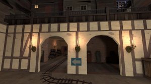
-Those arches could really use some more angles
20190125111615_1.jpg
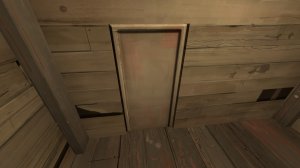
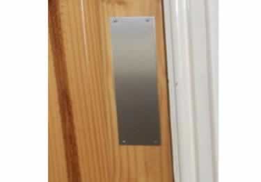
-Older TF2 maps keep door texture flat like this but it looks better, imo, if you give it some depth by having the frame stick out from the main door. Also without a knob or push plate it's hard to tell that this is a door and not just a big piece of wood. Something as basic as the image below would go a long way:
174L7.jpg


20190125111737_1.jpg
-This doorway has the doorframe inside and nothing where the actual door hole is, which looks odd
20190125111824_1.jpg
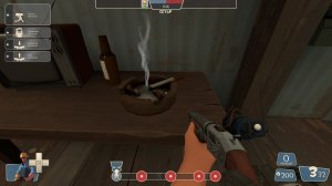
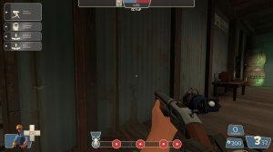
-Holy Crap this ashtray with cigars is flipping HUGE! Think about the size of Spy's cigs compared to this. These are larger than cigars.
20190125111837_1.jpg
-Clip
20190125111856_1.jpg
-Clip the wooden frame in this building
20190125111909_1.jpg
-Prop clips through the wall
20190125112007_1.jpg
-Could use a doorframe
20190125112026_1.jpg
-Many of you're wooden doorframe doorways are pretty short. It causes me to hit my head on the top even as a basic class like the engie. Idk how tall these are, but basic height to avoid this kinda thing is 192hu. You can play around with that number a bit but it's generally good form to avoid hitting the top of doors when jumping
20190125112048_1.jpg 20190125112213_1.jpg
-Are the clips on these stairs lined up correctly? It may just be the 3rd person perspective but my character looks like he's floating above them instead of walking on them
20190125112314_1.jpg 20190125112329_1.jpg
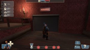
-no respawnroomvisualizer
20190125112442_1.jpg
-put a ramp clip on the wood under the tracks. It doesn't feel like there is one. If there is one already, make it stick out farther
20190125112524_1.jpg
-Clip this wood smooth
20190125112825_1.jpg
-This room in particular, but a lot of the mansion, just feels way too big. There's not enough things that are player sized and a lot of it is just big rooms with tall ceilings. Take a look at mannmanor and see how they do things to make areas feel like they are sized better.
 

Pocket

Half a Lambert is better than one.
aa
Nov 14, 2009
4,699
2,581
BB540100BB269DAC04709D5A861F6940F1D3C313


If this is a texture you made, I'd like to suggest that you rotate the grain on half of these slats so that it matches the direction they're going.
 
Oct 6, 2008
1,965
450
Hi Ho!

32 of us played this map last night and none of us had working lighting on the map. I tried mat_fullbright 1 and 0 on it and the map lighting didn't change - it was all flat contrast and looks nothing like the screenshots seen in the post.

Is there a setting that needs to be run with the map to get the lights working right?

Also the 2nd choke point for blue to attack is a killer - could it be modified - red held it for 12-15 mins despite multiple ubers going in.

Thanks