Retreat

CTF Retreat b1

Trotim

aa
Jul 14, 2009
1,195
1,045
The map is still as extremely narrow as it ever was so it's only really playable with low player counts. Despite that there are tons of routes all over the place so it's really easy to get flanked or ambushed, making it hard to actually consistently push into the enemy territory (even if there's no coordinated defense). Reminds me of 2fort or even parts of Dustbowl in that regard

I still don't see what the first two intels are for. To give Engies time to build on the 3rd that stalemated a lot when we played (making it really only CTF with a pointless beginning phase that makes Scout rushes uneffective)? Because that's all I really see happening. Is there a spawn time penalty or something?

And you saying "I don't see one uber so don't complain about Sentries" during the test was silly considering how hard it is to build and properly deploy one (gotta start it inside enemy territory right in front of spawns when trying to cap 3rd) and how easy it is to airblast one away
 

tyler

aa
Sep 11, 2013
5,100
4,621
I think when players know the map, the sentries get nastier but they also know when and how to uber to break a sentry. In fact, the hardest to counter spots are pretty simply outranged by someone clever.

And as for just building on C versus trying to guard A or B--it's a bad strategy for bad players. By the time the enemy team had capped A (which I had guarded the entire round), we were tagging their C repeatedly and then won. You don't want to give up the early intels so easy or you will lose because then you've only got one capture to defend instead of three. Pretty basic imo.
 
Last edited by a moderator:

MangyCarface

Mapper
aa
Feb 26, 2008
1,626
1,325
Reasoning for 3 flags being at different points:
1. Raise importance of flexible defense, see problems in 2fort/turbine flag rooms
2. Ramp up intensity of gameplay over time, see my thesis
3. Provide incentive for defense even when playing offensively- keeping the flag forward at A or even B makes running the enemy flag distances shorter, as well as avoiding the 10s increases in return time for your own flag
4. A being extremely close to mid provokes a real roll-out, who-gets-there-first response vs. the relative lax behind 2fort et al. rollouts; it's important to get the demoman to the flag room before the scouts reach the spiral ramp
5. Countering the ability to negate #1 by camping at C from the start is the buffers/margins of error allowed by having 2 or 3 flags still remaining vs. C being the only flag needed to lose; see also #3 re: return times & defense ease
6. Keeps more of the map relevant throughout the course of a round, see my thesis
7. Avoiding the tendency of tf2 to excessively reward success (e.g. cap crits, spawntime lowering); while goal attainment should certainly not impair a team, I feel no need to push a winning team further towards winning
8. Adds an additional feeling of reward for capture via concrete, observable changes in the gameplay environment vs. the addition of another point to an unsatisfying scoreboard

I think these are valid points arguing for the CSF system, and having tested so many flag variants myself I still feel this is currently the best option for mappers. Our playtests on the map have involved mainly newcomers who are still getting familiar with the layout and gameplay. I'm eager to see how future playtests proceed as player awareness grows. Generally when I'm only doing mediocre on the scoreboard it signifies that others know it as well as I do.

Criticisms re: narrowness may be valid so I'll be thinking that over.
 
Last edited:

Vilepickle

Banned
Oct 25, 2007
372
199
Description reminds me of the oldschool Dissect map. It had basically the same thing with ~6 sequential caps. If you got all 6 it started back on 1.
 

Penguin

Clinically Diagnosed with Small Mapper's Syndrome
aa
May 21, 2009
2,039
1,484
why does this use grey-painted badlands cliffs?

I am just baffled.
 

Ravidge

Grand Vizier
aa
May 14, 2008
1,544
2,820
https://dl.dropbox.com/u/1281220/2012-08/Screenshot-2012-08-08_12.52.39.jpg
This fence irritates me, it's practically see-through but it has a tiny board going right in crosshair height when you're aiming for the tower.
I think you said it wasn't intended to be jumpable either (crouch jumping over it)? I definitely think it should be possible to jump over it, I would feel extremely restricted if I couldn't exit that ledge into the water there. Removing that ability would also make every single exit out of the base a narrow corridor or hotspot (entering the opponents side already has this issue for the non-mobile classes).

https://dl.dropbox.com/u/1281220/2012-08/Screenshot-2012-08-08_12.52.23.jpg
nonsolid handrail. Nothing big

https://dl.dropbox.com/u/1281220/2012-08/Screenshot-2012-08-08_12.53.48.jpg
This doesn't look right at all. That bent piece of metal is like a foot thick! You've also managed to displace nodraw faces on that flat displacement brush below the bent piece.

https://dl.dropbox.com/u/1281220/2012-08/Screenshot-2012-08-08_12.54.32.jpg
Not a huge fan of these square rock thing. I think it looks good in the OOB detail areas, but in the playable area and seen upclose it just looks kinda strange? Maybe because it is so rough and blocky.

https://dl.dropbox.com/u/1281220/2012-08/Screenshot-2012-08-08_12.55.22.jpg
This staircase is nice, but the problem here is that the Red one far superior to the blue one.
I should probably have screenshotted the blue one since thats the one I dislike. The blue is awkward to navigate when in a hurry, it's barely wide enough to fit the playermodel and the thick stone railing make it feel even clumsier.
The red one is pretty alright.

https://dl.dropbox.com/u/1281220/2012-08/Screenshot-2012-08-08_12.58.01.jpg
This arch is clipped, which isn't strange (and you can stand on it, but that isn't my complaint), but it's' unfair since the metal conveyor prop on the red side is non-solid and unclipped. A red demoman has a huge advantage when it comes to rushing, and can with a 2-sticky jump land right at the enemy intel building just seconds after the round begins.
 

MangyCarface

Mapper
aa
Feb 26, 2008
1,626
1,325
Those're all good points, especially the last, a solution to which I'm trying to figure out. One option is to (lol) make the stone arch nonsolid to players as well

Edit:
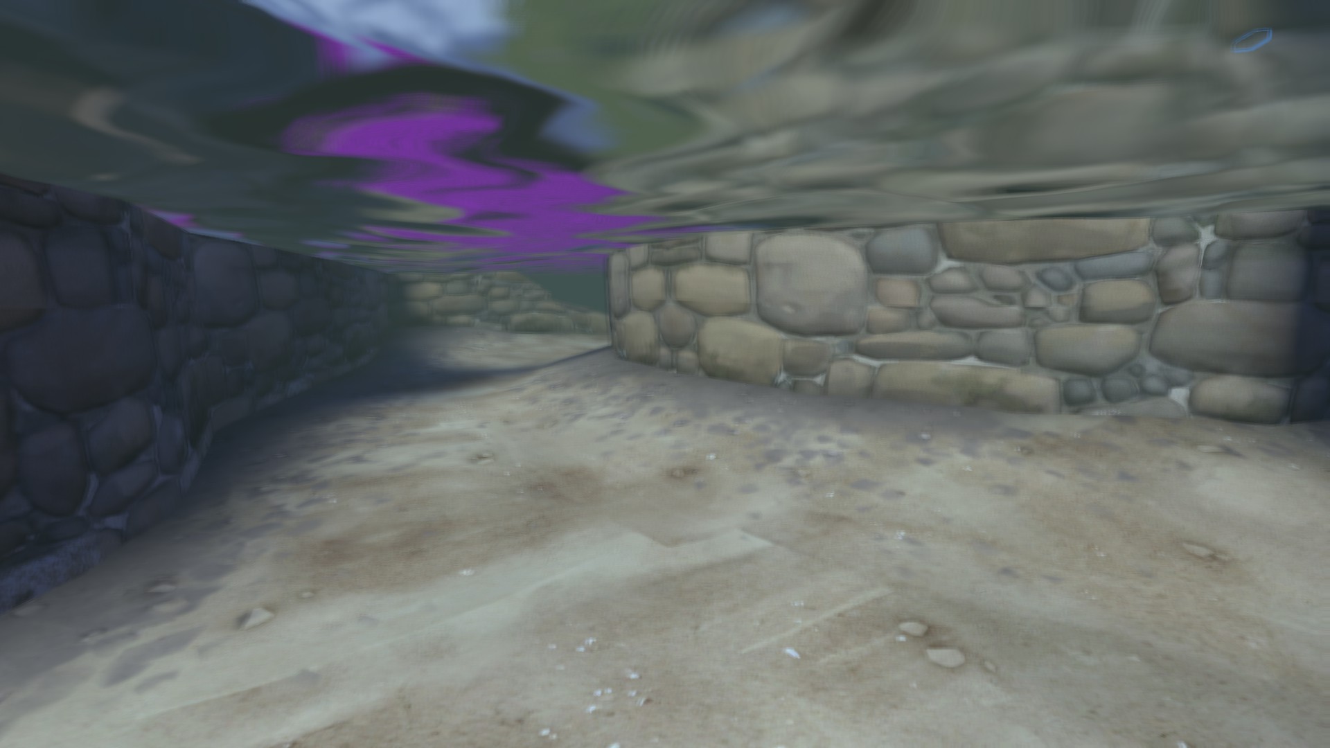
Anyone have a clue why the custom blendmaterial I use on the underground surface renders fine when out of water, but when underwater it looks to be missing (i.e. checkerboard pattern)? I don't get the inconsistency
 
Last edited:

tyler

aa
Sep 11, 2013
5,100
4,621
Hey don't get mad or anything but I decompiled your map stole your textures and then recompiled it until it worked

0Eqyl.jpg


just FYI im a super genius so it only took me like 5 seconds to see it was a problem with your $blendmodulatetexture. I already forgot what you were using but I didn't recognize it so I just changed it to something else and it works fine now.

Code:
"WorldVertexTransition"
{
	"$basetexture" "Nature/rockground010"
	"$basetexture2" "Nature/dirtground009"
	"$bumpmap2" "Nature/dirtground001_height-ssbump"
	"$ssbump2" "1"
	"$surfaceprop" "dirt"
	"$surfaceprop2" "dirt"
	"$blendmodulatetexture" "Nature/gravelground001_blendmask"
    "%keywords" "tf"
}

You were using something about snow before, and I dunno why really because I imagine blending gravel and gravel looks better with a gravel blend modulate???? not sure

anyway this fixes it happy to help <3

tldr ftfy
 
Last edited by a moderator:

MangyCarface

Mapper
aa
Feb 26, 2008
1,626
1,325
Hey don't get mad or anything but I decompiled your map stole your textures and then recompiled it until it worked

just FYI im a super genius so it only took me like 5 seconds to see it was a problem with your $blendmodulatetexture. I already forgot what you were using but I didn't recognize it so I just changed it to something else and it works fine now.

Code:
"WorldVertexTransition"
{
	"$basetexture" "Nature/rockground010"
	"$basetexture2" "Nature/dirtground009"
	"$bumpmap2" "Nature/dirtground001_height-ssbump"
	"$ssbump2" "1"
	"$surfaceprop" "dirt"
	"$surfaceprop2" "dirt"
	"$blendmodulatetexture" "Nature/gravelground001_blendmask"
    "%keywords" "tf"
}

You were using something about snow before, and I dunno why really because I imagine blending gravel and gravel looks better with a gravel blend modulate???? not sure

anyway this fixes it happy to help <3

tldr ftfy


Well yes, this is definitely a solution. I'll probably switch the two mats in the vmt because the gravel blend looks weird in this direction, but this will work. My q still stands though: why would a custom blend mat work above water but not under it
 

tyler

aa
Sep 11, 2013
5,100
4,621
Well yes, this is definitely a solution. I'll probably switch the two mats in the vmt because the gravel blend looks weird in this direction, but this will work. My q still stands though: why would a custom blend mat work above water but not under it

Hm I dunno. I thought you just made a weird mistake, didn't realize it was custom. I'll see if I can figure anything out later.

goddamn

last time i decompiled a map to help a small hell was raised :D
IDK what the context of that was but I wouldn't do this for just any map and I especially wouldn't do this for just any map without asking
 

tyler

aa
Sep 11, 2013
5,100
4,621
Forgive me if this is somehow dumb, but I went to look at the blend material you're using in Retreat, and the one you reference is neither packed into the map nor in the TF2 GCF.

There is, however, one by the same name in the winter folder rather than the nature folder.

I think we both know what happened here.
 

Francis

L1: Registered
Jul 6, 2010
3
2
Posted it to the workshop

Hoping to get wider feedback so I can release a final version, as this is my favorite of my maps... Give it a review/spam 5 stars if you have the chance.
<3, Mangy

Liked and subscribed. I dig your map, but people have a stigma against ctf so I've yet to play it with people. Message me if you ever do!
::p: