Resource icon

RD rd_uplink c1

SnickerPuffs

(*single chuckle*)
aa
Apr 10, 2014
1,325
1,866
Gnarly! There's not many custom RD maps. I hope you can take this all the way to RC!
 

WillWow_mc

L2: Junior Member
Nov 29, 2014
51
21
I plan on it! I really love the gamemode, and indeed, there aren't many custom RD maps.
 

SnickerPuffs

(*single chuckle*)
aa
Apr 10, 2014
1,325
1,866
I love RD too. I'm just really, really lazy. I'll run through this when I get the chance and give you some feedback.

I wish you luck!
 

SnickerPuffs

(*single chuckle*)
aa
Apr 10, 2014
1,325
1,866
Here's some feedback! It's not much, unfortunately, but that's why we have playtests!

20171013221710_1.jpg

First off, there's only one spawn exit. That's usually not a good thing, especially in CTF modes like RD. It can increase the chances of spawn camping.

20171013221636_1.jpg

You have some missing textures on the vents near the flag zone. You need to pack your textures!

20171013221903_1.jpg

This sign is placed rather low, and is partially blocked by a health pack. Try changing the model to the hanging variant, and putting it on the ceiling. That should fix it.

20171013221923_1.jpg

Now, I'm certain that the "No Entry" sign was visible from a distance/angle, but it should always be visible, from any angle. Also, making it flush with the surrounding walls would be nice, but isn't necessary.

20171013222021_1.jpg

The flag room doesn't feel right to me. I could be wrong, but it feels too tight, with not enough emphasis on the point itself. Try reworking the room, making it larger, and having the point "pop" more.

Other than those points, I really like what you have so far! The detailing, although A1-quality, is still phenomenal. However, I do have one last gripe. The RED and BLU bases both feel too small, especially for an RD mode map. It makes the mid area feel over scaled in comparison, when in reality it's perfectly scaled as-is.

I've very excited to see where you'll take this!
 

WillWow_mc

L2: Junior Member
Nov 29, 2014
51
21
Thanks for the feedback!
-I agree about the only one spawn exit thing, I thought that, though I'm having a slightly difficult time deciding how and where to place a second one. I have ideas though.
-I'll fix up that issue with the missing texture, packed with a1a.
-About the sign, I'll see what I can do. Shouldn't be too hard!
-The no entry sign I thought wasn't supposed to show until it opened. I'll see if moving it forward fixes that, it should.
-About the core room, it's kinda supposed to have the feel of Asteroid's vault, being a closed in space that is infiltration-like. I didn't want to open it up too much, in case it becomes hard for the thief to defend thonself from defenders as thon tries to steal more points before escaping. Asteroid has the advantage of its restricted ways to access the vault, but I didn't want to rip that off again in this map, and felt this size and layout would work appropriately. I'll see what I can try to make the point pop a little more, though!

And one thing I can note, in case you did it and noticed yourself, is that I find I hardly ever bother going out the proper exit passage, instead often opting to go up the battlements.

Also, did the overlays show up? E.g. the big 'A' and 'B's in their respective rooms on the floor?
upload_2017-10-14_14-34-12.png

They, frustratingly, don't show up for me, but I think it might be my game's settings.

I'm currently working on a1a, to address a few small issues, but the layout is going to stay the same until a test.
 

SnickerPuffs

(*single chuckle*)
aa
Apr 10, 2014
1,325
1,866
The overlays show up.
 

WillWow_mc

L2: Junior Member
Nov 29, 2014
51
21
-Made it so red team can't open the blue team spawn door anymore (messed up filter name)
-Added patch overlays on the ground under the ammo and health pickups
-Added a window on both sides of the little building in mid to make it clearer there is a medium health pack inside
-Made the vault lighting prop show up when the core isn't taken
-Hopefully stopped the blue C robots from getting stuck outside the spawn doors trying to go under the ramp into the vents
-Packed that missing texture
-Moved an intelligence direction sign from on a handrail to hanging from the roof
-Made the radio tower in mid slightly less scaled down
-More optimisation

Read the rest of this update entry...
 
Last edited:

WillWow_mc

L2: Junior Member
Nov 29, 2014
51
21
Ok crap it's broken aha... I should have launched that before uploading and checked...
 

WillWow_mc

L2: Junior Member
Nov 29, 2014
51
21
I have a server currently running the new map, should be findable in the master server list, search for the map.
It's hosted in Australia, not going to have the best ping for people overseas. If anyone wants to try it on there, it's an option.
 

wholeheart

L1: Registered
Oct 14, 2017
1
0
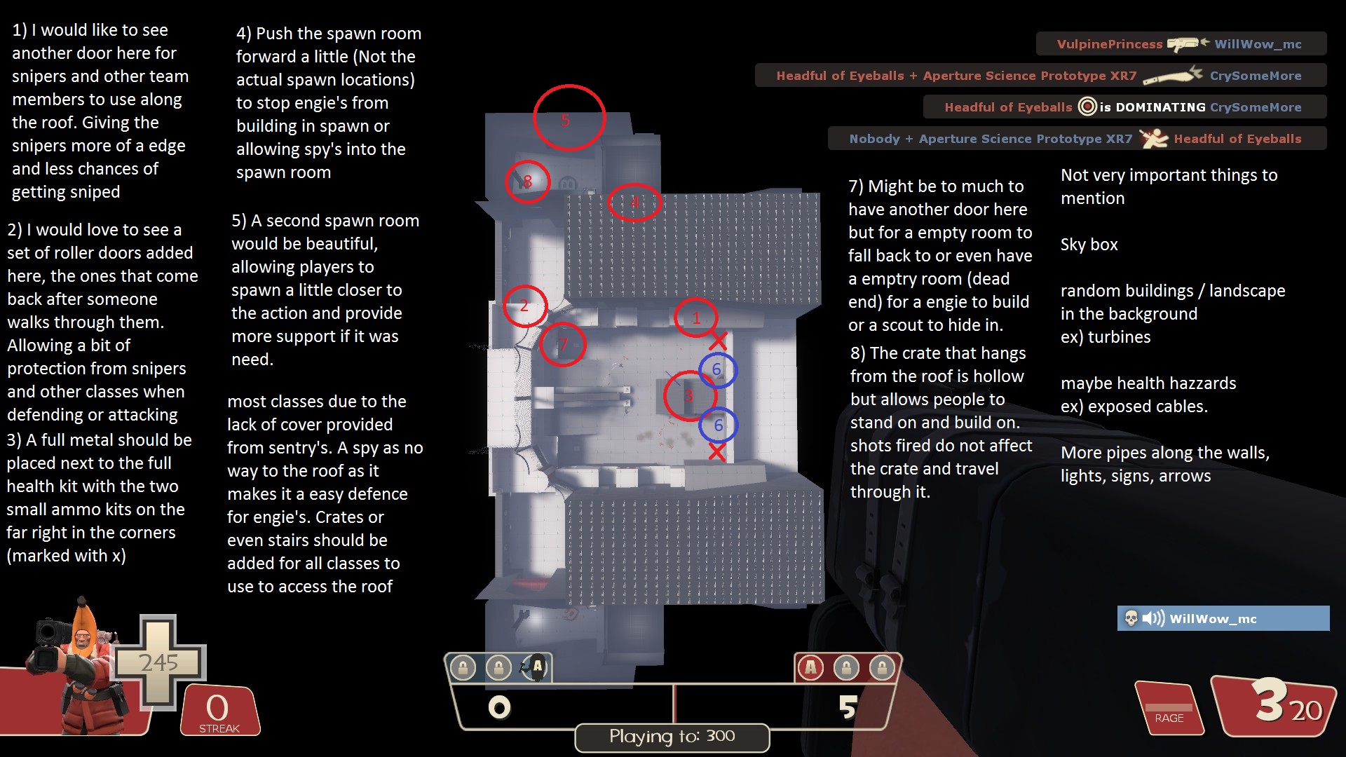
Here you go willwow, this is what I got so far for you after playing so far. Sorry about any spelling errors. I look forward to testing it some more when you add something new to it.

I know i missed number 6, it's just after number 5. I'm only saying this as to not confuse you or anyone else. I have more to add but those are the only things I important as of right now, details can wait till this is closer to being done
20171014215818_1.jpg
 

WillWow_mc

L2: Junior Member
Nov 29, 2014
51
21
So I've finally gotten around to updating this map, I'll upload a2 shortly. I've gotta just fix a few small bugs I found when walking around it last night, which'll be quite simple to fix.
 

WillWow_mc

L2: Junior Member
Nov 29, 2014
51
21
-Spawns were moved a bit, back into the base, in a whole new corridor that starts from old spawn location, goes past window overlooking B area, past spawns, and down a ramp out to new courtyard linking to B (mentioned again later)
-B room was expanded
-B robot paths are slightly shifted
-B room has a few crates added, existing one moved
-The ramp just inside the front door to B has been removed.
-Small route that once connected A to B has been lengthened, now the route connects from A to a new courtyard area that is linked to B. A window is added in the B room that looks into the route to give people more awareness. The route is also now being 3-way, to lead to the new rooms mentioned just below
-A new route was added over in mid to allow flanking from your base to the other from a new room off the end near the exit inside of each base
-You can now go around the back of the small mid building
-The [radio] tower has had many improvements, including having some collision and bullet blocking (bullet blocking only on main four beams, collision on beams and crosssections and top). You can climb it if you're good enough, and will hear a fitting soundscape from it. Also casts a shadow, though this is very soft and hardly noticeable (sadly)
-A few soundscape changes to allow the sounds on the tower to be the only ones heard at mid when on the tower, and to make it not so unexplainably noisy in the B room
-Minor pickup location shifts
-Small lighting tweak in core/flag room
-Previously dead-end of sniper battlements now also links to the new route in mid

After these changes, the amount of time from getting to and from key locations is closer, and in some cases exceeds, the times for said locations' counterparts in asteroid; this was one of the key goals, along with providing players more ways to move around the map.

Read the rest of this update entry...
 

SnickerPuffs

(*single chuckle*)
aa
Apr 10, 2014
1,325
1,866
Can we have screenshots?
 

WillWow_mc

L2: Junior Member
Nov 29, 2014
51
21
I don't quite have any for it just yet. I'll make a new video soon probably that'll point out the major changes and give you a better look than screenshots.
 

WillWow_mc

L2: Junior Member
Nov 29, 2014
51
21
Alright; I made a new video, but it's a bit different to the past ones. It's an 11-and-three-quarters minutes long video of me talking about what I changed between a1, and what I plan to change for a3. The microphone isn't the best so I almost sound like I have a lisp at some times. And if you get bored of watching it that's fine :p

View: https://www.youtube.com/watch?v=OHYq4iOy8RE
 

WillWow_mc

L2: Junior Member
Nov 29, 2014
51
21
-Moved C robots to where the a2 spawn locations were, making a more open area there
-Lighting changes in core room, along with small skylights added in said room
-Moved spawnrooms back into the base a little more
-Changed a few small things to create better player flow
-Added a few more overlays
-Removed a medium ammo pack from blue team's B room that I forgot to delete when making a2 originally
-Removed the crouch-jump obstacle that made it more annoying to get into core room end of vents than anything helpful
-Re-added doorway in B room to flank route from A->B to allow better attacking of B
-Added another, more covered doorway into B next to the main big entrance from A
-Window on room overlooking B room was made taller to make it clearer the C robots are inside
-Small health pack on large scaffolding/catwalk ramp inside B has been changed to a medium health pack
-Slight detail additions
-A few sound tweaks

Read the rest of this update entry...
 
Last edited:

WillWow_mc

L2: Junior Member
Nov 29, 2014
51
21
Totally reworked. I had to change a lot, so really and honestly this is almost a different map entirely. Kinda feels bad, because I liked what I had before, but it sadly just wasn't working, and besides RD needs a linear map for the little thief tracker to even work. Setting is changed, though the idea of it having to do with connection to satellites is still present, now being a location along a cable pipeline with a radio tower and satellite dish at mid.

-Linear design instead of confusingly curving in on itself in bases
-Rotationally symmetrical instead of mirrored
-Layout is totally different.

...I'm still really unsure if what I've done is right or not. I don't know if I should have just called it something new, being so different, but all I can hope for is that I won't have to totally rework it all again... ^^;;

Read the rest of this update entry...