- Jul 30, 2021
- 932
- 640
Heyo. Just had a bit of artstyle feedback I felt like sharing.
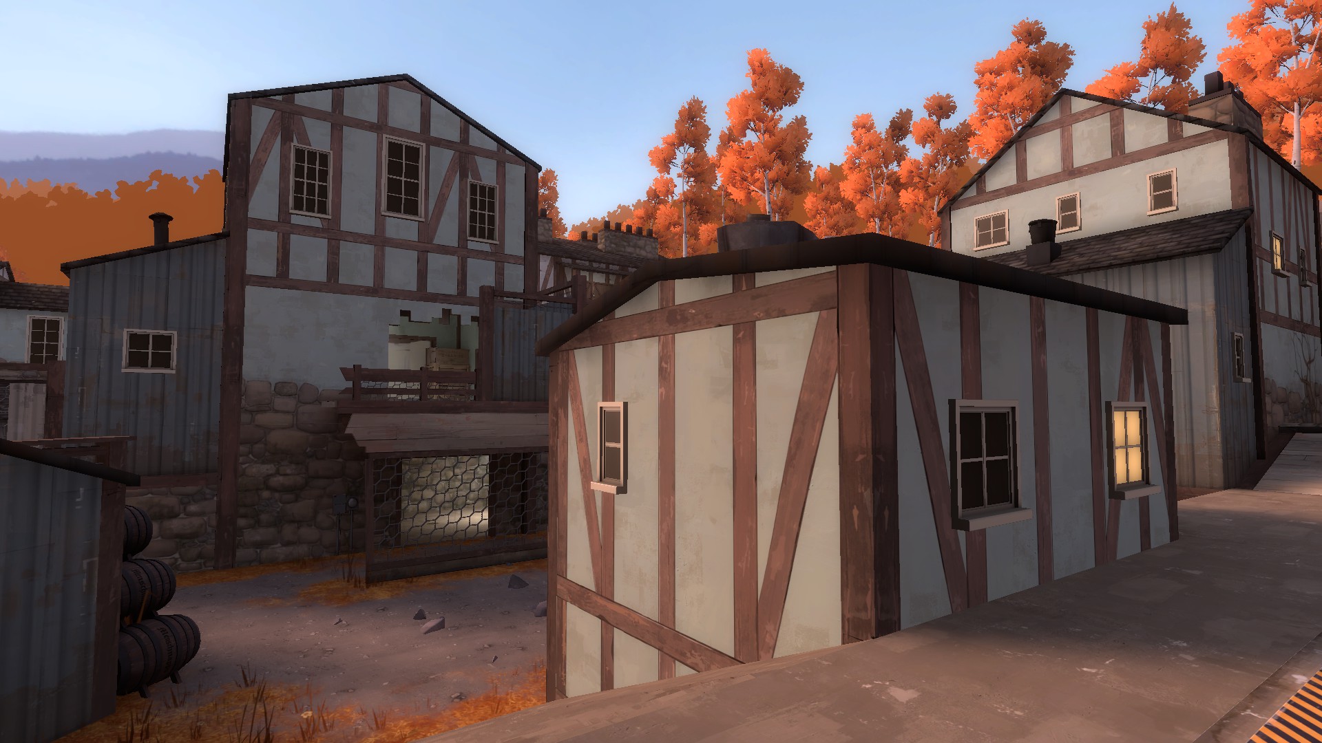
I really feel like these strut-esque things as texturing for the buildings is a step back from Proot's older counterpart; They just look kinda bad when compared to classic Proot. If I were to describe why, I think they feel out of place? Like from the look of what you're going for, it feels like you're trying to hit somewhere in Europe, but in my opinion it fails at that because these struts (in combination with the really tall cobblestone) end up making it feel more Medieval than anything, which to me is a really bad combination with the Autumn theme you're also going for. I much prefer the more plank-focused design of the Classic versions of Proot, as it really made the map feel more homely and it fit right in with the bricks of RED.
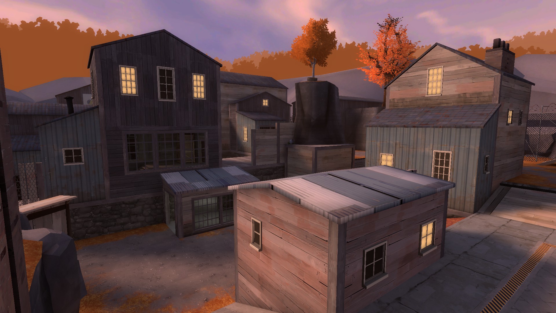
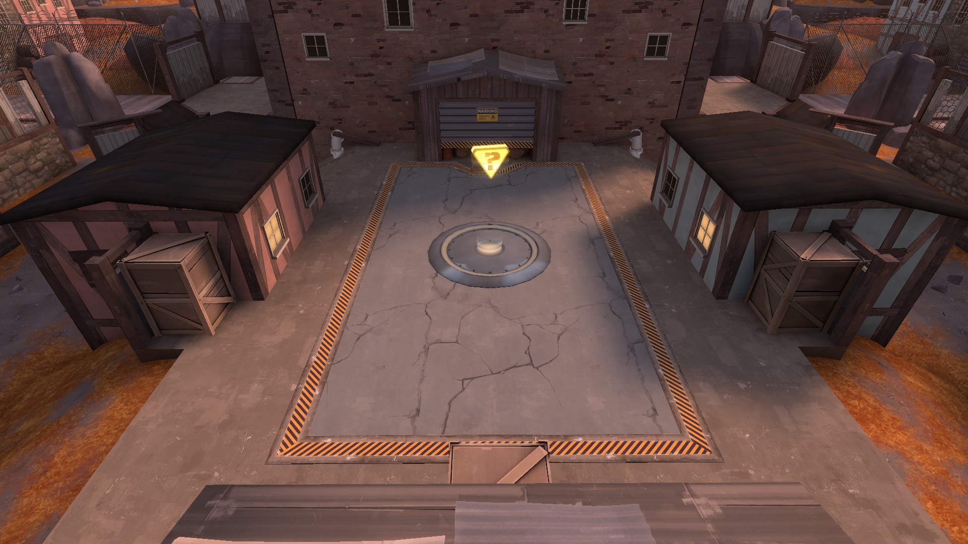
I think this area in general being simplified in terms of visual flair is a huge loss; The inner concrete area doesn't fit in with the outer concrete area at all in my opinion, and in general it just doesn't have as much substance as Classic Proot. I also think the leaves being made less bountiful on the ramps up to the point is a huge let down; they made the point feel a lot more like something I have to really pay attention to, apart from in general just being nice to look at in comparison to a patchy ground. Something I wouldn't mind seeing how they fit in would be the black, metal rooves featured in the new Proot; they look really distinct from the rest of the play area here, and I like them for it! I'm not sure how well they would fit in with the Classic Proot I prefer, but I'd be willing to give it a chance. I think the bricks in general on Classic Proot felt more in-line with the environment. In a way, it almost made the map feel like it came from Russia, which is a very underutilized setting for TF2. Also, and I will admit this is just more of a me thing, I really prefer the green-topped crates instead of the generic TF2 ones. They add some much-needed colour variety to the map.
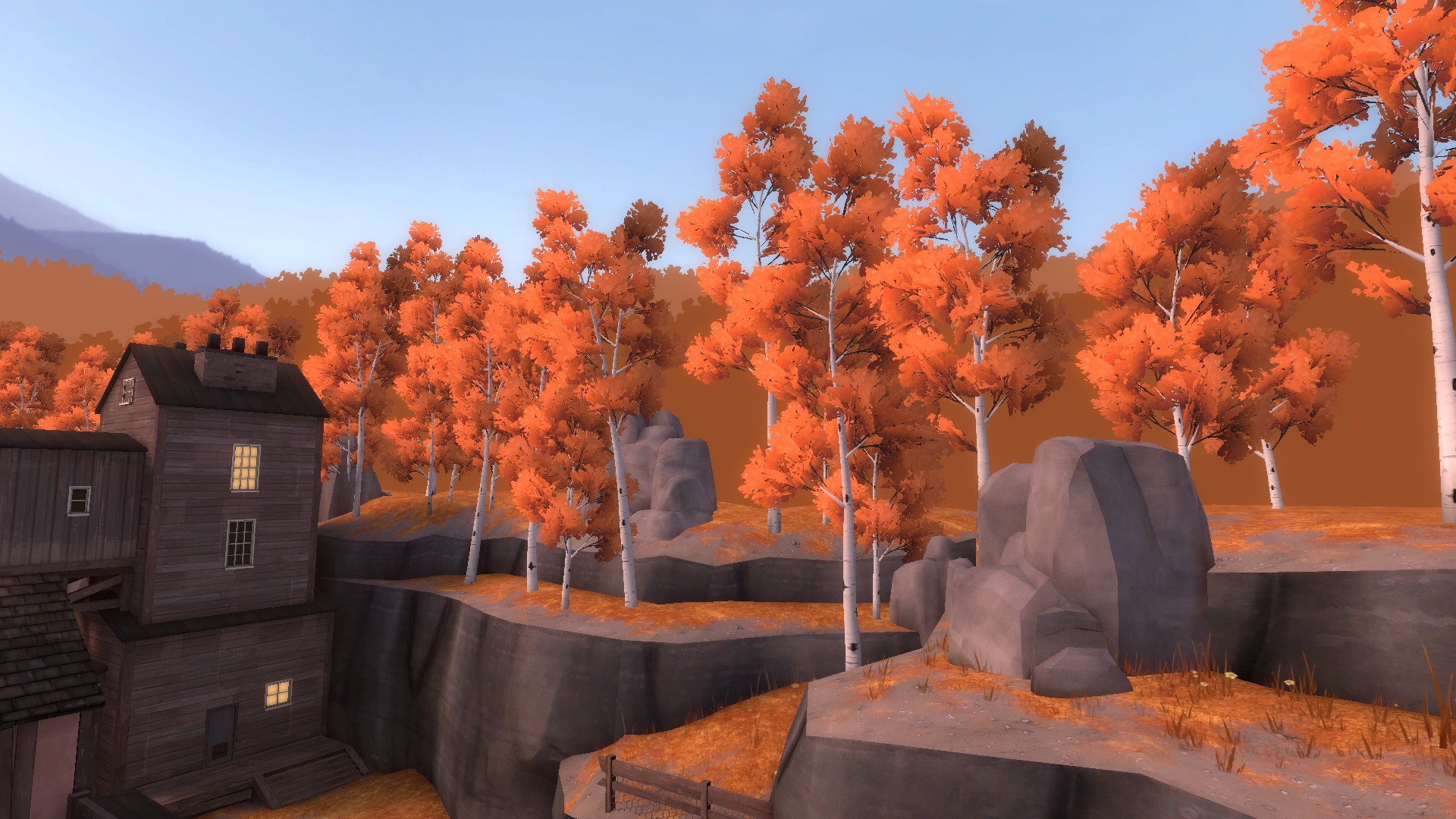
In general, I think the out-of-bounds area on the New Proot is overdetailed. I really dig the new cliffsides, those look awesome, but the multiple birch trees really throws it off for me. Not just in terms of aesthetic, but also optimization for me too; koth_proot_b5b runs at 210fps for me when static, whereas koth_proot_b6b runs at 175fps when static. I understand this is probably a bit nitpicky, but nonetheless it affects my experience and perception of the map. I really think you could cut down (heh) a bit on the trees in the OoB and possibly reintegrate some more tree variety into the mix as well, like with the other Autumn trees that were on b5b. I think the skycards did a lot of heavy lifting for the map already, and blocking them off just makes the whole thing feel... off, to me.
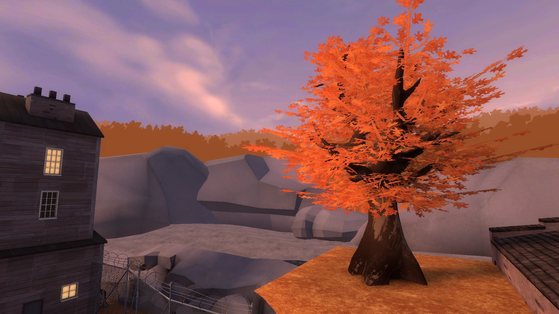
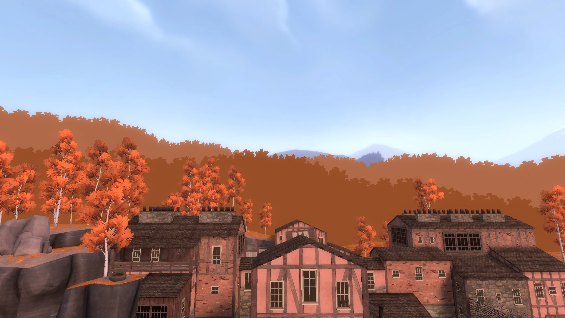
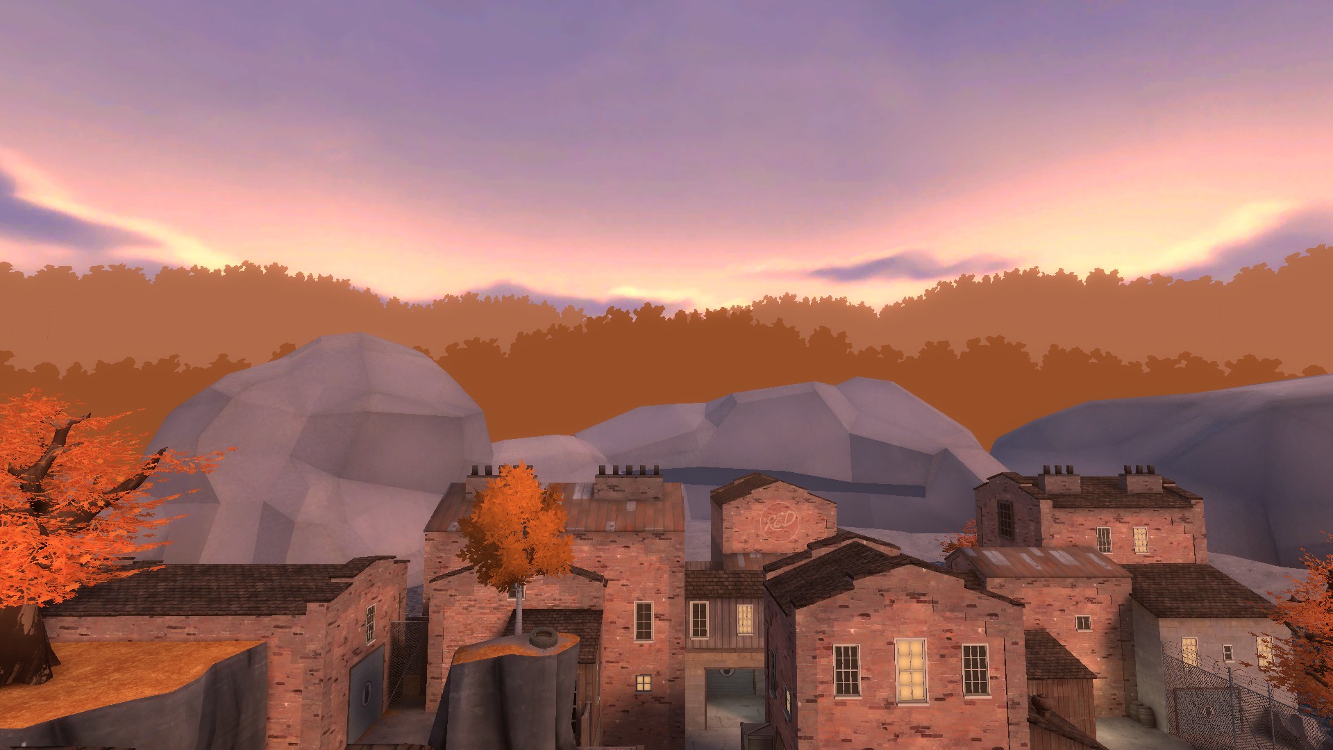
One thing I vastly prefer in the New Proot in comparison to the Classic Proot is the change and skybox, and thus the time of the day. The new, beautiful blue sky provides some much needed contrast for the map that I really, really like! I love seeing the bright blue sky, it keeps me energized when playing a game and in general I think it just looks better than the previous skybox, as much as I do like the texture itself.
That's really all the feedback I have right now. Sorry none of it's really about gameplay, I just felt particularly inspired to make a post after talking to one of my closer friends. I would really appreciate these changes being made, I think they would make Proot stand out some more (in a good way) and in general just be more pleasant to look at.
tl;dr:
- Dislike all the new frontline strut textures on all the buildings, pls revert BLU's side 100%. RED's kinda bland in b5b so not sure there.
- revert the mid texture changes pls, b5b looked a lot nicer
- remove some props from the OoB for both FPS reasons and style reasons
- I liked the change in time. It feels nice!
I really feel like these strut-esque things as texturing for the buildings is a step back from Proot's older counterpart; They just look kinda bad when compared to classic Proot. If I were to describe why, I think they feel out of place? Like from the look of what you're going for, it feels like you're trying to hit somewhere in Europe, but in my opinion it fails at that because these struts (in combination with the really tall cobblestone) end up making it feel more Medieval than anything, which to me is a really bad combination with the Autumn theme you're also going for. I much prefer the more plank-focused design of the Classic versions of Proot, as it really made the map feel more homely and it fit right in with the bricks of RED.
I think this area in general being simplified in terms of visual flair is a huge loss; The inner concrete area doesn't fit in with the outer concrete area at all in my opinion, and in general it just doesn't have as much substance as Classic Proot. I also think the leaves being made less bountiful on the ramps up to the point is a huge let down; they made the point feel a lot more like something I have to really pay attention to, apart from in general just being nice to look at in comparison to a patchy ground. Something I wouldn't mind seeing how they fit in would be the black, metal rooves featured in the new Proot; they look really distinct from the rest of the play area here, and I like them for it! I'm not sure how well they would fit in with the Classic Proot I prefer, but I'd be willing to give it a chance. I think the bricks in general on Classic Proot felt more in-line with the environment. In a way, it almost made the map feel like it came from Russia, which is a very underutilized setting for TF2. Also, and I will admit this is just more of a me thing, I really prefer the green-topped crates instead of the generic TF2 ones. They add some much-needed colour variety to the map.
In general, I think the out-of-bounds area on the New Proot is overdetailed. I really dig the new cliffsides, those look awesome, but the multiple birch trees really throws it off for me. Not just in terms of aesthetic, but also optimization for me too; koth_proot_b5b runs at 210fps for me when static, whereas koth_proot_b6b runs at 175fps when static. I understand this is probably a bit nitpicky, but nonetheless it affects my experience and perception of the map. I really think you could cut down (heh) a bit on the trees in the OoB and possibly reintegrate some more tree variety into the mix as well, like with the other Autumn trees that were on b5b. I think the skycards did a lot of heavy lifting for the map already, and blocking them off just makes the whole thing feel... off, to me.
One thing I vastly prefer in the New Proot in comparison to the Classic Proot is the change and skybox, and thus the time of the day. The new, beautiful blue sky provides some much needed contrast for the map that I really, really like! I love seeing the bright blue sky, it keeps me energized when playing a game and in general I think it just looks better than the previous skybox, as much as I do like the texture itself.
That's really all the feedback I have right now. Sorry none of it's really about gameplay, I just felt particularly inspired to make a post after talking to one of my closer friends. I would really appreciate these changes being made, I think they would make Proot stand out some more (in a good way) and in general just be more pleasant to look at.
tl;dr:
- Dislike all the new frontline strut textures on all the buildings, pls revert BLU's side 100%. RED's kinda bland in b5b so not sure there.
- revert the mid texture changes pls, b5b looked a lot nicer
- remove some props from the OoB for both FPS reasons and style reasons
- I liked the change in time. It feels nice!

